Weekly Chart Review
The S&P 500 closes below the 200-day moving average...Is that a big deal or not?
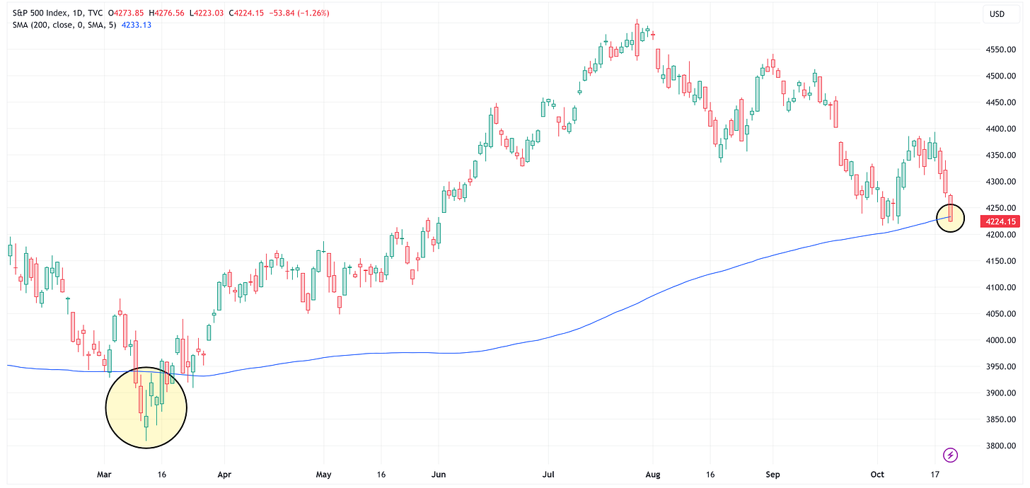
There’s been a lot of chatter over the last 48 - 72 hours noting that the S&P 500 closed below the 200-day moving average on Friday for the first time since March of this year.
Let’s start by pointing out a couple of facts:
Friday’s close was -8.98 points (or -0.21%) below the 200-day moving average.
I’m not sure that I’m ready to call that a major move below the 200-day moving average at this point.
In March, when the S&P 500 fell below the 200-day moving average, the max decline below the 200-day moving average was -3.35%.
The S&P 500 would go on to appreciate from there by +20.96% reaching a high on July 27th.
For grins, I asked Google’s AI engine, Bard, the following question:
“Q: What typically happens to the price of the S&P 500 after it falls below its 200-day moving average.”
I thought Bard’s response was pretty interesting:
“A: When the S&P 500 falls below its 200-day moving average, it is typically seen as a bearish signal, indicating that the market is in a downtrend. In the past, the S&P 500 has tended to continue lower after falling below its 200-day moving average, with an average decline of around 10% over the next three months. However, it is important to note that past performance is not indicative of future results, and the market can always rebound after falling below its 200-day moving average.
In short, the S&P 500 typically continues to decline after falling below its 200-day moving average, but there is no guarantee that this will happen.”
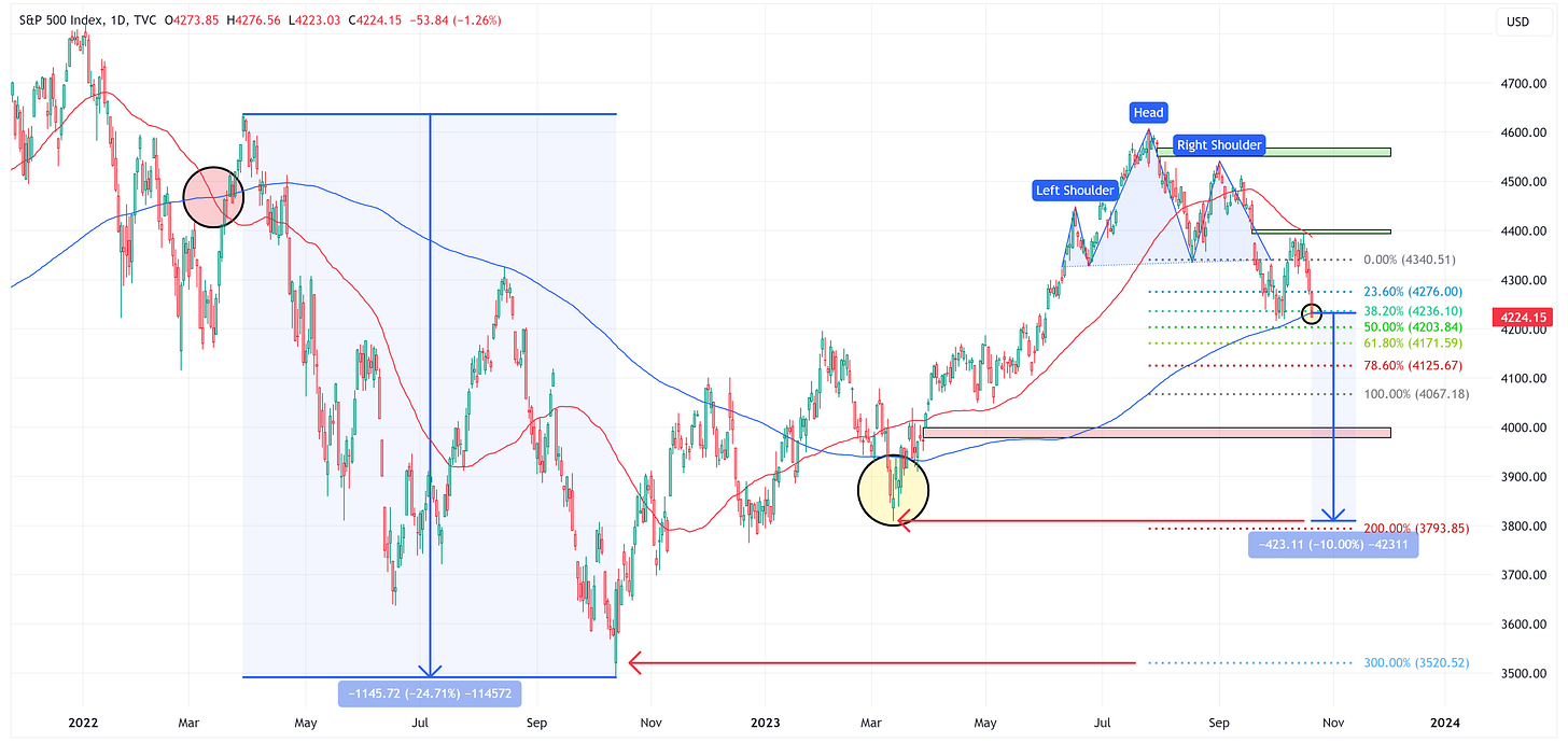
I have not independently verified if the “decline of around 10% over the next three months” statement is true or not, but let’s assume that it is. A 10% decline from here would line up almost perfectly with the lows from March which is significant because the market often looks for relative low/high points as areas of support/resistance.
From a technical standpoint, even though we briefly broke above the neckline, I think we can argue that the Head & Shoulders topping pattern is still in play. Note: a close above the right shoulder would negate the pattern.
If so, the first target is 4,067 and the second target is 3,794 (which conveniently lines up with the March low and the 10% decline noted by “Bard”.)
Long-time readers know that I am a big believer that price gaps tend to get filled. This is where the story gets more complex and offers something for both the bulls and the bears.
We have three major price gaps that currently need to be filled. The two “overhead ‘green’ gaps” would result in a positive outcome from current levels while the “red gap” could be filled on a move lower from here.
It is impossible to say if or when these gaps will be filled and the order in which it could happen. My bet is that they all get filled but it could take months to do so.
So far, we’re really only talking about a move of +/- 10% from current levels which in the grand scheme of things isn’t overly earth-shattering, especially when you consider the current global economic backdrop.
Where I think people will get exuberant and/or overly concerned is when we start talking about levels outside of this +/- 10% band.
On the upside, if we can close above the right shoulder of the Head & Shoulders pattern, we will be talking about targets in the 4,800 - 5,000 range and possibly higher.
On the downside, I would watch for the “death cross” when the 50-day moving average closes below the 200-day moving average. If that happens, we should expect an extended move lower.
You can see in the chart below that the last time that happened (red circle, March 2022), we had an initial sharp rally (could there be a similar rally to close the overhead gaps we currently have) and then the S&P 500 moved lower by almost -25%.
In closing, if the S&P 500 is going to shake off this recent downtrend and start moving appreciably higher, it needs to do it sooner rather than later as many people are going to view an extended stay below the 200-day moving average as a bearish signal and will try to get ahead of it by selling first and asking questions later.
Absolute Value & Relative Value
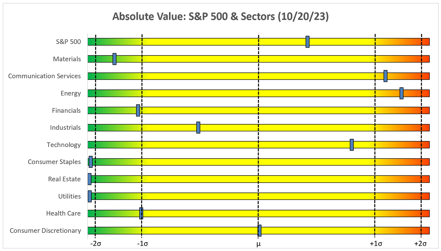
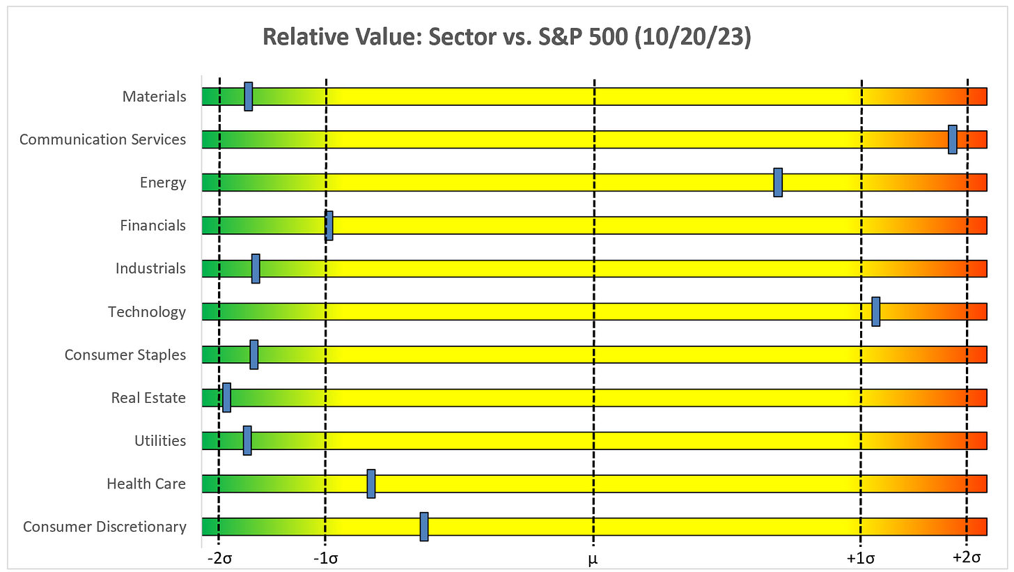
Here are the weekly Absolute & Relative Value charts.
Absolute Value - Equities
Relative Value - Equities
Absolute Value - US Treasuries
Chart Review
Remember, the goal with these charts is simply to stay on the “correct” side of the trailing stop loss as these trends often last for several weeks or months.
S&P 500 Index
I did a deeper dive on the S&P 500 in the initial section of this piece but as you can see from the weekly chart above, the trend continues lower.
The S&P 500 really needs to close above the 8EMA (red moving average line) if it is going to begin to make a move higher.
Technology
XLK is very similar to the S&P 500 as the trend remains lower. To get out of this funk, the first step is to start with a close above the 8EMA, otherwise, you should be biased lower.
Communication Services
XLC has remained in a positive trend and looks as though it may have formed a double-bottom recently which calls for a target of 73.44. Pair that with the inverse H&S pattern of 74.80 and you’ve got a couple of things continuing to point to a move higher for XLC.
Consumer Discretionary
XLY had a tough week last week and is now firmly below the moving average stack. RSI continues to have room to run lower. Net/net, this is not a good look for the sector.
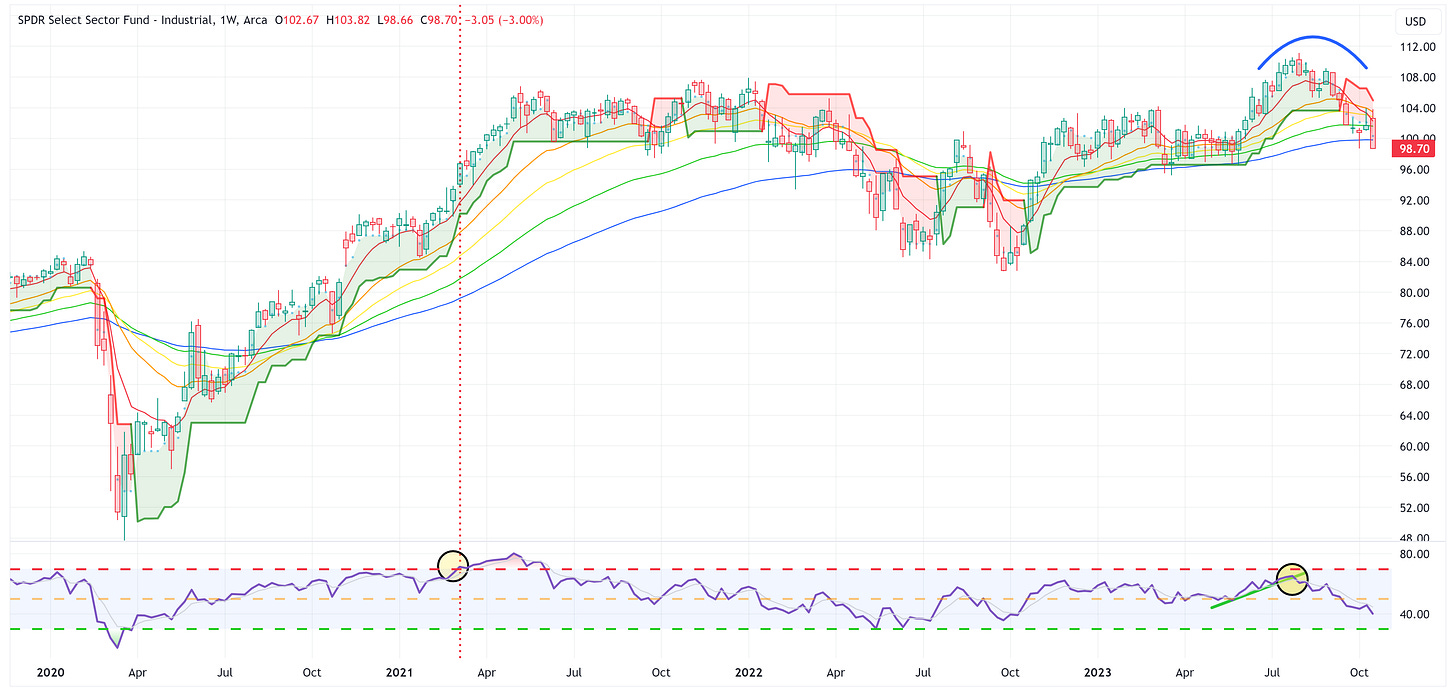
Industrials
Very similar move to XLY. Net/net, not a good look for the Industrials sector.
Materials
The only saving grace for XLB is that there does appear to be a line in the sand at 74.77 that may provide some support. If this fails, watch out below.
Energy
XLE continues to remain in a positive trend. Given the recent developments in the Middle East, I think you have to be biased towards higher energy prices.
Financials
XLF continues to hang in there (i.e., not breaking the triangle). As I’ve said several times recently, I’d wait for this to break out one way or the other before getting involved.
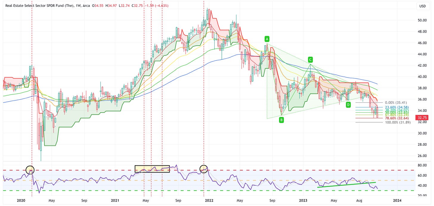
Real Estate
XLRE continues to hit the levels on the way down to our target of 31.89.
Consumer Staples
XLP has tried to battle back the last couple of weeks. Note that the RSI has bottomed as well. This could be a good place to hide out if the reversal continues.
Utilities
XLU continues to get beat up by the rate move. If the market goes full-on risk off and rates rally, XLU will probably become a relative safe haven.
Health Care
XLV continues its year-long sideways move.
US Treasury Review
The summary analysis for the products below is that if rates continue to move higher, these ETFs will suffer.
With that said, there will come a risk-off moment at some point when “something breaks” and at that point, these ETFs will appreciate and likely will do so quickly.
I still like the idea of pre-positioning ahead of the “something breaks” moment, but you will have to be willing to be “wrong” for a period of time.
ZROZ: 25+ Year UST
TLT: 20+ Year UST
TLH: 10 - 20 Year UST
IEF: 7 - 10 Year UST
IEI: 3 - 7 Year UST
SHY: 1 - 3 Year UST
Average Investor Allocation to Equities - Daily Chart Model
I will conclude this week with a snapshot of the daily version of my “Average Investor Allocation to Equities” model.
How to use this chart.
The blue line is the S&P 500.
The red line is my “fair value” model for the S&P 500.
“Current Value to Fair Value” is the amount the S&P 500 would “need” to decline from its current level to the “fair value” level.
“Current Z-Score Value” is a representation (in standard deviation terms) of the delta between the current price of the S&P 500 and the “fair value” price.
Historically, major corrections do not end until the Z-Score falls to somewhere between -3.0 & -4.0. The yellow circles denote the price of the S&P 500 the last four times this happened. Note where the price was at these points relative to the “fair value” line.
Let’s make it a great week!


