
Weekly Chart Review
NVDA Did Something Interesting Last Week…

Hey everyone, it’s Jim.
I hope you had a great weekend!
Last week was a big week for markets, so let’s jump right into this week’s newsletter…
But first…Don’t miss this special offer!!
We are running our “The Market Map Pro ($99/year)” special offer this week.
If you sign up this week, you will receive the Weekly Chart Review for $99/year for life.
The key here is “for life”; after this week, the promotional offer will only be for the first year, and every subsequent year will shift back to full price.
If you’ve ever thought about becoming a paid member, now is the time to do it.
In this week’s newsletter:
📰 Stay Informed
Key Macro Events From Last Week (ICYMI)
Key Macro Events To Watch This Week
🗺️ The Market Map
S&P 500 (SPY)
🔎 Deep Dive
NVDA Did Something Interesting Last Week…
📊 S&P 500 Fair Value Model
📈 The Market Map - Extended Analysis
Major US Indices
11 Major US Equity Sectors
US Treasuries
Currencies
Commodities
Fixed Income
📰 Stay Informed
Key Macro Events From Last Week (ICYMI)
Here’s a quick recap of the key data releases from last week:
📑 FOMC Minutes (July 29–30 Meeting, Released Aug 20)
Policymakers were split on the inflationary impact of Trump’s tariffs — some saw them as transitory, others as more lasting.
The Fed held rates at 4.25–4.50%, with dissent from Governors Waller and Bowman, who favored a 25 bps cut.
👉 Read more
📉 Jobless Claims (Week ending Aug 16)
Initial claims rose to 235,000, a two-month high and above expectations.
Continuing claims climbed to 1.972 million, the highest since late 2021.
Labor market remains “low-hire, low-fire” — stable, but softening.
👉 Read more
🏭 Flash PMIs (August)
Manufacturing PMI jumped back into expansion at 53.3 (vs. 49.8 in July).
Services PMI eased slightly to 55.4, still solidly positive.
Composite PMI rose to 55.4, its best since December.
👉 Read more
🏡 Existing Home Sales (July)
Sales rose 2.0% to 4.01M annualized, surprising to the upside.
Median price up 0.2% YoY to $422,400, the 25th straight monthly increase.
Inventory climbed to 1.55 million units, the highest since 2020.
👉 Read more
🎤 Powell at Jackson Hole (Aug 22)
Powell signaled rate cuts may be warranted if the labor market weakens further.
Highlighted risks from tariffs; said Fed may need to revisit its 2020 inflation framework.
Markets cheered: cut odds for Sept rose to 90%, S&P 500 +1.3%, yields fell.
👉 Read more
🌍 Additional Market Highlights
Retail earnings from Walmart, Target, and Lowe’s pointed to mixed consumer strength.
Global markets swung on Powell’s tone — bonds rallied, USD weakened.
👉 Read more
📊 Market Takeaway
The data flow painted a picture of a U.S. economy still growing but gradually cooling: stronger factory activity, softer jobless claims, and a housing market that’s stabilizing as inventories build. Powell’s dovish tilt at Jackson Hole shifted focus firmly toward near-term rate cuts, pushing equities higher, yields lower, and boosting risk appetite.
Key Macro Events To Watch This Week
Key U.S. Economic Data to Watch
Monday (Aug 25)
New Residential Sales (July)—a key housing indicator set to inform housing market momentum.
Dallas Fed Manufacturing Survey—a regional manufacturing sentiment gauge.
Tuesday (Aug 26)
Advance Durable Goods Orders (July)—early read on business investment and capital spending.
Consumer Confidence Index—signals consumer mood and potential consumption trends.
Wednesday (Aug 27)
Second Estimate of Q2 GDP & Preliminary Corporate Profits—provides a more complete picture of economic expansion.
Pending Home Sales Index—another housing metric useful for anticipating future sales trends.
Friday (Aug 29)
Advance International Trade in Goods (July)—crucial for assessing trade balance and net exports.
Personal Income & the PCE Deflator (July)—includes the Fed’s preferred inflation gauge, essential for rate-path expectations.
Corporate Earnings & Market Events
Nvidia’s Q2 Earnings (Aug 27, after market close)—a major read on AI-driven momentum and chip demand.
Other notable earnings this week: Best Buy, Urban Outfitters, Dell, HP, Snowflake, Royal Bank of Canada, plus several retailers, offering broader signals on consumer and retail health.
Market Impact Preview
GDP and PCE will be the defining data points for shaping Fed expectations—particularly with markets already leaning toward a September rate cut.
Durable goods and new home sales could shed light on investment and housing trends amid diverging factory strength.
Nvidia’s earnings, culminating in midweek, may steer tech sentiment and the broader risk appetite given its central role in the AI upcycle.
🗺️ The Market Map - S&P 500
We use this section each week to “Map the Market” using our proprietary, systematic methodology to gauge a) the current trend of the market and b) where the market may be heading over the medium term.
Most of our readers are long-term investors, so we focus on the weekly charts; however, our methodology can be used on any timeframe.
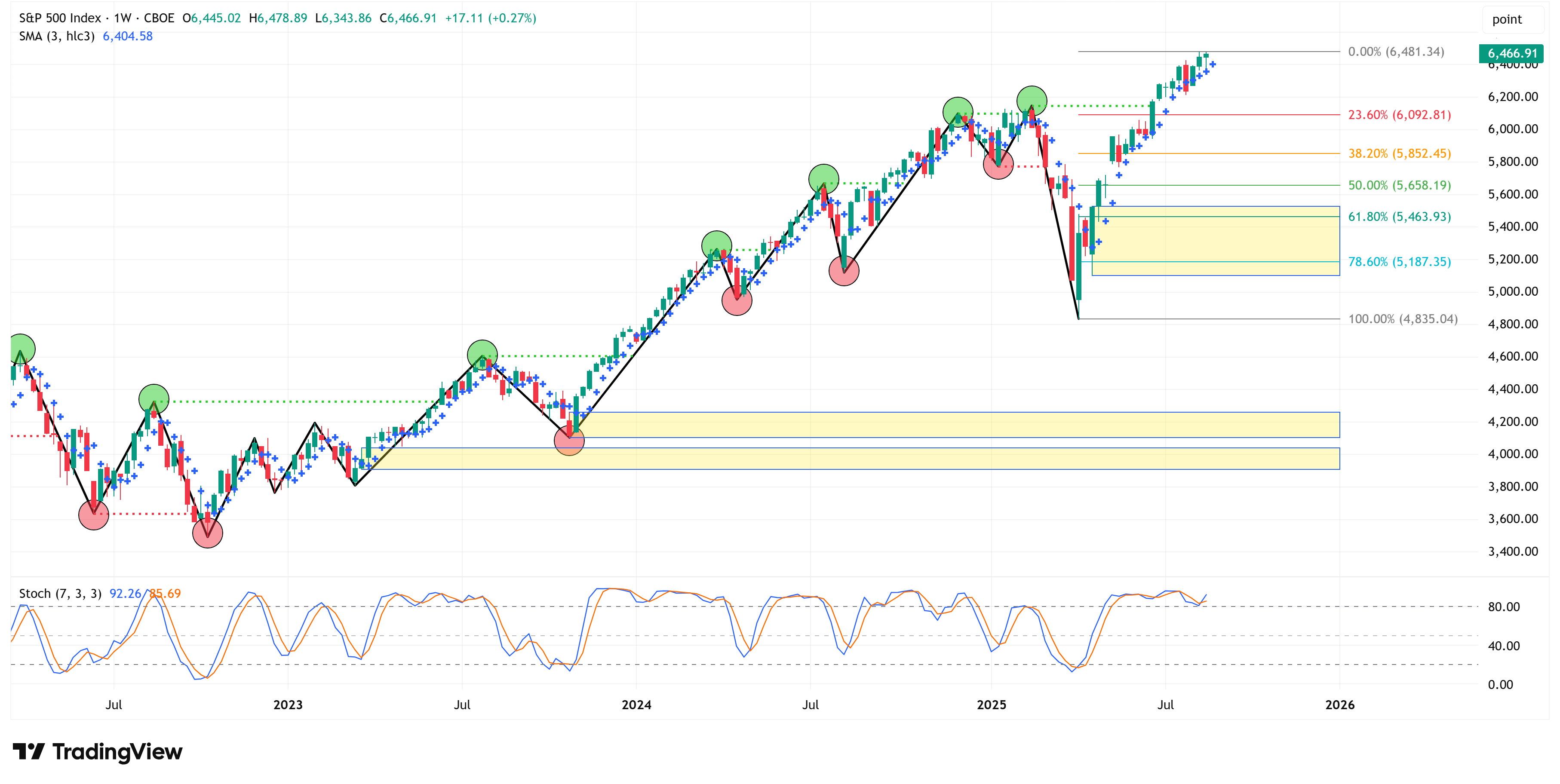
Let’s start by looking at the weekly chart.
The S&P 500 was higher by +0.27% last week and closed the week at a new all-time high.
I made the following statement last week, and it remains true this week:
“The market continues to maintain its bullish structure; therefore, all else being equal, we should expect a continued move higher.”
Let’s shift to the 4-hour chart to see if it gives us any clues as to the next move for the S&P 500.
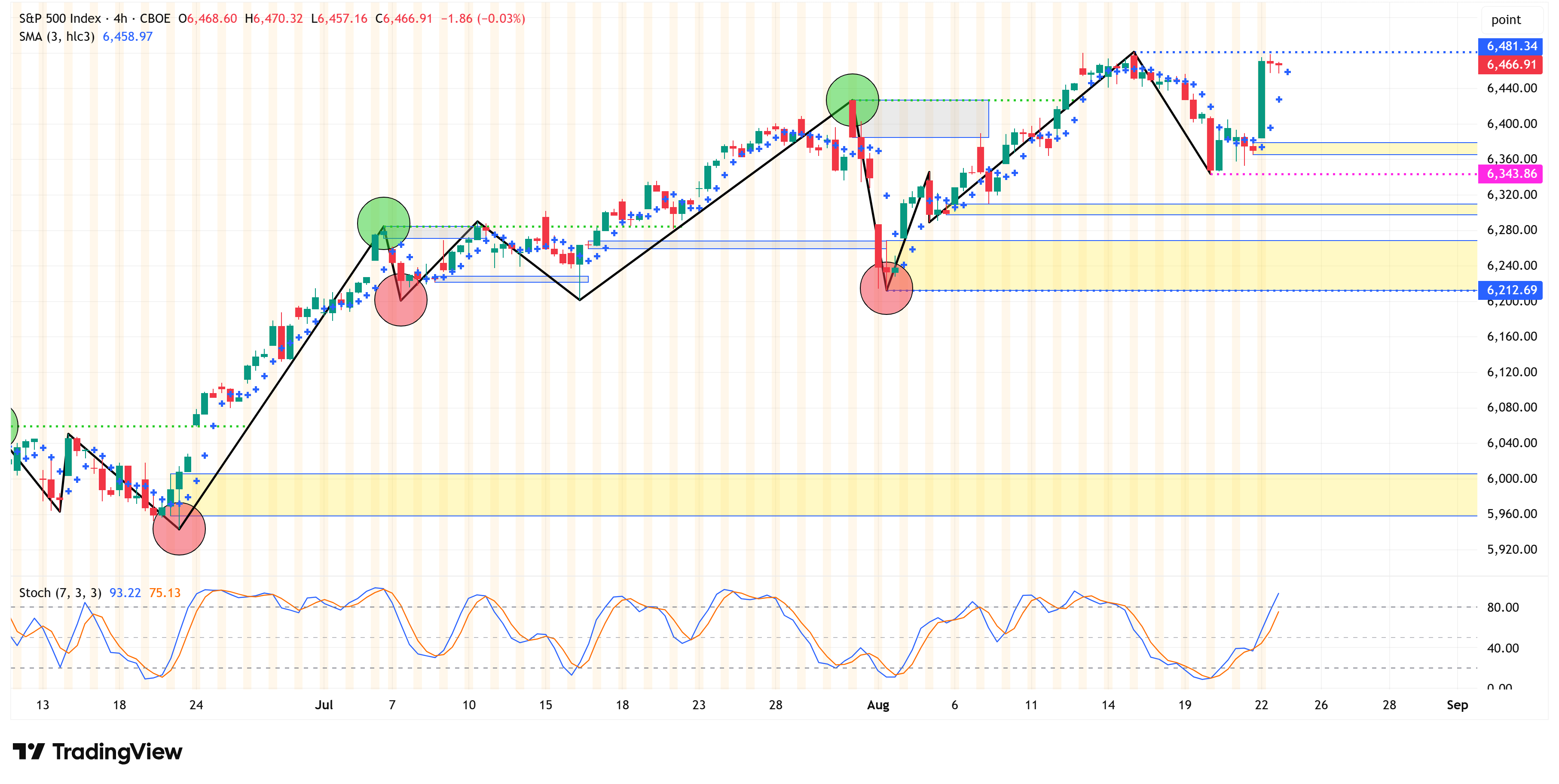
The 4-hour chart continues to remain bullish.
The same “key levels” I called out last week are the same “key levels” for this week:
Swing High: 6,481.34
Swing Low: 6,212.69
A break and close above 6,481.34 suggests the bullish run is continuing.
A break and close below 6,212.69 suggests we need to have our eyes and ears tuned for a possible correction.
Everything in between these two levels is effectively noise/chop.
With that said, I do want to call out one other level:
6,343.86 (pink dotted line)
If the S&P 500 closes below this level (without first having closed above the swing high level - 6,481.34), this will be what I call a “bearish internal shift”.
A “bearish internal shift” does not negate the overall bullish structure of the 4-hour chart; it just means we’re more likely to go down and grab the yellow boxes before potentially heading higher.
The yellow boxes below 6,343.86 (pink dotted line), but above 6,212.69 (swing low), are as follows:
6,297.58 - 6,309.80
6,212.69 - 6,268.65
In summary, both the 4-hour and weekly charts remain bullish, so all else being equal, our expectation should be that the market continues to press higher from here.
If you’re a bull, you’d really like to see the market close above our swing high value of 6,481.34 to suggest the bull market run is healthy and continuing.
If you’re a bear, the first sign of a possible correction would come with a close below our swing low value of 6,212.69.
Deep Dive
NVDA Did Something Interesting Last Week…
This week, I’d like to take a look at NVDA using our “Market Map” framework.
Similar to our analysis above for the S&P 500, we’ll start with the weekly chart and then work our way down to the 4-hour chart.
For the week ending June 23rd, NVDA closed above the previous swing high from the week of November 18th.
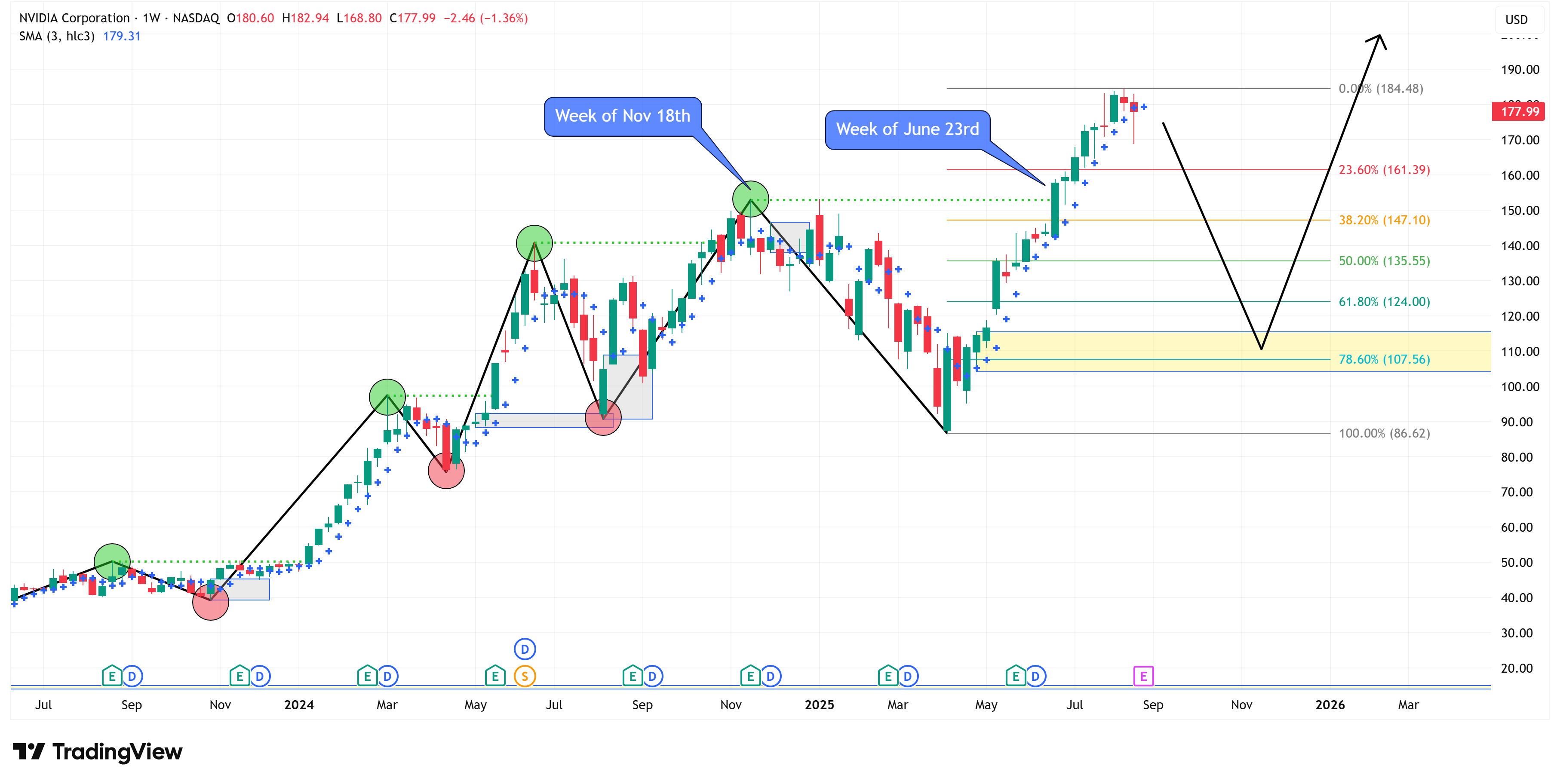
Once that happened, our analysis shifted to the 4-hour chart to look for signs of a pullback.
Remember, trees don’t grow to the sky, so even in a bull market, the expectation is that we’ll see a pullback at some point and then a continuation higher (the black line/arrow in the chart above is one possible path).
4-Hour Chart
Shifting to the 4-hour chart, we find that the 4-hour chart turned bearish on August 1st when we had a close below the previous swing low from July 29th.
Since then, NVDA has bounced around between 184.12 and 170.89, our current 4-hour chart swing high and swing low, respectively.
For the 4-hour chart to turn bullish, we need to see a close above 184.12. Until then, the 4-hour chart remains bearish.
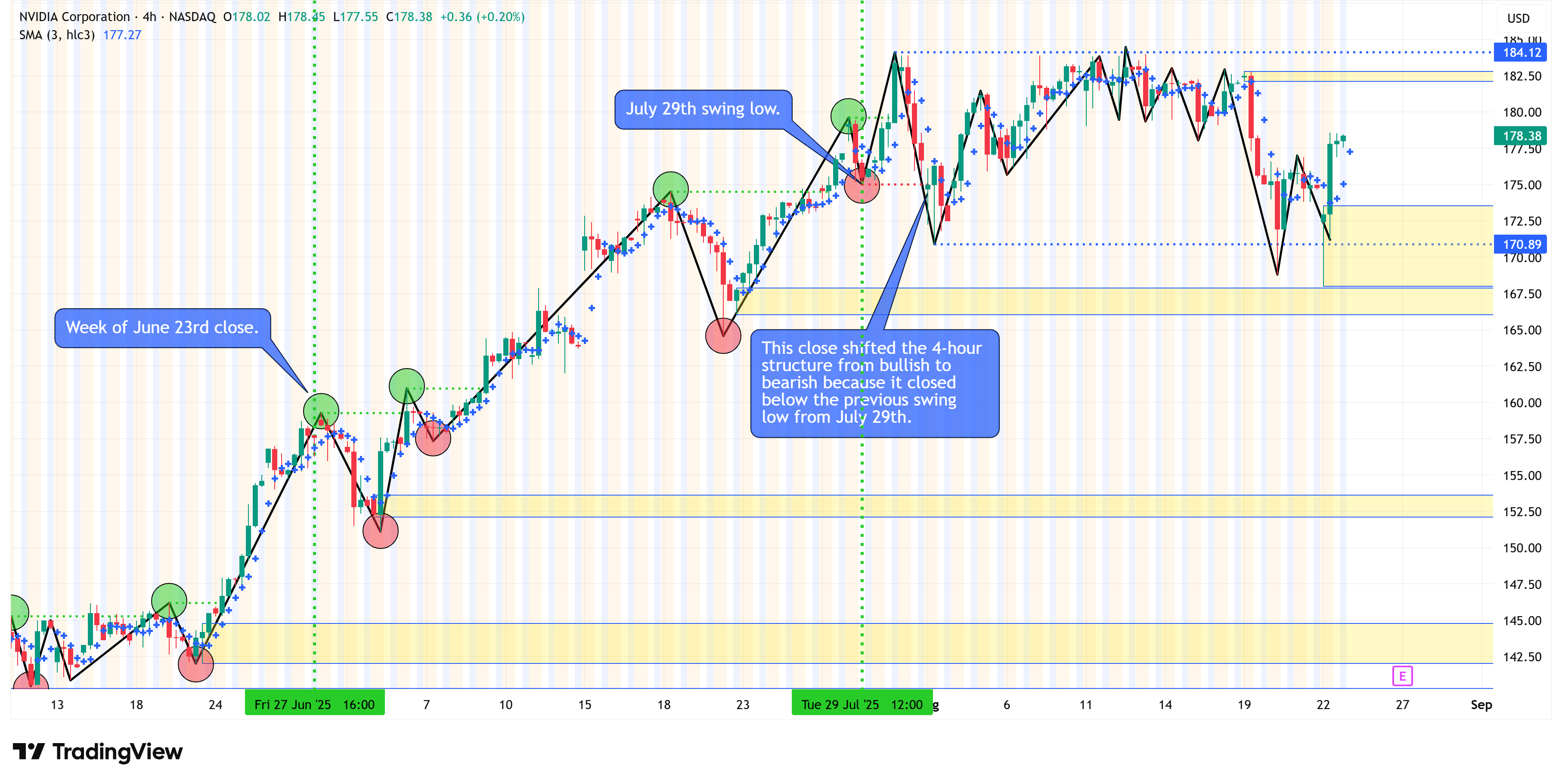
Let’s push pause and level set on everything we’ve discussed so far.
The weekly chart is bullish but has crossed above the previous swing high, so we need to be on the lookout for a pullback.
The 4-hour chart has turned bearish, which is often the first signal that a pullback is coming.
Watch the dot…
NVDA did something interesting last week in that the weekly chart closed below the dot (see zoomed-in image below).
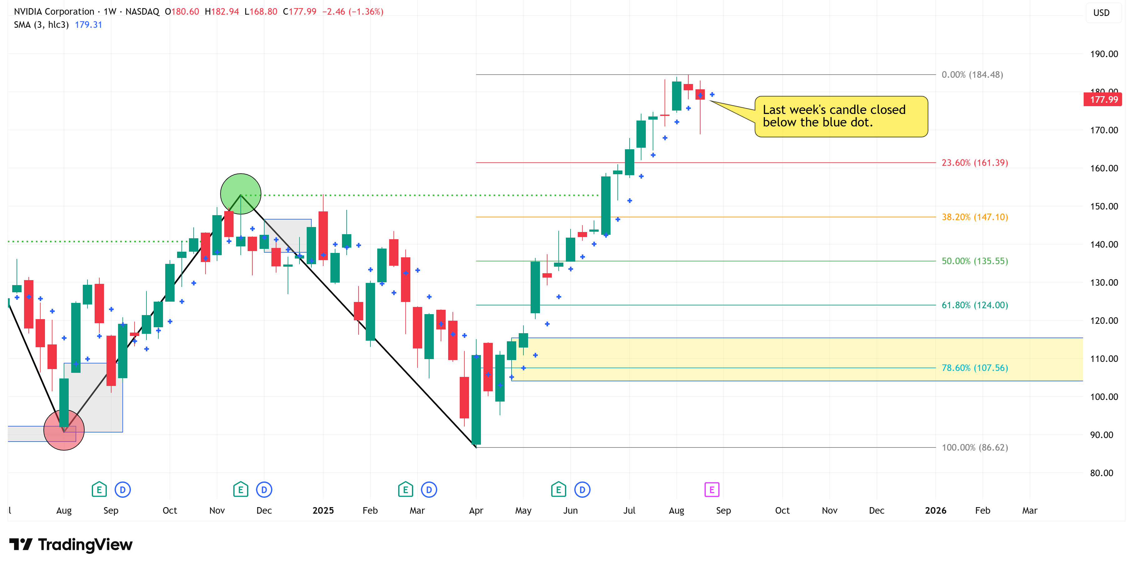
This is substantial because all turning points start with a close above (bearish turning bullish) or below (bullish turning bearish) the dot.
Follow the yellow arrows in the chart below. These denote the applicable closes above/below the dot at major turning points.
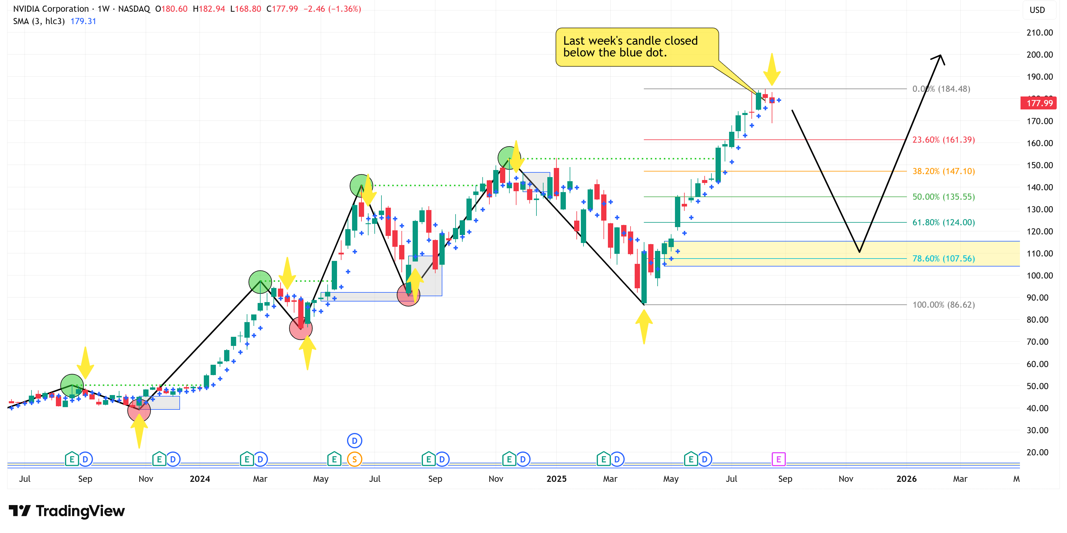
It is important to note that it wouldn’t be uncommon to get a rally above Friday’s close, but if this is truly the beginning of a pullback, we shouldn’t expect to see a weekly close above the current weekly swing high of 184.48.
Why is this important?
NVDA has the largest market cap of any company in the S&P 500, so how it performs has direct implications for the rest of the market.
Further, back-of-the-envelope math would suggest that NVDA’s 32.5% return YTD accounts for approximately 2.43% of the S&P 500’s 9.95% return YTD.
Said differently, NVDA’s return YTD has accounted for almost 25% of the return of the S&P 500 YTD.
If NVDA enters a corrective period, it will likely take the rest of the market with it unless and until we get broader market participation beyond the Mag 7 stocks.
Lastly, it is worth noting that NVDA reports 2Q earnings after the close on Wednesday, August 27th.
I tend to view earnings as a binary event (which means anything could happen), but 3 out of the last 4 earnings releases have not been overly kind to NVDA’s stock in the subsequent few days.

The following sections are for paid subscribers only.
In these sections, we will discuss our proprietary:
S&P 500 Fair Value Model
This model provides a guide for:
a) How far the S&P 500 could decline in the next recession.
b) When to get back into the market after it has declined.
The Market Map - Extended Analysis
We will call out specific price objectives (up trends vs. down trends, targets, stop losses, etc.) on the following:
Major US Indices
11 Major US Equity Sectors
US Treasuries
Currencies
Commodities
Fixed Income
If you would like exclusive access to the proprietary data below, be sure to take advantage of our “The Market Map Pro ($99/Year)” special offer!
Keep reading with a 7-day free trial
Subscribe to Skillman Grove Research to keep reading this post and get 7 days of free access to the full post archives.