


Weekly Chart Review
Quarterly Update: Average Investor Allocation to Equities...

Hey, it’s Jim.
I hope everyone had a great weekend!
A quick programming note: Next week, April 7th—11th, is my kids' Spring Break. I plan to use this time to get some much-needed R&R and to focus on my family. That said, there will not be a newsletter on April 7th or 14th.
In the meantime, I’ll leave you with two important things in this week’s newsletter:
The quarterly update for our “Average Investor Allocation to Equities” model (this is a reader favorite each quarter).
A 70% discount if you become a paid subscriber between now and when I return from Spring Break. Click below for the deal.
In this week’s newsletter:
Weekly Market Performance Recap
Weekly Key Economic Reports Recap
Key Macro Events This Week
Quarterly Update: Average Investor Allocation to Equities Model
Market Structure-Based Price Projections
S&P 500
NASDAQ
Russell 2000
S&P 500 Fair Value Model
First time reading? Click below to subscribe or to share with a friend or colleague…
Weekly Market Performance Recap

Weekly Economic Reports Recap
Here is a recap of key U.S. economic data releases from March 24–28, 2025:
Manufacturing PMI
The S&P Global U.S. Manufacturing PMI fell to 49.8 in March from 52.7 in February, indicating contraction in the manufacturing sector for the first time in several months. Key factors included reduced export demand, supply chain disruptions, and trade policy uncertainties. Input costs rose sharply, hitting a 31-month high, while employment declined for the first time since October 2024. (Link)
Services PMI
The Services PMI improved to 54.3 in March from 51.0 in February, showing robust expansion and reaching a seven-month high. This growth was driven by increased consumer spending and service-oriented activity, contrasting with the manufacturing sector's contraction. (Link)
Composite PMI
The Composite PMI, which combines manufacturing and services data, rose to 53.5 in March from 50.4 in February, reflecting modest overall economic growth. (Link)
Consumer Confidence
The Conference Board's Consumer Confidence Index dropped to 92.9, its lowest level since January 2021. The decline was driven by pessimism about future business conditions and labor market expectations, especially among older consumers and lower-income groups. (Link)
Durable Goods Orders
Durable goods orders fell by 1% in February (reported in late March), following a revised increase of 1.8% in January. Weakness was observed in transportation equipment and core capital goods orders, signaling potential softness in business investment. (Link)
Atlanta Fed GDPNow
The most recent update from the Atlanta Fed's GDPNow model estimates that real GDP growth for Q1 2025 is projected at -2.8% as of March 26, 2025. This represents a downward revision from earlier forecasts, reflecting weaker economic activity based on updated data inputs, such as personal consumption expenditures and net exports. (Link)
Core PCE Price Index
Core Personal Consumption Expenditures (PCE), the Fed's preferred inflation gauge, rose by 0.3% month-over-month in February and 4.6% year-over-year, suggesting persistent inflationary pressures. (Link)
University of Michigan Surveys
Inflation Expectations:
1-Year: The final value for March rose to 5.0%, up from 4.3% in February. This marks the highest level since November 2022 and reflects a fourth consecutive monthly increase. The March figure also exceeded the preliminary estimate of 4.9%.
5-Year: The final value climbed to 4.1%, up from 3.5% in February, reaching the highest level since February 1993. This increase also surpassed the preliminary estimate of 3.9%. (Link)
Consumer Sentiment Index: Fell to 57.0 in March, down 11.9% from February's 64.7 and 28.2% year-over-year (79.4 in March 2024). This marks the lowest level since November 2022 and the third consecutive monthly decline.
Consumer Expectations Index: Dropped sharply to 52.6, a decrease of 17.8% month-over-month (from 64.0 in February) and 32% year-over-year (77.4 in March 2024). This reflects growing concerns about personal finances, business conditions, unemployment, and inflation.
These data releases collectively highlight a mixed economic picture: strength in services and persistent inflation are offset by manufacturing contraction, weaker consumer confidence, and slowing growth momentum.
Key Macro Events This Week
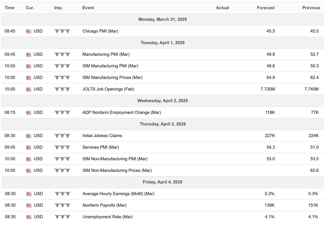
The first Friday of the month brings us Nonfarm Payrolls and the Unemployment Rate…these will be key this week!
Quarterly Update: Average Investor Allocation to Equities Model
This week, we’ll dive into the quarterly update of our “Average Investor Allocation to Equities” model. As I said in the opening, this is the most requested analysis I receive each quarter and by far the most popular piece I produce each quarter.
In the January update, I made the following observation:
“The most recent update to our model was the highest recorded value for the model since the beginning of our dataset in 1951.”
Well, not to be undone, today’s update said, “Hold my beer and watch this…” as it has now set the record for the highest recorded value for our model since our dataset began in 1951.
Average Investor Allocation to Equities
Let’s start with the chart and then get into the analysis and takeaways.
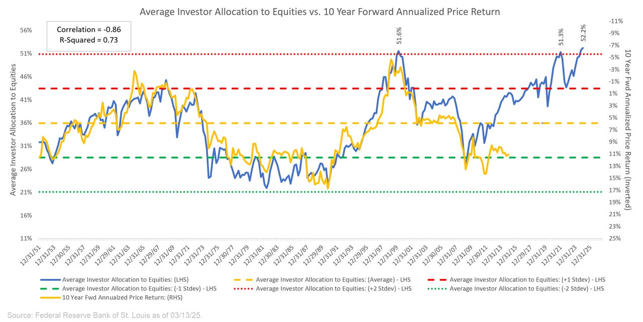
For those who may be new to our newsletter and this model, here is how to read the chart above:
“The blue line in the chart shows the “Average Investor Allocation to Equities”. As the name would imply, this line shows how much (i.e., what percentage) of the average investor’s portfolio is allocated to equities at any given time as opposed to other asset classes (i.e., fixed income, commodities, cash, etc.) This line maps to the left-hand scale of the chart.
The yellow line in the chart shows the “10-Year Forward Annualized Price Return” of the S&P 500 Index. This tells us what the 10-year forward return was for the S&P 500 Index from the corresponding point on the blue line. This line maps to the right-hand scale of the chart and the values have been inverted to better show the relationship between the two metrics.”
Next, we want to understand how to interpret this chart:
“Very simply, the higher the blue line (i.e., the “Average Investor Allocation to Equities”), the lower the subsequent 10-year return for the S&P 500 Index and vice versa.”
The current “Average Investor Allocation to Equities” reading is 52.2%
Our dataset contains 293 quarterly observations going back to December 31, 1951. The most recent reading of 52.2% is the highest in the model's history.
Note: the data has a quarterly lag, so our most recent reading is from December 31, 2024.
Only 11 of the 293 observations (or 3.7%) have been greater than 50%, only 4 observations (or 1.4%) have been greater than 51%, and this is now the first observation (or 0.3%) greater than 52%.
To summarize, we are in an extremely rare situation, and one that will likely have dramatic consequences for the market over the short-to-medium term.
Context is key…
In the chart below, the blue dots represent actual historical data.
X-Axis = Actual historical “Average Investor Allocation to Equities” values.
Y-Axis = Actual historical “10 Year Fwd Annualized Price Return” values.
Note the “You are here!” value (red dot).
This marks our most recent model value of 52.2%, which we then combine with a regression-based model output of -3.06% for the 10 Year Fwd Annualized Price Return of the S&P 500.
This means that over the next 10 years (starting from December 31, 2024, to December 31, 2034), our model suggests that the S&P 500 will have an annualized return of -3.06%.
This compares to an average rolling 10-year annualized return of +7.25% since the beginning of our dataset.
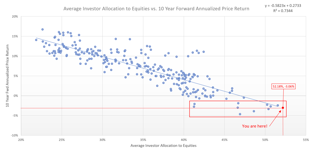
Switching gears, I thought it would be interesting to see which historical periods were represented by the cluster of dots around our current estimate (i.e., inside the red box).
Here’s what I found.
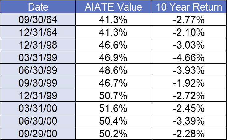
The table above encompasses essentially two periods, beginning in:
Late 1964
Turn of the century (1999 - 2000)
Let’s see what those two periods looked like on the charts and if there are any similarities to each other and/or to today.
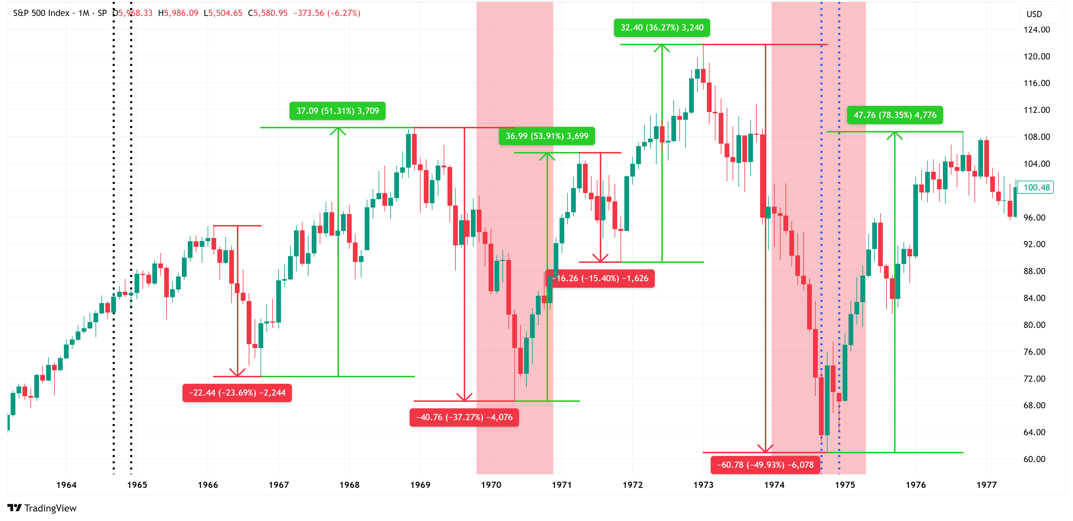
Here is the late 1964 era:
The black vertical bars denote the beginning of the 10-year window and correspond with the dates in the table above.
The blue vertical bars denote the end of the 10-year window, which began with the corresponding black vertical bars.
Here is the turn-of-the-century (1999 - 2000) era:
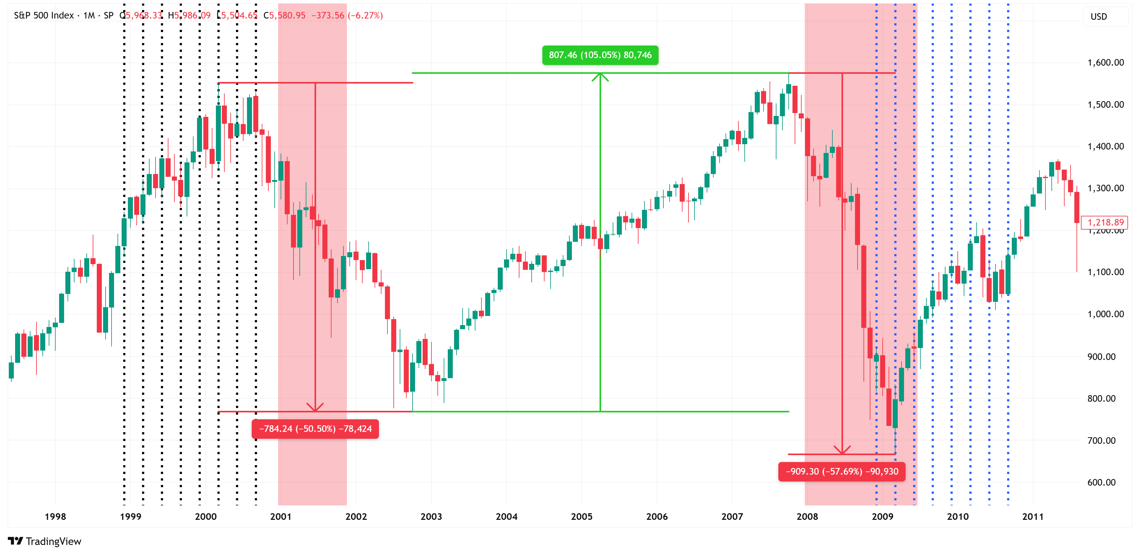
Note that both eras encompassed two recessions (red shaded bars). Further, note the wild swings in values from peak-to-trough and trough-to-peak.
Now, let’s fast forward to today.
Here is our current chart, and I have highlighted (with black vertical lines) all of the Average Investor Allocation to Equities (AIATE) readings above 46% (i.e., similar to the turn of the century era highlighted above).

Ironically, the current era contains 8 consecutive values above 46%, just as the turn-of-the-century era did.
Further, it was just after the 8th consecutive value that the market began to turn lower in the turn-of-the-century era, and that is exactly what we’re seeing today.
Coincidence or a foreshadowing of what’s to come…I don’t know, but what we can say with a high degree of certainty is:
Current AIATE values are at the highest recorded values we’ve ever seen. This means that as of December 31, 2024, the market was more overvalued (according to this model) than it has ever been since the beginning of our dataset.
Historically, elevated levels like these would suggest a decade of underperformance by the S&P 500 relative to its historical averages.
The current setup looks eerily similar to the 1999 - 2000 dot-com bust, which was a tech-driven bust. It’s not a stretch to suggest we’re seeing similar signs today with tech, AI, etc.
So what do we do about this?
If we leverage Robert Shiller’s data, we find that bonds have dramatically outperformed equities in the 10-year periods highlighted above (see table below).

I know there is currently a palpable fear that inflation is coming back (and it may, temporarily), but ultimately, I believe the slowing US economy will outweigh the current inflationary fears.
Over the short-to-medium term, I bet that we’ll see lower equities and higher Treasuries (i.e., lower yields).
Paid subscribers get access to my weekly market structure-based price predictions.
Last week, I suggested that the US Treasury 10-year could move briefly higher before heading lower.
Here is the original chart I posted last week.
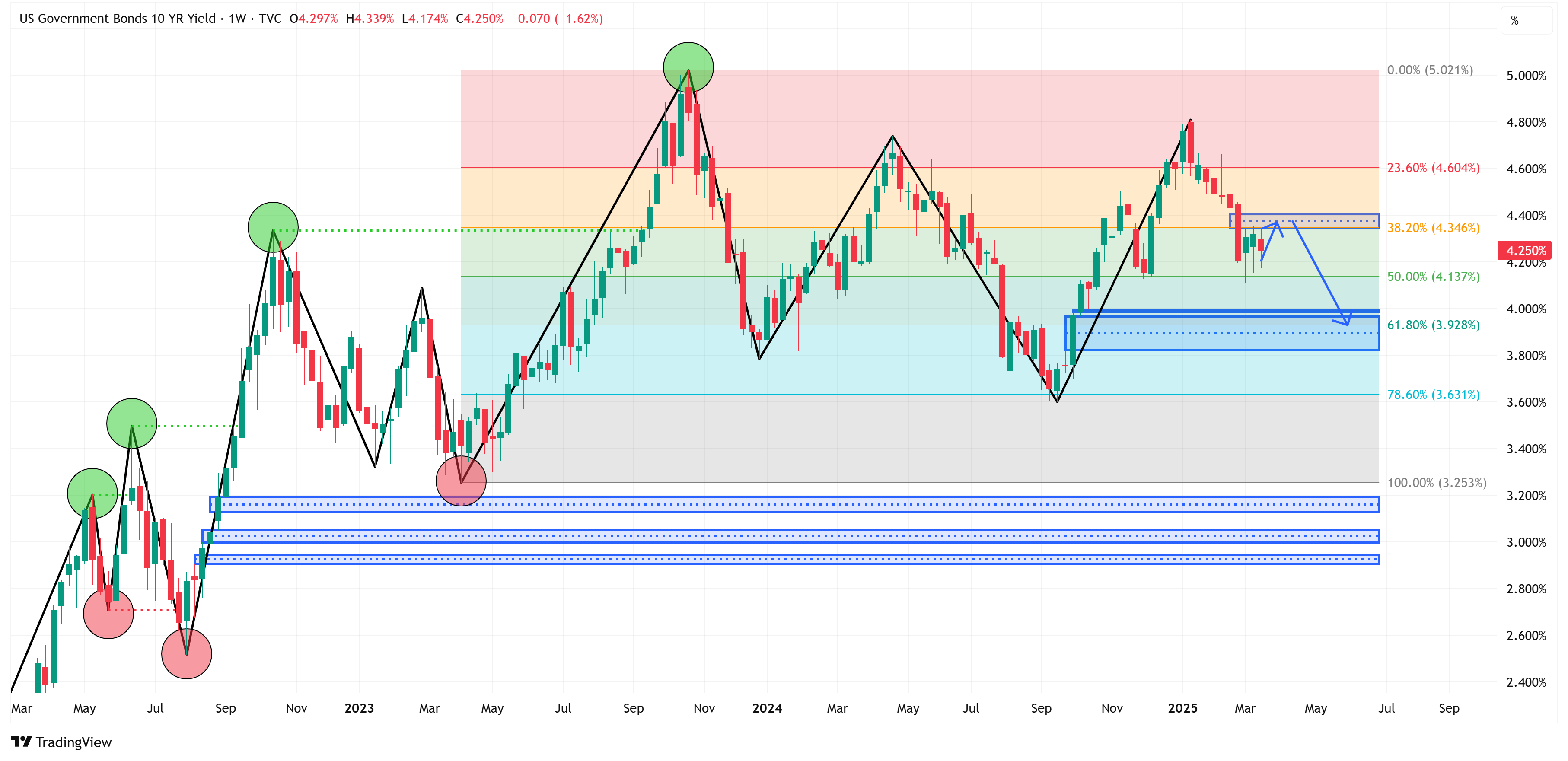
Fast forward to this week, and here is the updated chart. I would not be surprised to see US Treasury yields continue lower into the 4.00% area and substantially lower than that if we find ourselves in the middle of a recession.

Now, let’s dive into our market structure-based price projections for the S&P 500, NASDAQ, and Russell 2000.
In this section, I provide price targets and a potential price path these markets could take over the short-to-medium term.
We’ll also take a look at our S&P 500 fair value model to get a sense of where current prices are relative to our fair value model and how far prices could fall during the next recession.
The added benefit of our S&P 500 fair value model is that it also alerts us when to get back into the market after a large decline.
The analysis beyond this point is for paid subscribers only. To see all the details and analysis, simply click on the link below to join our community!
Keep reading with a 7-day free trial
Subscribe to Skillman Grove Research to keep reading this post and get 7 days of free access to the full post archives.