Weekly Chart Review
Jackson Hole and The Subtle Signal That Another Rate Hike May Be On The Horizon...
On Friday of last week at the annual “Jackson Hole Symposium”, Fed Chairman Jerome Powell, gave his much-anticipated speech. The speech did not give us anything new, but instead reiterated what the Fed has been saying for some time now.
The key to the entire speech was the very first paragraph, and specifically, the very last sentence of the first paragraph:
“Good morning. At last year's Jackson Hole symposium, I delivered a brief, direct message. My remarks this year will be a bit longer, but the message is the same: It is the Fed's job to bring inflation down to our 2 percent goal, and we will do so. We have tightened policy significantly over the past year. Although inflation has moved down from its peak—a welcome development—it remains too high. We are prepared to raise rates further if appropriate, and intend to hold policy at a restrictive level until we are confident that inflation is moving sustainably down toward our objective.”
The market took the “no new news is good news” speech in stride and finished positive for the day and the week.
Below is a 5-minute chart of the S&P 500 Index on Friday. The vertical line is where Powell’s speech began. After a modest selloff, the S&P 500 rallied back to close out the day in the green.
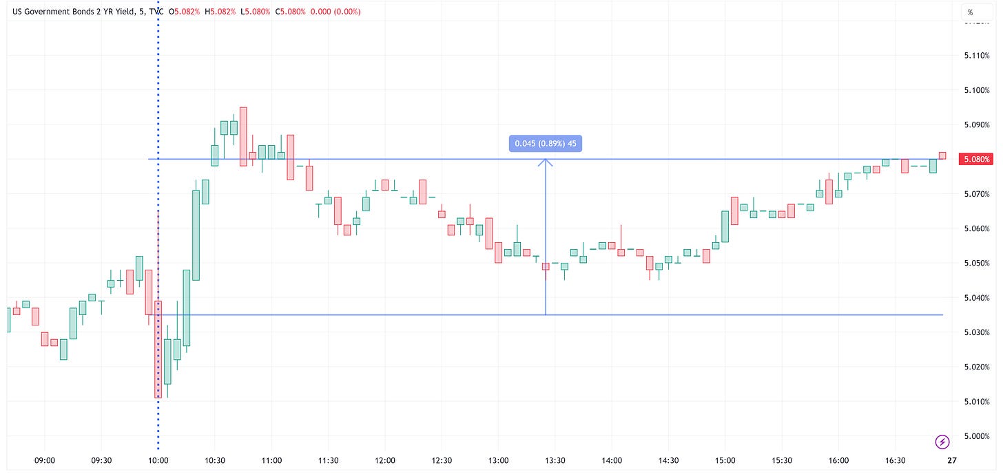
While the S&P 500 handled itself well, it’s worth looking at the yield on the US Treasury 2-Year Note in the same time frame as above.
The US Treasury 2-Year Note yield moved higher during/after the speech, retraced a bit over the course of the day, and ultimately closed higher on the day. It wasn’t a huge move but I think it was a telling move.
Here is a weekly chart of the US Treasury 2-Year Note yield. After reaching a high of 5.095% last week, it closed the week at 5.08%. The pattern that this has created over the balance of this year is a “cup & handle” pattern. If this pattern validates itself, it suggests a target of 6.635% for the US Treasury 2-Year Note yield.
Why is this important? It is important because the UST 2-Year Note tends to be a proxy for where the Fed Funds target rate is heading, at least directionally.
In the chart below:
Blue line = US Treasury 2-Year Note Yield
Red line = 100-day moving average of the US Treasury 2-Year Note Yield
Green line = Fed Funds Effective Rate
Red Vertical Bars = US Recessions
Chart observations:
During most rate hiking campaigns, the UST 2-Year Yield is slightly above or equal to the Fed Funds Effective rate.
Note that this was the case for our current rate hiking campaign until recently.
The Fed typically pauses its rating hiking campaign when the UST 2-Year Yield falls below its 100-day moving average.
Note that we saw the same thing during this current cycle, except more recently, we’ve seen the UST 2-Year Yield move back above its 100-day moving average.
Typically, a recession begins once the Fed has stopped hiking rates and the UST 2-Year Yield falls below its 100-day moving average and below the Fed Funds Effective rate.
There are two ways to look at this in the current environment and it really depends on what the UST 2-Year Yield does from here:
The “cup & handle” pattern suggests that the UST 2-Year Yield is likely to move higher assuming it breaks up and through the horizontal line. A move higher from here suggests that the Fed is likely to raise rates again which further tightens financial conditions. Tighter financial conditions are a drag on the US economy and thus further suggest a recession will be the ultimate outcome. Ironically, this scenario probably pushes a recession further out into 2024.
If the UST 2-Year Yield stalls out at the 5.08% level and moves down and through its 100-day moving average from here, this could be suggesting that we’re already in the end game and that a recession is more imminent than the scenario outlined in the previous bullet point. Only time will tell but watching the UST 2-Year Yield is key.
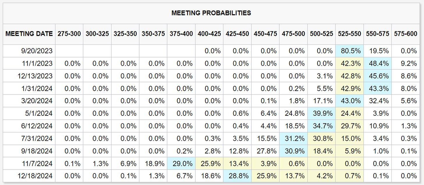
A quick glance at the current CME FedWatch Tool, tells us that the market is now pricing in a rate hike at the November 1st meeting. This was not the case prior to the Jackson Hole speech.
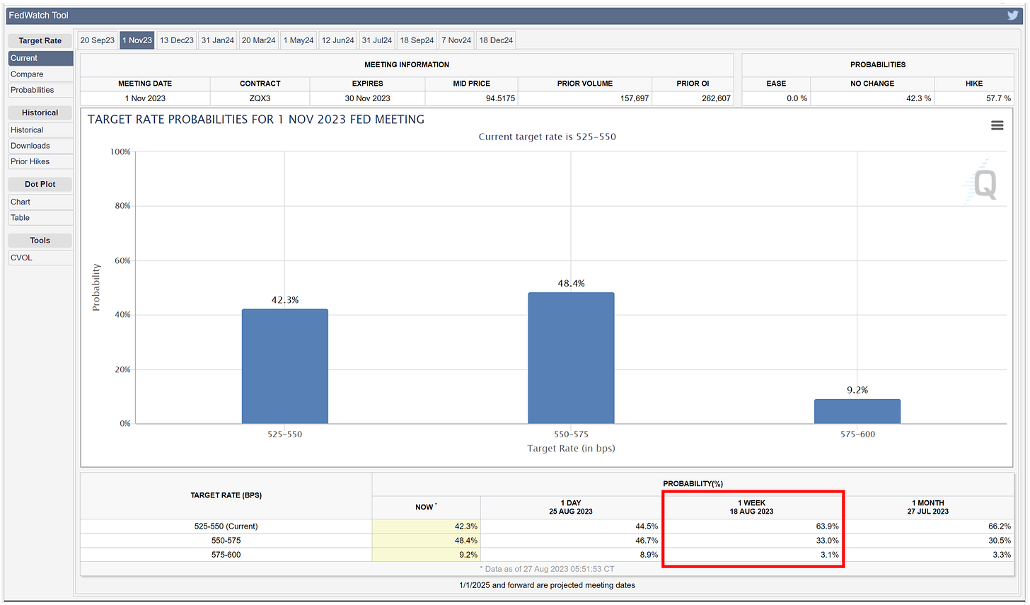
Here are the “Target Rate Probabilities” for the November 1st meeting. Note the probabilities from one week ago in the red highlighted box when a rate hike in November was not the predicted outcome.
Worth noting, a 48.4% chance of a hike vs. a 42.3% chance of no hike is not an overwhelming case that a rate hike in November is a foregone conclusion. These numbers will change daily between now and November, so as I noted above, the key is to watch the UST 2-Year Yield.
Meanwhile, back at the ranch…
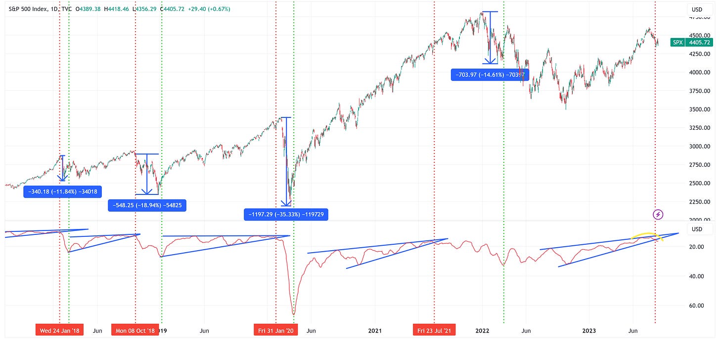
I posted the chart below a few weeks ago and made the following comments:
“Over the last 5 years, we’ve had 4 instances where the VIX has declined to very low levels thus creating the wedge patterns you see in the lower panel of the chart below (remember, the lower panel is inverted so “very low levels” on the VIX correspond to elevated levels on the VIX in the chart below).
When those wedge patterns broke, it was typically not very good for the S&P 500.
In the four periods prior to now when the VIX broke its wedge pattern (red vertical line), the S&P 500 had the following max peak-to-trough declines before the VIX peaked again (green vertical line): -11.84%, -18.94%, -35.33%, and -14.61% for an average decline of -20.18%.”
Here is the same chart as referenced above but updated through Friday’s close.
More importantly, let’s zoom in on where we are today.
Notice the following:
The VIX (lower panel) has broken down and through the wedge pattern. See the note above for what has happened historically when that happens.
We have a Head & Shoulders pattern on the S&P 500 that has developed. If the S&P 500 falls below 4,335, the target becomes 4,060, followed by 3,786, then 3,511, then 3,237. I find it amazing that these targets line up so perfectly with other inflection points as denoted by the highlighted boxes.
Absolute Value & Relative Value
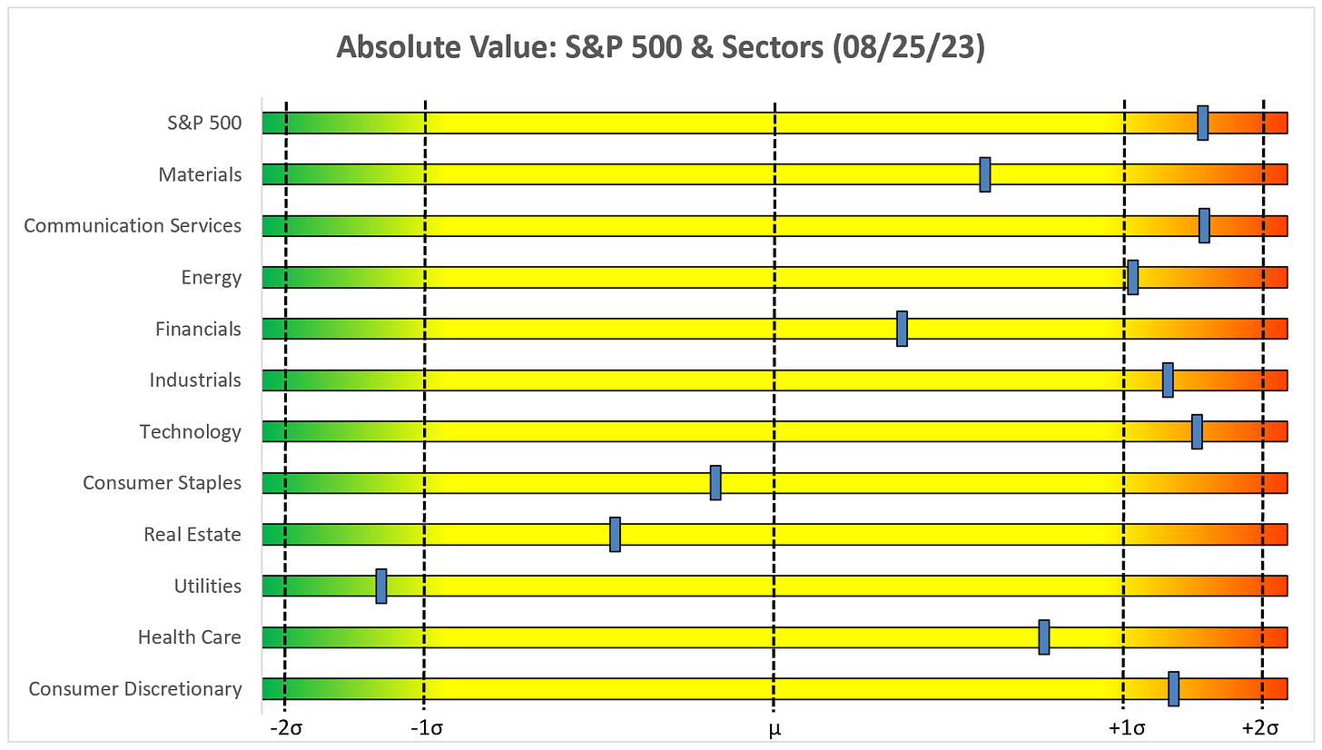
Here are the weekly updates for my absolute value and relative value charts.
Absolute Value
We still have the vast majority of sectors and the S&P 500 in the “Expensive & Overbought” quadrant and several well beyond +1.0 standard deviations.
Relative Value
On a relative basis, the market continues to be driven by the Communication Services and Technology sectors with six sectors well below the -1.0 standard deviation threshold.
Leader vs. Laggards
A quick YTD snapshot.
The “Leaders” got back to leading last week.
Despite that, the “Laggards” are still leading the “Leaders” over the last six weeks but candidly, it’s becoming more and more of an Energy show than a true reversal as I initially thought.
Sector Review
We will start with the S&P 500 and work our way through each of the sectors.
S&P 500 Index
A second week below the trailing stop loss is not a good look, not to mention the potential Head & Shoulders pattern that I mentioned earlier in this piece.
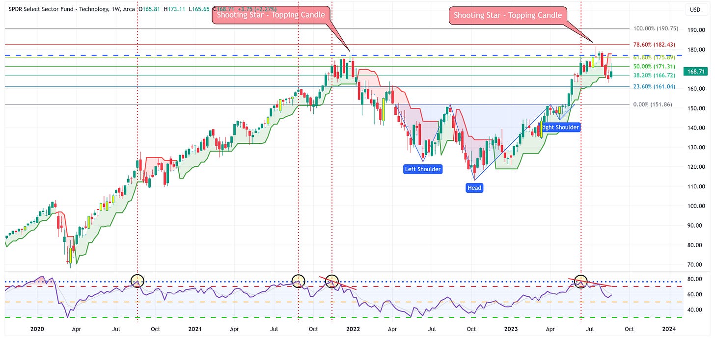
Technology
Similar to the S&P 500, a second week below the trailing stop loss is not a good look.
Communication Services
A rounding top and a break of the blue trendline are not overly positive but XLC continues to remain above the trailing stop loss so there is hope that the trailing stop loss will provide support and thus propel a further move higher.
Consumer Discretionary
Similar to Communication Services, we have a rounding top in place but over the last two weeks, the trailing stop loss provided support which is a net positive.
Industrials
I’m starting to sound like a broken record but we’ve got a rounding top and the potential for the trailing stop loss to provide support. Net/net, this is a positive.
Materials
A break of the neckline coupled with a rounding top is not optimal but XLB is still above the trailing stop loss so there is hope that it provides support.
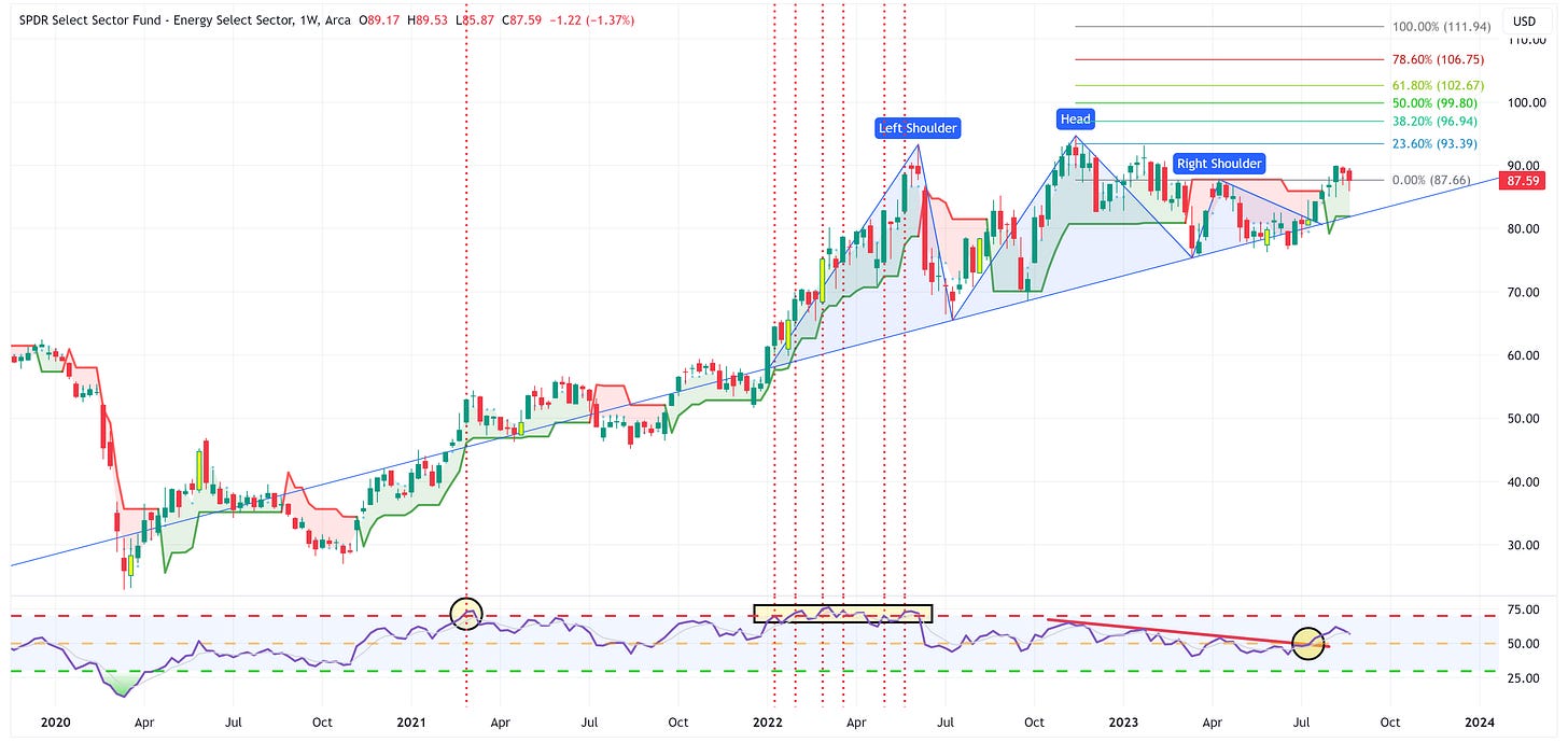
Energy
XLE continues to hold the right shoulder which means the “busted H&S” target of 111.94 is still in play.
Financials
I continue to believe we’re in the process of forming the right shoulder but to its credit, XLF remains above the trailing stop loss which may provide support and negate the completion of the H&S pattern.
Real Estate
XLRE continues to hold the breakout level of the triangle pattern. I have to believe it ends up moving lower but it certainly hasn’t given up the fight.
Consumer Staples
XLP is now at the point of creating a “busted inverse H&S” pattern. If it falls below 72.28, the target becomes 60.89.
Utilities
A break to the low side of the triangle pattern calls for a target of 53.99 for XLU.
Health Care
XLV continues to be rangebound between 132.78 and 136.69. Until notified otherwise, we have to continue to believe that the target of 149.34 remains in place.
Summary
As I’ve said for some time now, I continue to believe that the third quarter of this year could be an inflection point for the markets.
Watch the US Treasury 2-Year Note and the Head & Shoulders pattern on the S&P 500. These could be warning signals for what is to come.
Lastly, there was a lot of chatter last week regarding NVIDIA on the heels of their blowout earnings. It should be modestly problematic to have blowout earnings and not be able to have a positive day the next two days.
It is way too early for this to be an official call so I’m just putting this out there as a placeholder to refer back to in the months ahead.
I might be completely wrong on this, but could we be in the process of forming the head of a Head & Shoulders pattern? If so, the target of 303.56 nicely fills the gap that was created a few months ago after the last earnings cycle.
Just food for thought.
Until next week…












Great work; sure seems an uninspiring market (overall) but thanks for pointing out the areas of interest (pun intended)
Excellent work. Thanks!