


Weekly Chart Review
50 Basis Points...

Let’s start with the facts.
The Fed has initiated (or extended) nine rate-cutting campaigns over the last 30 years.
Three began with a 25 basis point cut, six began with a 50 basis point cut.
The following chart shows with yellow circles the easing campaigns that began with a 25 basis point cut and a red circle for those that began with a 50 basis point cut.
The magenta line is the S&P 500 and the green vertical bars are US recessions.
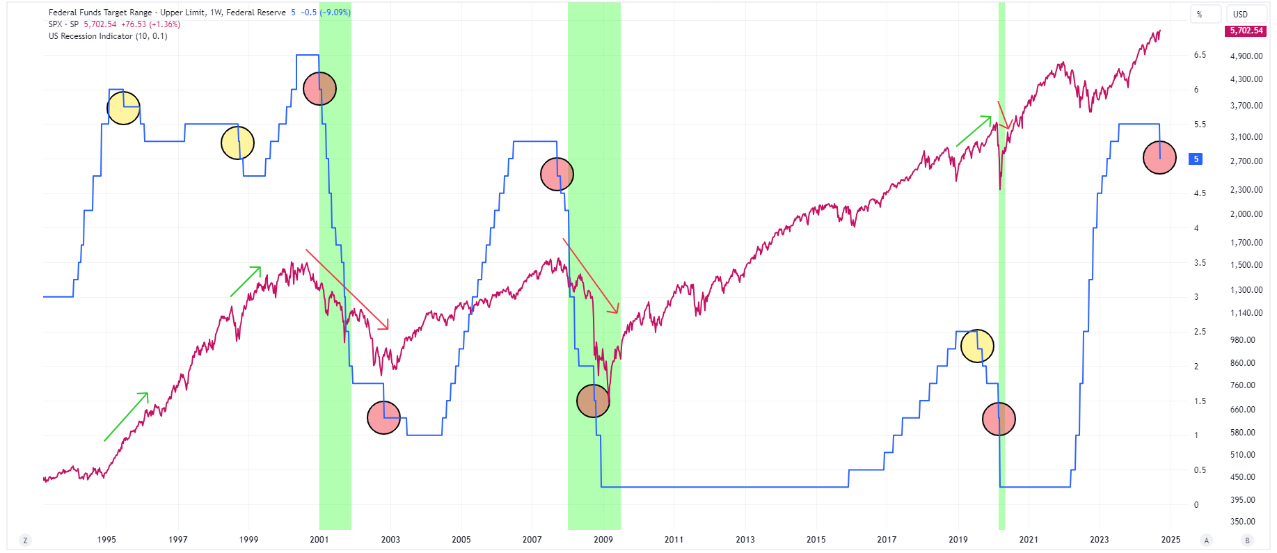
Note the performance of the S&P 500 when associated with the “red circles” vs. when associated with the “yellow circles”.
History would suggest that 50 basis point rate cuts tend to be associated with recessionary periods and an S&P 500 that is about to (or already has) decline(d).
Will we see a return of inflation?
The following chart made the rounds last week after the Fed cut rates.
Keep reading with a 7-day free trial
Subscribe to Skillman Grove Research to keep reading this post and get 7 days of free access to the full post archives.