This week’s newsletter will be free in its entirety to our 30,000+ subscribers so that non-paid subscribers can a) get a look behind the curtain of the analysis we provide each week and b) to offer all of our non-paid subscribers an end-of-year discount.
Regular readers know that we very rarely offer discounts for our service but we will be running a “15% discount for life” now through December 31st.
Simply click the button below to receive the discount and to be grandfathered into this price point for life.
Why upgrade to a paid subscription?
For less than a dollar per day, paid subscribers will receive:
Deep dive unbiased institutional quality research that can give you an edge vs. what the “big box” shops provide.
Access to our “Asset Class Review” which provides real-time analysis of sectors/geographic locations currently providing value for portfolio construction.
Access to our “S&P 500 - Fair Value Model” which provides a systematic, quantitative-based analysis of the S&P 500’s current price relative to its fair value.
This model also has the ability to predict turning points in the market after large downturns which will be crucial in the next correction.
The “Monthly Chart Deck” which provides individual charts detailing specific support and resistance targets across 30+ different asset classes/sectors.
The quarterly review of our “Average Investors Allocation to Equities” model which provides a glimpse into how investors are currently positioned and more importantly, which way the market may move next based on that positioning.
Next Level —> Join our “Inner Circle”
If you like everything you heard above but want to take things to the next level, join our “Inner Circle”.
Inner Circle members will receive everything noted above, plus you will have direct access to our team allowing you to receive customized charts, analysis, etc. per your request.
It just makes good economic sense…
At the equivalent of $0.92 a day, it’s not inconceivable to think that one good trade from reading this newsletter could generate enough profits to pay for itself for the entire year.
For the financial advisors, the same economic reality outlined above is true for you but also extends across your entire client base.
Further, wouldn’t it be valuable to you to have access to an independent third party whereby you could receive customized analysis on a stock or asset class you are considering adding to your client’s portfolio?
If so, consider joining our Inner Circle.
If you’re already a paid subscriber and think our newsletter would be of benefit to a friend or colleague, please feel free to share this publication with them by clicking this button. And, as always, we thank you for your continued support of this newsletter!
With that out of the way, let’s jump into this week’s newsletter!
This week we will dive into a few lessons learned from The Conference Board Leading Economic Index® (LEI).
Let’s start by defining the LEI. To do so, we’ll use information from The Conference Board’s website:
The LEI is a predictive tool that anticipates—or “leads”—turning points in the business cycle by around seven months.
The ten components of the Leading Economic Index® for the US are:
• Average weekly hours in manufacturing
• Average weekly initial claims for unemployment insurance
• Manufacturers’ new orders for consumer goods and materials
• ISM® Index of New Orders
• Manufacturers’ new orders for nondefense capital goods excluding aircraft orders
• Building permits for new private housing units
• S&P 500® Index of Stock Prices
• Leading Credit Index™
• Interest rate spread (10-year Treasury bonds less federal funds rate)
• Average consumer expectations for business conditions
Here is a chart of the LEI (blue line) going back to the 1960’s.
A couple of key observations regarding the chart above:
There has never been a recession when the LEI was above its 24-month moving average (dotted red line).
There has always been a recession when the LEI was below its 24-month moving average (dotted red line).
That begs the question: Where are we today?
The LEI fell below its 24-month moving average in September 2022 (see chart above) and has been there ever since. This equates to 26 months below its 24-month moving average (Note: the most recent LEI reading is for October 2024).
According to the two “observations” above, this would suggest that we’re in recessionary territory, yet we haven’t had a recession since 2020.
It is important to remember that recessions are never “announced” in real time; they are always announced after the recession has started and sometimes after it has already ended.
For comparison purposes, the most similar era to today was 2007 when the LEI was below its 24-month moving average for 25 months (remember, we’re currently at 26 months) before the recession was “announced”.
If you recall, the National Bureau of Economic Research (NBER) did not announce until December 2008 that the recession began in December 2007 (i.e., one year after it began). That recession did not conclude until June 2009.
Dissecting the LEI a little further…
In the image below, I have provided the component contributions of the LEI for the most recent reading (October 24) and the trailing six months as provided on The Conference Board’s website.
The Conference Board provided the following commentary regarding the latest release:
“In October, manufacturing hours worked fell by the most since December 2023, while unemployment insurance claims rose and building permits declined, partly reflecting the impact of hurricanes in the Southeast US. Additionally, the negative yield spread continued to weigh on the LEI. Apart from possible temporary impacts of hurricanes, the US LEI continued to suggest challenges to economic activity ahead.”
It is noteworthy that there are only two components of the LEI that are positive and both are financial components. In particular, the S&P 500 is the strongest component for both the October reading and the trailing six months.
What if the financial components of the LEI started to wane?
Regular readers of this newsletter know that for the better part of the last two months, I have been providing the following chart and commentary.
Technical analysis suggests ~6,118 could be a top but we are in a seasonally strong portion of the year and our composite trend scores are largely “Max Bullish” suggesting the market still has momentum on its side.
On December 6th, the S&P 500 traded as high as 6,099.97, a mere 18.37 points below our suggested high, and has traded lower ever since.
Further, if you scroll down to our “Asset Class Review” section, you’ll notice that while there are still some “Max Bullish” readings, there are not as many as a few weeks ago.
Was December 6th the high? We don’t know but let’s take a quick look at valuations.
Valuation Metrics
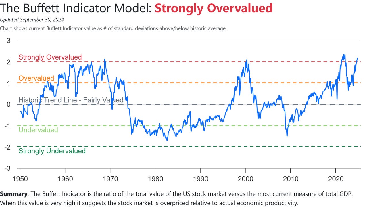
The following charts have been taken from the Current Market Valuation website.
Let me say upfront, that valuation metrics are horrible timing tools and should not be used as such. However, they are good at letting you know where you are within the scope of history.
With that said, rules are made to be broken so overbought conditions can get more overbought just as oversold conditions can get more oversold.
Net/net, use these charts as one component in a “confluence of evidence” process and position accordingly.
In summary, there is nothing to say that the market can’t go higher from here but it’s important to keep in mind your risk vs. reward scenario.
How much upside do you think is left?
Scroll down to our S&P 500 - Fair Value Model for one look at the potential risks that may lie ahead.
Asset Class Review
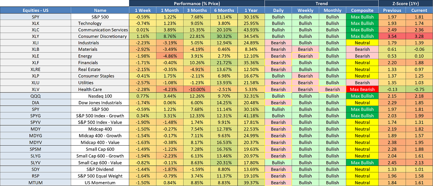
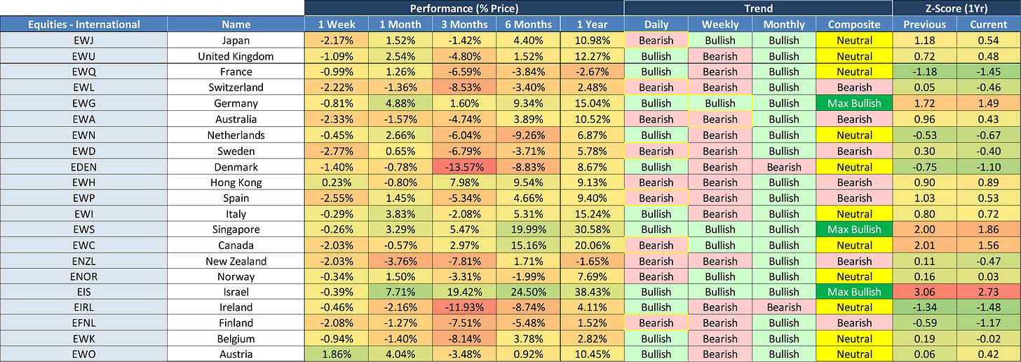
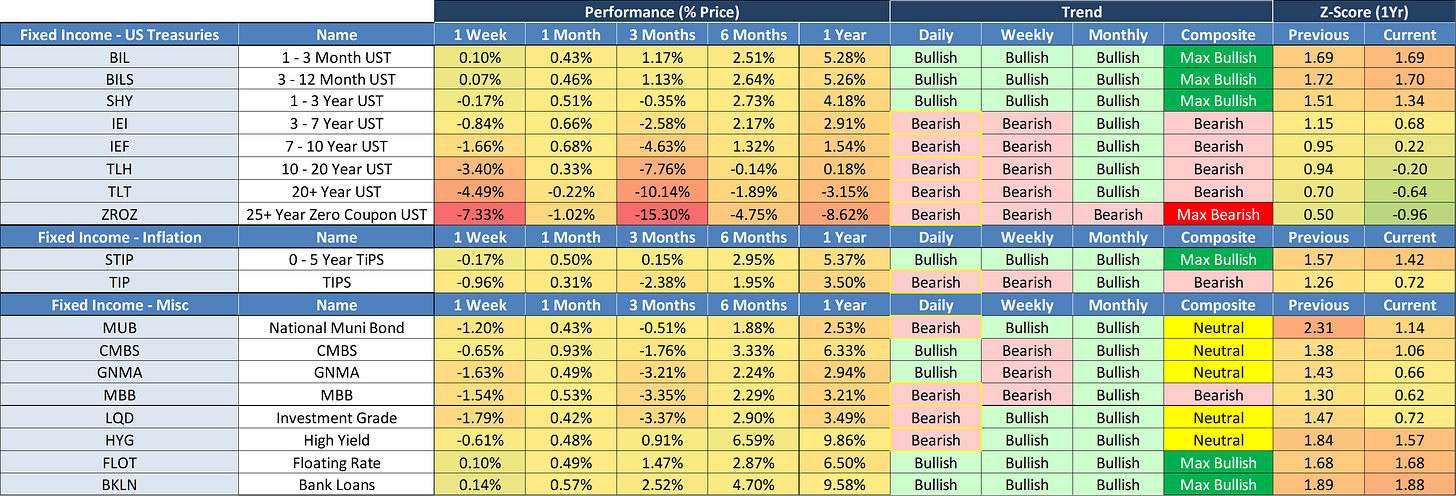
Each week we take a spin through the major asset classes in an attempt to discern a) what has changed, b) how markets are tilted (i.e., “Bullish” or “Bearish”), and c) where markets may be extended (either positively or negatively) which may provide an opportunity to either enter or exit a position.
We do this by looking at three different time periods: Daily (Short-Term), Weekly (Medium-Term), and Monthly (Long-Term). Additionally, we analyze the applicable Z-Scores to get a sense of overbought or oversold conditions.
Weekly Changes
Overall Totals
US Equities
International Equities
Emerging Market Equities
Fixed Income
Commodities
Currencies
S&P 500 - Fair Value Model
Let’s close this week with an update on our S&P 500 fair value model.
The red line in the chart below is the fair value we have constructed for the S&P 500. Based on our model, the current fair value for the S&P 500 is 2,641.56.
Friday’s close on the S&P 500 was 6,051.09.
This means it would take a decline of -56.3% from the S&P 500’s current value to its fair value.
Thank you, as always, for your support of this newsletter!
If you have found it helpful, please feel free to “like” it and share it with a friend or colleague.
Also, don’t forget to take advantage of this once-a-year discount for new subscribers by clicking on the following link:
Let’s make it a great week!
Take care,
Jim Colquitt
The Weekly Chart Review is a publication of Skillman Grove Research.
All opinions and views expressed herein are based on our judgments as of the date of writing and are subject to change at any time.
The content of this newsletter is for educational purposes only and should not be construed as investment advice.
Investing involves risk, including loss of principal, and past performance may not be indicative of future results.


