

Hey everyone, it’s Jim.
I hope you had a great weekend!
A quick programming note before we jump into this week’s newsletter.
I will be traveling this week with limited access to email/internet, so next week’s newsletter may be a “lite” version and/or may be delayed by a day (Tuesday, 08/12).
Okay, with that out of the way, let’s jump into this week’s newsletter…
In this week’s newsletter:
Stay Informed
Key Macro Events From Last Week (ICYMI)
Key Macro Events To Watch This Week
The Market Map
S&P 500
Deep Dive
Thoughts on Last Week’s Barrage of Economic Data…
S&P 500 Fair Value Model
The Market Map - Extended Analysis
Major US Indices
11 Major US Equity Sectors
US Treasuries
Currencies
Commodities
Fixed Income
Stay Informed
Key Macro Events From Last Week (ICYMI)
Here’s a quick recap of the key data releases from last week:
🧠 Consumer Confidence (Conference Board, July release – July 29)
The Consumer Confidence Index rose to 97.2 in July, up 2.0 points from June’s revised 95.2, slightly above consensus forecasts. (Link)
The Present Situation Index dipped slightly to 131.5, while the Expectations Index jumped by 4.5 points to 74.4, indicating improved outlook for business conditions and income. (Link)
However, perceptions of job availability weakened for the seventh month in a row, with nearly 20% of consumers saying jobs are hard to find—the lowest since March 2021. (Link)
👥 ADP Nonfarm Employment (July private payrolls – July 30)
The ADP National Employment Report showed 104,000 private-sector jobs added in July, rebounding from a revised June loss of 23,000 and topping expectations (~77,000). (Link)
This was the strongest month since March, signaling a mild acceleration in hiring within private firms. (Link)
🏦 FOMC Rate Decision (July meeting – July 30)
The Fed maintained the federal funds rate at 4.25–4.50% for the fifth consecutive meeting. (Link)
The vote split 9–2, with Governors Waller and Bowman dissenting in favor of a 25 bps rate cut—a rare occurrence in recent decades. (Link)
Chair Powell emphasized a cautious, data‑dependent approach, leaving the door open for possible action later in the year but giving no commitment on September moves. (Link)
💡 Core PCE (June, released late July)
The PCE Price Index rose 0.3% MoM, bringing headline inflation to 2.6% YoY, up from 2.4% in May. (Link)
Core PCE, which excludes food and energy, also rose 0.3% MoM, keeping annual core inflation at 2.8%, matching May—well above the Fed’s 2% goal and reinforcing inflation persistence. (Link)
Tariff-driven price increases in goods, healthcare, and financial services contributed to the stickiness in core inflation. (Link)
📉 Initial & Continuing Jobless Claims (weekly data)
Initial claims for the week ending July 26 rose slightly to 218,000, up 1,000 from the prior week, marking a mild uptick after six straight weeks of declines. (Link)
Continuing claims remained steady at 1.946 million for the week ending July 19, showing little change in the insured unemployment pool. (Link)
🛠 Nonfarm Payrolls & Unemployment Rate (July jobs report – August 1)
Nonfarm payrolls increased by just 73,000 in July, significantly below forecasts (~110–115K), with May and June payrolls revised down by a total of 258,000. (Link)
The unemployment rate ticked up to 4.2% from 4.1% in June, as hiring softened and long-term joblessness rose. (Link)
Average hourly earnings were up 0.3% MoM (+3.9% YoY), though wage growth still outpaced inflation marginally. (Link)
📌 Additional Market-Moving Highlights
The jobs report triggered a swift reevaluation of Fed cut timing, with markets pulling forward rate‑cut expectations as labor conditions showed signs of faltering.
Commentary surrounding a rare FOMC dissent from two governors heightened awareness of internal policy debate and possible shifts in Fed posture.
Overall, last week’s data point to a slowing labor market, persistent inflation above target, and a Fed in wait‑and‑see mode. While consumer optimism rebounded slightly, employment softness and sticky price dynamics signal challenges ahead.
Key Macro Events To Watch This Week
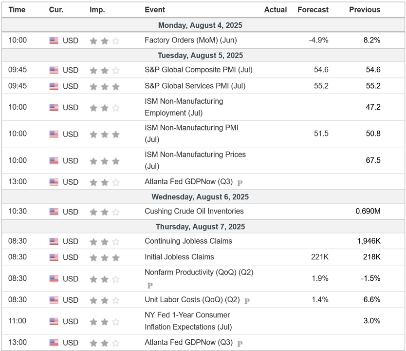
After last week, this week’s economic calendar feels pretty tame. Watch the PMIs and any new developments on the tariff front.
The Market Map - S&P 500
We use this section each week to “Map the Market” using our proprietary, systematic methodology to gauge a) the current trend of the market and b) where the market may be heading over the medium term.
Most of our readers are longer-term investors, so we focus on the weekly charts; however, our methodology can be used on any timeframe.
As always, let’s start by looking at the weekly chart.
The S&P 500 was lower last week by -2.36% after multiple weeks of creating new all-time highs.
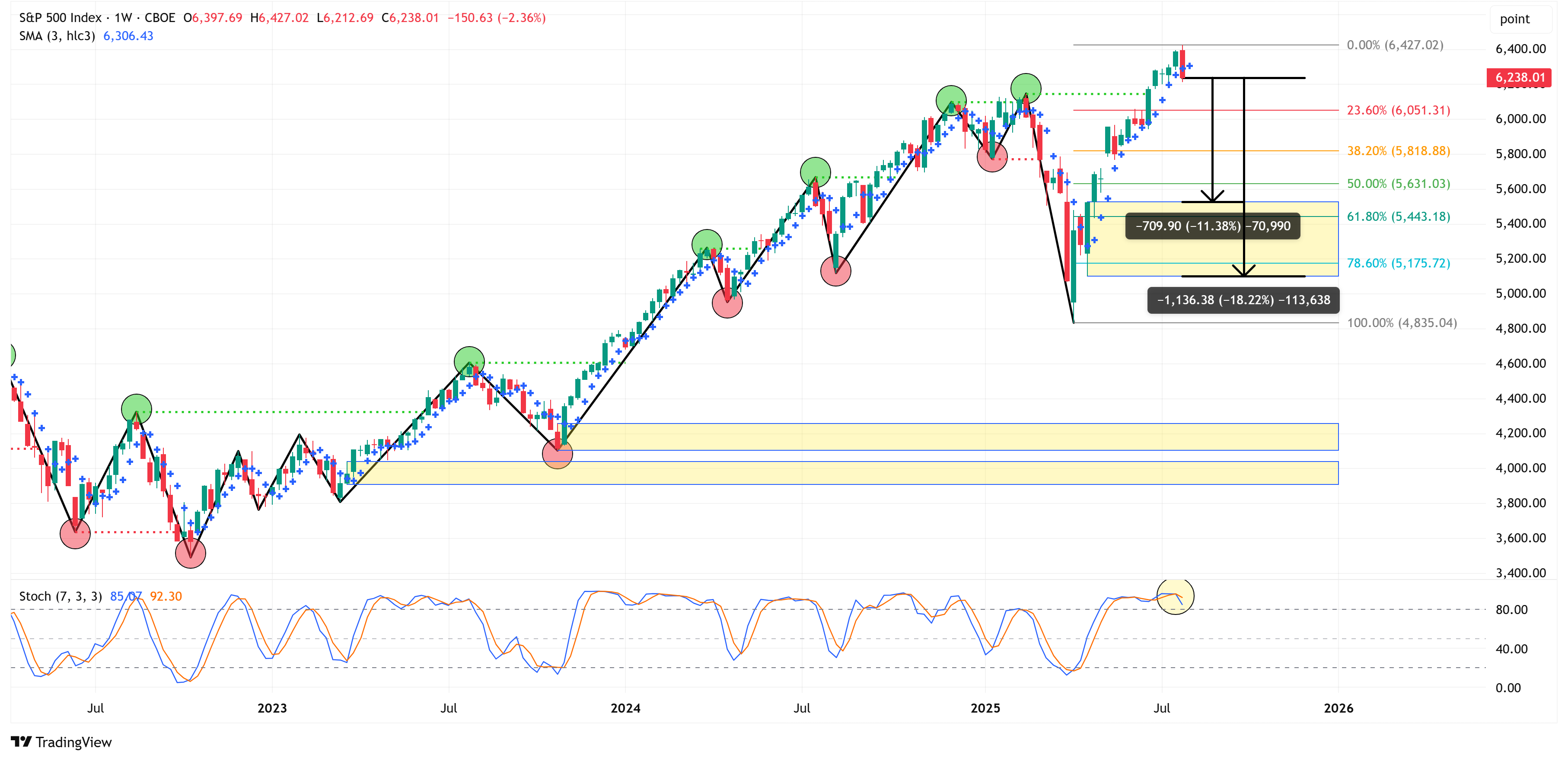
I made the following statement in last week’s newsletter:
“As we have discussed for several weeks, we want to keep an eye out for a weekly close “below the dot” as this will be our first sign of any potential loss of momentum for the market. For this week, that would mean a close below 6,292.35.”
Last week’s close was 6,238.01, which is below the 6,292.35 noted above.
What does this mean?
It simply means that some of the recent market momentum is subsiding.
It does NOT mean that the recent rally is over and/or that you need to sell everything and move to 100% cash (which I would never recommend anyway).
Instead, what this is telling us is that the 4-hour chart becomes very important at this point. The 4-hour chart will tell us if the weekly trend is starting to change.
4-Hour Chart
Here is the 4-hour chart.
Notice that the line in the sand we’ve drawn for a shift from bullish to bearish (on the 4-hour chart specifically) is at a price level of 6,201.00.
If we get a 4-hour chart close below 6,201.00, the 4-hour chart will officially shift to a bearish trend.
If that happens, I could easily see a scenario whereby the S&P 500 follows the path I’ve drawn with the red arrow.
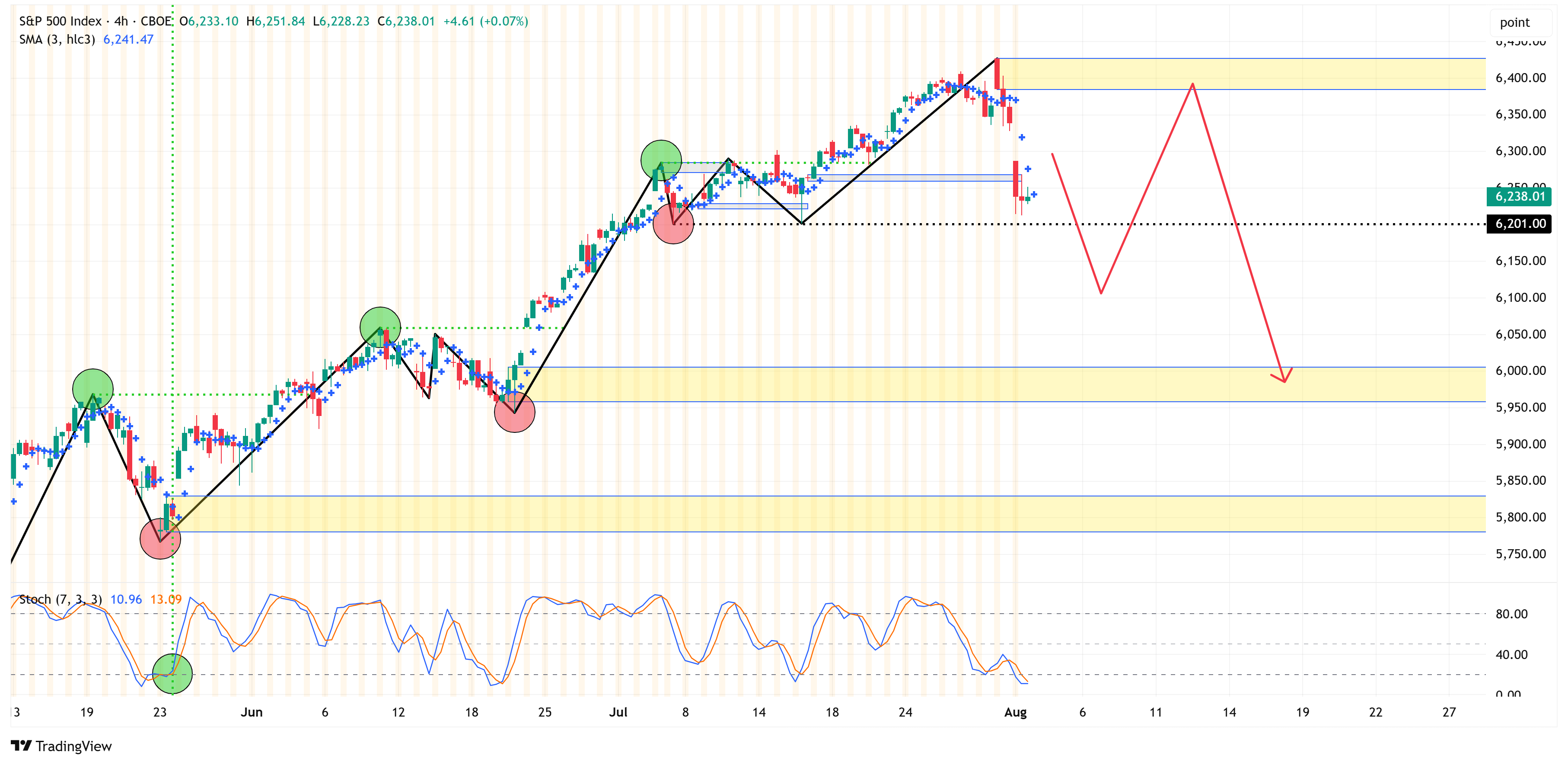
If we find ourselves in the above scenario, where a) the 4-hour chart turns bearish, and b) the S&P 500 comes back towards the recent highs and is unable to break through them, I think we have to start considering the possibility of a more pronounced short-term correction.
In that scenario, the S&P 500 will likely trade down to somewhere between 5,528.11 - 5,101.63. I have highlighted this region with a yellow box on the weekly chart above.
For context, from Friday’s closing price, this would be a decline of approximately -11.38% to -18.22%.
To summarize, the S&P 500 remains bullish on both the 4-hour and weekly charts; however, we are getting some signals that suggest a modest correction could be coming.
As a reminder, the goal of “The Market Map” process is to create a systematic, unemotional way of analyzing the market that defines key levels (in advance) and gives us clues as to when to take action and/or when to remain patient and let the market play out.
Deep Dive
Thoughts on Last Week’s Barrage of Economic Data…
Last week was a barrage of economic data. Two key things stand out, though.
First, the FOMC left rates unchanged (as expected), and J. Powell’s presser can effectively be summed up as follows:
“We have a dual mandate - stable prices & maximum employment - as it stands right now, inflation remains ‘too hot’ for our liking, and employment isn’t showing severe signs of stress; therefore, we have no reason to do anything (i.e., no rate cuts)…”
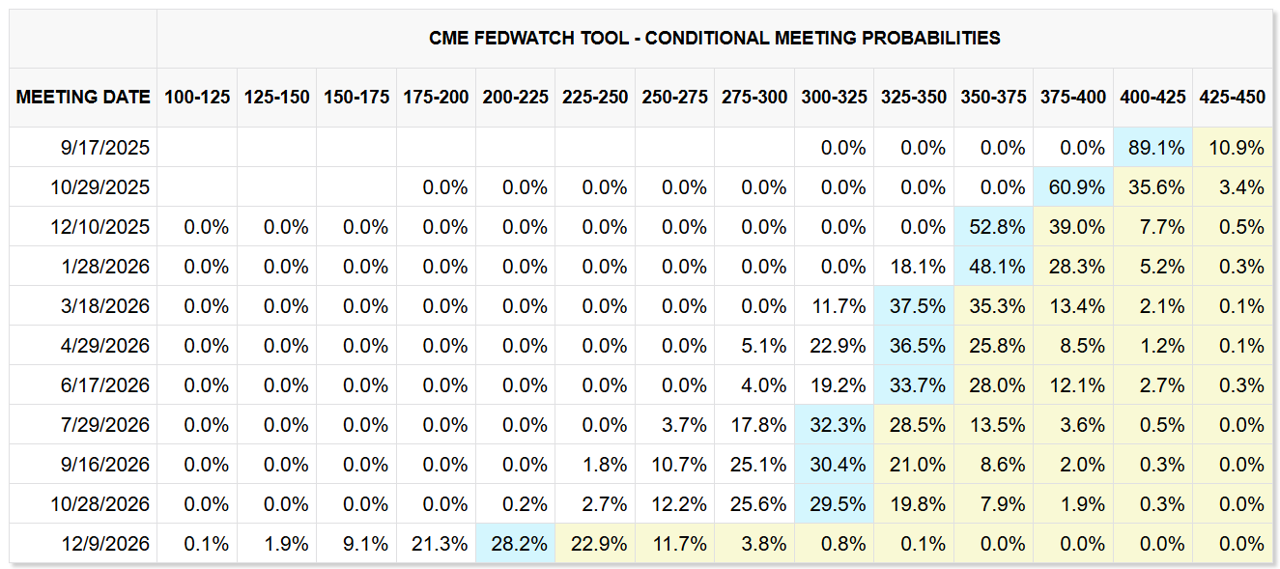
That narrative priced out the possibility of a September rate cut and left us with only one rate cut priced in through year-end.
I think the market read this as “Okay, kinda makes sense, sounds like if we’re going to get a cut, it will have to come from a material shift in the employment situation…”
Second, if we fast forward to Friday, the jobs report was dismal (especially the revisions).
That quickly put the “maximum employment” side of the dual mandate in focus, and the market acted swiftly to price in an 89.1% chance of a rate cut at the September meeting and the potential for three rate cuts in total by year-end.
How quickly things can change.
We can see that in the US Treasury market as well.
In the chart below, I’m showing a 15-minute chart of 2yr, 5yr, 10yr, and 30yr treasuries.
That sharp decline in yields that you see came at 8:30 am on Friday, when the jobs report came out.
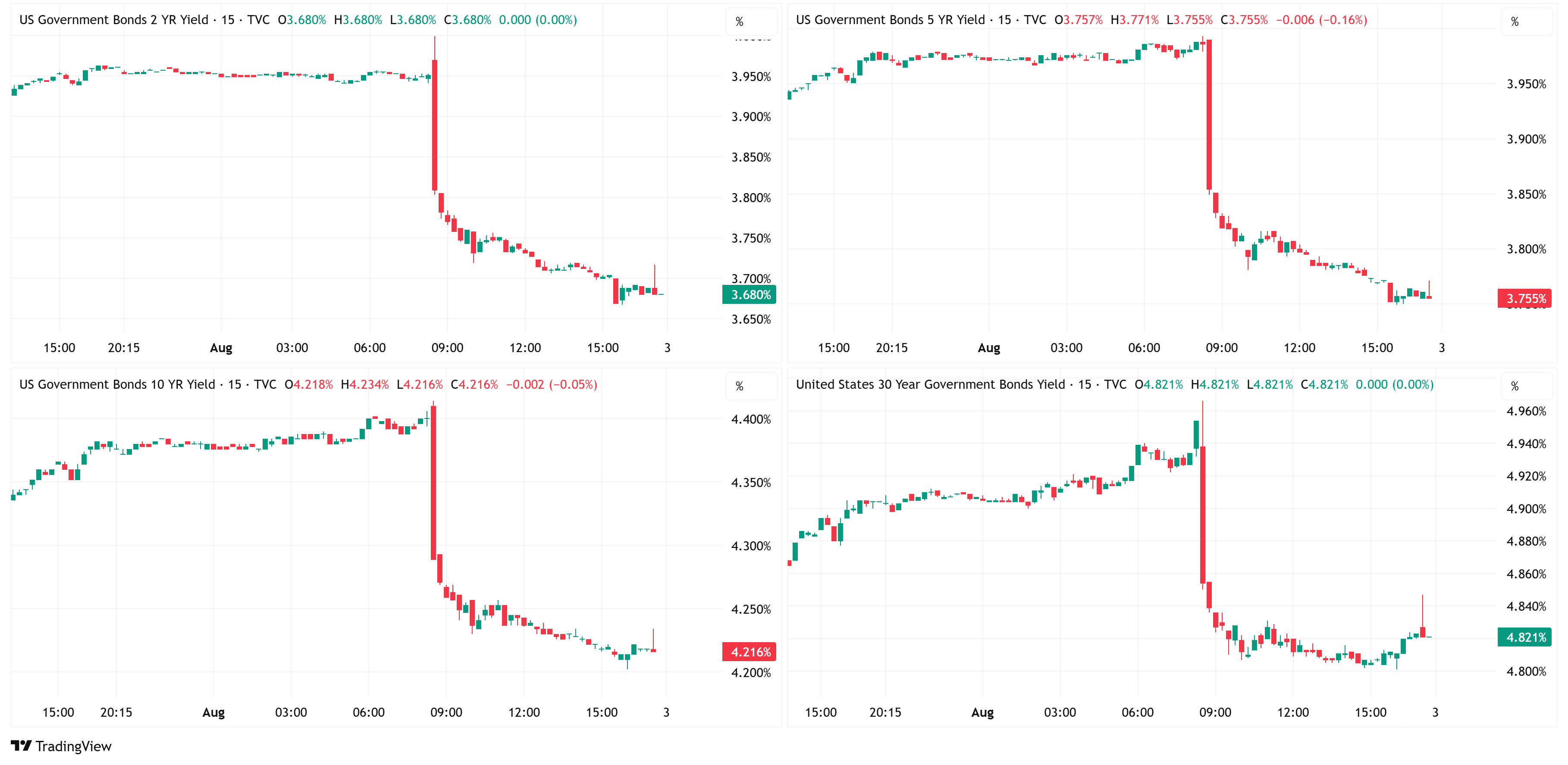
In my opinion, this was a complete gift to President Trump, as he has been calling for lower rates for months.
Despite this, Trump decided to fire the head of BLS, Erika McEntarfer, for her role in what he called “RIGGED” numbers.
It would seem that Trump believes we have a booming economy, creating no inflation, and therefore, those things justify further rate cuts.
I think most seasoned market participants know this, but I thought it would be interesting to ask ChatGPT the following question to see how it responds:
Q: What is the objective of the Fed when it cuts rates?
Here is ChatGPT’s response:
When the Federal Reserve (the Fed) cuts interest rates, its primary objective is to stimulate economic activity. Specifically, the Fed is usually trying to:
1. Support Economic Growth
Lower interest rates reduce the cost of borrowing for consumers and businesses.
This encourages more spending, investment, and hiring, which boosts GDP.
2. Increase Inflation (if it’s too low)
Rate cuts can lead to higher demand, which may push prices higher.
The Fed’s target for inflation is around 2%, so if inflation is persistently below that, a rate cut is used to reflate the economy.
3. Improve Labor Market Conditions
Cheaper borrowing can incentivize businesses to expand and hire more workers.
The Fed has a dual mandate: maximum employment and stable prices. Rate cuts aim to promote both.
4. Stabilize Financial Markets
In times of financial stress or volatility, cutting rates can boost confidence in markets and provide liquidity.
It can also help lift asset prices by reducing discount rates and encouraging risk-taking.
In summary, when the Fed cuts rates, it’s typically because the economy is slowing, inflation is too low, or financial conditions are tightening, and the goal is to spur borrowing, spending, and investment to keep the economy on track.
When you read the response above from ChatGPT, does that square with Trump’s view of our economy and his reasoning for rate cuts?
1. Support Economic Growth -
Why would we need to support economic growth if our economy is booming?
2. Increase Inflation (if it’s too low)
Trump repeatedly has said that we have no inflation, but I don’t think he would argue that we want to increase inflation.
3. Improve Labor Market Conditions
Why would we need to “improve labor market conditions” if the Jobs number was “RIGGED”?
4. Stabilize Financial Markets
Why would we need to stabilize financial markets if our economy is booming and the stock market is at all-time highs?
The bottom line is that none of the reasons Trump is giving for why we need to cut rates makes any sense in a logical or historical context.
So, that leads me to believe that one of the following items has to be true:
Trump is out of touch with why the Fed typically cuts rates. Given his business sense and years of deal-making, I don’t think that is the case.
Trump knows the economy is weaker than it appears to be, and he’s trying to get ahead of it so that the coming slowdown will be mitigated to the degree possible.
Trump is worried about refinancing the US debt at current interest rates and, therefore, he desperately needs lower rates. The US has over $30 trillion in debt outstanding, a good portion of that (~>30%) is coming due in the next two years, and the current weighted average yield on US debt is somewhere between 2.75% - 3.40% which is substantially lower than even 3-month T-bills, which yield 4.31%, or 30-year bonds which yield 4.85%.
Personally, I think it’s some combination of #2 and #3.
You probably can’t get to rates that are helpful (i.e., less than the weighted average yield of our current outstanding debt) for our debt situation without a recession or some other type of shock event.
I certainly don’t wish either of those potential outcomes on the US economy, but I think it is important to look through the current narrative and try to get to the heart of the real issue, because if #2 or #3 are even directionally correct, I think the stock market has to go lower.
The following sections are for paid subscribers only.
In these sections, we will discuss our proprietary:
S&P 500 Fair Value Model
This model provides a guide for:
a) How far the S&P 500 could decline in the next recession.
b) When to get back into the market after it has declined.
The Market Map - Extended Analysis
We will call out specific price objectives (up trends vs. down trends, targets, stop losses, etc.) on the following:
Major US Indices
11 Major US Equity Sectors
US Treasuries
Currencies
Commodities
Fixed Income
If you would like exclusive access to the proprietary data below, please become a paid subscriber today! Use the button below for a “15% Discount” for life!
Keep reading with a 7-day free trial
Subscribe to Skillman Grove Research to keep reading this post and get 7 days of free access to the full post archives.