Weekly Chart Review
Has the Technology sector run its course? And what does that mean for the rest of the market?
Sector Review
Let’s start this week by looking at our sector review and specifically, the S&P 500 and the eleven underlying sectors on an absolute basis.
Both charts below show where Friday’s closing price ranks in standard deviation terms relative to all of the closing prices for the previous year. The chart on the right adds the price return for the S&P 500 and the eleven sectors over the previous year on the x-axis.
Our second set of charts looks at the same eleven underlying sectors but does so on a relative basis by taking the price of the sector and dividing it by the price of the S&P 500 and then calculating our return metrics. This tells us how each sector is performing relative to the S&P 500.
Any sector located to the right of the 0.00% line on the x-axis would suggest that the sector has outperformed the S&P 500 over the given time period and vice versa.
Technology is the outlier
We want to be mindful of situations where the S&P 500 or one of the underlying sectors finds itself in an extreme position. I would define an “extreme position” as anything approaching, or greater than 2.0 standard deviations, either positive or negative.
The technology sector is the obvious outlier in both sets of charts above. Technology is not only pushing a 2.0 standard deviation move in both absolute and relative terms but you can see in the “relative” set of charts that technology has been the driving force behind the S&P 500’s returns over the last year.
It’s worth noting that the technology sector is by far the largest sector in the S&P 500 accounting for 26.10% of the market cap of the S&P 500. At 26.10%, the technology sector alone is almost as big as the next two sectors combined (health care = 14.41%, financials = 12.75%). To a large degree, as goes the technology sector, so goes the S&P 500.
Support and Resistance
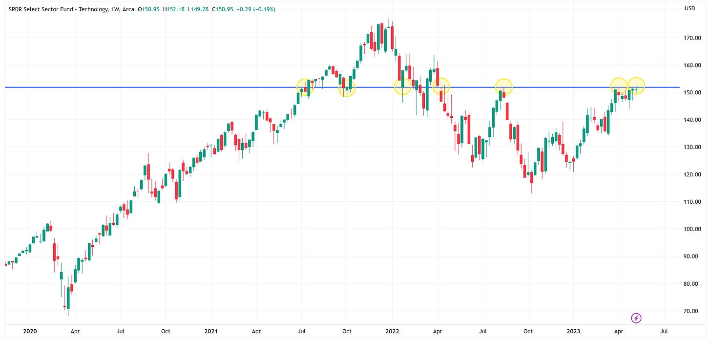
In the chart below, we are looking at the technology sector (XLK) on a weekly basis. Sometimes the best annotation you can make on a chart is simply a basic horizontal line that captures repeated periods of support and resistance. That’s what I’ve done in the chart below with the blue line.
When we do this, you can pretty quickly see that the current price level of around $152 has repeatedly acted as either support or resistance. The last four times it has approached this line, the line has acted as resistance.
Given technology’s current ~2.0 standard deviation move, I’m inclined to think the blue line could be another period of resistance. With that said, remember, this is a weekly chart so technology may trade above and below the blue line intra-week, but for a weekly chart, the most important data point is where it closes on Friday.
Stages of a Bubble
If we zoom out and instead look at the technology sector using a monthly chart, we find that a very similar historical pattern has developed. In the chart below, I have overlaid the technology sector’s price performance with a diagram depicting the “Stages of a Bubble” as created by Dr. Jean-Paul Rodrique from the Department of Global Studies & Geography, Hofstra University.
Dr. Rodrique suggests the following:
Bubbles (financial manias) unfold in several stages, an observation that is backed up by 500 years of economic history. Each mania is obviously different, but there are always similarities; simplistically, four phases can be identified:
Stealth
Awareness
Mania
Blow-off
Using Dr. Rodrique’s analysis, this would suggest that the technology sector is currently in the “Blow-off” phase.
Dr. Rodrique notes the following regarding the “Blow-off” phase (emphasis added):
A moment of epiphany (a trigger) arrives, and everyone roughly at the same time realizes that the situation has changed. Confidence and expectations encounter a paradigm shift, not without a phase of denial where many try to reassure the public that this is just a temporary setback. Some are fooled, but not for long. Many try to unload their assets, but takers are few; everyone is expecting further price declines. The house of cards collapses under its own weight, and latecomers (commonly the general public) are left holding depreciating assets while the smart money pulled out a long time ago. Prices plummet at a rate much faster than the one that inflated the bubble. Many over-leveraged asset owners go bankrupt, triggering additional waves of sales. There is even the possibility that the valuation undershoots the long-term mean, implying a significant buying opportunity. However, the general public at this point considers this sector as “the worst possible investment one can make”. This is the time when the smart money starts acquiring assets at low prices.
Conclusion
It’s certainly possible that the technology sector may appreciate further from here and that it may take the S&P 500 along for the ride given its size of the overall index.
However, the market is giving us sign after sign that the US economy is headed for a recession which suggests any further price appreciation from here is likely only temporary.
If that is the case, it would be wise to be mindful of the items that I highlighted above in the “Blow-off” phase paragraph and take the appropriate actions:
Don’t get lulled into believing that the recent rally is a “return to normal”.
Don’t get left holding the bag.
Be mindful of the fact that recessions often create generational buying opportunities.
Be the “smart money” and aggressively acquire assets at low prices.
In order to accomplish item #4, you have to make sure don’t succumb to item #2. Also, remember that given the size of the technology sector, the S&P 500 will likely follow a similar return path once the next downturn begins.
Until next time…


