I have been blessed with three wonderful children and a lovely wife. All four are keenly aware of this newsletter and the time I spend putting it together each week.
I wish I could tell you that all four of them read the newsletter from start to finish each week and that it leads to in-depth macroeconomic discussions around the dinner table but that would be a bit of a stretch.
That said, my 15-year-old daughter gave me some “feedback” recently. She made the following statement:
“No one wants to read this many words Dad. You need more pictures (think charts) and less words. You do that and I bet your readers would double.”
Candidly, I think she’s on to something. I do use a lot of words, but it is always done with the intention of making sure that I am thorough in my explanation of what I’m trying to convey but maybe that isn’t needed.
Henceforth, “more ‘pictures’, less words”!
Overview
Quarterly Update: Average Investors Allocation to Equities
S&P 500 & NASDAQ Targets
Asset Class Review
Quarterly Update: Average Investors Allocation to Equities
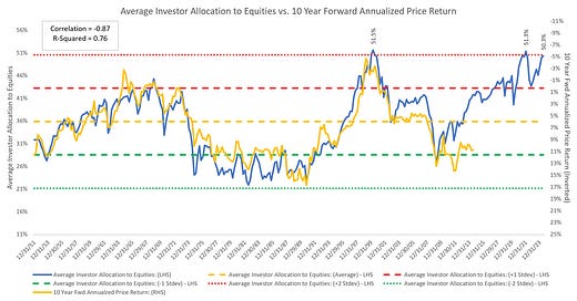
The current quarterly value for the “Average Investors Allocation to Equities” chart above is 50.3%.
This value has only been exceeded 5 other times in almost 75 years’ worth of quarterly data points.
Those periods and values were as follows:
4Q 1999 = 50.6%
1Q 2000 = 51.5%
2Q 2000 = 50.4%
2Q 2021 = 50.4%
4Q 2021 = 51.3%
Why does this matter?
“Very simply, the higher the blue line (i.e., the “Average Investor Allocation to Equities”), the lower the subsequent 10-year return for the S&P 500 Index and vice versa.”
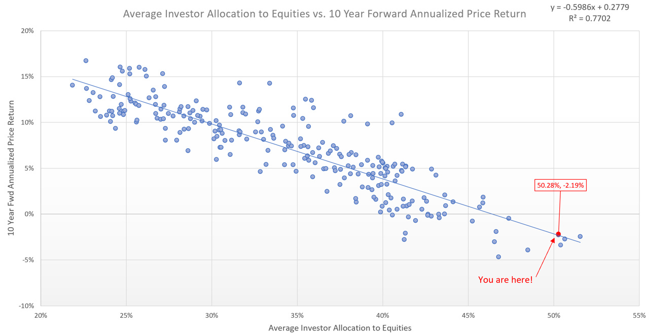
Here’s what this looks like on a scatterplot:
The “You are here!” value is typically not the starting point for extended bull markets.
Instead, the linear regression scatterplot suggests that from this starting point, we should expect a -2.19% annualized return over the next 10 years for the S&P 500.
Here’s how the S&P 500 fared over the subsequent 10 years vs. the highlighted starting points noted above:
4Q 1999 = 50.6% —> -2.72%
1Q 2000 = 51.5% —> -2.45%
2Q 2000 = 50.4% —> -3.39%
2Q 2021 = 50.4% —> N/A
4Q 2021 = 51.3% —> N/A
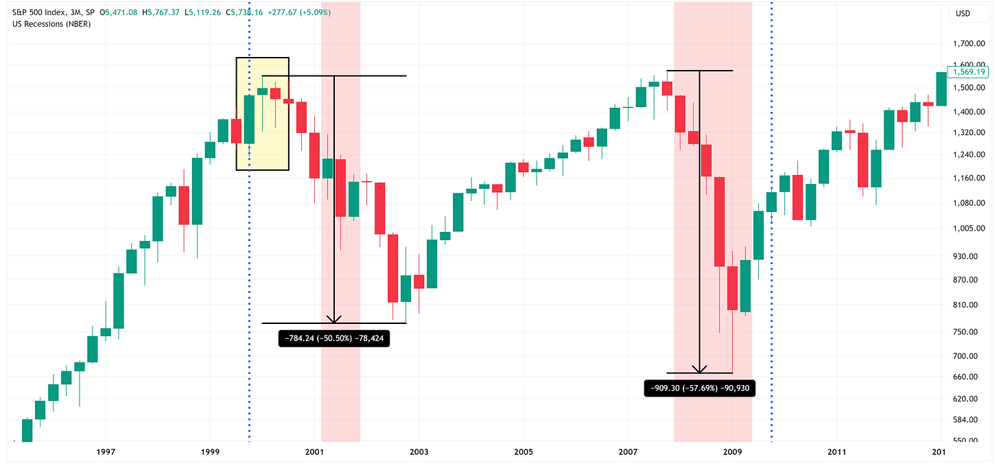
Here’s what it looked like on a chart:
Yellow highlighted box = 4Q 1999 - 2Q 2000
Vertical red shaded boxes = recessions
The takeaway is that the last time we reached these levels, we had two recessions over the subsequent 10-year period and drawdowns of -50.50% and -57.69%.
Does that mean that has to happen this time, no, but as I stated above, I don’t believe this is the place where extended bull markets begin.
S&P 500 & NASDAQ Targets
Here’s the conundrum. The market is extremely bullish right now.
Scroll down to our Asset Class Review and you will see a lot of “Max Bullish” readings across the various equities we cover.
Going back to the previous chart, I have changed the time frame from quarterly to weekly and posted it below.
It’s not inconceivable to think that we’re currently living in a period that is similar to the “melt-up” that we saw in late 1999, early 2000 (blue arrows).
Why do I say that?
Here are the charts and price targets for the S&P 500 and the NASDAQ.
Keep reading with a 7-day free trial
Subscribe to Skillman Grove Research to keep reading this post and get 7 days of free access to the full post archives.


