
Weekly Chart Review
U.S. large-cap weekly outflow, biggest since 2020…

Hey everyone, it’s Jim.
I hope you had a great weekend!
Let’s dive right into this week’s newsletter.
In this week’s newsletter:
📰 Stay Informed
Key Macro Events From Last Week (ICYMI)
Key Macro Events To Watch This Week
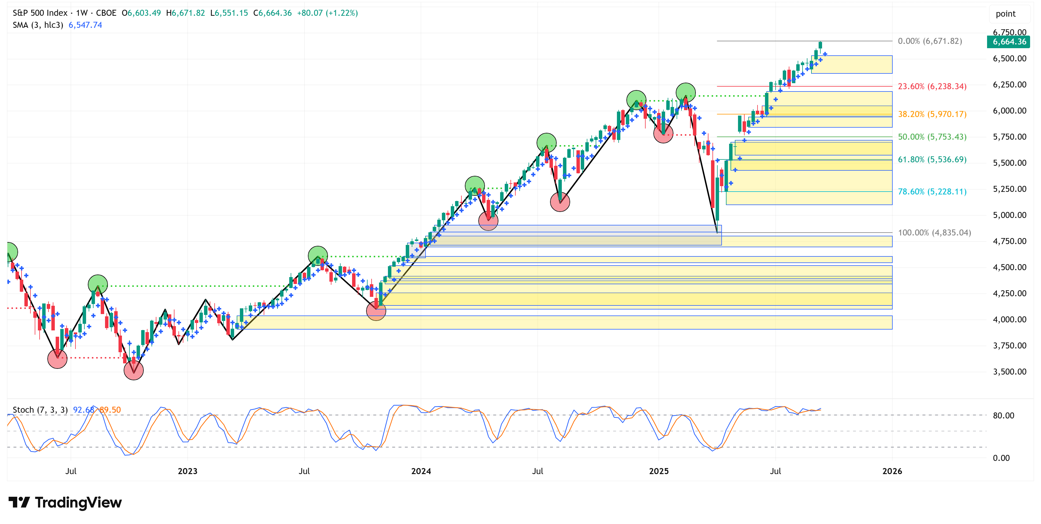
🗺️ The Market Map
S&P 500
🔎 Deep Dive
U.S. large-cap weekly outflow, biggest since 2020…
📊 S&P 500 Fair Value Model
📈 The Market Map - Extended Analysis
Major US Indices
11 Major US Equity Sectors
US Treasuries
Currencies
Commodities
Fixed Income
📰 Stay Informed
Key Macro Events From Last Week (ICYMI)
Here’s a quick recap of the key data releases from last week:
NY Empire State Manufacturing Index (September)
The Empire State Manufacturing general business conditions index fell sharply to −8.70 in September from +11.90 in August — its first negative reading since June. New orders and shipments plunged; supply availability worsened, employment was little changed, and price pressures (input and selling) eased somewhat.
The six-month outlook remains muted: optimism is subdued, and capital spending plans remain weak. Firms expect only modest improvement ahead.
Retail Sales (August)
Retail sales rose 0.6% month-over-month in August, beating expectations; core sales (excluding autos, gasoline, building materials, and food services) rose about 0.7%.
Strength was fairly broad but offset by risks: inflation/headwinds from tariffs make part of the growth likely due to higher prices rather than volumes; the labor market is weakening, which could dampen future spending.
Building Permits & Housing Starts (August, Single-Family)
Single-family housing starts dropped about 7.0% (annualized) to ~890,000 units; permits for new single-family homes declined ~2.2% to about 856,000 units.
The decline reflects oversupply of unsold new homes and a weakening labor market. Even though mortgage rates have eased (reaching an ~11-month low), builders remain cautious—pricing incentives and cuts are being used to deal with excess inventory.
FOMC Rate Decision (September 17, 2025)
The Federal Reserve cut its federal funds rate by 25 basis points, bringing it into the 4.00%–4.25% target range. This was the first rate cut of 2025.
The Fed’s statement acknowledged that job gains have slowed, the unemployment rate has edged up (though still low), and inflation remains “somewhat elevated.” The cut was characterized as a risk management move; expectations for further cuts this year were also signaled.
Initial & Continuing Jobless Claims
For the week ending Sept. 13, initial jobless claims dropped by ~33,000 to 231,000, reversing a prior week’s spike to nearly a four-year high.
Continuing claims (people already on benefit rolls) edged down slightly to 1.920 million, but remain elevated; the four-week moving average of initial claims is creeping upward in a zone that suggests a softening labor market.
Overall Takeaways for the U.S. Economy
Mixed signals abound: On one hand, retail spending has shown resilience, and the Philly Fed index indicates a pickup in manufacturing activity in the Mid-Atlantic region. On the other hand, NY State manufacturing data and the housing sector show clear signs of cooling.
Labor market weakening is a recurring theme. Slower job gains, elevated unemployment claims (initial and continuing), and creeping concerns over layoffs are all contributing to a more cautious posture by the Fed.
Inflation remains a concern, though some price pressures are moderating (especially in manufacturing surveys). Tariffs continue to influence both cost-side inflation (inputs) and consumer prices.
The Fed’s rate cut reflects recognition of these soft spots — particularly labor and housing — but the “risk management” framing suggests that the Fed still views inflation risks as nontrivial.
The housing sector’s drop in starts and permits signals that rate cuts and lower mortgage rates have not yet reversed builders’ caution; inventory excess and affordability remain obstacles.
Consumer spending is holding up for now, partly buoyed by higher-income households and possibly by purchasing ahead of price increases, but the weakening labor market may curb that in the months ahead.
Key Macro Events To Watch This Week
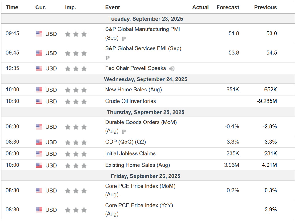
Core PCE is the Fed’s favorite measure of inflation and will be watched closely this week by market participants.
🗺️ The Market Map - S&P 500
We use this section each week to “Map the Market” using our proprietary, systematic methodology to gauge a) the current trend of the market and b) where the market may be heading over the medium term.
Most of our readers are long-term investors, so we focus on the weekly charts; however, our methodology can be used on any timeframe.
Let’s start by looking at the weekly chart.
The S&P 500 was up 1.22% last week, closed at an all-time high, and remains in an uptrend.
The yellow boxes in the chart below are the boxes that “need” to be filled.
There are a lot of boxes that “need” to be filled, and unfortunately, I can’t tell you when they will get filled, only that they are likely to get filled in time.
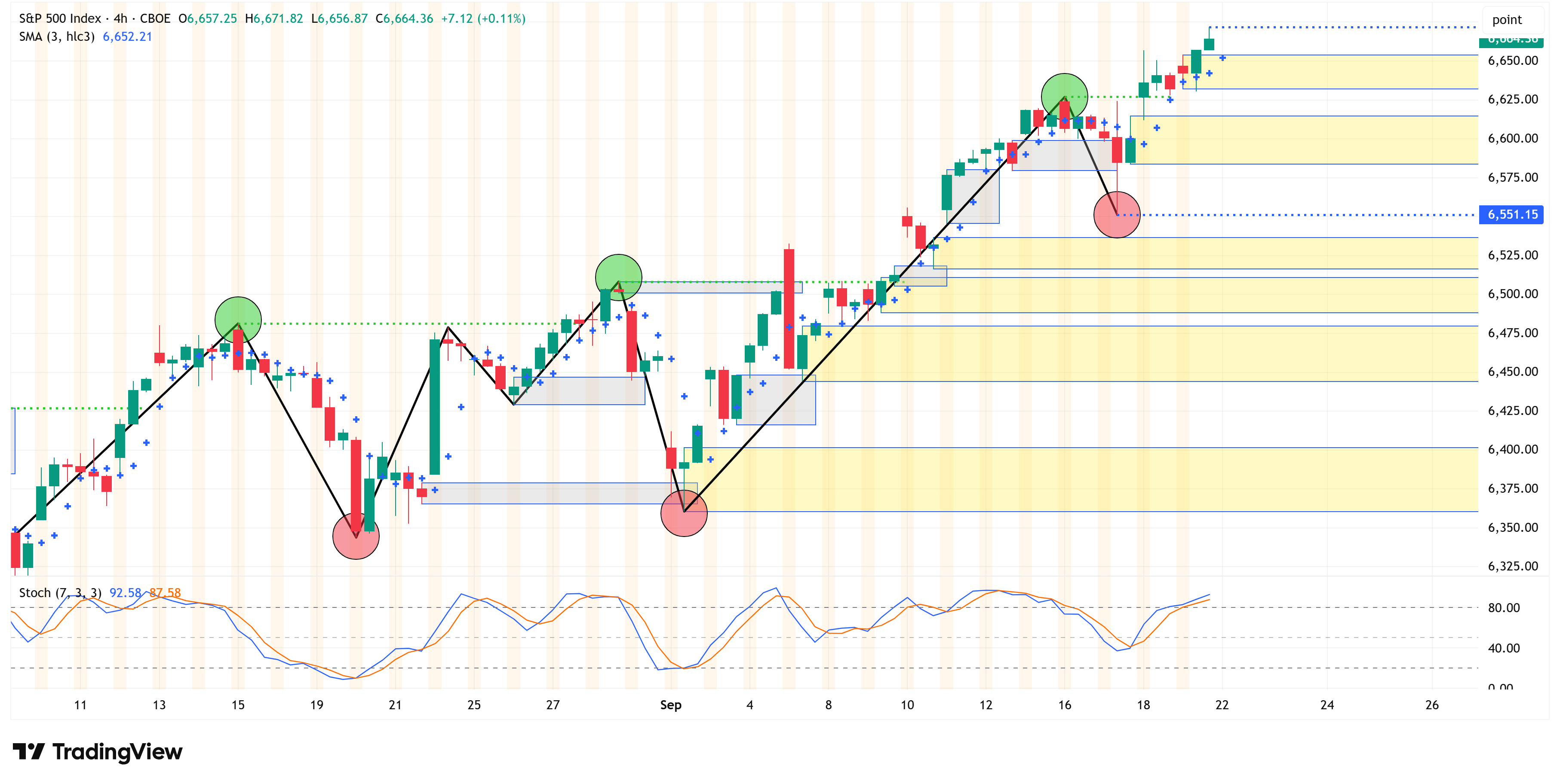
4-Hour Chart
Let’s shift to the 4-hour chart to see if it provides any clues about the potential for a pullback.
Here again, the 4-hour chart continues to remain in an uptrend.
The key level we will be watching is 6,551.15.
If the 4-hour chart closes below this level, it could be a potential clue that we are entering a pullback and/or some sort of consolidation.
Until then, the market is telling you it wants to continue to move higher.
Deep Dive
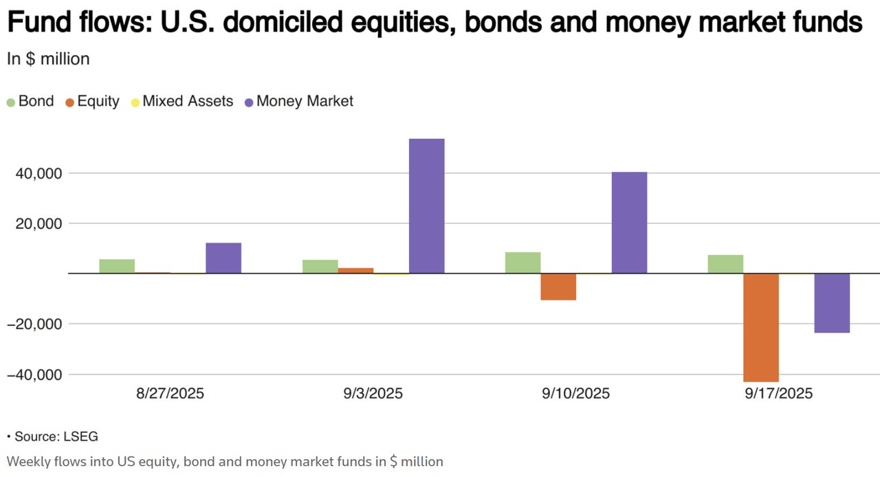
U.S. large-cap weekly outflow, biggest since 2020…
Reuters published an article on September 19th that caught my attention.
It was titled “U.S. equity funds see large outflows as investors book profit” and you can find it here if you’d like to read the entire piece (which I would encourage you to do).
Here are a few of the key takeaways from the article:
“Investors withdrew massive capital out of U.S. equity funds in the week to Sept. 17 as they turned cautious about the market's lofty valuations following the recent rally through a policy rate cut by the Federal Reserve and rushed to lock in profits.
According to LSEG Lipper data, investors pulled out a net $43.19 billion from U.S. equity funds in the week, logging their largest weekly net sales since a $50.62 billion weekly outflow in mid-December 2024.”
Reuters provided this chart in support of the quote above…
Another key point from the article:
“The S&P 500 forward price-to-earnings ratio, at 22.6x, is in the 99th percentile over the past 20 years," said Mark Haefele, Chief Investment Officer at UBS Global Wealth Management.
"After such a strong recent run, a period of consolidation should not come as a surprise, in our view," UBS's Haefele said.
U.S. large-cap funds had a net $34.19 billion weekly outflow, the biggest since at least 2020. Investors also shed mid-cap funds of $1.58 billion but invested a marginal $50 million in small-cap funds.”
And one more:
“U.S. bond funds, meanwhile, saw a 22nd successive weekly inflow to the tune of $7.33 billion.
The short-to-intermediate investment-grade funds, general domestic taxable fixed income funds and municipal debt funds stood out with $1.59 billion, $1.14 billion and $1.04 billion, respectively in weekly inflows.”
Here is the chart Reuters provided in support of the quote above:
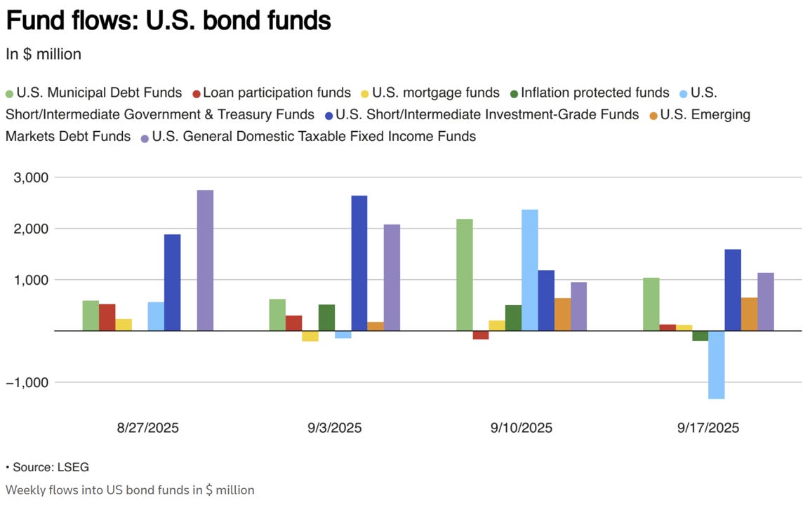
The article would suggest that investors are moving out of risk assets and towards safer assets (i.e., bonds).
Is this part of a bigger plan to de-risk, or is this just the normal course of business as we get towards quarter-end? Honest answer, I don’t know the answer.
Separately, I was recently made aware of a tool that Finviz.com has, which tracks insider activity. You can find it here.
Outside of Elon’s pledge to purchase $1 bln worth of TSLA, there’s a lot of red in this dataset.
Here’s a small snippet of the dataset:
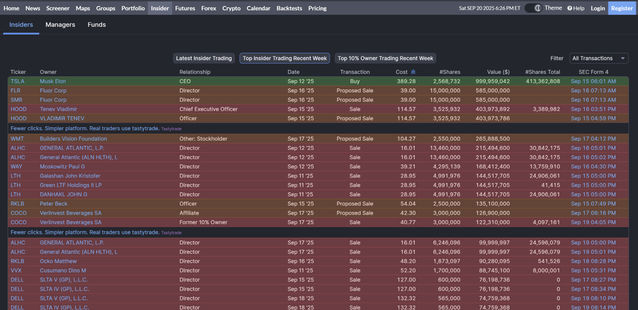
I will admit, I’m very new to this tool, and it doesn’t give you much history beyond the previous week, so I would suggest using this with caution.
More so, I think this will become something that I look at on a semi-regular basis to get a better feel for how it ebbs and flows.
I cannot quantify the following statement in any reasonable way, but it just feels like we’re getting close to the point (or maybe we’re there) where the “big guys” start unloading their shares to the “small guys” because they know this market is topping and they don’t want to be left holding the bag.
Again, I cannot quantify that statement, and the technicals continue to paint a picture of a market that wants to move higher, but I would keep your eye on the S&P 500 level of 6,551.15 that I noted above and make sure you know where the exits are if someone yells “fire” in a crowded theater.
We’re at the point in the cycle where things start to get interesting. Be sure to subscribe to our newsletter to stay on top of everything that’s heading our way.
The following sections are for paid subscribers only.
In these sections, we will discuss our proprietary:
S&P 500 Fair Value Model
This model provides a guide for:
a) How far the S&P 500 could decline in the next recession.
b) When to get back into the market after it has declined.
The Market Map - Extended Analysis
We will call out specific price objectives (up trends vs. down trends, targets, stop losses, etc.) on the following:
Major US Indices
11 Major US Equity Sectors
US Treasuries
Currencies
Commodities
Fixed Income
If you would like exclusive access to the proprietary data below, be sure to take advantage of our “The Market Map Pro ($99/Year)” special offer!
Keep reading with a 7-day free trial
Subscribe to Skillman Grove Research to keep reading this post and get 7 days of free access to the full post archives.