
Weekly Chart Review
Doji on the S&P—Reversal or Head Fake?

Hey everyone, it’s Jim.
I hope you had a great weekend!
Let’s dive right into this week’s newsletter.
In this week’s newsletter:
📰 Stay Informed
Key Macro Events From Last Week (ICYMI)
Key Macro Events To Watch This Week
🗺️ The Market Map
S&P 500
📊 S&P 500 Fair Value Model
📈 The Market Map - Extended Analysis
Major US Indices
11 Major US Equity Sectors
US Treasuries
Currencies
Commodities
Fixed Income
📰 Stay Informed
Key Macro Events From Last Week (ICYMI)
Here’s a quick recap of the key data releases from last week:
🏭 S&P Global Manufacturing PMI (Sep, flash)
The “flash” S&P Global U.S. Manufacturing PMI slipped to 52.0 in September from 53.0 in August, still signaling expansion but with slower momentum.
Sub-indices show that new orders growth weakened, exports are soft, and inventory buildup accelerated, all of which point to fading strength in the goods sector.
🏢 S&P Global Services PMI (Sep, flash)
The U.S. services PMI eased to 53.9 in September from 54.5 in August, still above the 50 mark but reflecting a softer expansion in demand.
The rate of increase in new orders slowed, and firms cited challenges with pricing power and stiff competition, suggesting services are becoming more sensitive to economic headwinds.
🏠 New Home Sales (Aug)
New single-family home sales surged 20.5% month over month to an annualized 800,000 units, well above expectations and the strongest level since early 2022.
The jump is partly attributed to lower mortgage rates and builder incentives, though the figure is volatile and may be revised downward. Inventory declined modestly, pushing months’ supply down to ~7.4 months.
🏘 Existing Home Sales (Aug)
Existing home sales dipped 0.2% MoM in August to an annualized rate of 4.00 million units.
Year over year, sales rose 1.8%. Inventory stood at about 1.53 million units, a 4.6-month supply, and the median price continued to rise amid tight supply and financing constraints.
📈 GDP (QoQ, Q2 – final estimate)
The final revision shows that U.S. real GDP grew at an annualized rate of 3.8% in Q2 (April to June), higher than the prior estimate of 3.3%.
Growth was driven primarily by stronger consumer spending and a decline in imports (which are counted negatively in GDP). Real final sales to private domestic purchasers rose 2.9%.
📊 Core PCE Price Index (YoY, Aug)
The PCE price index (overall) rose 2.7% year over year in August, up from 2.6% in July.
Core PCE (excluding food and energy) was up 2.9% YoY, holding steady from the prior month, indicating persistent underlying inflation.
🔍 Key Takeaways for the U.S. Economy
The service and manufacturing sectors remain in expansion territory, but the softer PMI readings suggest a moderation in activity—expansion continues, but at a lower pace.
The housing market is showing divergence: new home sales are unexpectedly strong (boosted by rate moves and incentives), while existing home sales remain constrained by affordability and inventory.
The robust Q2 GDP print (3.8%) underscores that the economy retained momentum heading into Q3, and the upward revision suggests more resilience than earlier estimates suggested.
Inflation pressures persist, with core PCE still elevated at 2.9%. This will keep the Federal Reserve cautious about further easing, even if growth weakens.
Overall, we see an economy that is resilient but softening—strong consumer demand is still supporting growth, but various headwinds (tariffs, tighter credit, slower hiring) are beginning to weigh on momentum.
Key Macro Events To Watch This Week
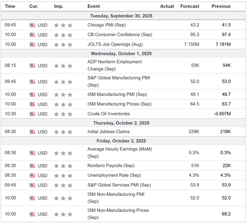
The first Friday of the month brings us Nonfarm Payrolls and the Unemployment Rate…those will likely be the key focal points for this week.
🗺️ The Market Map - S&P 500
We use this section each week to “Map the Market” using our proprietary, systematic methodology to gauge a) the current trend of the market and b) where the market may be heading over the medium term.
Most of our readers are long-term investors, so we focus on the weekly charts; however, our methodology can be used on any timeframe.
Let’s start by looking at the weekly chart.
Although the S&P 500 closed lower by -0.31% last week, a lot of things remain the same:
The market is still in an uptrend.
The market remains overbought.
Several gaps “need” to be filled below current levels.
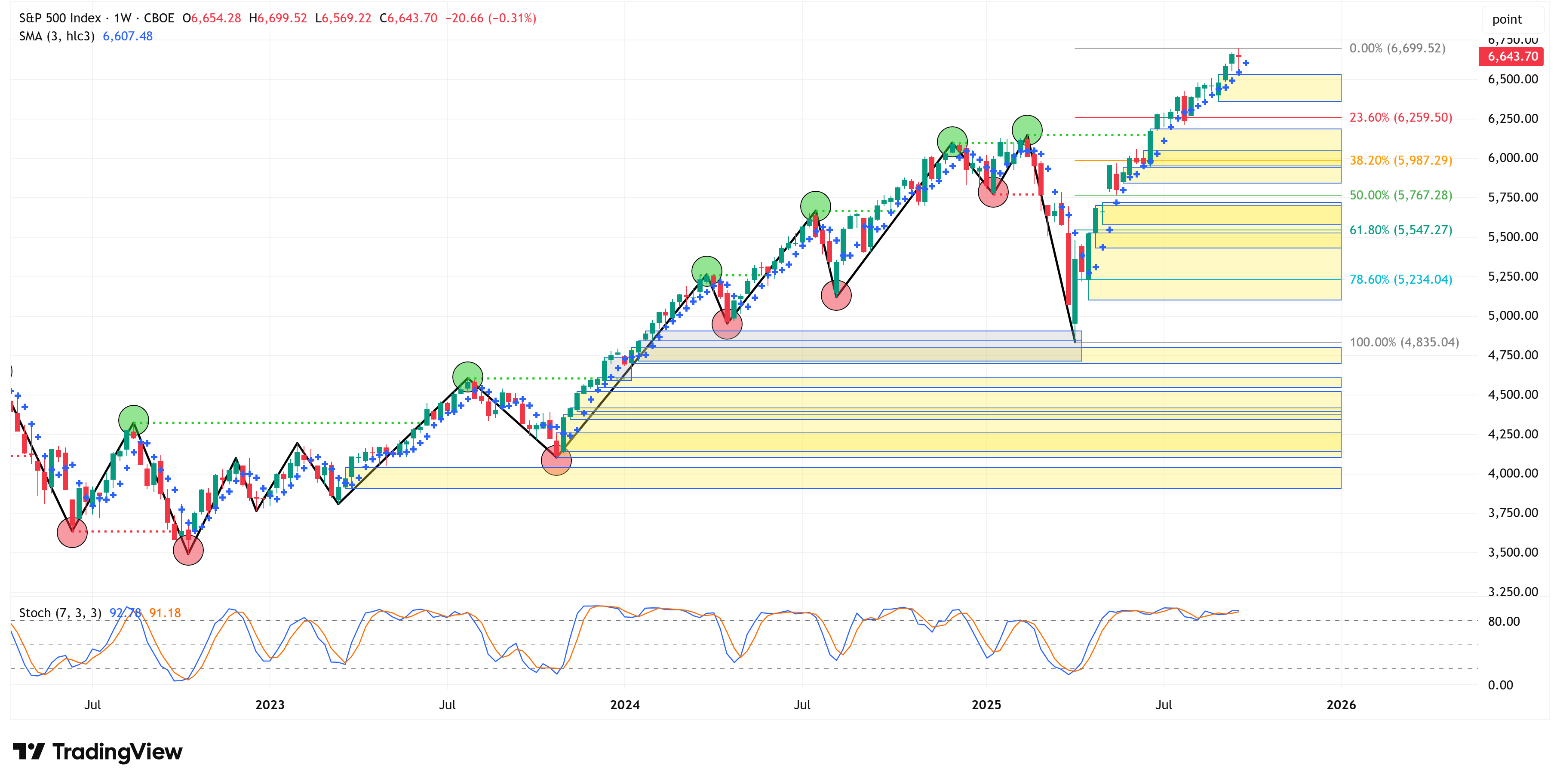
One thing that is new is that last week’s price action formed a “doji” candle.
Here’s what that looks like if we zoom in a bit on the chart above:
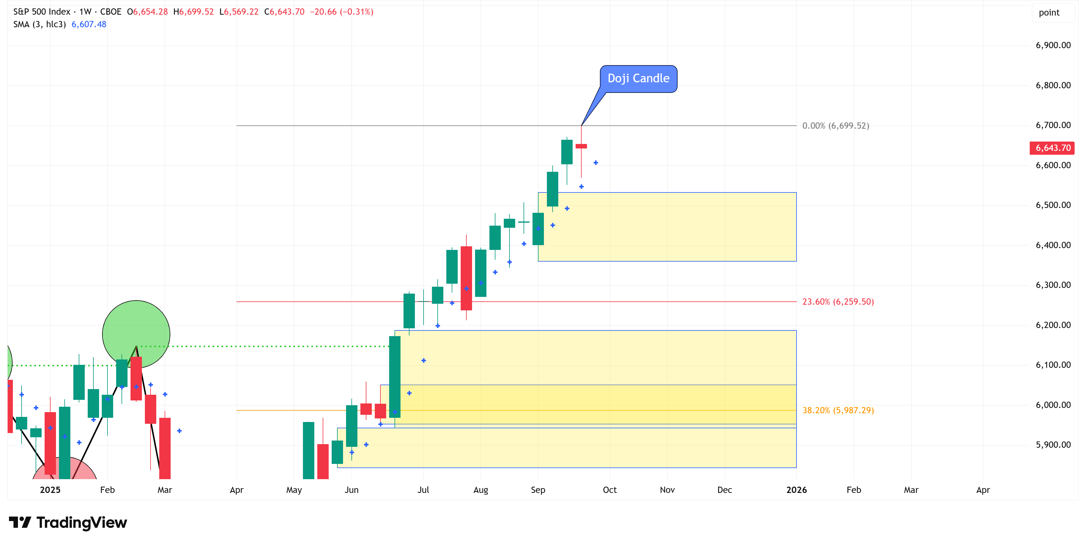
Investopedia describes a “Doji” candle as follows:
“A doji is created when the open and close for a stock are virtually the same. Doji tend to look like a cross or plus sign and have small or nonexistent bodies. From an auction theory perspective, doji represents indecision on the side of both buyers and sellers. Everyone is equally matched, so the price goes nowhere; buyers and sellers are in a standoff.
Some analysts interpret this as a sign of impending price reversal. However, it may also be a time when buyers or sellers are gaining momentum for continuing a trend. Doji is commonly seen in periods of consolidation and can help analysts identify potential price breakouts.”
Most technical analysts tend to believe that a “doji” candle signifies a potential reversal, and while that may be true, I think the bigger takeaway is that it signals indecision.
In a strong bull run, we don’t want “indecision”; we want sustained buying, kind of like all the green candles we’ve seen since the April lows.
With that said, we’ve had a couple of other “doji” candles since July, and they turned out to be continuation candles and not reversal candles.
This is why it is important to shift to the lower time frame to see if it gives us any clues as to a possible reversal that could be heading our way.
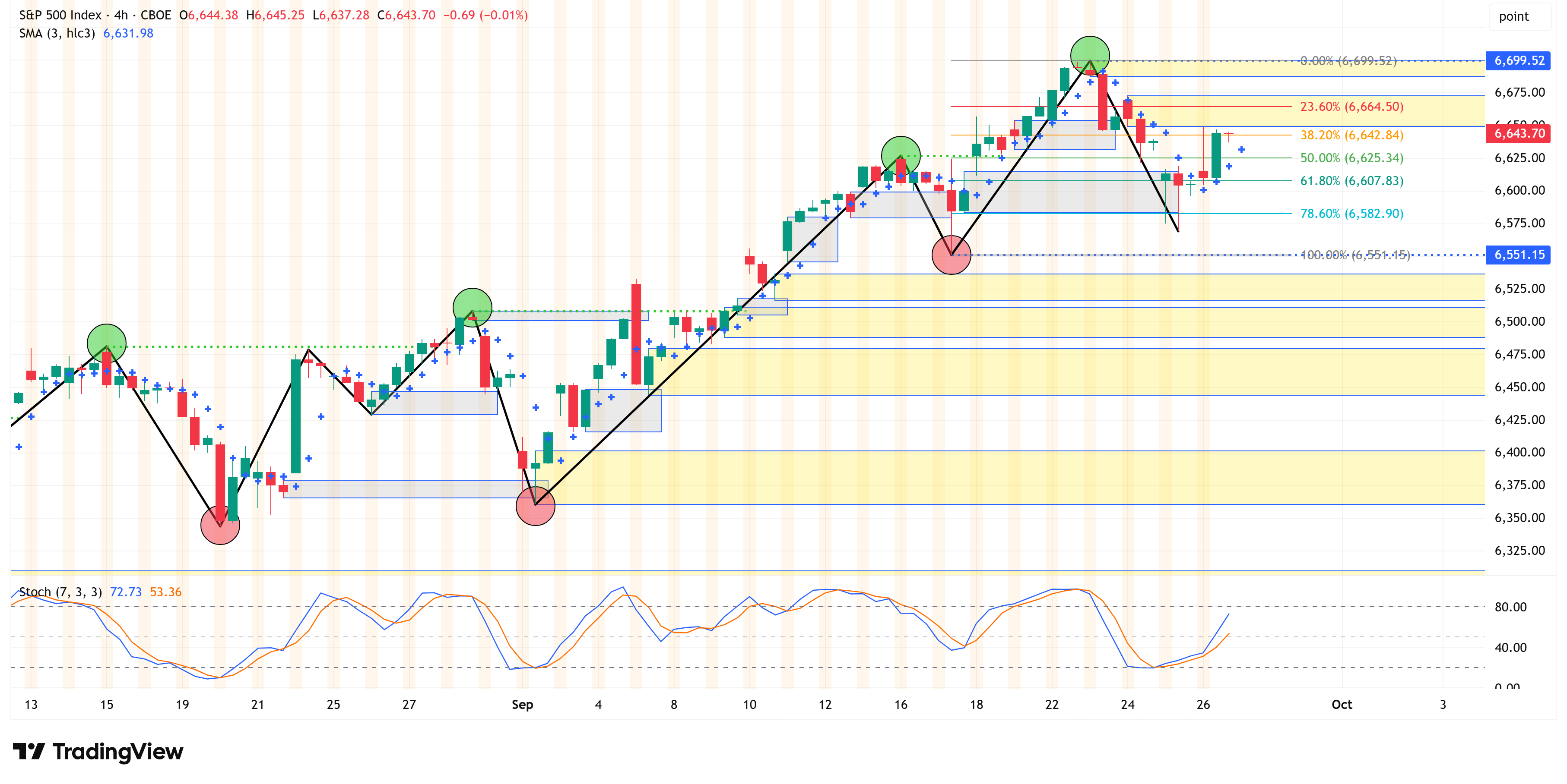
4-Hour Chart
You may recall from last week’s newsletter that we highlighted the 6,551 level and suggested that a 4-hour close below that might be our first sign of some consolidation.
Well, we didn’t get a 4-hour close below that level; instead, we got a nice pullback right to the 78.6% Fibonacci level and then started to push higher.
Translation: the 4-hour chart remains in an uptrend, and 6,551 remains our key level to watch for this week.
The following sections are for paid subscribers only.
In these sections, we will discuss our proprietary:
S&P 500 Fair Value Model
This model provides a guide for:
a) How far the S&P 500 could decline in the next recession.
b) When to get back into the market after it has declined.
The Market Map - Extended Analysis
We will call out specific price objectives (up trends vs. down trends, targets, stop losses, etc.) on the following:
Major US Indices
11 Major US Equity Sectors
US Treasuries
Currencies
Commodities
Fixed Income
If you would like exclusive access to the proprietary data below, be sure to take advantage of our “The Market Map Pro ($99/Year)” special offer!
Keep reading with a 7-day free trial
Subscribe to Skillman Grove Research to keep reading this post and get 7 days of free access to the full post archives.