Weekly Chart Review
Un-Inversion
Last week was a tough week for equities. The S&P 500 was lower by -4.25% and if you scroll down to our “Asset Class Review” section, you’ll notice that 77% of the US Equities we track moved from “Bullish” to “Bearish” on our short-term charts.
If there was a saving grace it is that while the downward moves were fairly extreme, they were not extreme enough, except in one case - US Small Cap 600 - Growth, to trip our medium-term charts from “Bullish” to “Bearish”.
Last week we saw both the ADP Employment Report and the Non-Farms Payroll Report come in below expectations.
Possibly even more noteworthy is what happened with the US Treasury yield curve, and specifically, the US Treasury 2-year vs. the US Treasury 10-year curve (aka the “2/10 curve”).
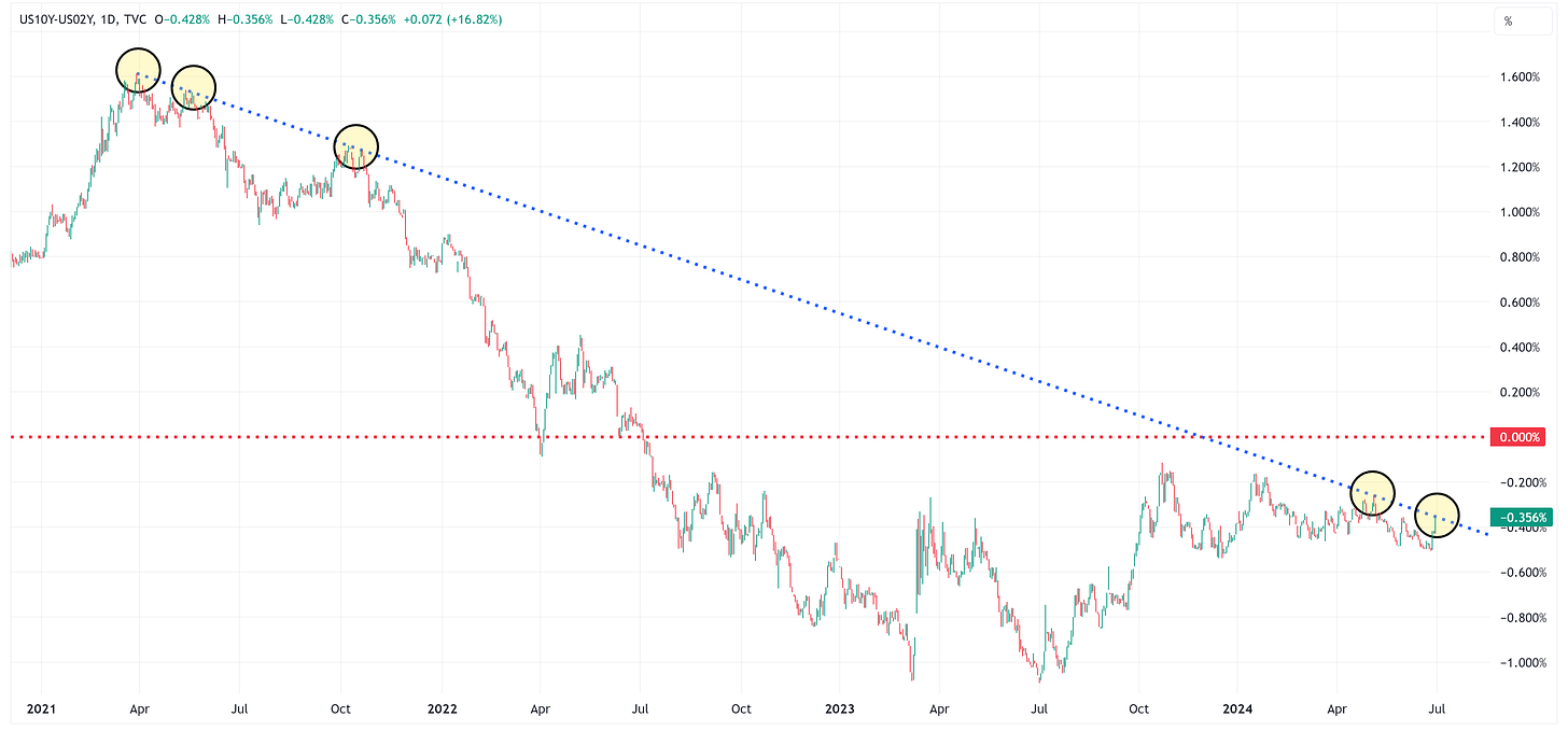
In the July 1st newsletter (here), I provided the following chart…
And made the following comment…
“I have said a number of times in this newsletter that you don’t get a recession when the yield curve inverts, it’s when the yield curve un-inverts that you get a recession.
A key barometer in that analysis is the 2/10 curve.
In the chart (above), I have placed a red horizontal line at 0.00%. When the 2/10 curve moves above that line, a recession will not be far off (or we may already be in one at that point).
Note that Friday’s close of the 2/10 curve was exactly in line with a trendline connecting four other such instances going back to early 2021.
Will the 2/10 curve bounce off that trend line and head lower or is this the beginning of the march towards 0.00%?”
The point I was trying to make at that time was that we were at a make-or-break moment for the 2/10 curve with two very distinct potential outcomes:
Scenario A - The 2/10 curve bounces off resistance, heads lower, and we maintain the “status quo” we’ve known for the better part of the last three years.
Scenario B - The 2/10 curve breaks through resistance, heads up to (and through) the 0.00% threshold, and then we would have yet another reason to believe we are at or near the beginning of a recession.
If we fast forward to Friday’s close, here is the same chart but zoomed in.
Note that the 2/10 curve has now officially closed above the 0.00% threshold. Will it immediately reverse course this week or continue higher?
Why does this matter?
In the chart below, you can see that in the last four recessions (and virtually every other previous recession), after the 2/10 curve un-inverts, there is a recession.
The time from un-inversion to recession has varied from 3 - 7 months (or 5.75 months on average) but a recession has followed in every case.
Blue Vertical Bars = Period from un-version to recession.
Red Vertical Bars = Recessionary period in the US.
Digging Deeper
Let’s take this a step further and zoom in on the periods where the un-inversion and subsequent recession occurred and see if there is anything we can learn.
Keep reading with a 7-day free trial
Subscribe to Skillman Grove Research to keep reading this post and get 7 days of free access to the full post archives.


