A couple of noteworthy items to mention from last week before we jump into a deeper dive of the S&P 500 charts.
First, on Friday, Moody's Investors Service (Moody's) changed the outlook on the Government of United States of America's (US) ratings to negative from stable. This would suggest that Moody’s is contemplating downgrading the credit rating of the US and thereby removing its “triple A” status.
Recall, that on August 1st, Fitch downgraded to US to AA+ from AAA and S&P made a similar move to AA+ in 2011. If Moody’s downgrades the US, to my knowledge, this would be the first time that the US did not have a “triple A” rating at any of the three major credit rating agencies (S&P, Moody’s, and Fitch).
Yes, I realize that DBRS still has the US at AAA, but let’s face it, S&P and Moody’s are the most important, Fitch is third and DBRS is a distant fourth in importance rankings.
Moody’s made the following statement with regard to their reasoning behind the potential downgrade:
“The key driver of the outlook change to negative is Moody's assessment that the downside risks to the US' fiscal strength have increased and may no longer be fully offset by the sovereign's unique credit strengths. In the context of higher interest rates, without effective fiscal policy measures to reduce government spending or increase revenues, Moody's expects that the US' fiscal deficits will remain very large, significantly weakening debt affordability. Continued political polarization within US Congress raises the risk that successive governments will not be able to reach consensus on a fiscal plan to slow the decline in debt affordability.”
While this is a net negative, candidly, I don’t believe it will be a market-moving event. Moody’s isn’t pointing out anything that isn’t already known and the US continues to benefit (right or wrong) from the perception that we’re still “the best house in a bad neighborhood”.
With that said, it would be to our benefit to get our fiscal house in order, but that doesn’t seem to be a high priority for anyone in Washington at this time. My hope is that that view changes over time.
Second, FOMC Chairman, Jerome Powell, gave a speech on Thursday where he appeared to walk back some of what the market took to be “dovish talk” after the conclusion of their most recent FOMC meeting on November 1st.
J. Powell made the following statements in his speech on Thursday:
“The Federal Open Market Committee is committed to achieving a stance of monetary policy that is sufficiently restrictive to bring inflation down to 2 percent over time; we are not confident that we have achieved such a stance…”
He followed with:
“If it becomes appropriate to tighten policy further, we will not hesitate to do so…”
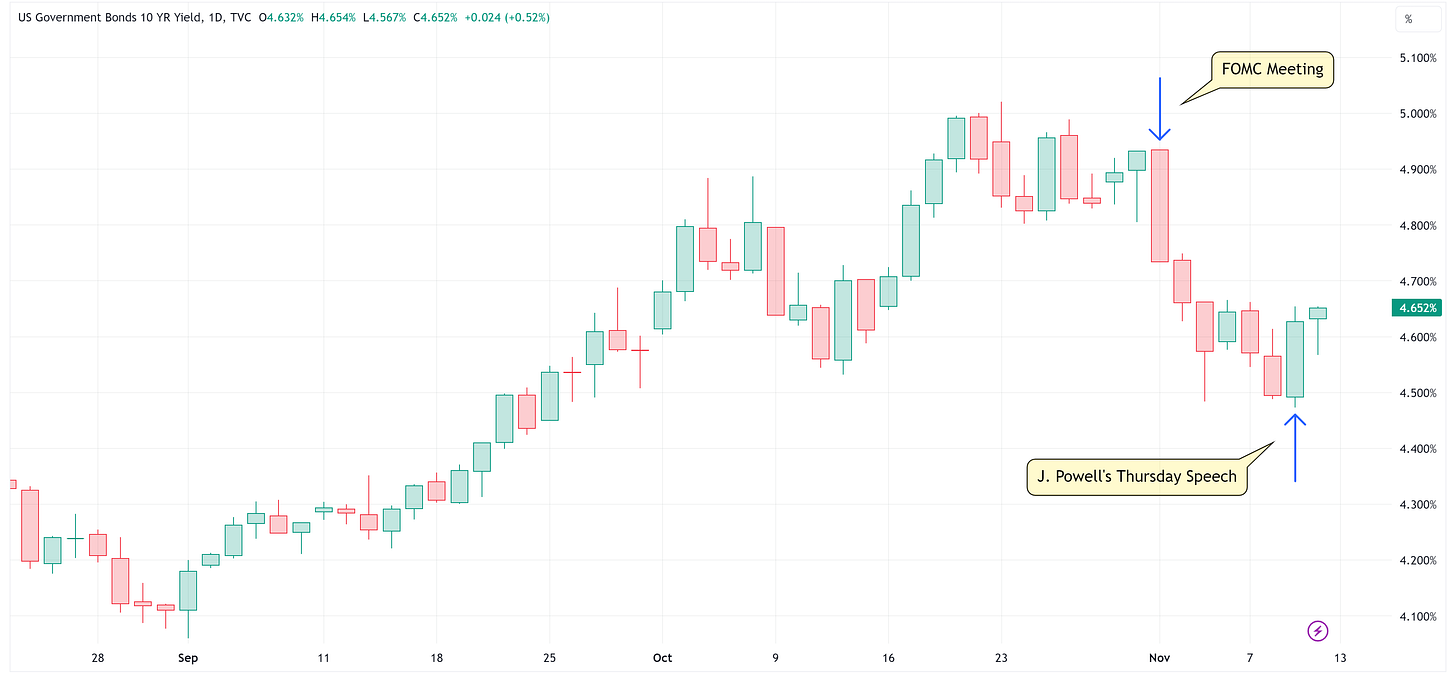
Here is a chart of the yield on the 10-Year US Treasury.
Note the sharp move lower in yields after the FOMC meeting on November 1st and the sharp move higher in yields on Thursday after Powell’s meeting.
I’m not convinced the FOMC is going to raise rates again in this cycle but I think J. Powell and team don’t want to see the market pricing in cuts before they are ready to make said cuts.
Remember, if the Fed “allows” rates to fall too low, that will lead to an “easing” of financial conditions and the FOMC fears that if that happens, we could see inflation rear its ugly head again.
It will be interesting to see if this develops into an “acceptable” trading range for the FOMC.
For instance, if the 10-year starts pushing the 5.00% threshold again, do they come back out with the narrative of “the move in yields has done a lot of the work for us…”
Conversely, if rates start to fall below 4.50%, do they repeat the narrative from Thursday of “on second thought, we might not be done with rate hikes…”
Only time will tell but clearly, the Fed didn’t like rates falling at the pace they were falling post the November 1st FOMC meeting.
S&P 500 - Inflection Point
I’d like to take a more detailed look at the S&P 500 charts this week.
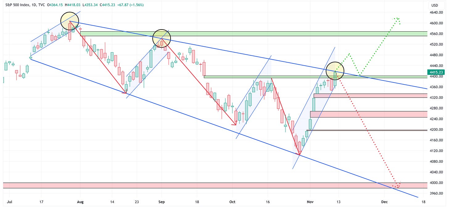
We’ll start by looking at the daily chart which I have posted below.
Since the YTD high on July 27th, the S&P 500 has been in a downtrend with lower lows and lower highs.
Friday’s price action not only closed a previously mentioned “overhead gap”, but also put the S&P 500 perfectly in line with the trendline connecting the “lower highs” (see the yellow circles).
I believe the S&P 500 is at an inflection point.
Bullish Path = A continuation higher from here where the S&P 500 not only breaks the trendline but then retests the trendline thus allowing it to become support and then marching higher from there to take out the next “overhead gap”.
Bearish Path = The trendline becomes resistance and we see the S&P 500 head lower creating a new “lower low” and potentially taking out the multiple gaps that need to be filled on the way to the 4,000 level.
Unfortunately, I can’t tell you which one of these will ultimately play out, I’m simply painting the picture as I see it right now.
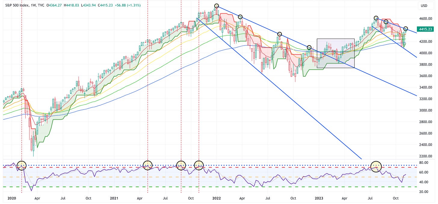
With that said, let’s zoom out and look at the weekly chart of the S&P 500.
When we look at the weekly chart above, notice that we had a very similar setup during 2022 except that we had four touches of the upper trendline before finally breaking through and moving on to “higher highs”.
If that were to happen this time, it would suggest that we’d need one more “lower low” before eclipsing the trendline to the high side.
Further, note the purple shaded box and specifically that once the trendline was broken, the S&P 500 came back down to test it and established it as support before taking the next leg higher.
If you’re a bull, I’d wait for a break of the trendline and a retest of the trendline before potentially getting long again.
If you’re a bear, you may get a chance to ride this thing lower and establish a new “lower low” but the trendline needs to prove to be resistance.
As I said above, I have no idea which way this will go, but if nothing else, I think it’s fair to say we’re at an inflection point that will probably reveal itself this week.
Absolute Value & Relative Value
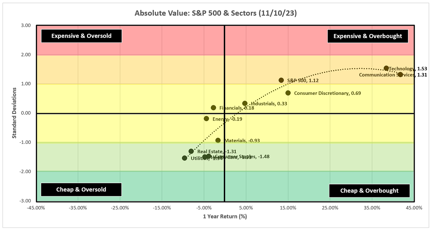
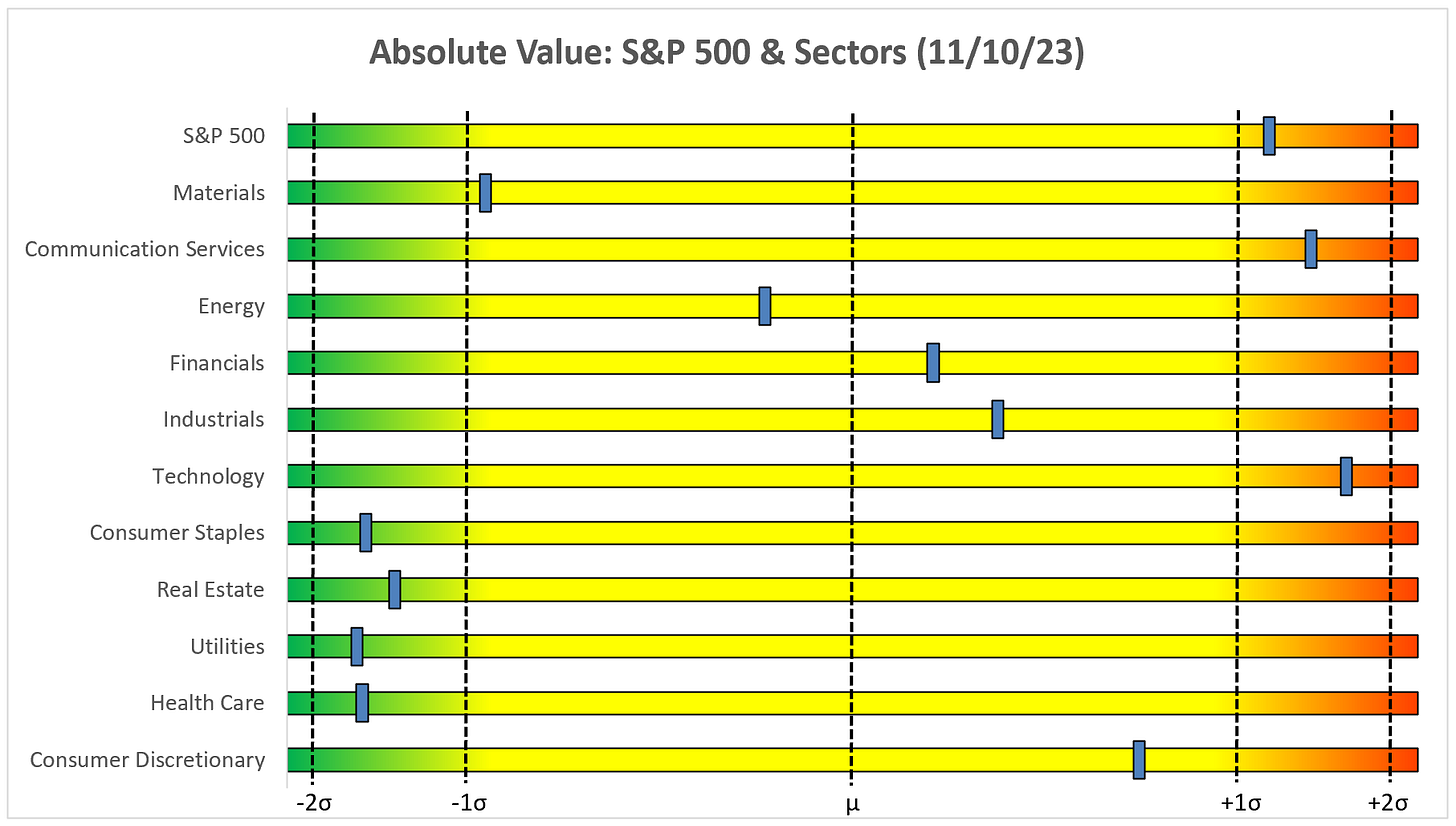
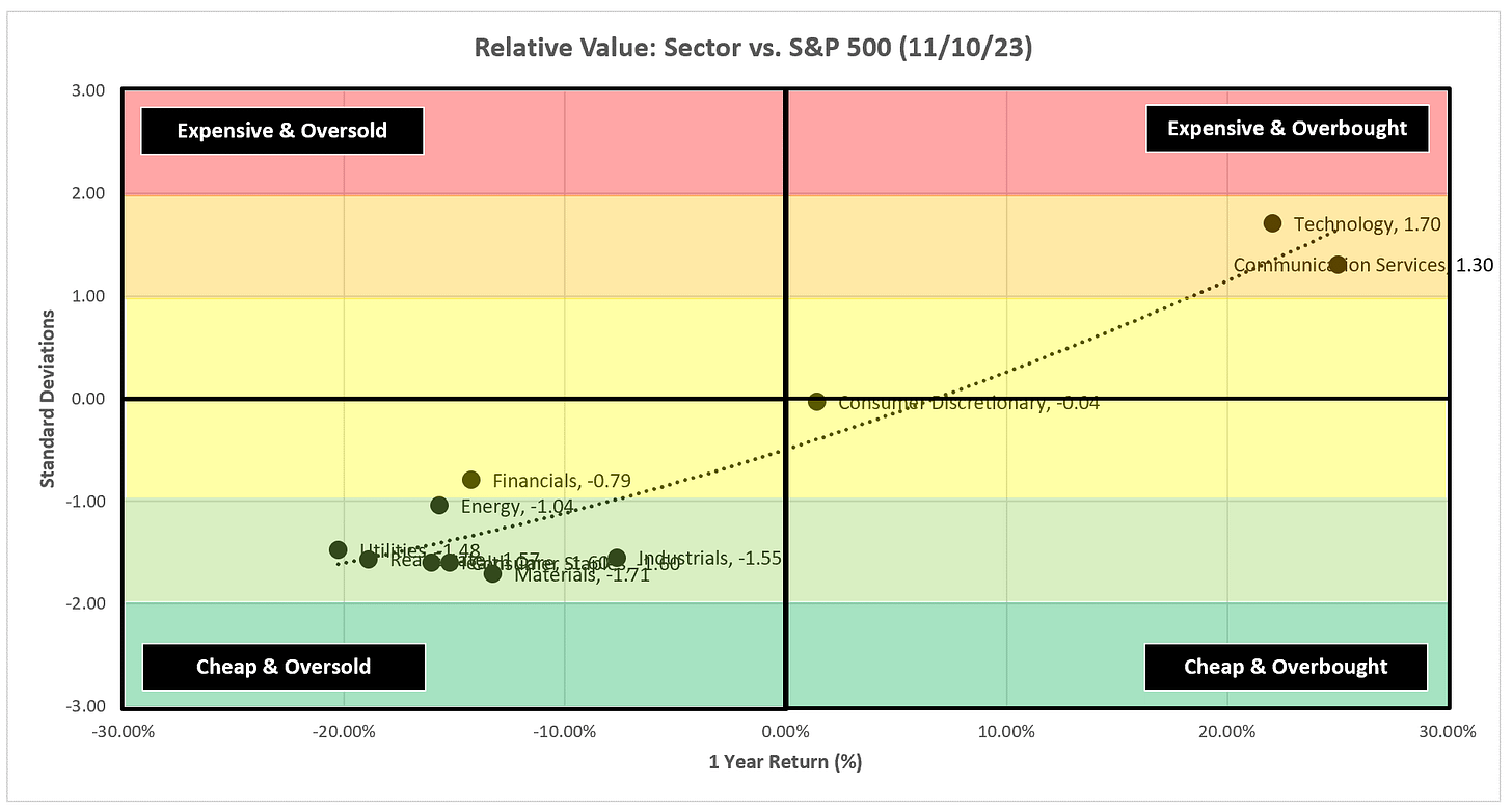
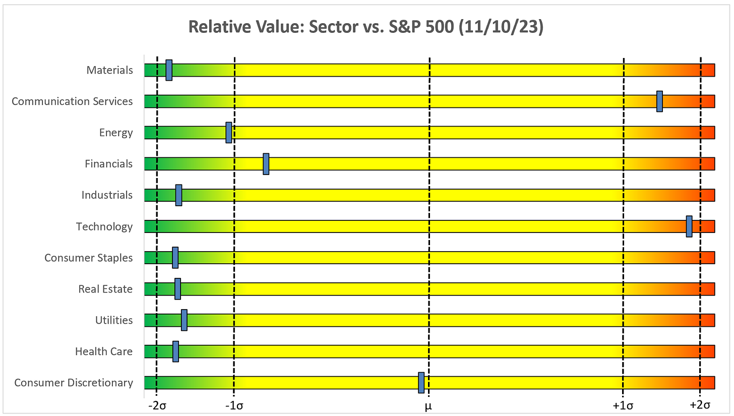
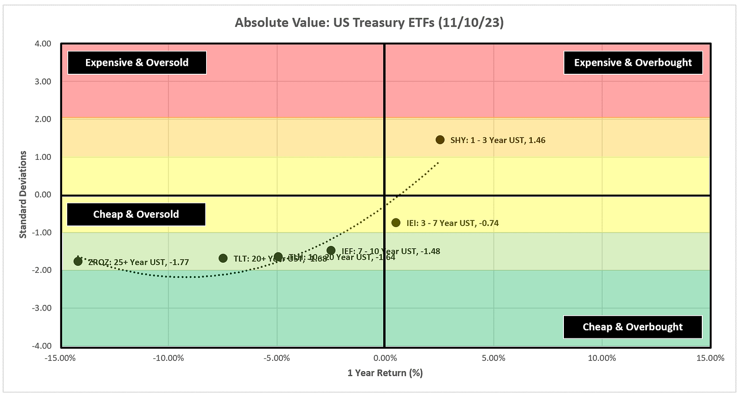
Here are the weekly Absolute & Relative Value charts.
Absolute Value - Equities
Relative Value - Equities
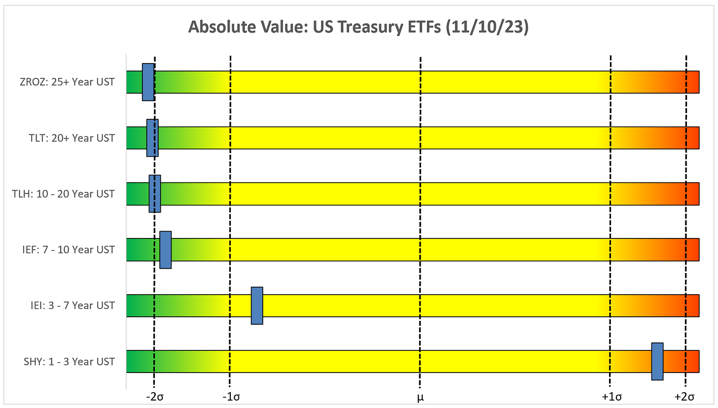
Absolute Value - US Treasuries
Chart Review
Remember, the goal with these charts is simply to stay on the “correct” side of the trailing stop loss as these trends often last for several weeks or months.
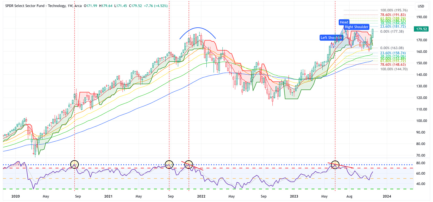
Technology
Two incredible back-to-back weeks for XLK. As I’ve said several times before, last week was week one of crossing “up-and-through” the trailing stop loss, I’d like to see it have a follow-through confirmation week this week.
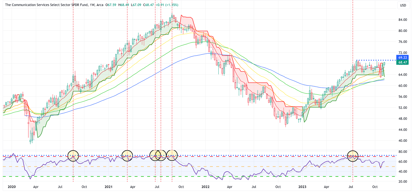
Communication Services
XLC needs to cross above 69.22. If it does, it may be off to the races again.
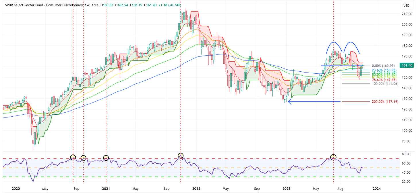
Consumer Discretionary
Double-top in place, last week was a testing of the neckline, I wouldn’t be surprised to see a move lower from here.
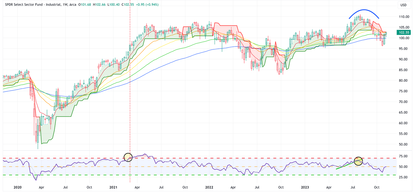
Industrials
XLI took it right up to the trailing stop loss. Can it break through this week?
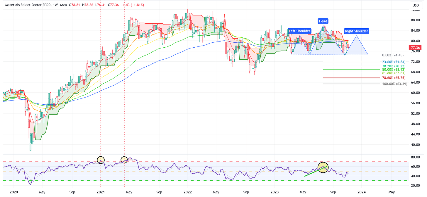
Materials
Is XLB still trying to form the right should of the proposed H&S pattern? Regardless, it remains below the trailing stop loss therefore I am biased to the downside.
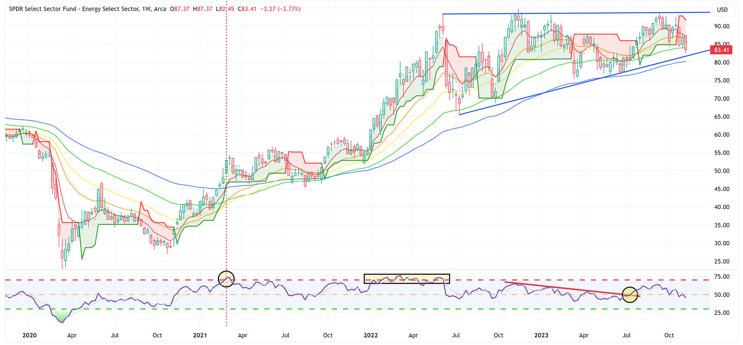
Energy
A tough few weeks for XLE. It remains in this extended wedge pattern. It’s going to break one way or the other. Given where it is relative to the trailing stop loss and the RSI, I am biased to the low side at this point.
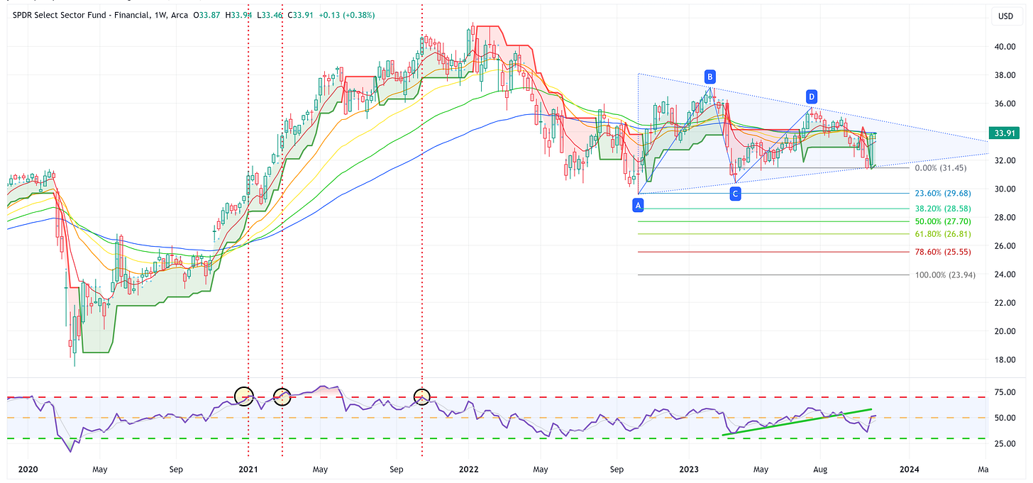
Financials
XLF refuses to break the wedge pattern but it will at some point!
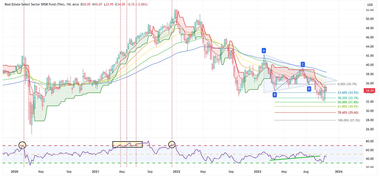
Real Estate
I suggested last week that we might see a down week for XLRE given the huge ramp the week before and that’s exactly what we got. Also, worth noting how even with the big week a couple of weeks ago, it remains below the trailing stop loss.
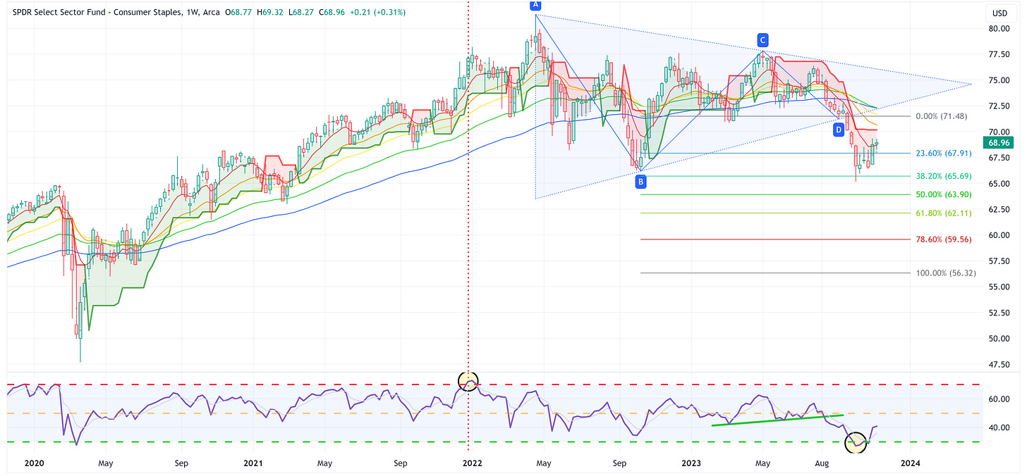
Consumer Staples
XLP has been trying to stage a rally over the last couple of weeks from very oversold conditions. We need to see it “flip” the trailing stop loss to think this rally is for real.
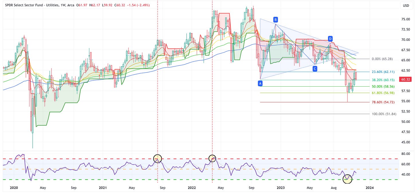
Utilities
Similar to XLRE, XLU saw some profit-taking last week after a huge ramp the week before.
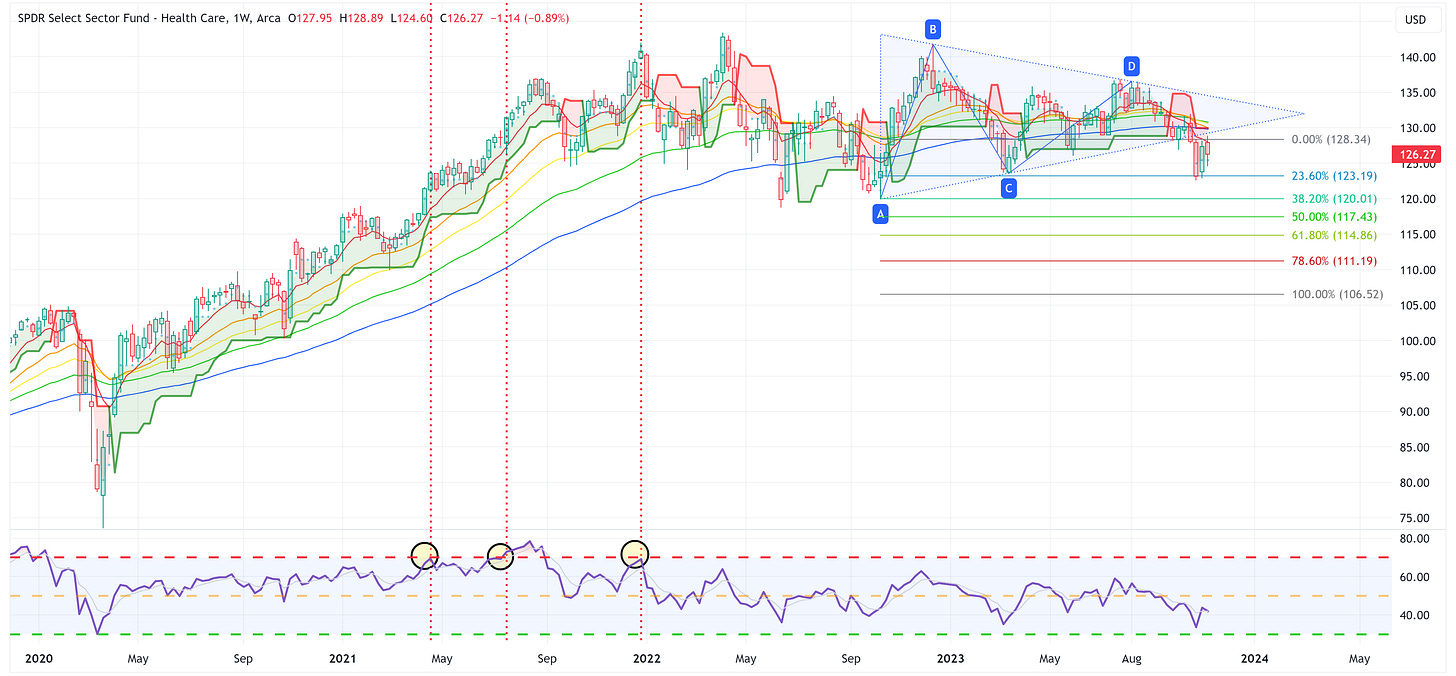
Health Care
XLV is trying to test the lower bound of the triangle pattern. That will likely prove to be resistance.
US Treasury Review
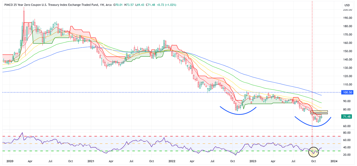
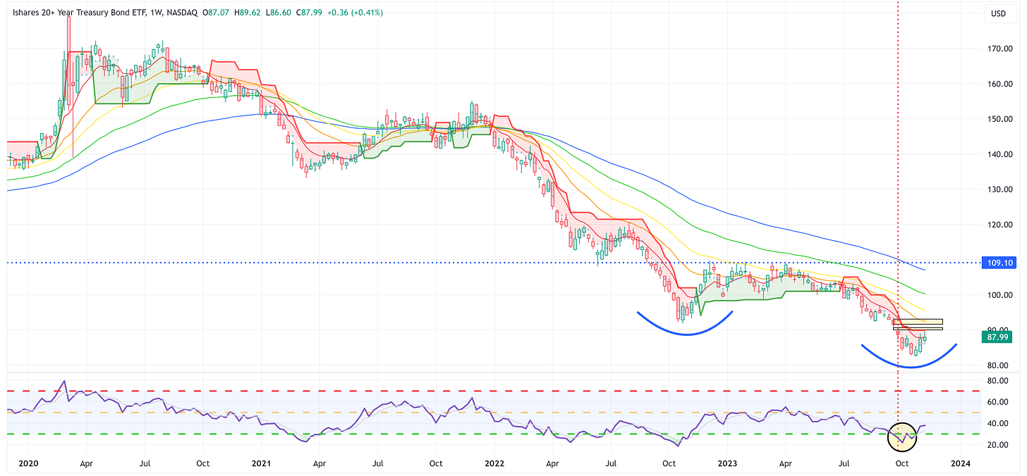
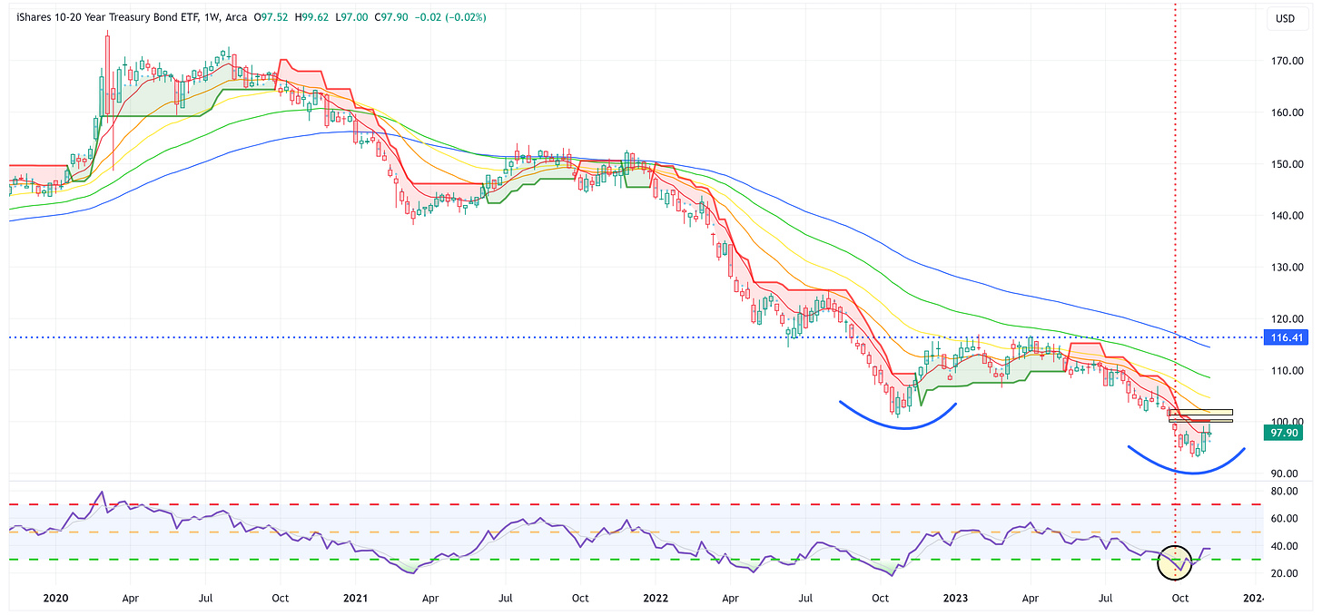
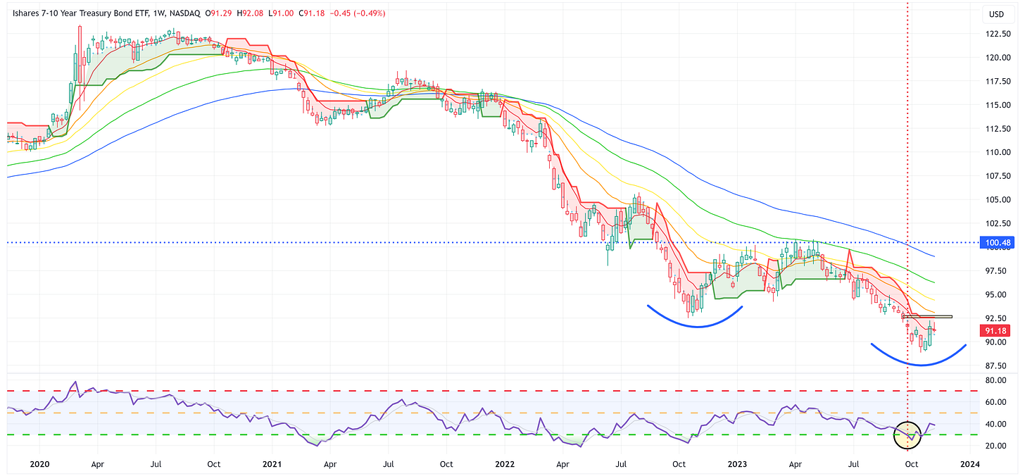
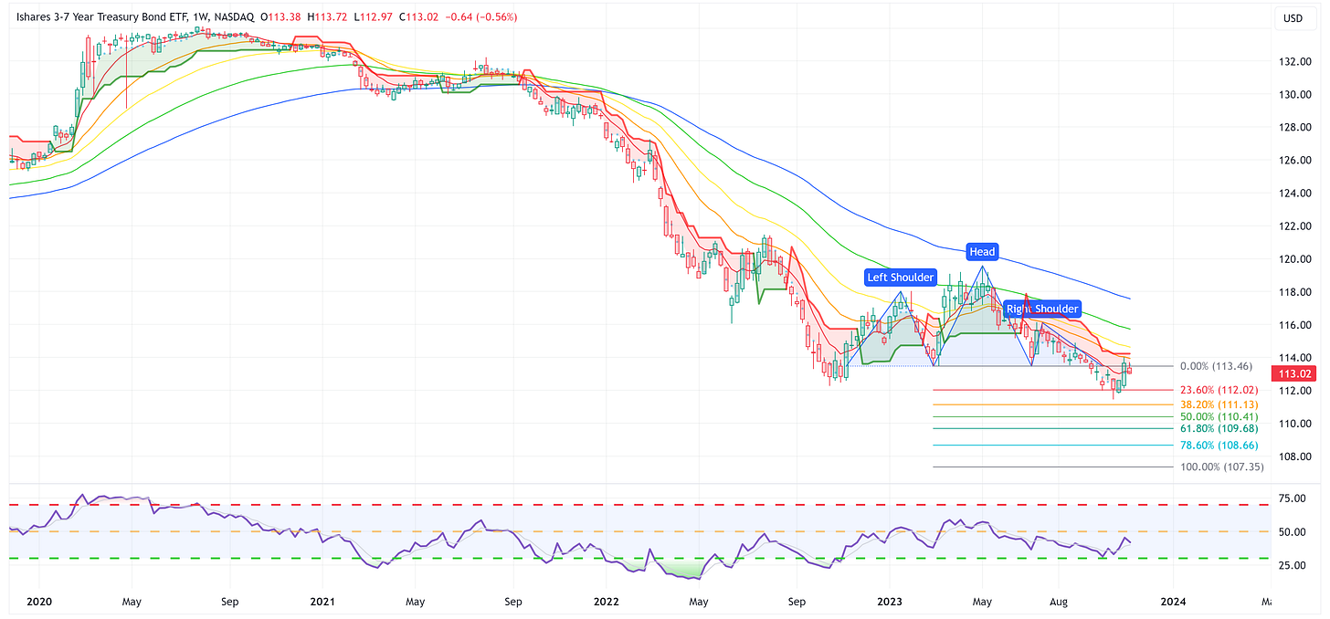
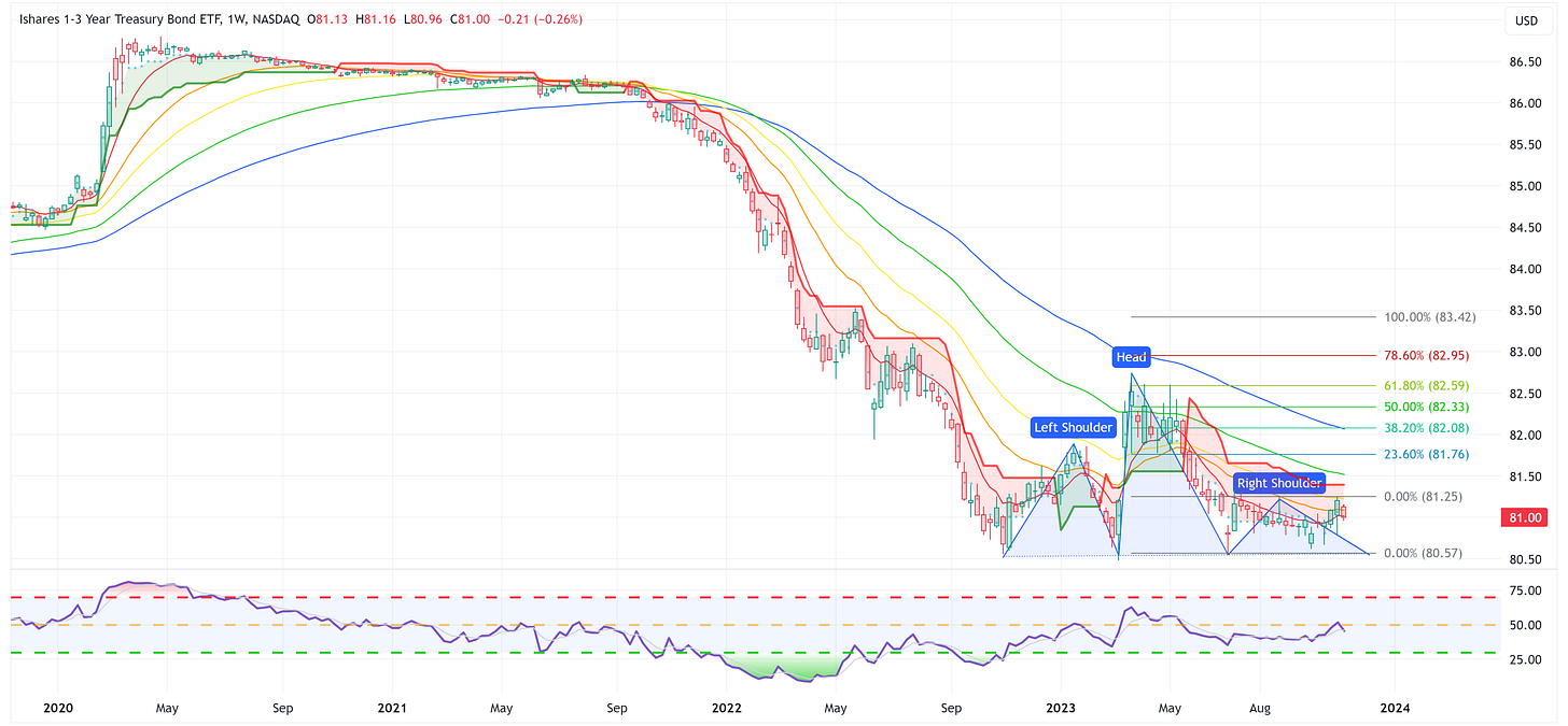
For the most part, the Treasury products below have had a good couple of weeks. The key going forward will be how much J. Powell and team do to try and talk yields higher like he did on Thursday of last week.
If he continues (and succeeds) that is a net negative in the short term for the following ETFs. However, I still believe we’re at the point in the cycle where you want to have some duration in your portfolio because there are more cuts than hikes coming for the remainder of this cycle in my opinion.
ZROZ: 25+ Year UST
TLT: 20+ Year UST
TLH: 10 - 20 Year UST
IEF: 7 - 10 Year UST
IEI: 3 - 7 Year UST
SHY: 1 - 3 Year UST
Average Investor Allocation to Equities - Daily Chart Model
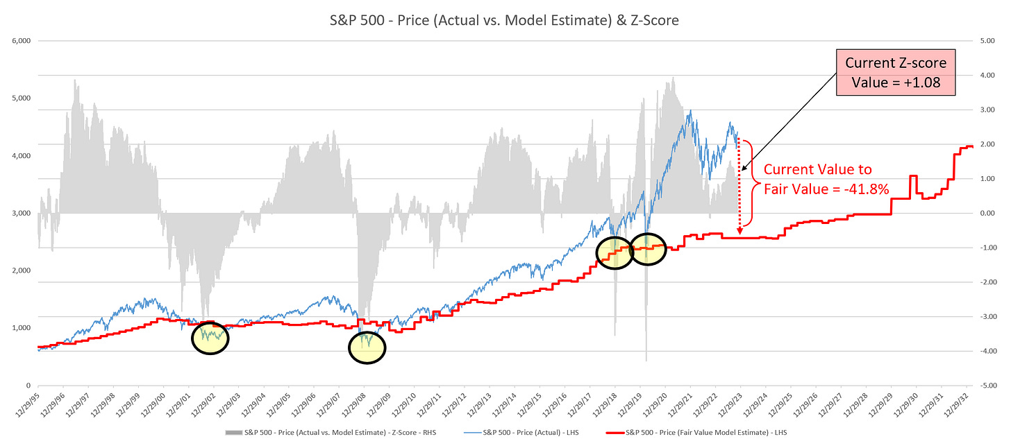
I will conclude this week with a snapshot of the daily version of my “Average Investor Allocation to Equities” model.
How to use this chart.
The blue line is the S&P 500.
The red line is my “fair value” model for the S&P 500.
“Current Value to Fair Value” is the amount the S&P 500 would “need” to decline from its current level to the “fair value” level.
“Current Z-Score Value” is a representation (in standard deviation terms) of the delta between the current price of the S&P 500 and the “fair value” price.
Historically, major corrections do not end until the Z-Score falls to somewhere between -3.0 & -4.0. The yellow circles denote the price of the S&P 500 the last four times this happened. Note where the price was at these points relative to the “fair value” line.
If you have found value in reading this piece, please consider sharing it with a friend or a colleague and even better, become one of our tens of thousands of subscribers!
Let’s make it a great week!


There is much uncertainty ahead. I imagine we see a higher S&P going into year's end with window dressing and perhaps a recession hits March/April 2024 as many predict. Thank you Jim,