Weekly Chart Review
Triangulating on when the next recession might begin.
In case you missed it, the S&P 500 had a tremendous week last week as it was up +5.85%! This came largely on the heels of an equally tremendous decline in longer-term US Treasury yields.
For reference, the yield on the UST 10-year opened the week at 4.88% and closed the week at 4.57%, and in between, reached a high of 4.93% and a low of 4.48%. Talk about volatility!
The US Treasury move last week was driven in large part by a) Wednesday’s FOMC meeting where the FOMC did not raise rates (as was expected), b) the view by many market participants that Chairman Powell’s press conference “leaned dovish”, and c) the weaker than expected Non-Farm Payrolls release on Friday.
The other noteworthy item from last week was Friday’s release of the Unemployment report which showed that the Unemployment Rate increased to 3.9% from 3.8% the previous month.
The increase in the Unemployment Rate sparked a lot of chatter suggesting that the “Sahm Rule” or the “Sahm Recession Indicator” had been triggered.
The Sahm Recession Indicator (SRI) was created by former Federal Reserve and Council of Economic Advisors economist, Claudia Sahm. It is used to determine the beginning of a recession and is defined as follows:
“Sahm Recession Indicator signals the start of a recession when the three-month moving average of the national unemployment rate (U3) rises by 0.50 percentage points or more relative to its low during the previous 12 months.”
Let’s start with the facts.
The Sahm Recession Indicator was not triggered by last Friday’s Unemployment report as the three-month moving average (3.8%) is not currently 0.5% above the relative low (3.4%) during the previous 12 months.
What would it take for the Sahm Recession Indicator to trigger?
The SRI would trigger next month if the Unemployment Rate increased to 4.0% as this would move the three-month moving average to 3.9% which is 0.5% above the relative low (3.4%) during the previous 12 months.
Should we even care about the SRI and has it been accurate in the past?
To answer this, I recreated the Sahm Recession Indicator on the following chart.
The SRI has been triggered 10 times over the last 50+ years. These instances are noted on the chart above by the black vertical dotted lines.
The red vertical shaded bars are recessionary periods in the US. Note that 8 of the 10 SRI triggers have been directly associated with a US recession. This would suggest that the SRI has an 80% accuracy rate.
Couple the above analysis with my previous work (go here for the full analysis) which shows that once the Unemployment Rate crosses "up-and-through” its 18-month moving average, that is your “warning signal” that a recession is imminent.
You can see the instances where the Unemployment Rate crossed “up-and-through” its 18-month moving average on the following chart highlighted by the black vertical dotted lines and the yellow circles.
The most recent “warning signal” occurred in May 2023.
My analysis shows that after the “warning signal” has been triggered, a recession starts, on average, 3.25 months later or historically, a maximum of 9 months later.
The following table summarizes my results.
As noted above, the “warning signal” was triggered in May 2023. This means that we’re 6 months into the warning. The historical max, 9 months, would put us at a recession starting in February 2024.
Couple this with the Sahm Recession Indicator, which could trigger as early as next month, and we’ve got a couple of different metrics pointing to the fact that we could have a recession beginning sometime in the fourth quarter of 2023 or the first quarter of 2024.
What does this mean for the S&P 500?
Looking at the table above, the average decline from when the “warning signal” is triggered to the S&P 500’s trough is -32.5%.
You can see on the chart below this puts the S&P 500 at approximately 2,821 which ironically, or maybe not so ironically, is in line with my S&P 500 fair value analysis that I include at the end of this piece each week.
I know everyone is excited about the almost 6% increase in the S&P 500 last week but you need to look through this one week to the underlying details that suggest the economy is weakening more than the S&P 500’s move last week would suggest.
My sense is that the S&P 500’s rally last week was directly related to the move in US Treasuries. If US Treasury yields continue to move lower, which they may, the S&P 500 could continue to rally in the short term.
With that said, there will come a point where the market wakes up and realizes that US Treasury yields are declining not because “inflation is finally under control” but because US economic growth is declining. At that point, US equities will begin to decline. Unfortunately, I can’t tell you if that will happen in two weeks or two months but my bet is that it will happen.
Lastly, remember that a recession is never “called” in real-time by the National Bureau of Economic Research (NBER). Instead, they typically determine that a recession began many months, and often several quarters, after it already began (and sometimes already ended) so you need to take precautionary measures in advance of said declaration.
Absolute Value & Relative Value
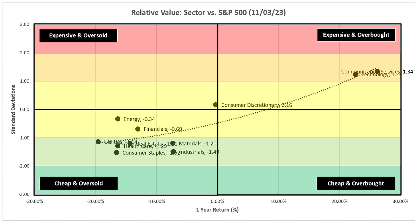
Here are the weekly Absolute & Relative Value charts.
Absolute Value - Equities
Relative Value - Equities
Absolute Value - US Treasuries
Chart Review
Remember, the goal with these charts is simply to stay on the “correct” side of the trailing stop loss as these trends often last for several weeks or months.
One of the reoccurring themes last week was that many of the sectors had incredible rallies, yet, despite the rally, they were unable to flip the trailing stop loss from negative to positive.
I would tend to fade those rallies until they can prove that they can not only flip the trailing stop loss from negative to positive but also produce a follow-through confirmation the following week.
S&P 500 Index
In the chart above, we’re looking at a daily chart of the S&P 500.
The violent move higher last week created three new gaps below Friday’s closing price that need to be filled.
In the chart below, we’re looking at a weekly chart of the S&P 500.
While the S&P 500 did flip to the positive side of the trailing stop loss last week, I would give it a week to confirm the move before believing that we’re setting up for another bull run.
Technology
Even after a +6.60% move last week, XLK still couldn’t flip the trailing stop loss.
Communication Services
Similar to XLK, but XLC had a +7.09% return last week and it couldn’t flip the trailing stop loss.
Consumer Discretionary
XLY made it to the double top neckline and couldn’t go any further and continues to remain on the negative side of the trailing stop loss.
Industrials
XLI rallied, but not enough to eclipse the trailing stop loss.
Materials
Same song for XLB.
Energy
Candidly, I’ve been bullish energy, and last week I suggested that you needed to give it a week to confirm its move below the trailing stop loss. That has now happened and it was unable to get above the 8EMA, I think you have to view this as a negative outcome for XLE.
Further, if my thesis about a potential recession being on the horizon is correct, that should lead to slower growth and falling demand for the energy complex.
Financials
Similar to other sectors noted above, XLF “flipped” the trailing stop loss but ran into resistance at the moving averages. Give it a week to prove itself.
Real Estate
An +8.53% move and XLRE couldn’t flip the trailing stop loss. I have to believe people will use this rally to lighten up on XLRE.
Consumer Staples
Same song for XLP…a nice rally but still can’t get to the positive side of the trailing stop loss.
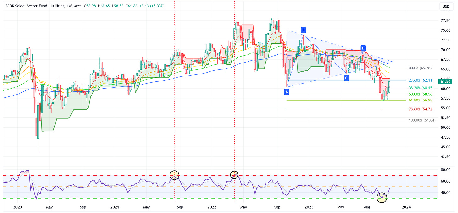
Utilities
XLU touched the trailing stop loss and got rejected lower.
Health Care
A nice rally but still can’t eclipse the trailing stop loss.
US Treasury Review
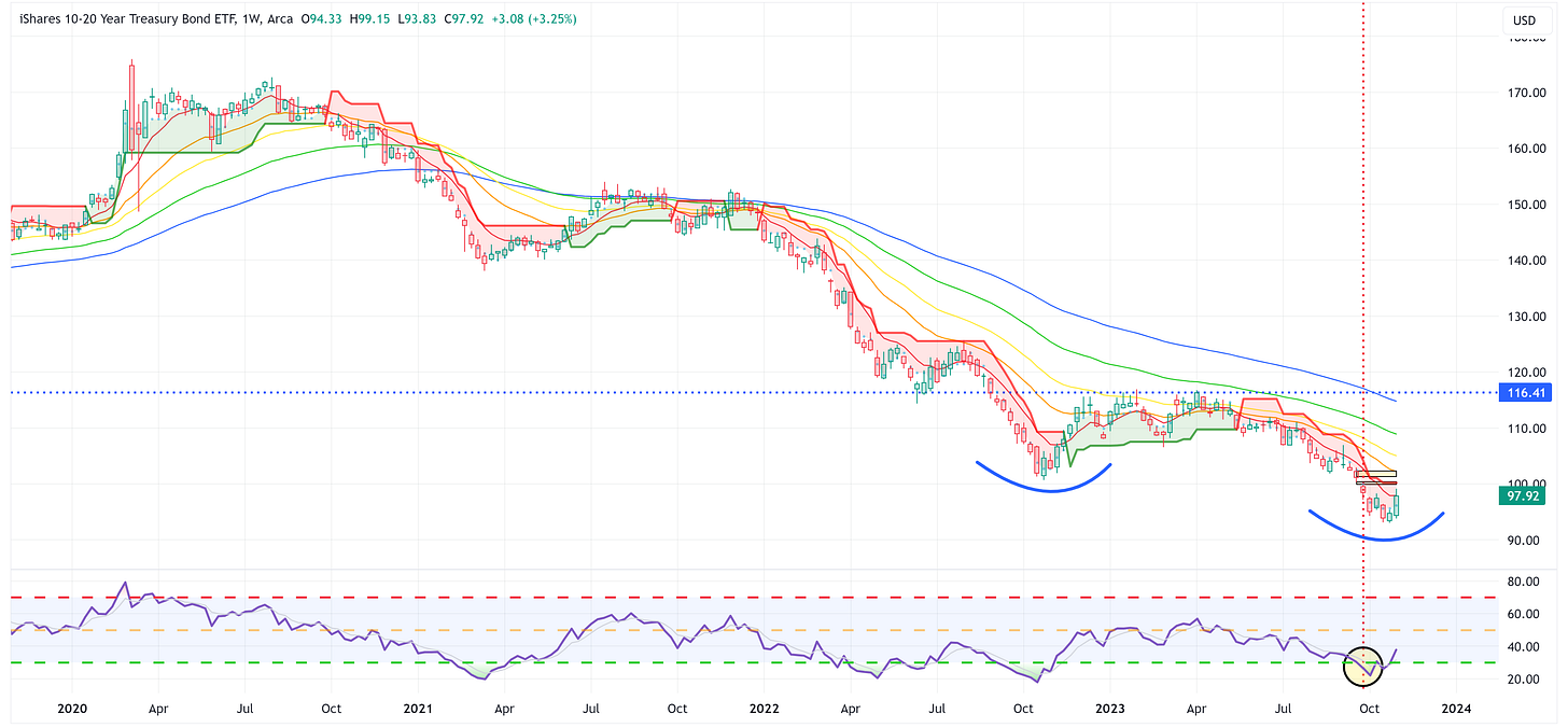
Last week I suggested that we may be in the process of creating the “Head” of an inverse Head & Shoulders pattern for ZROZ, TLT, TLH, and IEF. I think it’s still too early to formally make that call but the rally last week was nice.
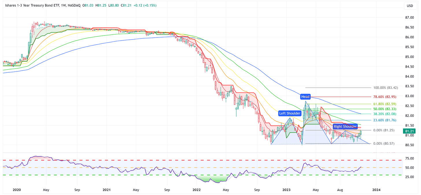
On the shorter end of the curve, IEI and SHY look like they believe the next move by the FOMC will be a cut and hence their rallies last week.
ZROZ: 25+ Year UST
TLT: 20+ Year UST
TLH: 10 - 20 Year UST
IEF: 7 - 10 Year UST
IEI: 3 - 7 Year UST
SHY: 1 - 3 Year UST
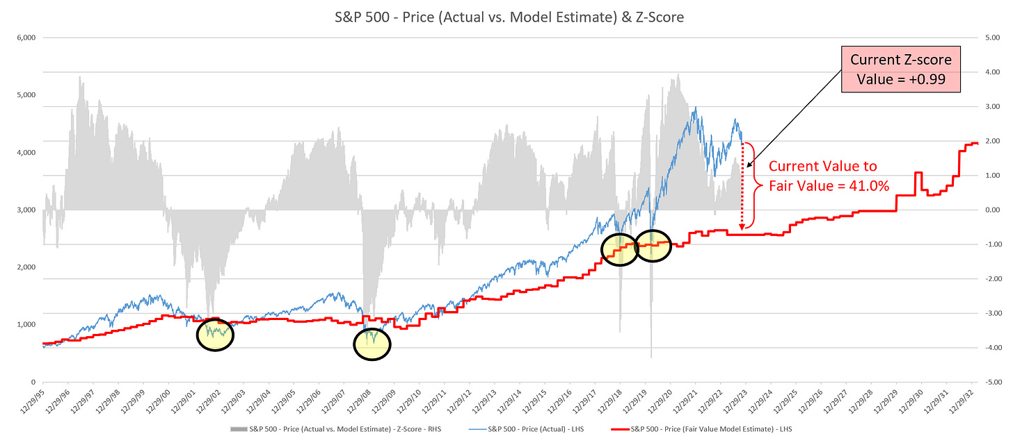
Average Investor Allocation to Equities - Daily Chart Model
I will conclude this week with a snapshot of the daily version of my “Average Investor Allocation to Equities” model.
How to use this chart.
The blue line is the S&P 500.
The red line is my “fair value” model for the S&P 500.
“Current Value to Fair Value” is the amount the S&P 500 would “need” to decline from its current level to the “fair value” level.
“Current Z-Score Value” is a representation (in standard deviation terms) of the delta between the current price of the S&P 500 and the “fair value” price.
Historically, major corrections do not end until the Z-Score falls to somewhere between -3.0 & -4.0. The yellow circles denote the price of the S&P 500 the last four times this happened. Note where the price was at these points relative to the “fair value” line.
Let’s make it a great week and if you’ve enjoyed reading these pieces, please feel free to share it with a friend/colleague by clicking the “Share Jim’s Substack” button below, or subscribe by clicking the “Subscribe now” button below.








excellent analysis with a lot of^pragmatism; maybe we won't stall because of the end-of-year seasonality; but if not, we're indeed gearing up for an air pocket in early 2024.
Great stuff Jim as always. I would prefer the market to tank and long term treasuries rally please :)
I appreciate your work.