Happy Monday! Let’s get right to it.
Leaders vs. Laggards
Last week, I made the point that on a YTD basis, the market has been driven primarily by the returns of the Communication Services, Technology, and Consumer Discretionary sectors.
Further, I noted that if we add the Industrials and Materials sectors, we have a clear delineation between the “leaders” and “laggards” on a YTD basis.
Here is the same chart from last week but updated through 08/04/23. So far, the “leaders” have returned an average of +26.3% on a YTD basis while the “laggards” have returned an average of -0.3% on a YTD basis.
I then made the point that when we see the market begin to turn, we will likely see flows out of the “leaders” and into “laggards”. Primarily because several of the YTD “laggards” (Consumer Staples, Health Care, and Utilities) are typically associated with being the more “defensive” sectors and where people tend to like to camp out in times of trouble.
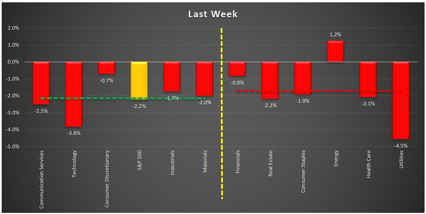
We got our first taste of this three weeks ago when the “laggards” dramatically outperformed the “leaders” on a weekly basis. I said then that we would need to continue to monitor this as we move forward.
Last week, the “laggards” outperformed the “leaders” again, but candidly, not by much.
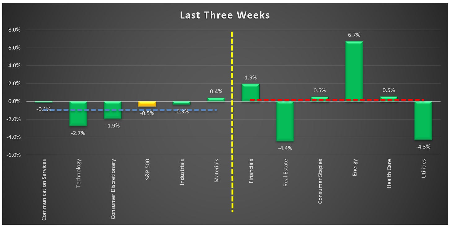
If we look at the last three weeks combined, we find that only one of the “leaders” has had a positive return (Materials +0.4%), while 4 of the 6 “laggards” have had positive returns and collectively the “laggards” continue to outperform the “leaders”.
Are the last three weeks the beginning of a rotation out of the “leaders” and into the “laggards”? Only time will tell.
Is the VIX telling us something?
Let’s start with a definition of the VIX:
“The CBOE Volatility Index (VIX) is a real-time index that represents the market’s expectations for the relative strength of near-term price changes of the S&P 500 Index (SPX). Because it is derived from the prices of SPX index options with near-term expiration dates, it generates a 30-day forward projection of volatility. Volatility, or how fast prices change, is often seen as a way to gauge market sentiment, and in particular the degree of fear among market participants.”
The short-hand version of the definition is that when the VIX rises, there is perceived to be more fear/risk in the market, and when the VIX declines, there is perceived to be less fear/risk in the market.
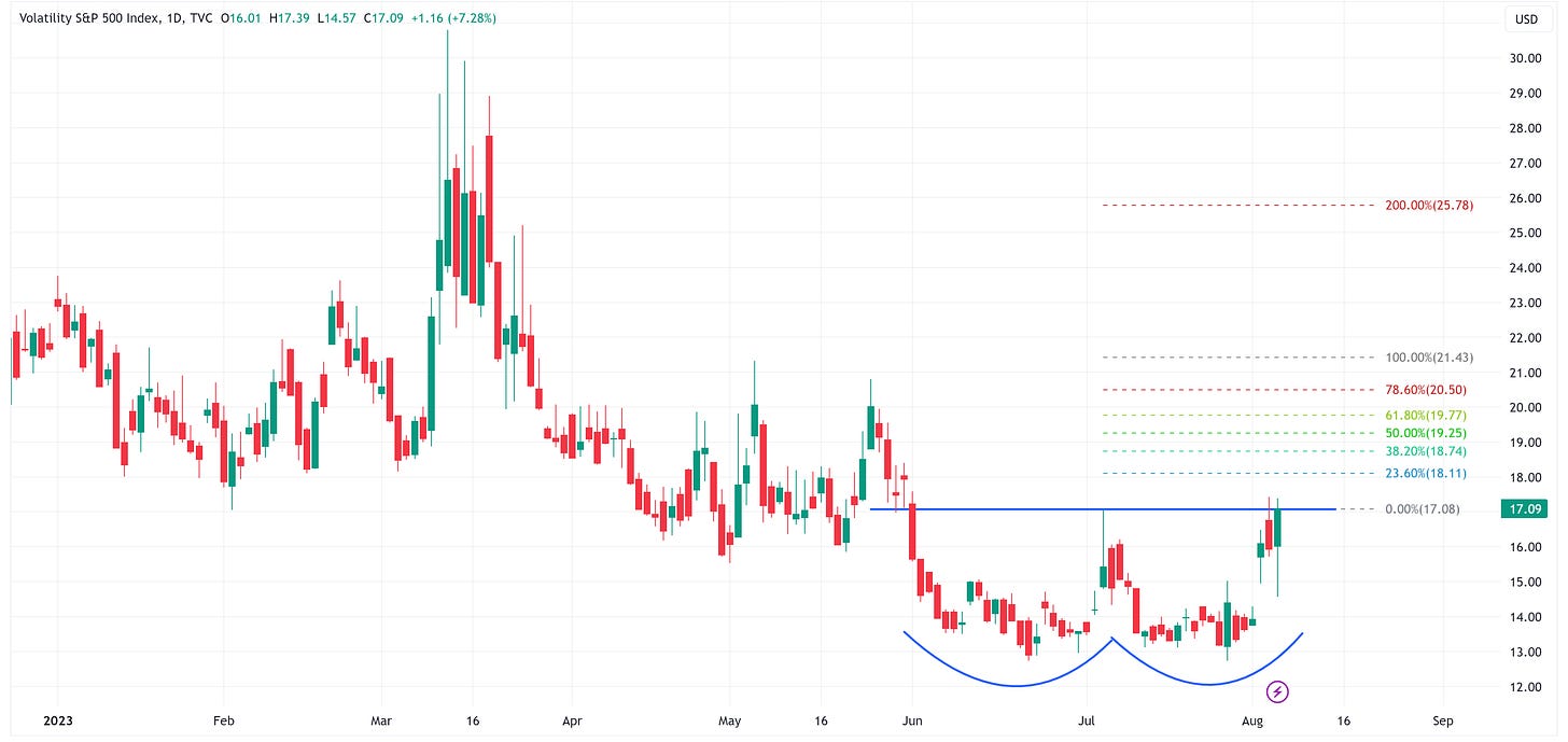
Last week, the VIX increased by +28.1%. That sounds like a lot (and it is) but it started from a very low base so we need to keep that in perspective.
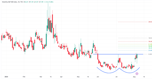
From a technical standpoint, the VIX has created an almost perfect “double-bottom”. The double-bottom pattern calls for an initial target price of 21.43 and a secondary target price of 25.78. These are levels that we have not seen on the VIX since March of this year when we had several banks fail.
Maybe more importantly is what this recent VIX move may be suggesting in the bigger picture.
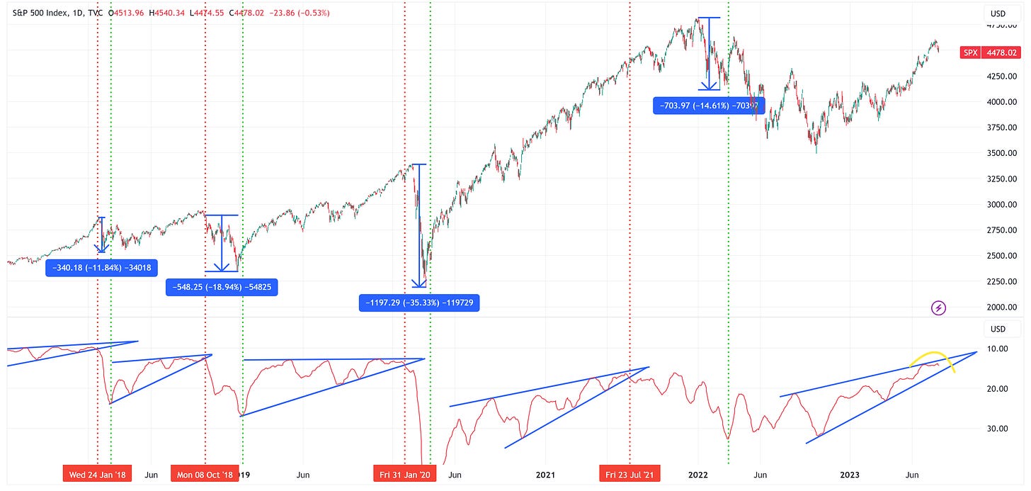
In the chart below, I have the S&P 500 in the top panel and the 15-day moving average of the VIX in the lower panel. Note: the figures in the bottom panel have been inverted to line up directionally with the price moves in the upper panel.
Over the last 5 years, we’ve had 4 instances where the VIX has declined to very low levels thus creating the wedge patterns you see in the lower panel of the chart below (remember, the lower panel is inverted so “very low levels” on the VIX correspond to elevated levels on the VIX in the chart below).
When those wedge patterns broke, it was typically not very good for the S&P 500.
In the four periods prior to now when the VIX broke its wedge pattern (red vertical line), the S&P 500 had the following max peak-to-trough declines before the VIX peaked again (green vertical line): -11.84%, -18.94%, -35.33%, and -14.61% for an average decline of -20.18%.
We need to watch the VIX, and especially the 15-day moving average, in the coming days and weeks.
Absolute Value & Relative Value
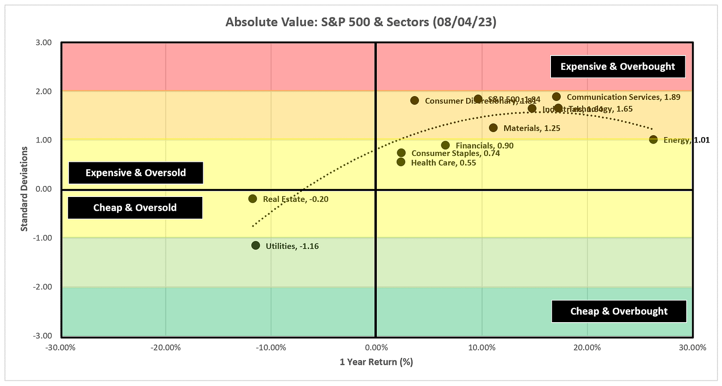
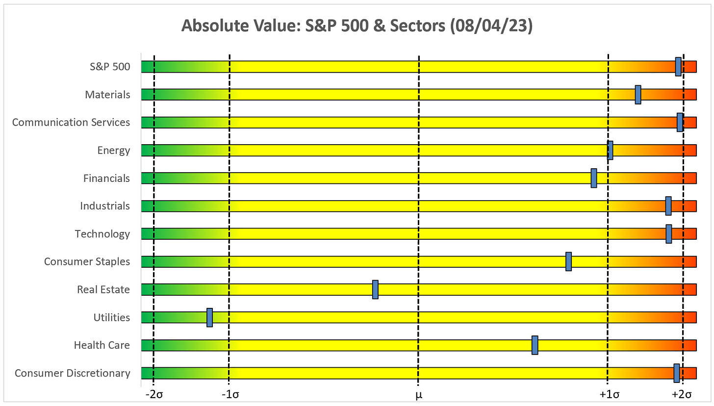
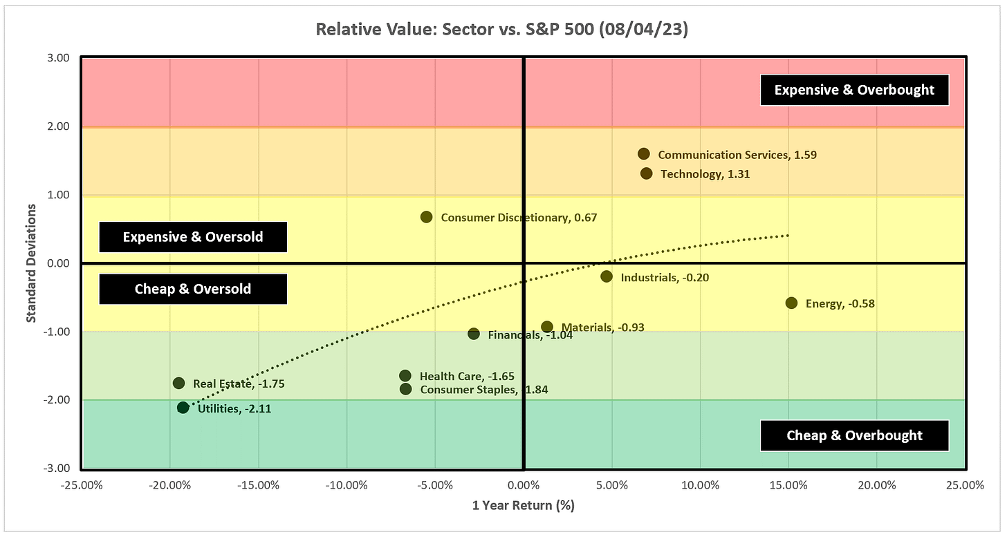
Here are the weekly updates for my absolute value and relative value charts.
Absolute Value
Despite the recent pullback, we continue to see many sectors & the S&P 500 well past +1.0 standard deviations which would suggest they still have room to the downside.
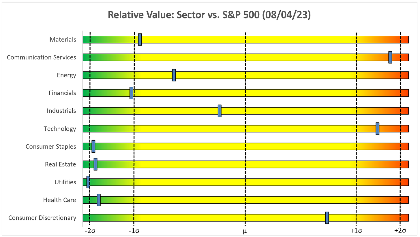
Relative Value
From a relative value standpoint, 5 of our 6 “laggard” sectors remain well below the -1.0 standard deviation threshold which would suggest they still have room to the upside relative to the S&P 500.
Let’s close this week’s piece by taking a look at the individual charts. I’ll start with the S&P 500 and then run through each of the sector charts.
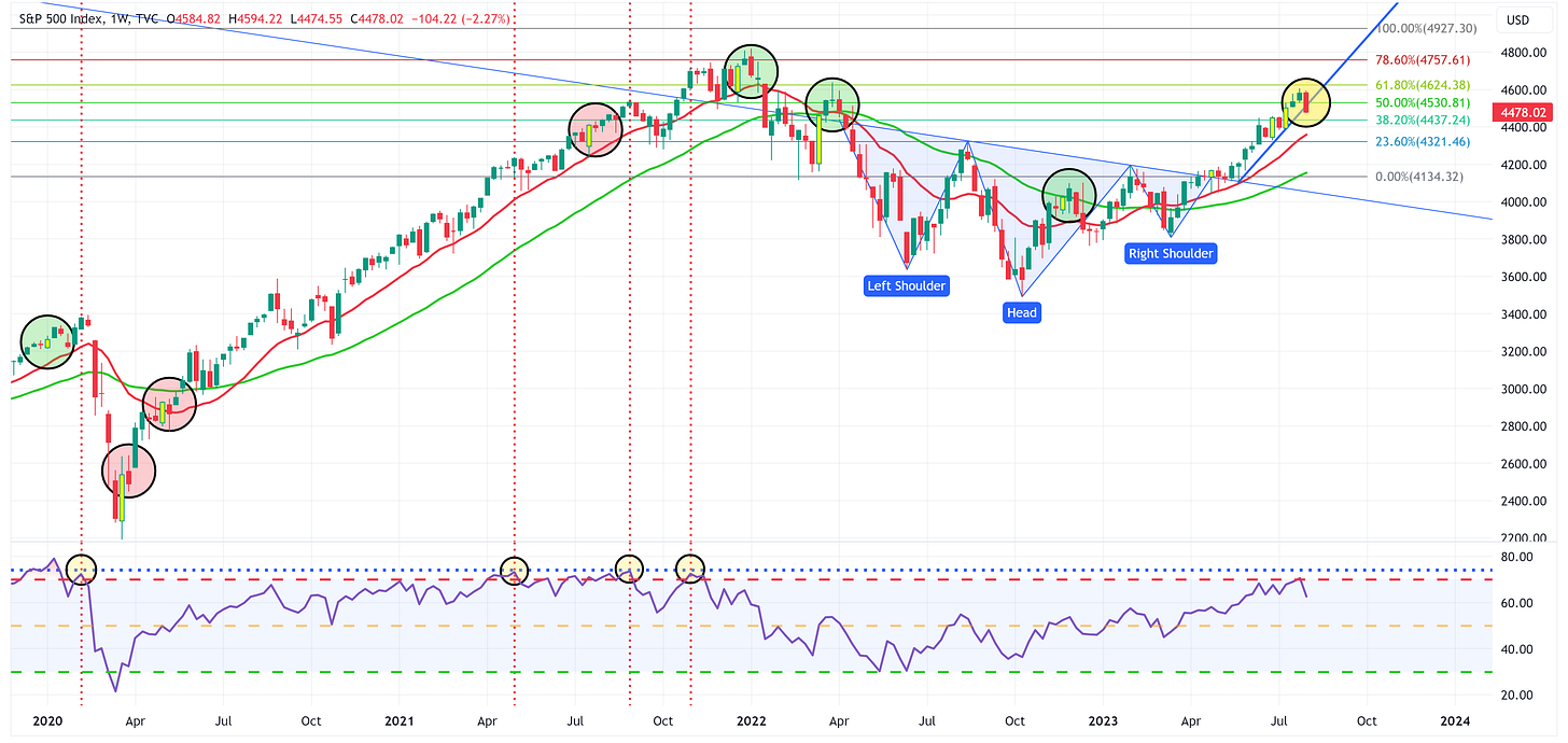
S&P 500 Index
Positive:
The uptrend remains intact and we should look to the moving averages to provide support.
Negative:
The blue trend line support from the last 10 weeks has been broken.
RSI is rolling over.
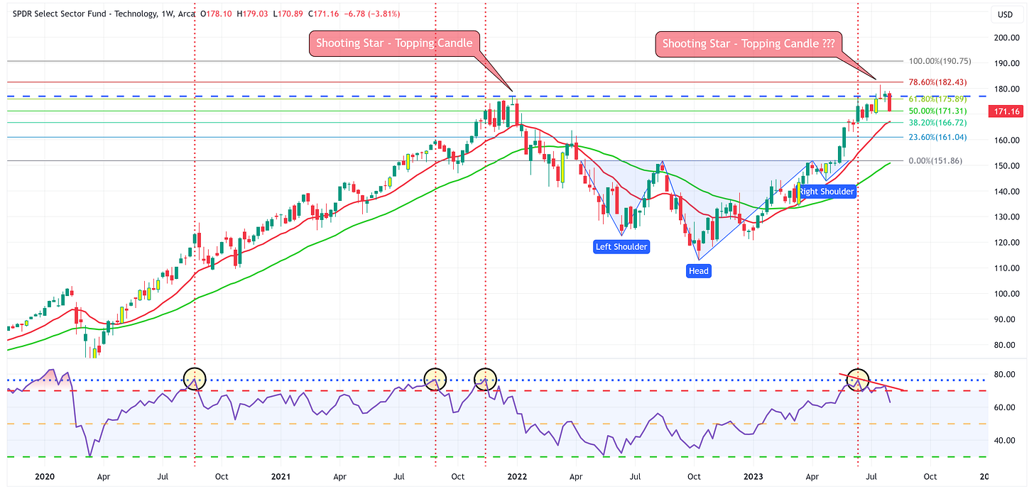
Technology
Positive:
The uptrend remains intact and we should look to the moving averages to provide support.
Negative:
The shooting star pattern from a couple of weeks ago looks to have taken hold. Note how that played out last time.
RSI is rolling over.
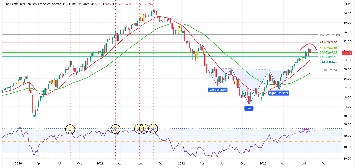
Communication Services
Positive:
The uptrend remains intact and we should look to the moving averages to provide support.
Negative:
XLC has stopped out two weeks in a row at the 61.8% Fib and now appears to be in the process of creating a rounding top.
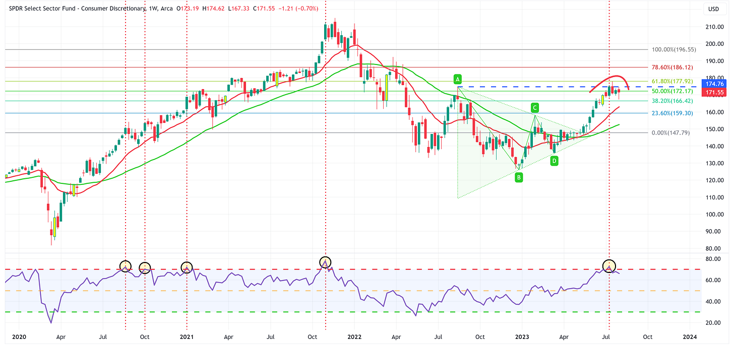
Consumer Discretionary
Positive:
The uptrend remains intact and we should look to the moving averages to provide support.
Negative:
For several weeks now, XLY hasn’t been able to break through its high from a year ago and now appears to be creating a rounding top.
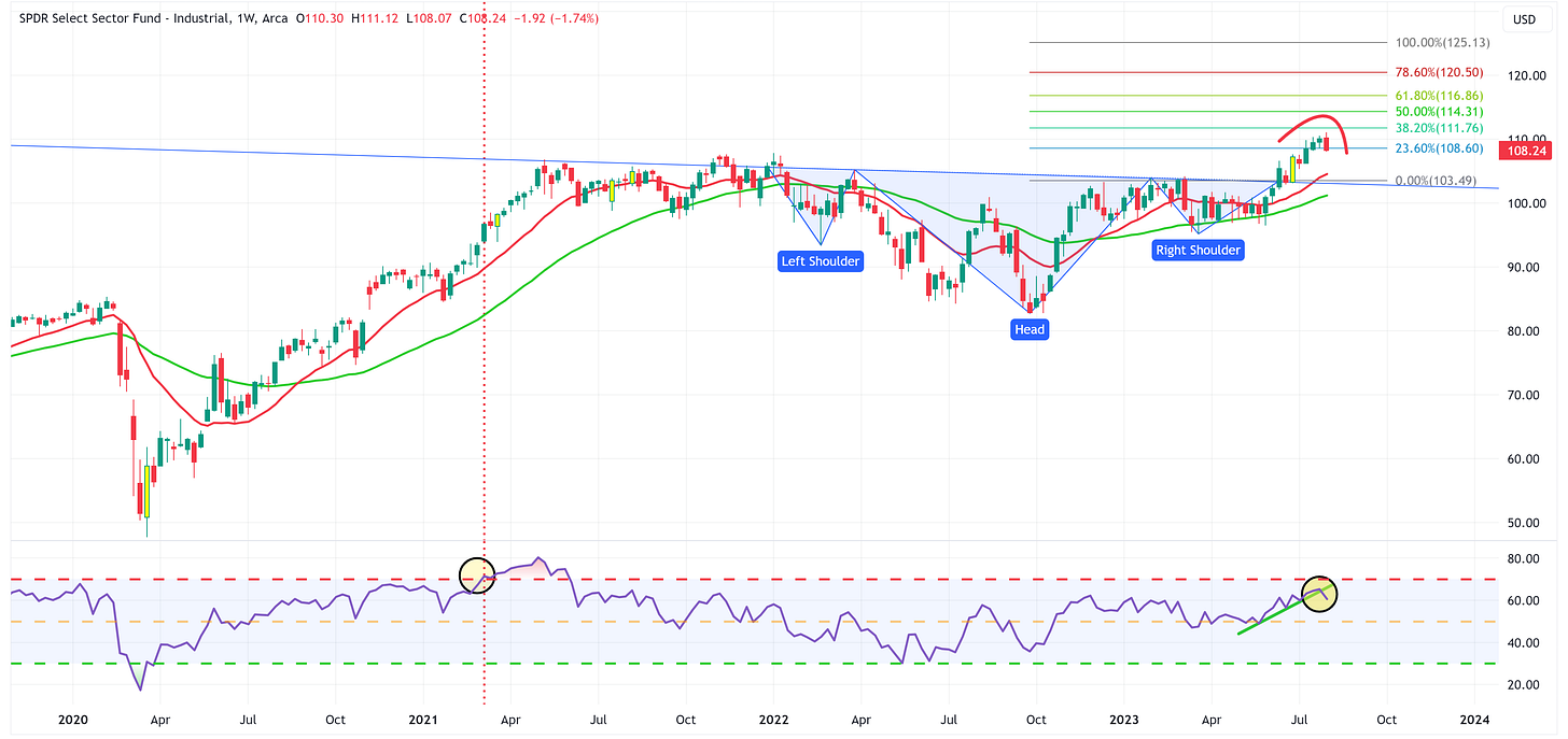
Industrials
Positive:
The uptrend remains intact and we should look to the moving averages to provide support.
Negative:
Note that RSI has broken down and through support.
XLI appears to be creating a rounding top.
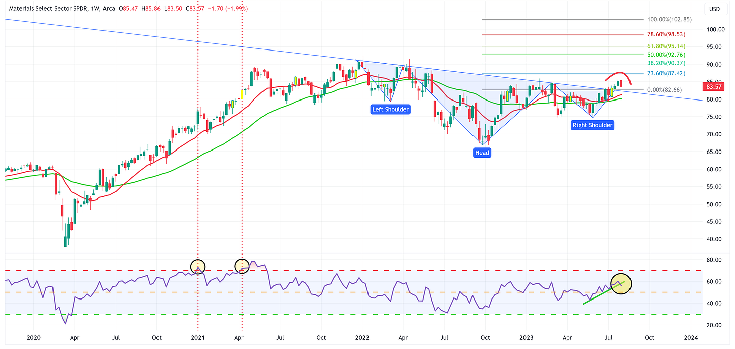
Materials
Positive:
The uptrend remains intact and we should look to the moving averages to provide support.
Negative:
Note that RSI has broken down and through support.
XLB appears to be creating a rounding top.
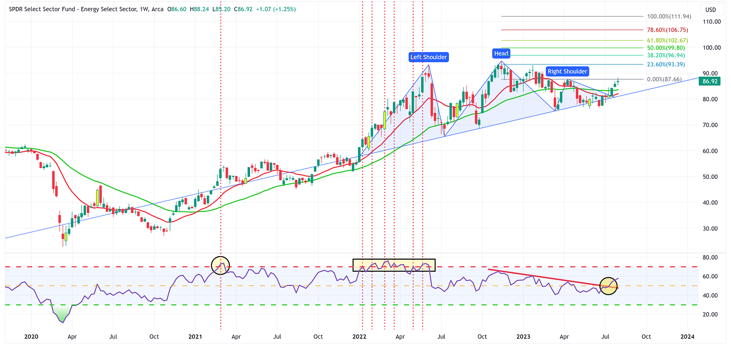
Energy
Positive:
RSI has broken through resistance.
If XLE can clear the right shoulder high, it could be off to the races.
Negative:
XLE has yet to clear the right shoulder high, this will likely keep it rangebound between there and the neckline until it makes a move definitively in one way or the other.
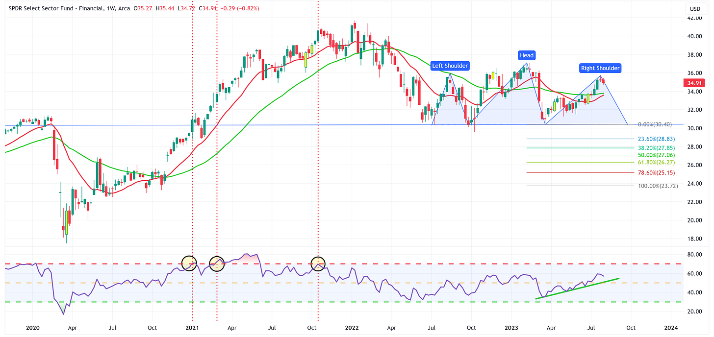
Financials
Positive:
RSI remains in an uptrend and XLF’s price remains above moving averages.
Negative:
This is week #2 of XLF looking like it may have created the right shoulder of a Head & Shoulders topping pattern.
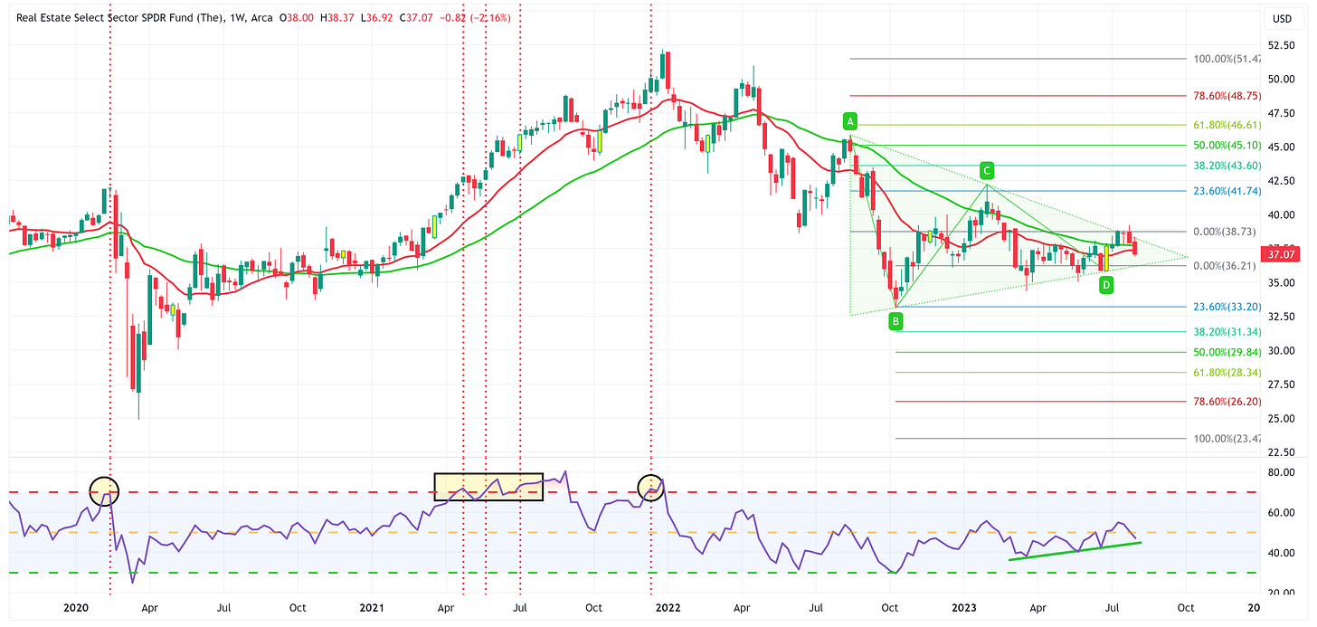
Real Estate
Positive:
XLRE is trying to find support at the moving averages.
XLRE continues to maintain RSI support level albeit at a level below the mid-line.
Negative:
We’ve gone from thinking that we might get a break of the triangle pattern to the upside to now wondering if we get a break to the downside. If that happens, the 23.6% Fib is probably within reach fairly quickly.
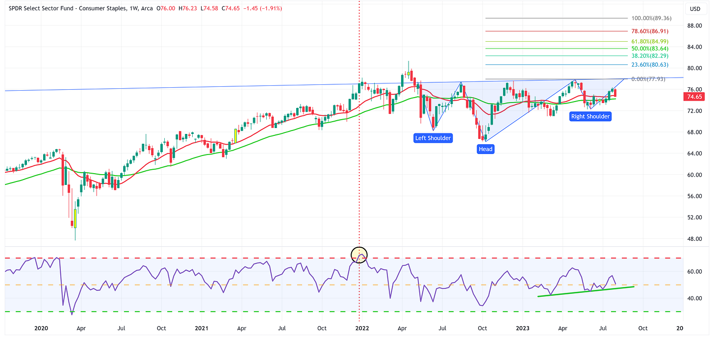
Consumer Staples
Positive:
XLP continues to find support at the moving averages and RSI continues to maintain a modest uptrend.
Still holding out the possibility for an inverse Head & Shoulders pattern to materialize.
Negative:
XLP can’t seem to get out of its own way and continues to move sideways.
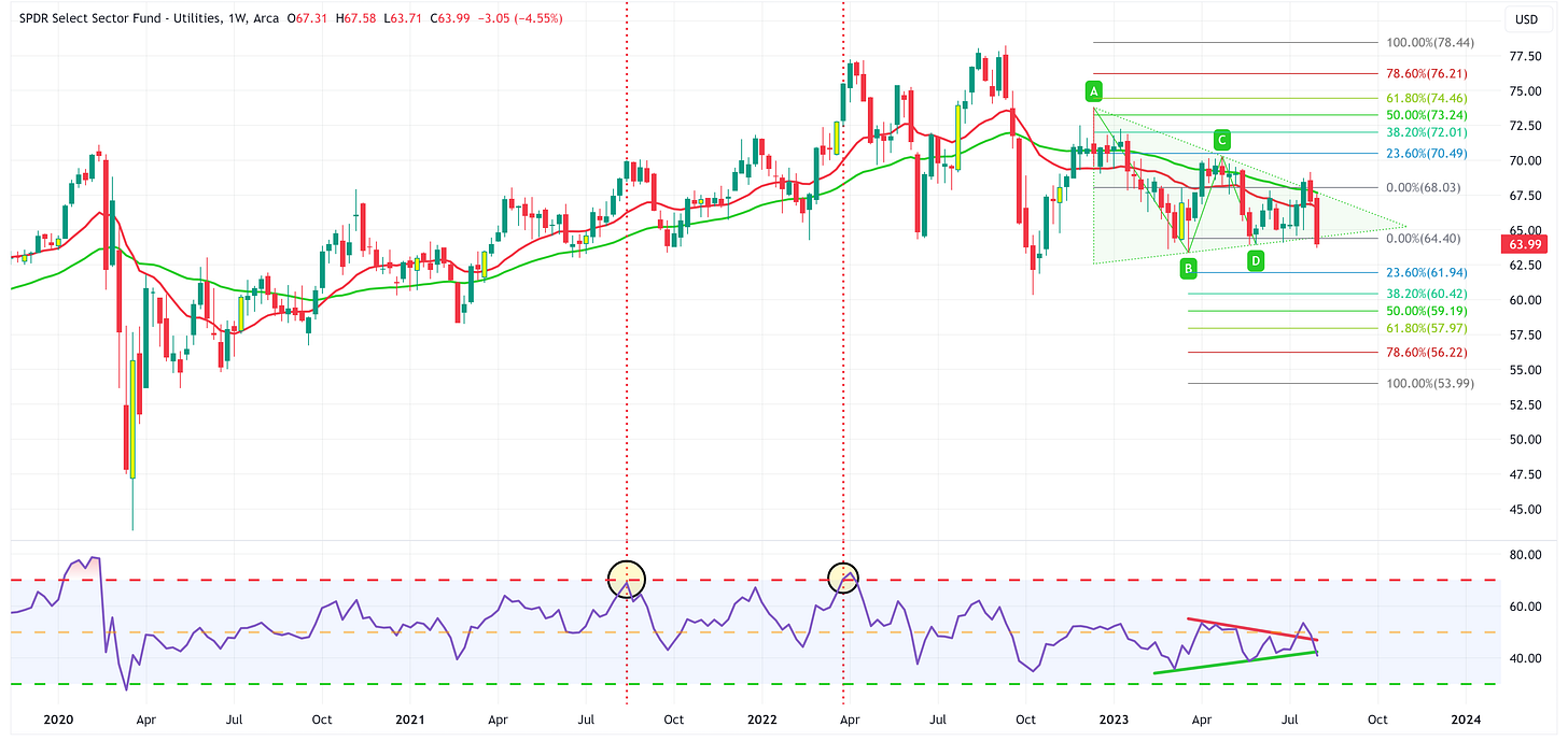
Utilities
Positive:
I’m not sure there is a positive thing to note about this chart.
Negative:
Everything.
The only hope is that last week was an overreaction and we see a snapback this week.
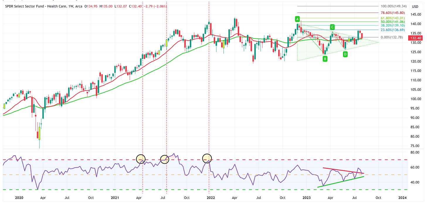
Health Care
Positive:
XLV continues to hold the moving averages.
Really need to see XLV hold the top of the triangle pattern.
Negative:
RSI is breaking lower.
Summary
I find it interesting that the “most positive” thing I could say for a lot of these charts is that “the uptrend remains intact” and that we are depending upon “the moving averages to provide support”.
Compare that with several weeks ago when I was talking about the strength of many of the sectors and that new all-time highs were well within sight. How quickly things can change!
With that said, let’s be clear, new all-time highs for the S&P 500 and several sectors are still a very strong possibility but the market needs to shake off this recent downturn pretty quickly.
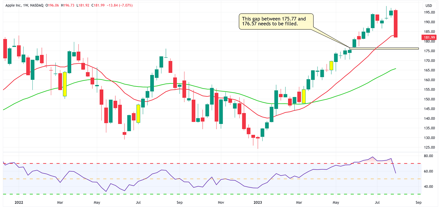
Lastly, watch Apple this week. For better or worse, Apple has been a proxy for the market of late and it had an absolutely horrible week last week.
I’m a big believer that all price gaps eventually get filled. To that end, Apple currently has a price gap between 175.77 and 176.57 that needs to be filled which would suggest a continued move lower over the short-term. If Apple continues to move lower, my sense is that it will take most of the market with it.
As I said last week, the third quarter of this year could be an inflection point for the market so keep your stops tight.
Until next week…

