Weekly Chart Review
Equities finished last week on a strong note, can they carry the momentum to this week?
On Friday of last week, the US economic releases contained two of the more important monthly releases - 1) the Change in Nonfarm Payrolls and 2) the Unemployment Rate.
The Change in Nonfarm Payrolls came in well above expectations at +336k vs. a forecast of +170k.
There was a lot of chatter over the weekend that the Payrolls beat was driven by an increase in people taking second jobs as full-time employment figures have fallen for the last three months and part-time employment figures have increased over that same period.
There’s probably some seasonality involved here but let’s say that there isn’t and let’s take the number at face value.
If the payroll situation is indeed this strong, you have to believe this means the Fed will hike again before year end (as they have suggested that they will) and that they will be biased towards keeping rates higher for longer.
Alternatively, let’s say the “chatter” is correct and people are having to work second jobs to make ends meet. What does this say about the economy? This would suggest that wages are struggling to keep up with the inflationary environment we’ve seen in the prices of goods and services.
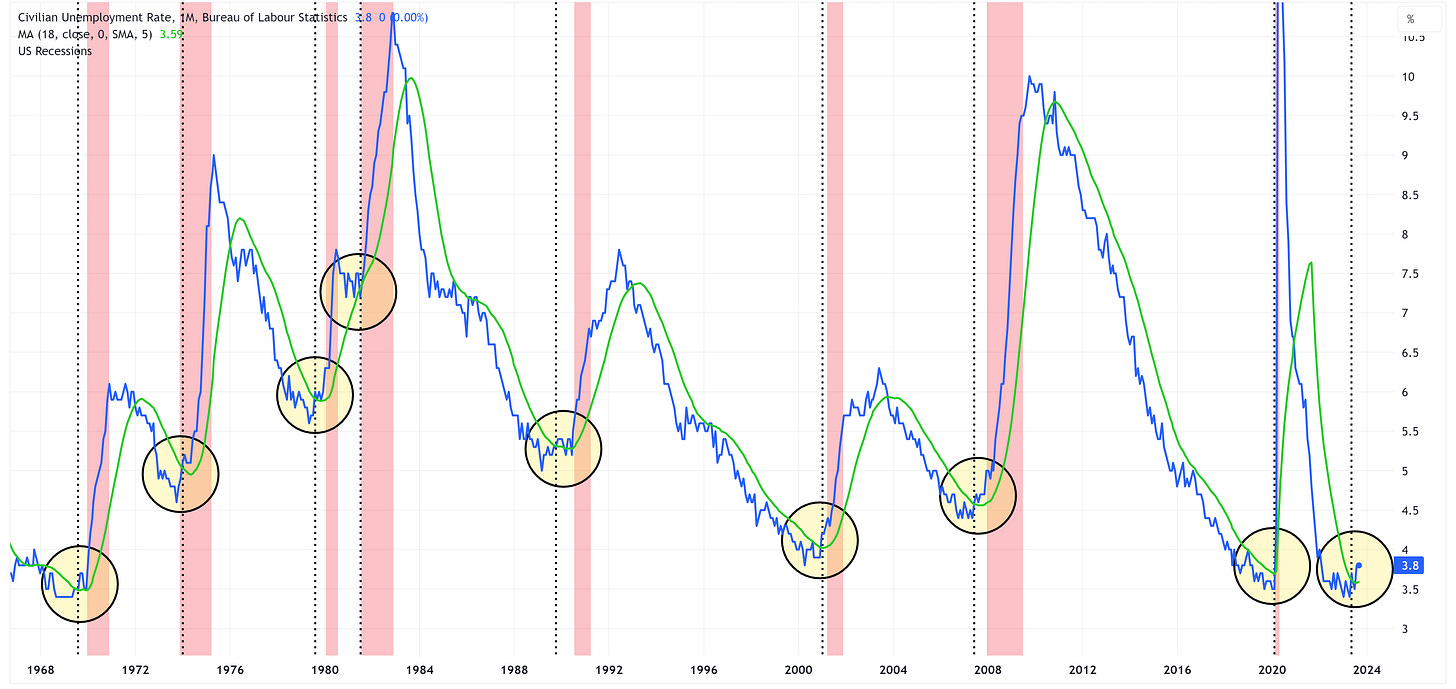
The Unemployment Report showed that the current unemployment rate is 3.8% which was slightly hotter than the forecast of 3.7% but the same as the August report.
Last month, I did a deep dive comparing the Unemployment Rate to its 18-month moving average and the implications for the economy when the Unemployment Rate crosses “up and through” the 18-month moving average. I would encourage you to go back and read this post if you haven’t already.
Here are the “CliffsNotes” from last month’s piece:
“If you examine the chart closely, you’ll notice that each time the Unemployment Rate has had a sustained move “up and through” its 18-month moving average, we have had a recession begin within the next three quarters.”
It’s worth adding that the Unemployment Rate first crossed up and through the 18-month moving average with the May 2023 report so we’re now technically more than a quarter into this phase of the cycle.
NASDAQ vs. 10-Year US Treasury Yields
Last week, we looked at the relationship between the S&P 500 and the High Yield market. This week, we’re going to compare the NASDAQ 100 (NDX) vs. the 10-Year US Treasury Yield.
Note: for comparison purposes, I have inverted the scale for the UST 10-year yield.
In general, the chart shows that when yields fall (i.e. when the red line increases on the chart as this metric has been inverted), NDX increases and when yields increase, NDX declines. With that said, note how this relationship has broken down starting in May of this year.
For this relationship to “correct” itself, either NDX needs to decline, US 10-year yields need to fall, or a combination of both. Given how oversold US Treasuries are right now, might they be the first one to make a move? If so, this will likely bode well for US Treasury ETFs we’re tracking below.
Absolute Value & Relative Value
It is worth noting that I had to expand the charts below to encompass +/- 4.0 standard deviations given how oversold several items are this week.
Absolute Value - Equities
Another tough week for Utilities, Consumer Staples, and Real Estate taking them to -3.10, -2.95, and -2.30, respectively, on a standard deviation basis. They have really begun to separate themselves from the rest of the pack on an absolute basis.
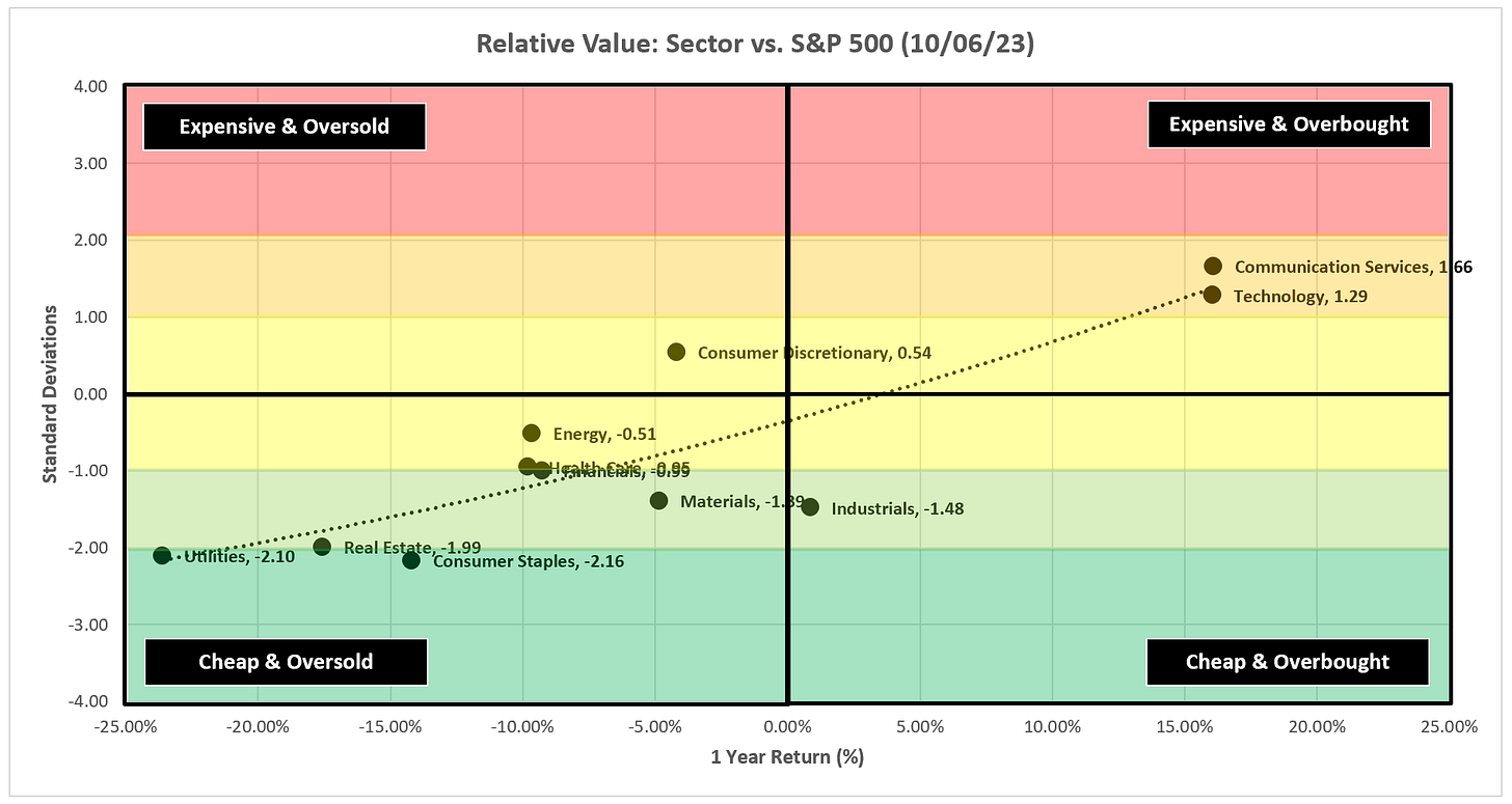
Relative Value - Equities
Note the barbell structure with Communication Services and Technology on one end and Utilities, Real Estate, and Consumer Staples on the other.
Absolute Value - US Treasuries
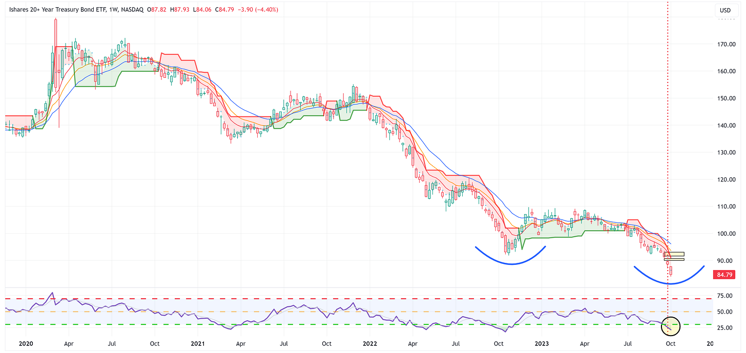
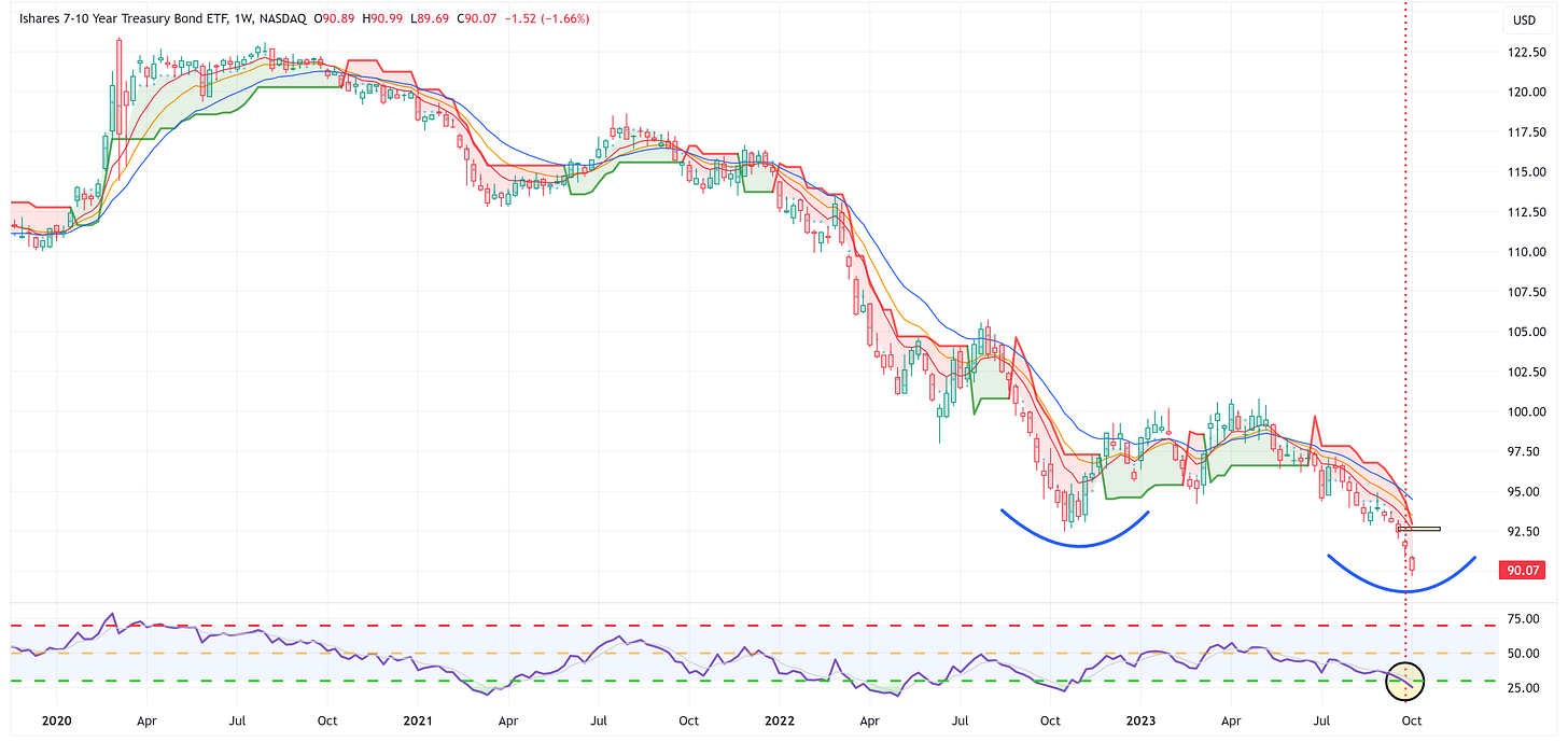
US Treasuries had a tough week last week but note how oversold ZROZ, TLT, TLH, and IEF are at this point.
Sector Review
As a reminder, the goal with these charts is simply to stay on the “correct” side of the trailing stop loss. What you should notice is that once the price shifts from one side of the trailing stop loss to the other, it tends to continue in that direction for several weeks if not more.
I overlay technical analysis to try and gauge how long that trend may last and/or when we should think about the trend reversing course. It’s not a perfect science, but it often gives us some road signs to pay attention to along the way.
S&P 500 Index
The chart above is a daily chart for the S&P 500.
Note that the S&P 500 finished the week on a very strong note yet couldn’t close above the 13-week EMA and still remains below the daily trailing stop loss.
With that said, we still have an overhead gap that needs to be filled.
The chart below is a weekly chart for the S&P 500.
The S&P 500 remains below the trailing stop loss on a weekly basis as well and the H&S pattern continues to point to a target of 4,060.
Technology
Strong week for XLK but note that it was unable to close above the MA’s and continues to remain below the trailing stop loss.
Communication Services
XLC had a strong week while closing above the MA’s and continues to remain above the trailing stop loss.
There’s a lot to like about this chart and the target continues to be 74.80.
Consumer Discretionary
Two back-to-back indecisive weeks for XLY and it is now comfortably below the trailing stop loss.
Be mindful of the overhead gap that still needs to be filled.
Industrials
XLI hit our target of 99.61 intra-week and then bounced higher. Let’s see if it can rally next week but the trend still looks to be lower.
Materials
XLB bounced off the 61.8% Fib and remains below the trailing stop loss but be mindful of the overhead gap.
Energy
XLE had a tough week but note how it bounced off the trailing stop loss.
Given the events over the weekend regarding Israel, Energy could see a bounce this week.
Financials
XLF continues to remain within the wedge pattern on a weekly basis and slightly above the trailing stop loss.
I probably wouldn’t consider getting involved here until it breaks through the wedge pattern in one direction or another.
Real Estate
XLRE hit 78.6% Fib perfectly and the bounced higher. With that said, it still looks to be in a downtrend and definitely below the trailing stop loss.
Consumer Staples
Ugly week for XLP but it has reached the “oversold” mark on the RSI. Let’s see if it can bounce from here.
Utilities
Ugly week for XLU but it has reached the “oversold” market on the RSI. Let’s see if it can bounce from here.
Health Care
XLV is trying to stay in the game here but needs to rally sooner rather than later.
US Treasury Review
In general, US Treasuries took it on the chin last week, and in several cases, “oversold” became even more “oversold”. Could they be setting up for a bounce?
ZROZ: 25+ Year UST
The following bullet points apply to ZROZ, TLT, TLH, and IEF.
In all four of these cases, “oversold” became even more “oversold”.
We’re now pushing way more than -2.0 standard deviations for each of these.
All four have overhead gaps that need to be filled.
Is this the week for a bounce?
TLT: 20+ Year UST
TLH: 10 - 20 Year UST
IEF: 7 - 10 Year UST
IEI: 3 - 7 Year UST
IEI hit the 23.6% Fib perfectly and bounced. It remains below the trailing stop loss and the moving average stack continues to work against a move higher.
The target remains 107.35.
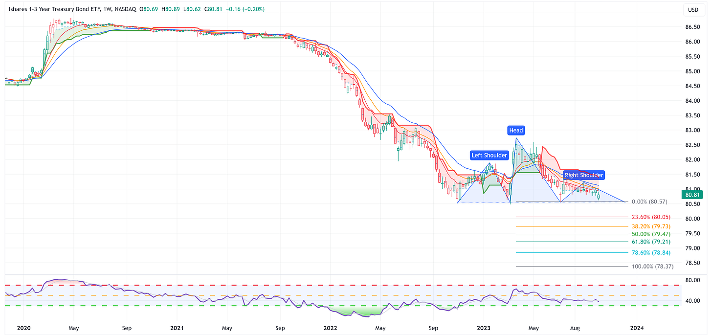
SHY: 1 - 3 Year UST
SHY still appears to be forming a head & shoulders pattern but it is not been validated as of yet.
If it does get validated, the target becomes 78.37.
Average Investor Allocation to Equities - Daily Chart Model
I will conclude this week with a snapshot of the daily version of my “Average Investor Allocation to Equities” model.
How to use this chart.
The blue line is the S&P 500.
The red line is my “fair value” model for the S&P 500.
“Current Value to Fair Value” is the amount the S&P 500 would “need” to decline from its current level to the “fair value” level.
“Current Z-Score Value” is a representation (in standard deviation terms) of the delta between the current price of the S&P 500 and the “fair value” price.
Historically, major corrections do not end until the Z-Score falls to somewhere between -3.0 & -4.0. The yellow circles denote the price of the S&P 500 the last four times this happened. Note where the price was at these points relative to the “fair value” line.
Let’s make it a great week!









Thanks. Always excellent.
Re the huge open jaws between NDX and 10yr, what other period might be similar if we look further back?