
Weekly Chart Review
Is the bearish divergence foretelling a possible move lower for the major indices?

Hey everyone, it’s Jim.
I hope you had a great weekend!
Let’s jump right into this week’s newsletter.
🗺️ The Market Map - S&P 500
Let’s start with the higher time frame, the weekly chart.
As you can see below, the weekly chart continues to remain in a strong bullish uptrend.
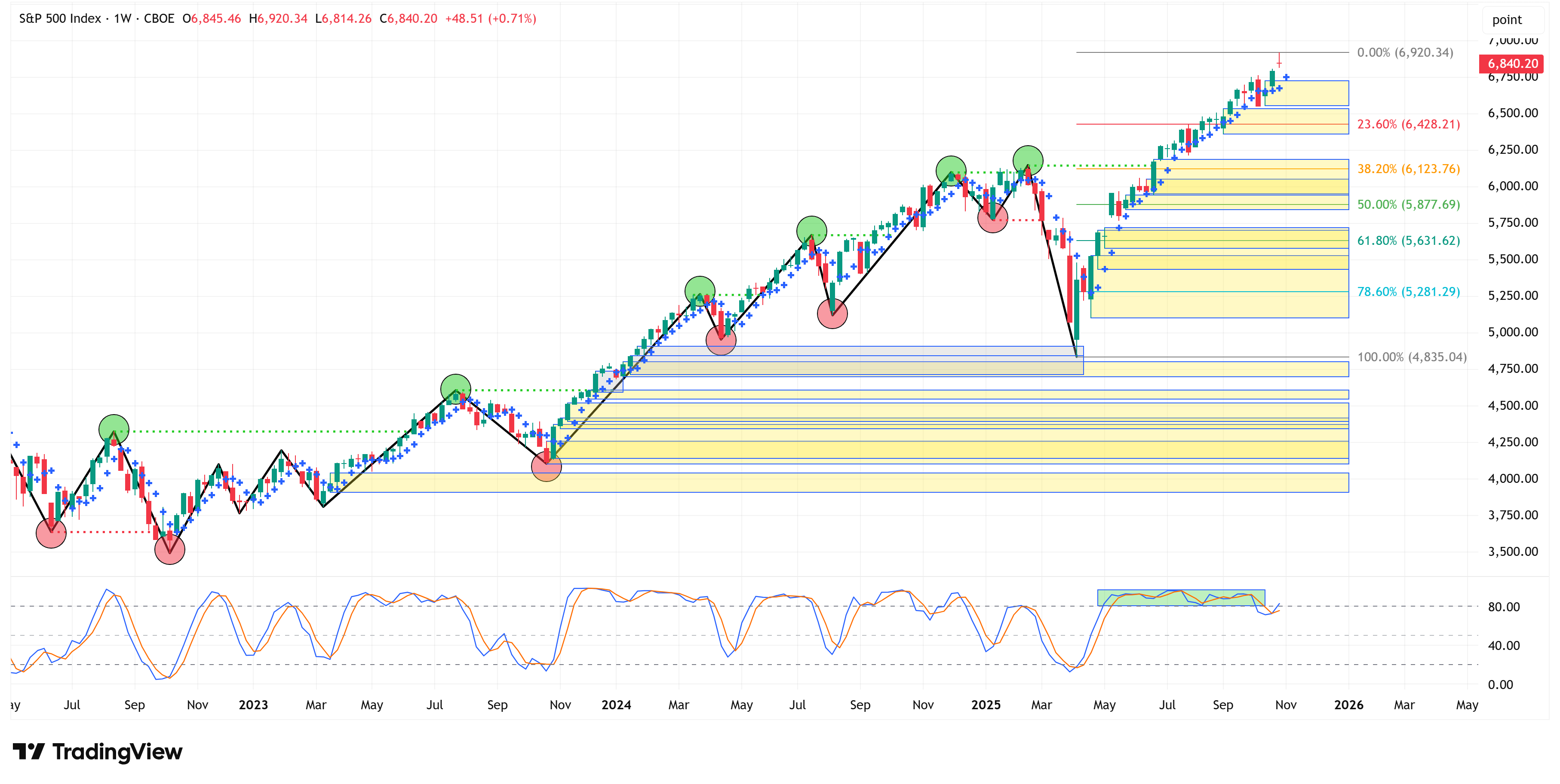
With that said, I would like to bring to your attention to the “bearish divergence” that has been developing.
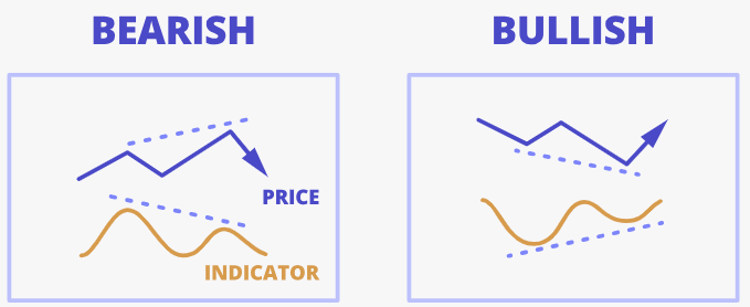
First, what is a “bearish divergence”?
Investopedia describes a “bearish” or “negative” divergence as follows:
“Negative divergence, or bearish divergence, occurs when prices create higher highs, but the momentum indicator shows lower highs. This signals a reduction in bullish momentum, suggesting that prices may reverse downward.”
The opposite is also true for a “bullish” or “positive” divergence.
“Positive or bullish divergence occurs when prices reach new lows, but the momentum indicator records higher lows. This implies declining bearish momentum and may indicate a price reversal upward.”
Here’s a graphic for those who are visually inclined:
If we focus solely on the stochastic indicator for the S&P 500 on the weekly chart, here’s what we see.
Note the yellow and red circles on Mon 21 Jul ‘25, and Mon 22 Sep ‘25, respectively.
Further, note how when we connect the two, it creates a downward trendline (the red dotted line).
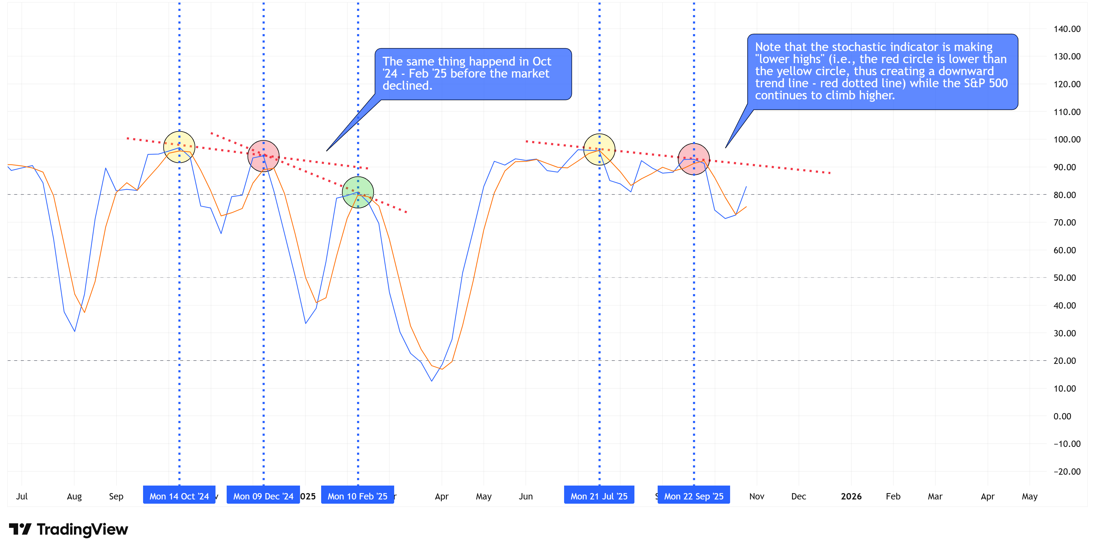
If we rewind the tape and look at Mon 14 Oct ‘24, Mon 09 Dec ‘24, and Mon 10 Feb ‘25, we see the same thing; we just haven’t seen the green circle form in the present-day example as of yet.
If we zoom out and look at the stochastic and the price candles together, here’s what we find.
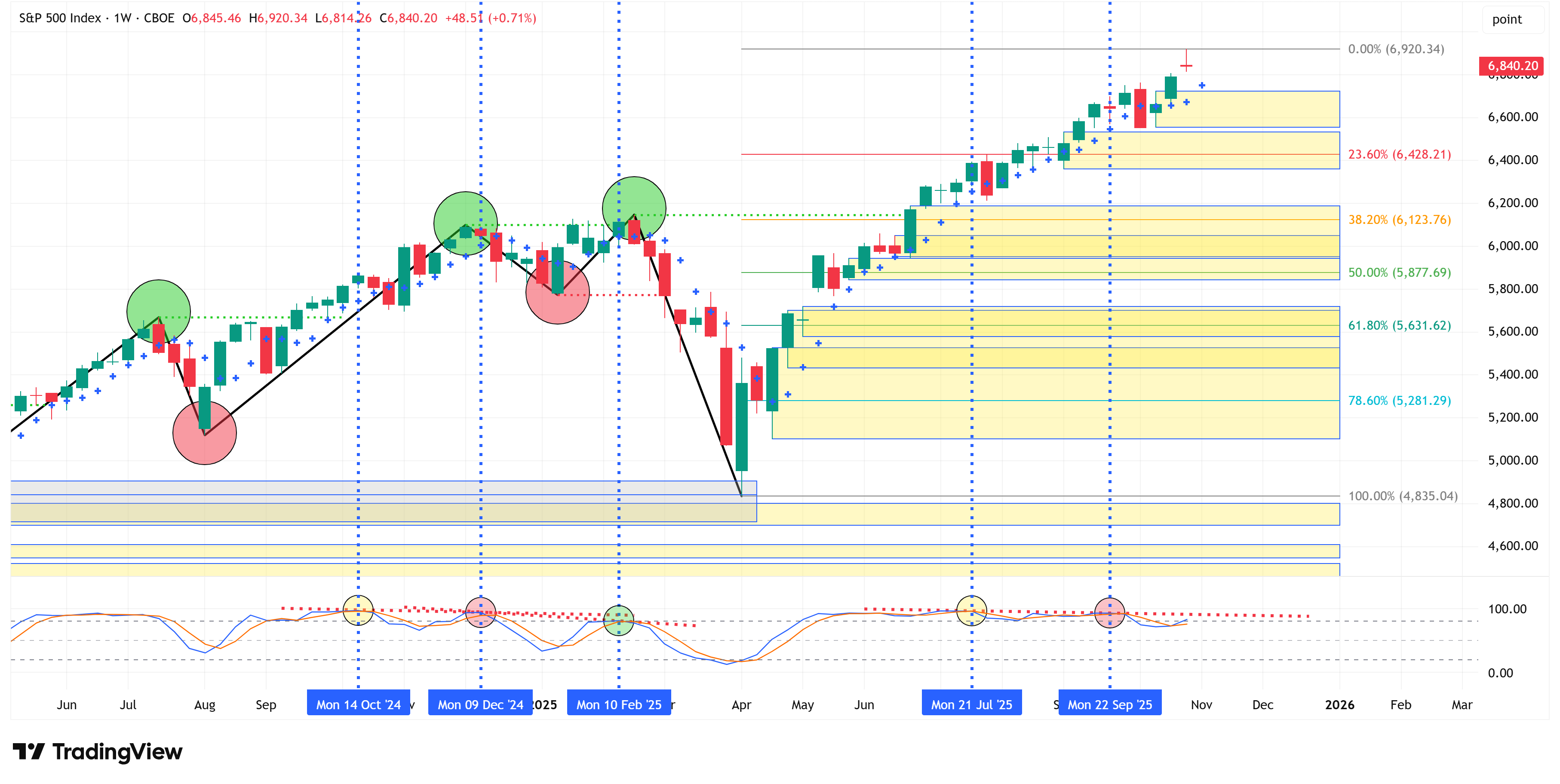
Will we get a third “rolling over” of the stochastic that trips the market into a more sustained downturn?
I have no idea, but that’s why it’s good to shift to the lower time frame for clues.
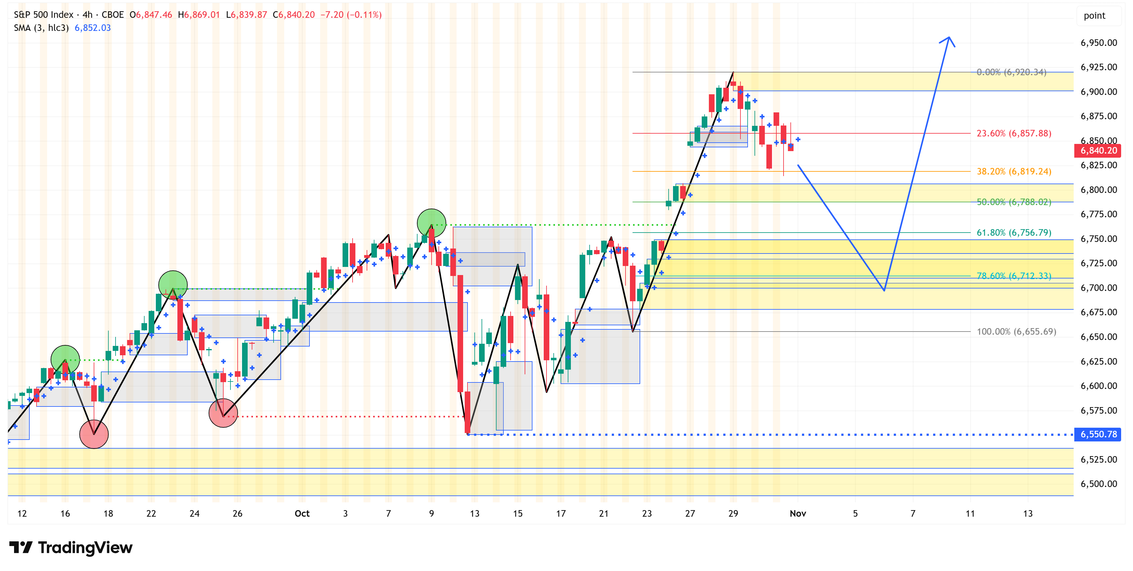
4-Hour Chart
When we shift to the 4-hour chart, we find a chart that remains in a technical uptrend but has started to pull back.
Our “Market Map” methodology would suggest that we could see the recent 4-hour chart continue its recent pullback until we “clear” the yellow boxes I’ve labeled on the chart.
The blue line/arrow is one possible path.
Where the market could find itself in some trouble is if it breaks and remains below 6,655.69 and, even more importantly, if it breaks and remains below 6,550.78.
Paid subscribers know that behind the paywall, I do this same analysis on an additional 25+ sectors/indices/US Treasuries.
In working through the charts this week, we have no less than 12 other sectors/indices/US Treasuries that are exhibiting the same types of divergences, suggesting they could be due for a possible pullback.
Two of the divergences are positive divergences for some of the US Treasuries that we track, suggesting that these maturities may be poised for higher yields.
If you want to find out which ones are primed to move, become a paid subscriber and see everything behind the paywall.
Paid subscribers, I’ve marked the sectors/indices/US Treasuries in question with two asterisks **.
The following sections are for paid subscribers only.
In these sections, we will discuss our proprietary:
S&P 500 Fair Value Model
This model provides a guide for:
a) How far the S&P 500 could decline in the next recession.
b) When to get back into the market after it has declined.
The Market Map - Extended Analysis
We will call out specific price objectives (up trends vs. down trends, targets, stop losses, etc.) on the following:
Major US Indices
11 Major US Equity Sectors
US Treasuries
Currencies
Commodities
Fixed Income
If you would like exclusive access to the proprietary data below, be sure to click on the link to become a paid subscriber.
Keep reading with a 7-day free trial
Subscribe to Skillman Grove Research to keep reading this post and get 7 days of free access to the full post archives.