


Weekly Chart Review
It's all about Core PCE...AND...Potential price targets for the S&P 500 & UST 10-Year yields...

Coming into last week, the key focus was on inflation, namely the CPI and PPI reports which came out on Wednesday and Thursday, respectively.
As you can see from the table below, almost all of the figures came in “hotter” than anticipated and in multiple cases, higher than the previous month.

Despite that, equities ended the week higher, and US Treasury yields fell. This seems counterintuitive, given the “hot” inflation prints noted above.
Why is that?
The market is looking past these numbers to the Core Personal Consumption Expenditures (CPE) figure released on February 28th.
There has long been the argument (true or false is debatable) that the Fed’s “preferred” measure of inflation is the Core PCE and that their preferred “target” for this metric is 2.0%.
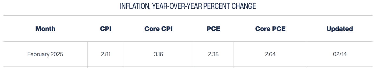
The Core PCE (YoY%) figure released in January was 2.8%.
The Cleveland Fed provides a “nowcast” for the Core PCE (which they update daily) that incorporates the release of figures that flow into the calculation of Core PCE.
Both the CPI and PPI that were released last week have components that flow into the calculation of the Core PCE.
Note in the table below that the most recent forecast for Core PCE (updated: 02/14/25) shows an estimated figure of 2.64% which is lower than the previous month’s 2.8%.
It is noteworthy that the “hotter than expected” CPI and PPI figures would still translate to a lower Core PCE. This is because only a portion of the components of CPI and PPI flow through to Core PCE and those components were more deflationary in nature.
So the line of thinking goes like this:
Inflation is still “too hot” but it continues to come down —> if it continues to come down, the Fed can at least entertain the thought of more rate cuts —> if the Fed can entertain the thought of more rate cuts then history would suggest that is positive for equities and bonds (i.e., yields falling) —> buys stocks/bonds (despite elevated valuations).
Given everything noted above, let’s look at charts of the S&P 500 and US Treasury - 10 year yields and see if we can glean some insight into possible price targets.
Keep reading with a 7-day free trial
Subscribe to Skillman Grove Research to keep reading this post and get 7 days of free access to the full post archives.