Happy Monday!
Three weeks ago, I started to notice that the year-to-date (YTD) “laggards” appeared to be in the process of outperforming the YTD “leaders”.
My thesis was/is that when we start to see a more pronounced shift from the “leaders” to the “laggards”, it would likely indicate a market that may be on the cusp of going through a corrective period.
On a YTD basis (as of 08/11/23), it’s not hard to see that the “leaders” have dramatically outperformed the “laggards”.
The “leaders” have had an average return of +25.3% YTD while the “laggards” have had an average return of +1.0% YTD.
If we look at last week by itself, we see that the “laggards” outperformed the “leaders” as the “laggards” returned +1.3% last week vs. the “leaders” return of -0.8% last week.
If we look at the last four weeks (i.e., the period over which I have been highlighting this shift), we find that the “laggards” have outperformed the “leaders” by +1.5% to -1.7%, respectively.
Will this shift from “leaders” to “laggards” continue, I have no idea.
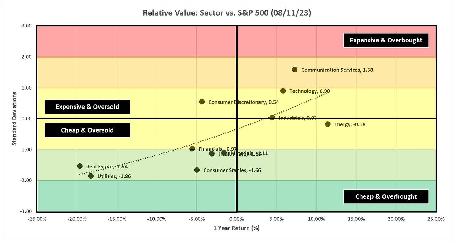
However, it makes intuitive sense to think that if we are on the cusp of a more significant correction, investors would likely prefer to err on the side of moving out of the “Expensive & Overbought” sectors and into the “Cheap & Oversold” sectors, especially when several of the “Cheap & Oversold” sectors also happen to be the sectors which are typically associated with being more “defensive” in nature (i.e., Consumer Staples, Health Care, and Utilities.)
Checking in on Apple
If this move from sector “leaders” to sector “laggards” is to continue, we will likely see it manifest itself in a number of the “leading” companies as well.
Apple is the largest component of the S&P 500 at just over a 7% market cap weight.
In last week’s piece, I made the following comment regarding Apple.
“For better or worse, Apple has been a proxy for the market of late and it had an absolutely horrible week last week.
I’m a big believer that all price gaps eventually get filled. To that end, Apple currently has a price gap between 175.77 and 176.57 that needs to be filled which would suggest a continued move lower over the short-term. If Apple continues to move lower, my sense is that it will take most of the market with it.”
Last week, Apple had a return of -2.31% last week while the S&P 500 fell by -0.31% so I think it’s fair to say that Apple had a “continued move lower over the short-term” but interestingly enough, Apple did not close the gap I highlighted last week.
Here is an updated weekly chart for Apple. Note that last week’s price stopped right at the top end of the gap that I suggested needs to be filled. For this gap to be filled this week, at some point, Apple “needs” to move lower by -1.14% relative to Friday’s close.
If that happens, the key question will be where does Apple (and potentially the rest of the market) go from there?
As I previously noted, the above chart is a weekly chart for Apple, whereas the following chart is a daily chart. I wanted to show the daily chart as well because I believe it may provide some hope for the bulls.
Going back to my “price gap theory”, on the daily chart above, we can see that there is also a price gap between 187.38 and 190.69 that needs to be filled. To fully close this gap, Apple would have to appreciate by +7.26% relative to Friday’s close.
Note that the RSI (bottom panel of the chart) is pegged at the lower threshold thus suggesting that Apple is currently “oversold”.
Is it conceivable that Apple falls by -1.14% sometime this week to close the lower gap but then starts marching higher over the subsequent weeks to close the overhead gap? Anything is possible, but I think this is the most bullish case for Apple and the market as a whole.
Where Apple may find itself in trouble is if it closes the gap below and continues to move lower from there. We need to watch this over the coming weeks and the impact it could have on the rest of the market.
Absolute Value & Relative Value
Here are the weekly updates for my absolute value and relative value charts.
Absolute Value
Note the cluster of sectors and the S&P 500 that remain above the +1.0 standard deviation threshold. At some point, each of these will move back into the yellow area below +1.0 standard deviations. This will happen either via a corrective move lower or a sufficiently long enough move sideways to work off the overbought conditions.
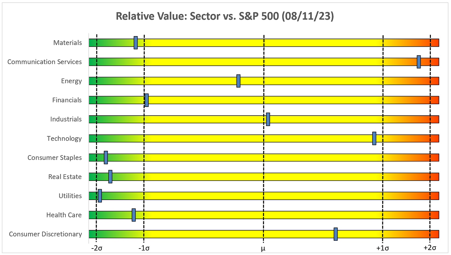
Relative Value
Note that the “defensive” sectors still remain well below the -1.0 standard deviation threshold relative to the S&P 500. I continue to believe that flows will move toward these “safe-haven” and “cheap & oversold” sectors.
Sector Review
Let’s start with the S&P 500 and then work our way through each of the sectors.
S&P 500 Index
Positive:
We still have the potential for the two moving averages to provide support and maintain the uptrend.
Negative:
The blue trendline has been broken and RSI is rolling over.
Technology
Positive:
We need to have the red moving average provide support this week.
Negative:
The current setup (i.e., shooting star pattern, RSI negative divergence) is eerily similar to late 2021. I think you want to be really careful with Tech right now.
Communication Services
Positive:
The more recent blue trendline has not broken.
Negative:
Negative divergence on the RSI suggests we are in the midst of a topping pattern and should expect a continued move lower.
Consumer Discretionary
Positive:
There is still room for the red moving average to provide support and maintain the uptrend.
Negative:
XLY was never able to break through the high from a year ago and now appears to be rolling from an RSI that has peaked.
Industrials
Positive:
There is still room for the red moving average to provide support and maintain the uptrend.
Negative:
XLI appears to rolling over as the RSI has broken down and through its recent uptrend.
Materials
Positive:
We really need to see the red moving average provide support to maintain any chance of keeping the uptrend intact.
Negative:
XLB appears to rolling over as the RSI has broken down and through its recent uptrend.
Energy
Positive:
Energy may be the single most important sector to watch right now. A failed H&S pattern, which is the case now that we have cleared the right shoulder, calls for a target of 111.94.
RSI has broken up and through its downtrend and still has plenty of room to run.
Negative:
The fast-moving average (red line) hasn’t broken up and through the slow-moving average (green line)…at least not yet.
Financials
Positive:
RSI remains in an uptrend above the midline and the moving averages still have the ability to provide support.
Negative:
It looks like we are in the process of forming the right shoulder of a head and shoulders pattern.
Real Estate
Positive:
XLRE is really in no-man’s land. I believe it has to make a decision (either positive or negative) within the next few weeks.
Negative:
See bullet point above. I don’t think XLRE knows what it wants to do.
Consumer Staples
Positive:
Similar to XLRE, I don’t think XLP knows what it wants to do after moving effectively sideways for so long. I continue to believe when the market moves into more of a risk-off mode that we’ll see flows come into XLP.
Negative:
See bullet point above.
Utilities
Positive:
XLU just keeps hanging on to the triangle pattern.
Negative:
If XLU breaks definitively down and through the triangle pattern, the target becomes 53.99.
Health Care
Positive:
Solid week for XLV last week after a test of the moving average. The break of the triangle pattern calls for a target of 149.34.
Negative:
The 23.6% Fib has provided resistance twice before, XLV really needs to break through this to continue the move higher.
Bonus Chart: US Treasury 10YR
Call it a double-bottom (blue annotations) or a bull flag (red channel), either way you slice it or dice it, it looks like rates are moving higher especially as the 4.09% threshold has been broken again.
Chart patterns call for a target of 4.92%. Watch for the previous high of 4.335% to provide resistance along the way.
Summary
The read-through of the market this week is that the energy sector and rates are trying to tell us something. I think they are telling us that inflation has not been contained to the degree that we would like to believe.
If that is the case, then we have to expect the Fed to continue to raise rates and the market isn’t pricing that in at this point.
Higher US Treasury yields, higher energy prices, and more rate hikes do not bode for equities over the medium term.
Never a dull moment.
Until next week…


Excellent again. Thanks!