
Weekly Chart Review
Distance to Fair Value (%)...

Hey everyone, it’s Jim.
I hope you had a great weekend!
Let’s jump right into this week’s newsletter…
In this week’s newsletter:
📰 Stay Informed
Key Macro Events From Last Week (ICYMI)
Key Macro Events To Watch This Week
🗺️ The Market Map
S&P 500 (SPY)
🔎 Deep Dive
Distance to Fair Value (%)…
📊 S&P 500 Fair Value Model
📈 The Market Map - Extended Analysis
Major US Indices
11 Major US Equity Sectors
US Treasuries
Currencies
Commodities
Fixed Income
📰 Stay Informed
Key Macro Events From Last Week (ICYMI)
Here’s a quick recap of the key data releases from last week:
📈 Inflation and Producer Prices
CPI (July): Consumer prices rose 0.2% MoM and 2.7% YoY, a modest uptick, though service costs remain sticky. (Business Insider)
PPI (July): Wholesale prices surged 0.9% MoM, the steepest since mid-2022; YoY PPI climbed to 3.3%. (BLS)
Market Impact: Rising producer costs hint at renewed inflationary pressures that could eventually flow into consumer prices, keeping the Fed cautious.
💼 Jobs Market – Initial Jobless Claims
Jobless Claims (week ending Aug 9): Fell by 3,000 to 224,000, reflecting continued labor-market resilience despite slowing payroll momentum. (DOL)
Market Impact: A still-low level of claims supports consumer income, but it complicates the Fed’s ability to ease policy quickly.
🛒 Consumer Behavior — Retail, Prices & Sentiment
Retail Sales (July): Rose 0.5% MoM, led by auto sales and retailer promotions; core retail sales also up 0.5%. (Reuters)
Import/Export Prices (July): Import prices increased 0.4%, underscoring higher costs at the border. (Reuters)
Michigan Consumer Sentiment (August): Dropped to 58.6 (from 61.7 in July). Inflation expectations rose—1-yr to 4.9%, long-run to 3.9%. (Reuters, MarketWatch)
Market Impact: Strong spending keeps growth steady, but rising import prices and weakening sentiment suggest consumers are feeling the pinch of inflation fears.
🇺🇸 🇷🇺 Trump / Putin Summit Overview
What happened: President Trump and President Putin met for roughly 2.5 hours at Joint Base Elmendorf–Richardson—highlighted by a red‑carpet welcome, a military flyover, and an informal, closed‑door meeting that concluded with a very brief joint press appearance. (Link)
No formal deal: Despite Trump calling the summit “very productive,” no ceasefire or formal peace agreement was finalized. Trump emphasized, “There’s no deal until there’s a deal.” (Link)
Key Macro Events To Watch This Week
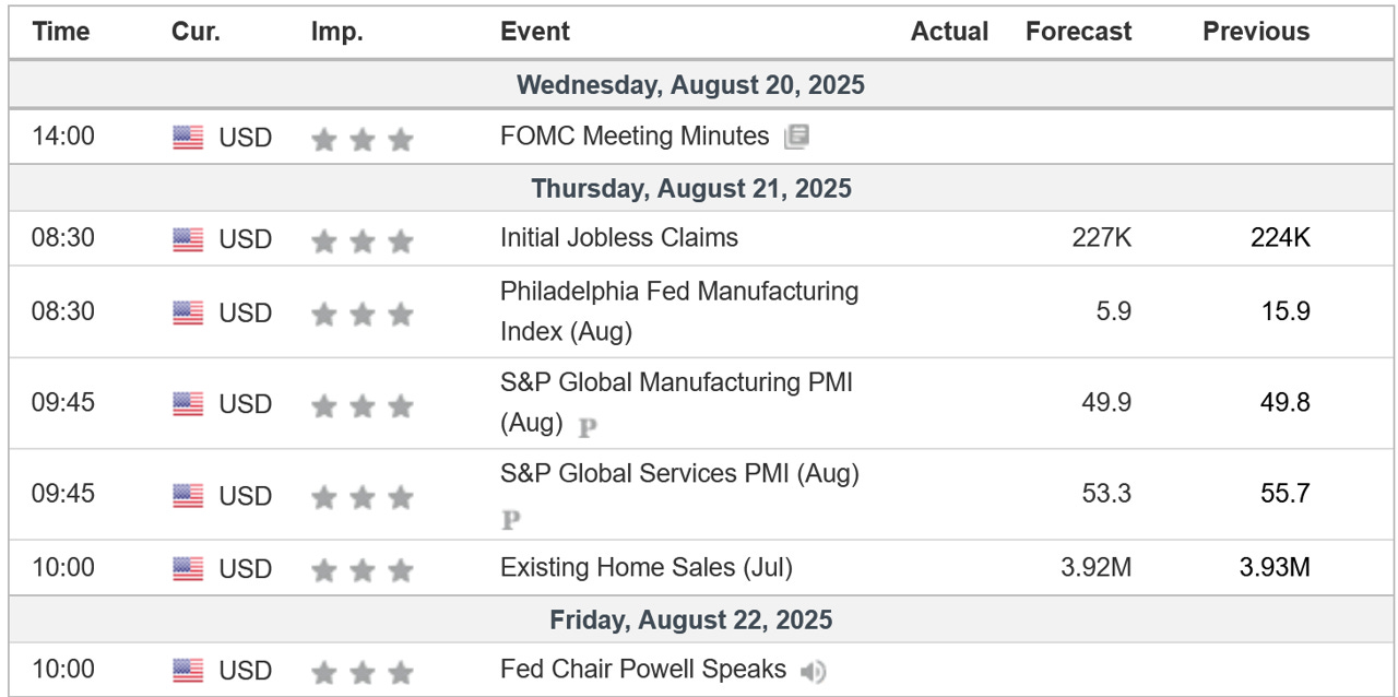
All eyes this week will be on the initial market reaction to the Trump / Putin summit from Friday and any insight Fed Chair J. Powell may give from the Jackson Hole symposium on interest rate policy and the upcoming September FOMC meeting.
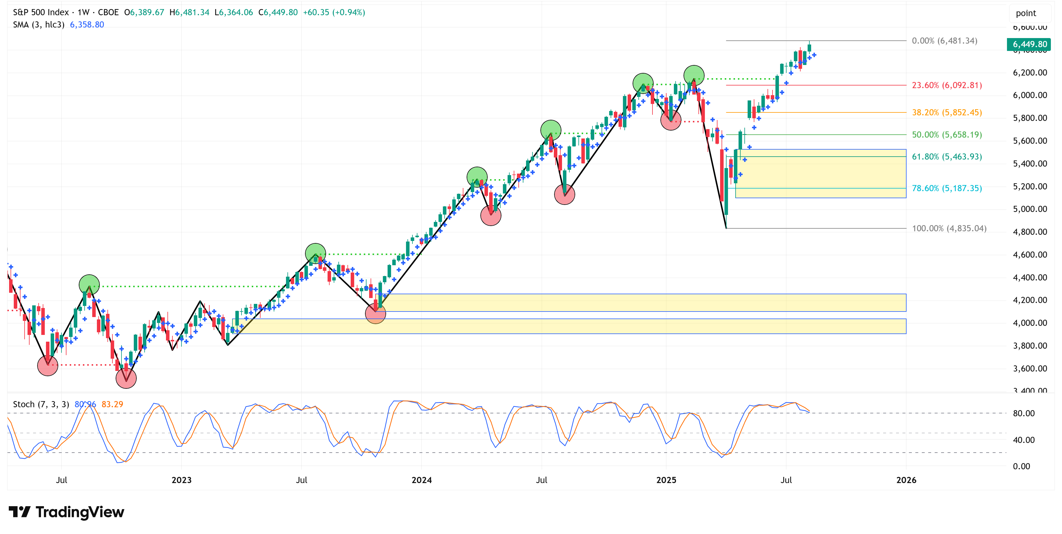
🗺️ The Market Map - S&P 500
We use this section each week to “Map the Market” using our proprietary, systematic methodology to gauge a) the current trend of the market and b) where the market may be heading over the medium term.
Most of our readers are long-term investors, so we focus on the weekly charts; however, our methodology can be used on any timeframe.
As always, let’s start by looking at the weekly chart.
The S&P 500 was higher by +0.94% last week and closed the week at a new all-time high.
As evidenced by the chart below, the market continues to maintain its bullish structure; therefore, all else being equal, we should expect a continued move higher.
With that said, it is important to shift to the 4-hour time frame to see if it gives us any clues of exhaustion and thus the potential for a correction.
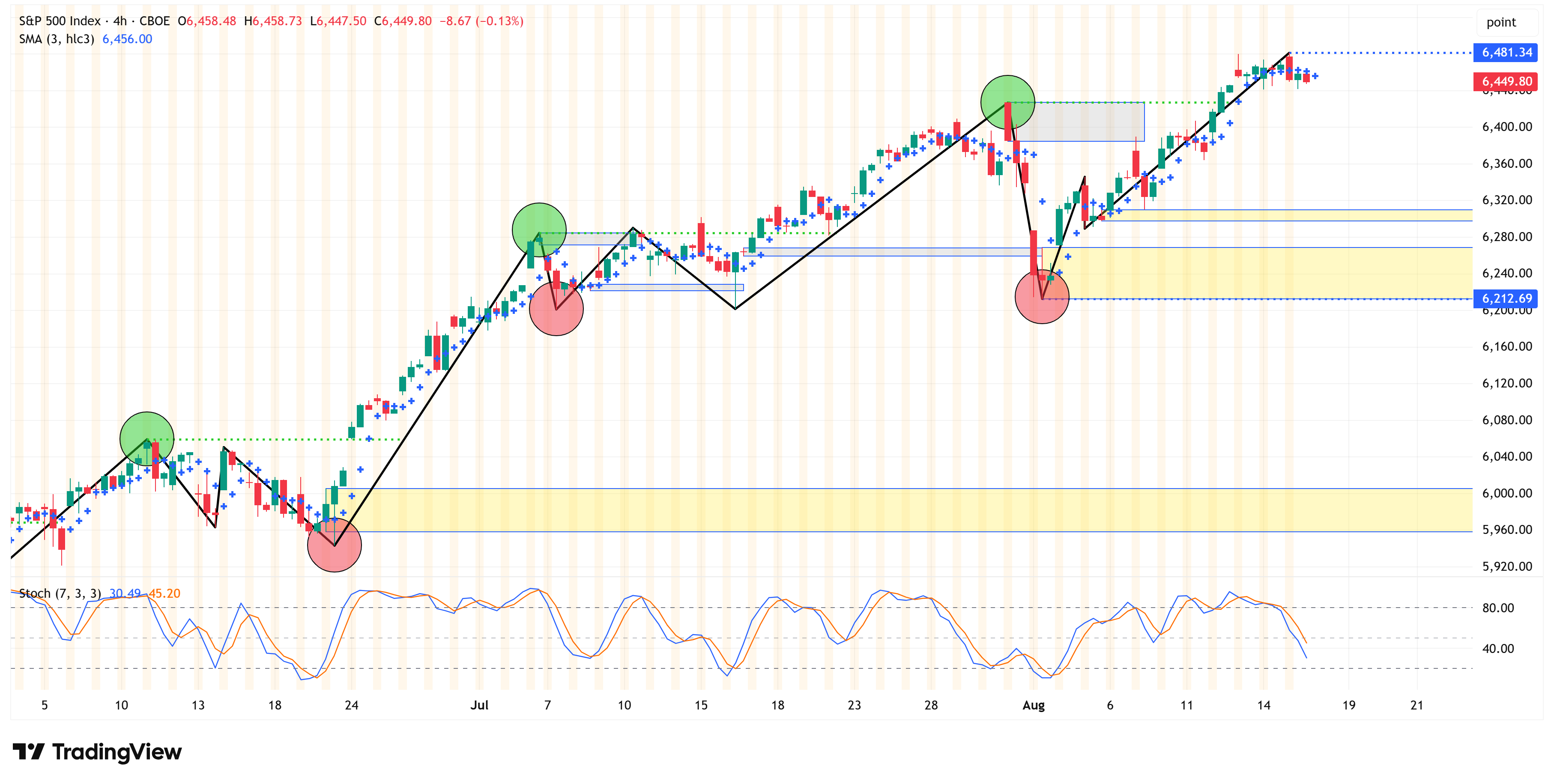
So far, the 4-hour remains bullish as well.
The key levels to watch are:
6,481.34
6,212.69
If the S&P 500 can close above 6,481.34, the bullish strength should continue.
If the S&P 500 closes below 6,212.69, this could be an early sign that a correction is possible.
If/when we get a close below 6,212.69, the next area of support will be the lowest yellow box on the chart above, which is a range between 5,958.16 & 6,005.58.
In summary, the S&P 500 remains bullish both on the weekly chart and the 4-hour chart.
Deep Dive
Distance to Fair Value (%)…
Regular readers know that I have developed a proprietary model that defines what I call the “fair value” of the S&P 500.
Note: this model is available each week to paid subscribers. If you would like access to this model, please consider upgrading to a paid membership (if you don’t have one already).
If we know (or at least can estimate) the “fair value” of the S&P 500, we can have a reasonable idea of how over-/under-valued the market is on any given day.
Very critical point here…the market can (and does) stay over-valued and/or under-valued for extended amounts of time (oftentimes for years).
With that said, this aspect of the model is not a timing tool, but more so a general health of the market tool.
As I was updating the model for this week, I noticed something very interesting.
On Thursday of last week, the distance (in percentage terms) between the current value of the S&P 500 and the calculated fair value of the S&P 500 hit the largest negative amount ever at -57.5%.
Translation = as of 08/14/25, the S&P 500 would have to decline by -57.5% to get back to its fair value.
As noted above, this is the largest delta between the two metrics in the history of this model, and our data goes back to 1961.
In the following chart, I am displaying the “% to Fair Value” with the blue line.
You should read the chart as follows:
The higher the blue line, the more oversold the market is, and therefore will have to appreciate by “X” percent to get back to fair value.
The more negative the blue line, the more overbought the market is, and therefore will have to decline by “X” percent to get back to fair value.
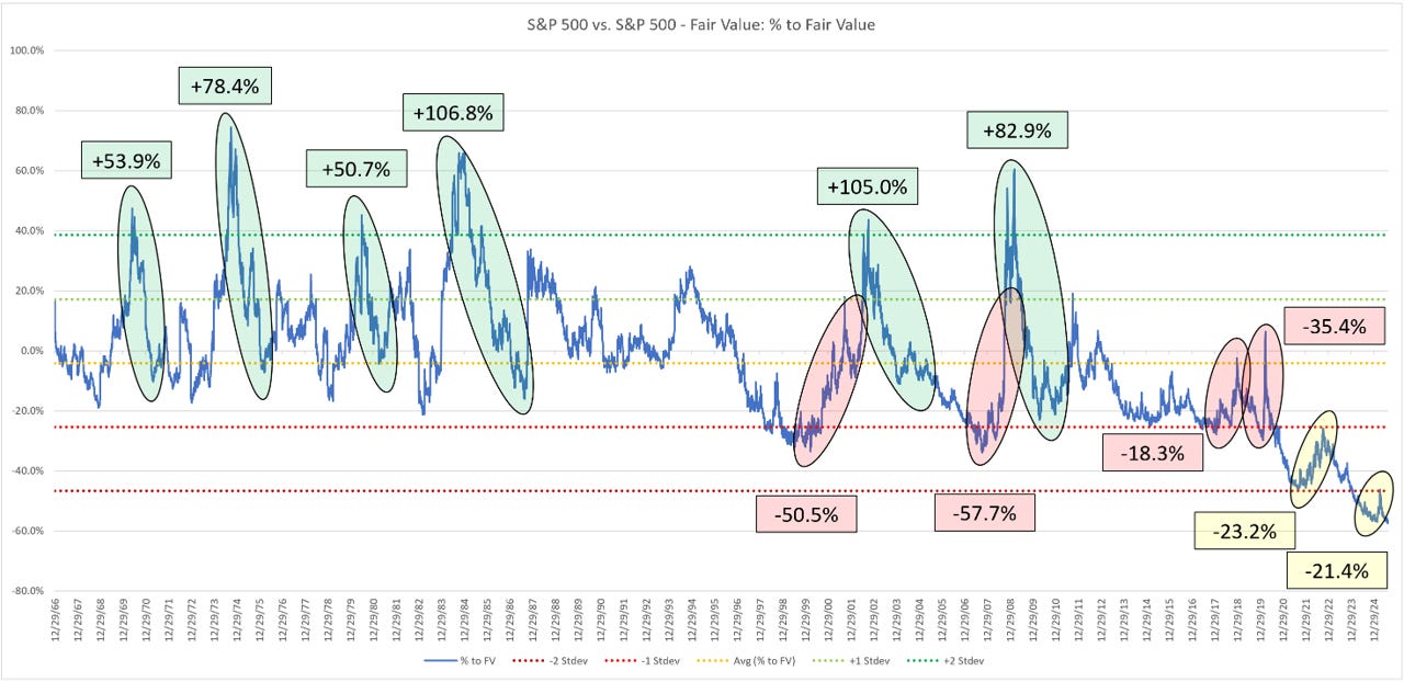
A few observations:
Every time the blue line has been above +2 standard deviations (green bubbles), it always retraced to at least the average line, which led to some pretty spectacular results for the S&P 500 (i.e., +53.9%, +78.4%, +50.7%, +106.8%, etc.)
On four occasions, the blue line has fallen below -1 standard deviation (red bubbles) and subsequently reverted to at least the average line, which led to some pretty poor results for the S&P 500 (i.e., -50.5%, -57.7%, -18.3%, and -35.4%)
The blue line has now fallen well below -2 standard deviations. This puts us in uncharted territory. You can see via the yellow bubbles that we’ve had two corrections of -23.2% and -21.4% and those didn’t get us anywhere close to the average line.
As I noted above in The Market Map - S&P 500 section, the market remains bullish, so we should expect the path of least resistance to be a continued move higher, BUT, when this market does start to turn lower, it could get ugly.
Don’t be the last one trying to exit the crowded theater.
The following sections are for paid subscribers only.
In these sections, we will discuss our proprietary:
S&P 500 Fair Value Model
This model provides a guide for:
a) How far the S&P 500 could decline in the next recession.
b) When to get back into the market after it has declined.
The Market Map - Extended Analysis
We will call out specific price objectives (up trends vs. down trends, targets, stop losses, etc.) on the following:
Major US Indices
11 Major US Equity Sectors
US Treasuries
Currencies
Commodities
Fixed Income
If you would like exclusive access to the proprietary data below, please become a paid subscriber today! Use the button below for a “15% Discount” for life!
Keep reading with a 7-day free trial
Subscribe to Skillman Grove Research to keep reading this post and get 7 days of free access to the full post archives.