Weekly Chart Review
We saw a "bullish engulfing" candle for the S&P 500 last week...what happens this week may be the tell for the weeks to follow...
In honor of the 4th of July, this will be an abbreviated note this week.
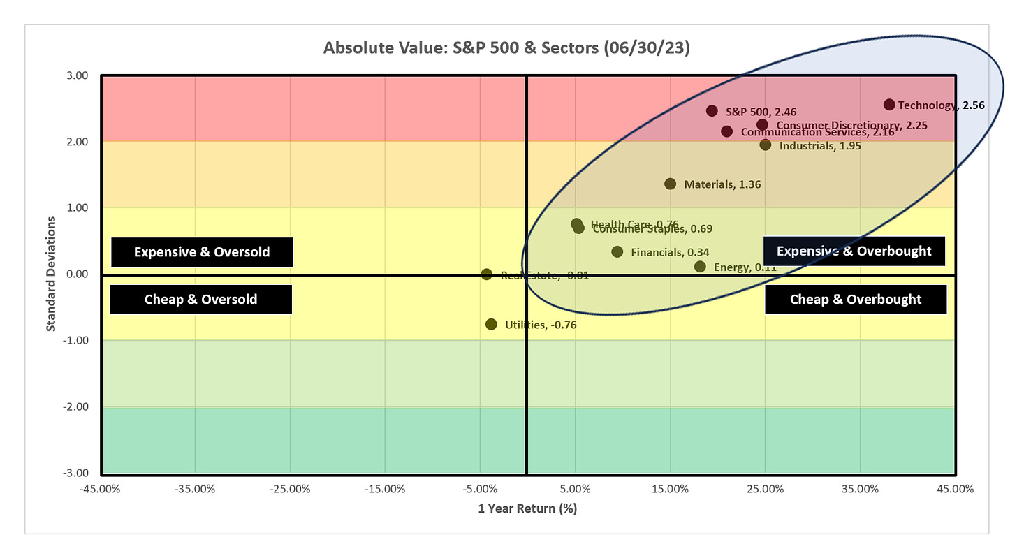
Let’s look at the absolute value and relative value charts.
Absolute Value
Note the massive cluster of sectors, and the S&P 500, in the top-right “Expensive & Overbought” quadrant. We now have three sectors, and the S&P 500, beyond the 2.0 standard deviation threshold, and the Industrials sector is knocking on the door at 1.95 standard deviations.
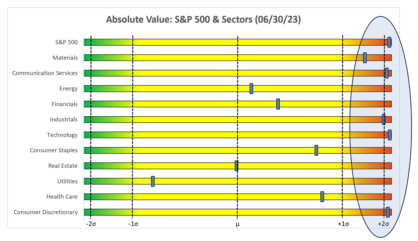
Same data here just a different look. Note the highlighted area towards the right of the chart. Typically, values above 2.0 standard deviations do not hold for an extended amount of time.
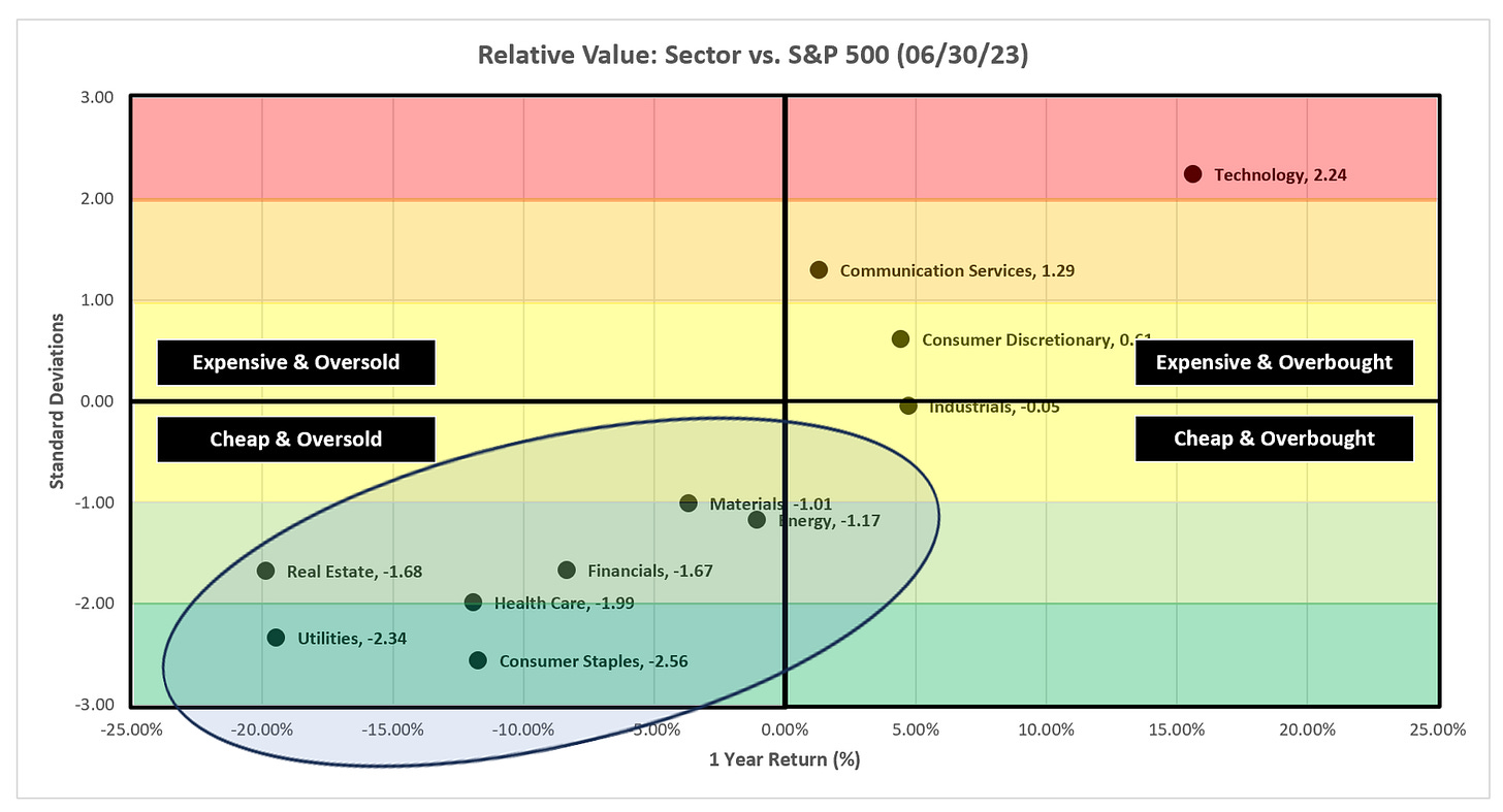
Relative Value
As I have said for weeks, it continues to be the Technology show for the entire first half of the year. With that said, look at the seven sectors in the bottom-left “Cheap & Oversold” quadrant. At some point, we will see a rotation back into these sectors.
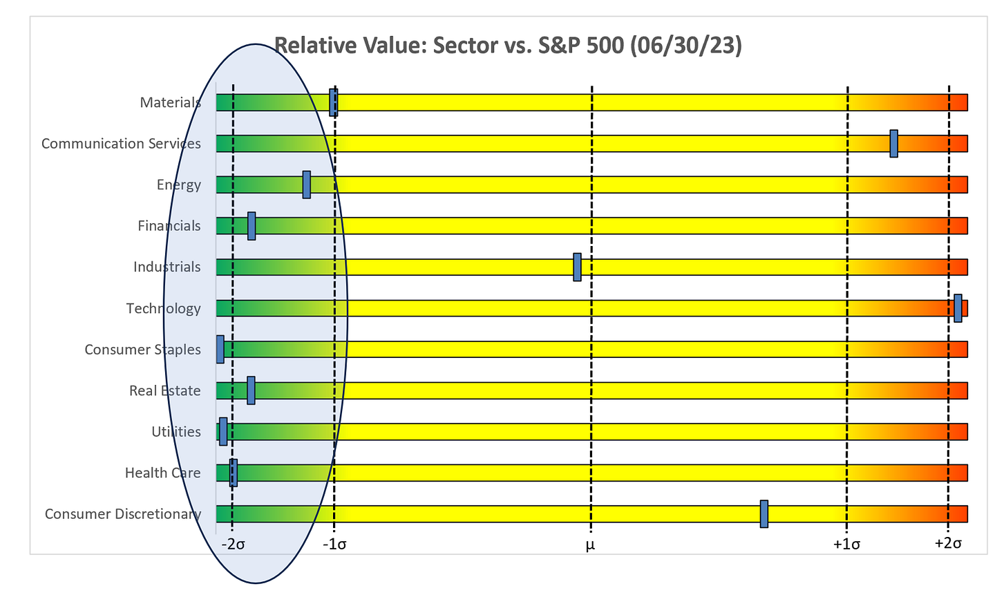
Like above, same data here, just a different look. It really has become a tale of two markets (i.e., Technology and everything else) on a relative basis.
Bullish Engulfing
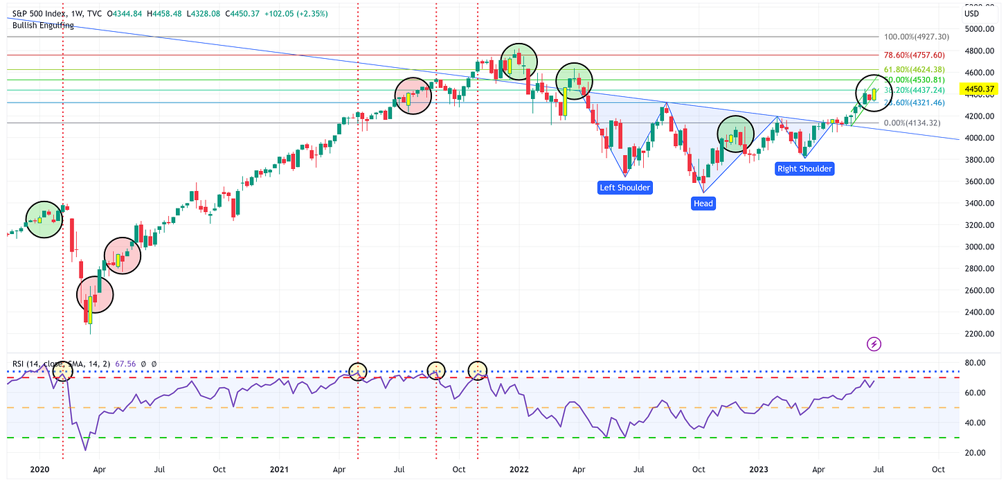
The S&P 500 formed a “bullish engulfing” pattern with its weekly candle last week.
“The bullish engulfing pattern is created when the open and close of the red candlestick are both tighter than the open and close of the green candlestick. The green candlestick should also be significantly larger than the red candlestick, indicating that there is strong buying pressure in the market.”
A bullish engulfing candle in a downtrend often signals a reversal whereas a bullish engulfing candle in an uptrend often signals a continuation of the existing trend.
I have highlighted with yellow price bars, the eight bullish engulfing patterns the S&P 500 has had since 2020.
It is interesting to note that in three of the instances (red circles), the bullish engulfing candle was followed by a down week (i.e. a red candle) only to shake off that down week and continue to ramp higher.
Alternatively, in four of the instances (green circles), the bullish engulfing candle was followed by an up week (i.e. a green candle) only the find the S&P 500 decline rather significantly in the weeks directly following the green candle.
Summary
If this pattern holds, we need to watch the price action closely this week because an up week this week, suggests that we could have a more substantial pullback in the subsequent weeks. Alternatively, if this week is a down week, it could suggest that the rally will continue in the following weeks.
Have a great 4th everyone and stay safe out there!
Until next week…


Excellent. Thanks!