


Weekly Chart Review
Survey Results + The Market Map + A Market Warning

I hope everyone had a wonderful Easter and Passover!
As a Christian, this was an extremely special and important weekend.
It started with Good Friday, when Jesus went to the cross to die for the sins of this world (including yours and mine), and culminated with His resurrection on Easter Sunday.
“He is not here, for He has risen, just as He said.” Matthew 28:6
If you don’t know this story and how it can lead to your eternal salvation, I would be more than happy to speak with you about that.
Please do not hesitate to reach out to me if that is of interest, and may God bless you!
Survey Results
A sincere “Thank you!” to everyone who completed the survey last week.
It provided incredibly valuable insight (and encouragement), and I genuinely appreciate the time you took to complete it!
I promised a recap of survey results, so here goes:
1) What best describes your current "type" of investment related position?
Financial Advisor / Planner = 49%
Retail Investor = 32%
Institutional Investor = 13%
Other = 6%
2) What is the most valuable insight I can provide you with in each week's newsletter?
Learning how to read the charts to make better investment decisions = 51%
S&P 500 fair value model = 42%
The week ahead news items to watch = 37%
Previous week's recap of financial / economic news = 33%
Deep dive on the "topic of the week" = 32%
* This question allowed for multiple answers, which is why the totals do not add up to 100%.
3) What would make our newsletter better? Said differently, how can I serve you better as a subscriber?
These responses were written by subscribers; therefore, they did not lend themselves to uniform responses like the first two questions.
However, I used ChatGPT to summarize the results.
Here is what ChatGPT found:
Enhanced chart analysis and education
A significant number of subscribers emphasized the need for more detailed guidance on interpreting charts.
Requests included a) tutorials, b) deeper exploration of technical analysis tools, and c) regular charts displaying major indices/sectors to highlight key market events.
Focus on long-term and strategic insights
Subscribers expressed a preference for longer-horizon contrarian or inflection point ideas, such as identifying cyclical tops and bottoms, and providing actionable investment strategies or tactical ETF allocations.
Improved coverage of economic and market drivers
Subscribers suggested expanding coverage to include more analysis of macroeconomic themes, the state of the economy, sector valuations (overbought/oversold), and specific drivers of indices.
Summary
My takeaways from the survey:
Subscribers value the charts and want more of them, but more importantly, they want to learn how to interpret the charts on their own.
This speaks to me of providing more educational content. More in the “teach a man how to fish…” category.
Subscribers value the S&P 500 fair value model and want to learn more about how it is calculated.
Again, more educational content…how is the model calculated, how do we interpret the results, etc.
Analysis should be geared towards medium-to-long-term trends vs. tactical short-term trends.
More than half of our subscribers are financial advisors/planners and/or institutional investors who are not nearly as concerned with the day-to-day fluctuations of the market.
Market recaps (i.e., what you missed last week) are good, but not as valuable as a preview of what’s coming up for the current week.
This suggests to me that subscribers have already processed the market performance/news from the previous week but want to stay informed as to what’s coming up in the current week so that they can be prepared.
The deep dive topics should be more geared towards macroeconomic themes, the state of the economy, etc.
Know that I have heard you, that I appreciate your input, and that I will be incorporating these changes over the next several weeks.
If you would like to provide any additional feedback, please do not hesitate to leave a comment below, or you can reply to this email. I read every response.
Thanks again for your help, and please feel free to use this discount code to get 70% off an annual subscription as a token of my appreciation.
The Market Map - Lesson #1
Given the overwhelming response to understand how to read charts, I thought I would begin today with what will be a multi-week tutorial on how to interpret charts.
Let me emphasize from the beginning, there is no single “right way” to do this. What I am going to share over the next several weeks is the process I use, but that doesn’t mean it’s the only way.
Additionally, no method is perfect, and there is no holy grail (believe me, I’ve searched for it).
The key is to develop a systematic approach to remove emotions from the decision-making process.
Let’s dive in.
State of the market…
There are only two states in which the market can exist:
Trending (up or down)
Consolidation (rangebound)
Further, no market (even a trending market) moves in a straight line.
You can see in the illustration below that the “Up Trend” market moves higher, then pulls back, moves higher, then pulls back…rinse and repeat.
The same is true for the “Down Trend” market, but the opposite.

How do we define the state of the market…
Up Trend = a series of higher highs and higher lows.
Down Trend = a series of lower highs and lower lows.
Consolidation = a series of equal highs and equal lows.

How do we know when the state of the market has changed…
In the example below, the market is shifting from an up trend (bullish) to a down trend (bearish).
This is confirmed when we establish a new “lower low” vs. what we had previously, a series of “higher lows”.

The example above is a perfect “academic” model.
Here is a real-world example using actual market data.

This is a good place to stop for this week’s lesson.
Over the next week, look at as many charts as possible and see if you can mark out the HH, HL, LH, and LL.
I’ll be back next week with the next lesson.
S&P 500 Analysis
Let’s take what we learned above and apply it to the S&P 500 on the weekly chart.
I’m using the weekly chart because it provides a longer-term view vs. the daily chart or even shorter, more tactical time frames.

As noted in the chart above, the S&P 500 officially entered a down trend on the weekly chart when it closed below 5,773 (the previous HL).
This means the only thing we need to concern ourselves with is the current range as outlined in the chart below by the blue horizontal dotted lines (6,147 & 4,835).
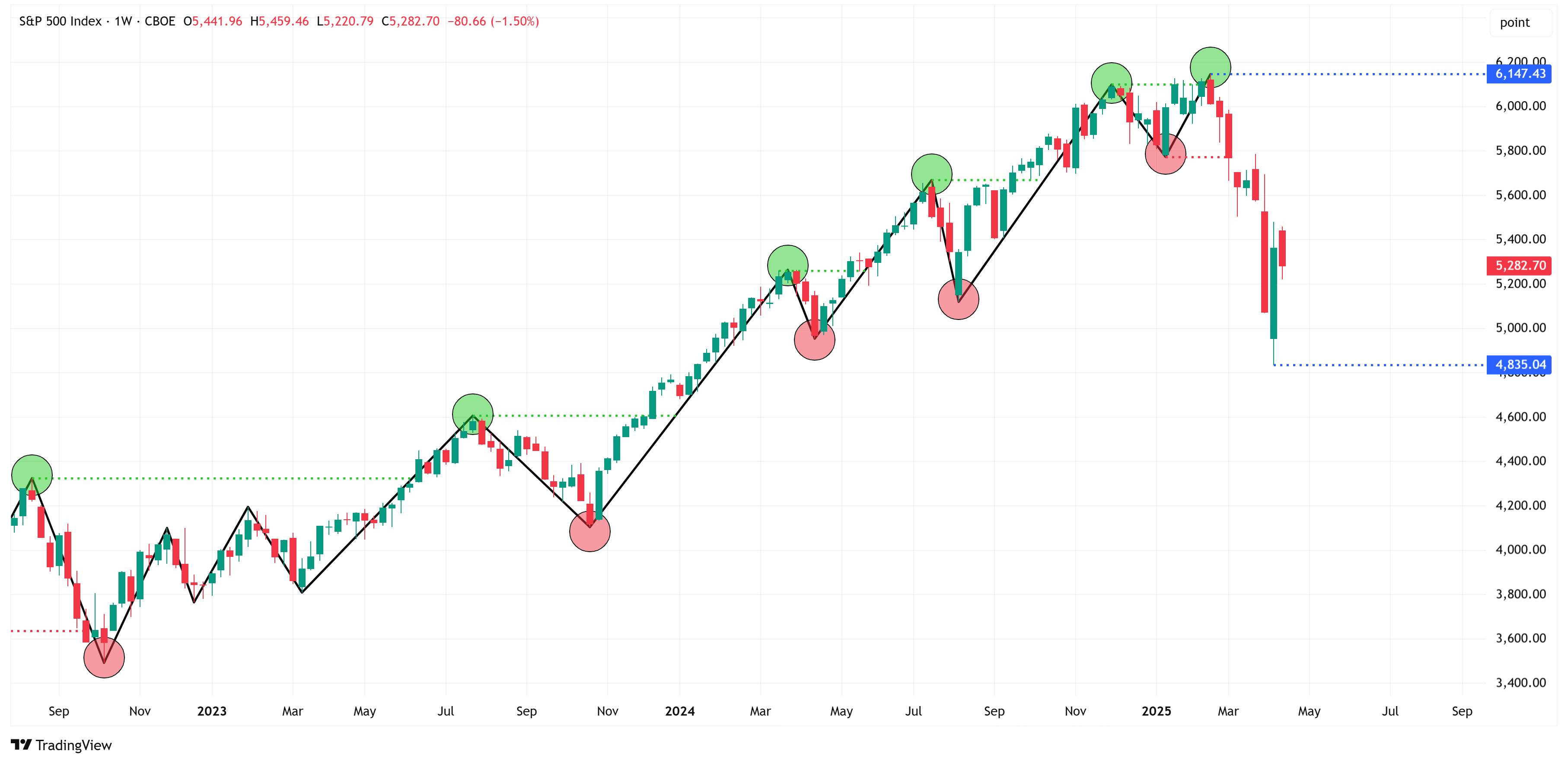
As the weekly chart stands right now, by my methodology, the S&P 500 cannot enter a new up trend until it closes above 6,147.
A close above 6,147 would constitute a “change of character” because the market would have formed a new “higher high”.
All else being equal, and given that we’re in a down trend, we should expect the market to move lower over the short-to-medium term.
As I stated above, the market never moves in a straight line. Therefore, it would not be uncommon (or unexpected) to see the S&P 500 move higher before it moves lower.
When you are in a down trend, the market loves to retrace to a) order blocks, b) fair value gaps, or c) the golden zone (area between the 61.8% & 78.6% Fibonacci) and then turn lower.
Which one will it be? No one knows, but I’ve laid out three potential paths in the chart below.
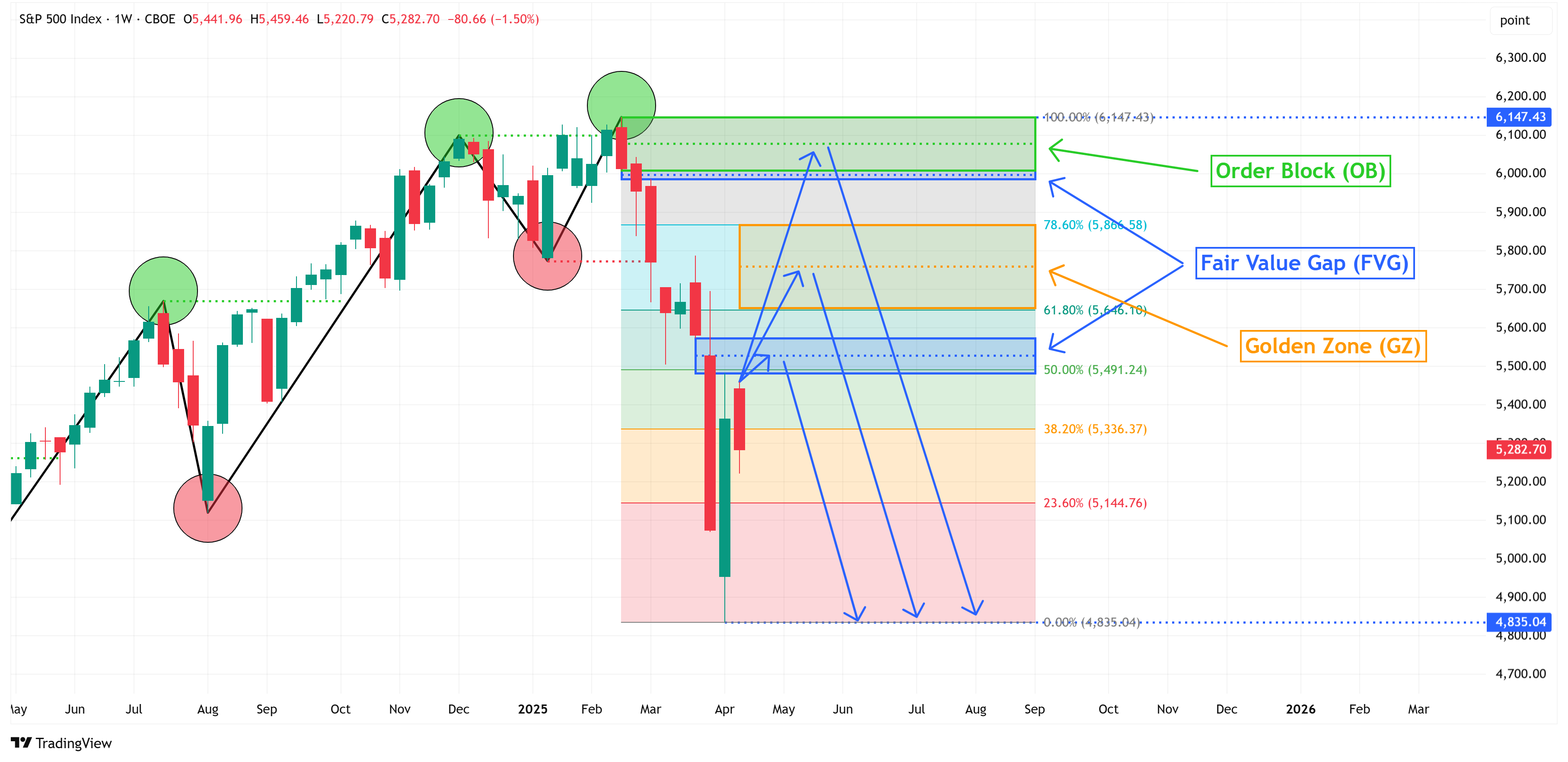
The other alternative is that the market doesn’t hit any of these levels and goes lower immediately upon today’s open, and starts heading towards 4,835.
No one knows how it will play out, but here is what our system does allow us to understand:
The market is in a down trend, so we should expect lower prices over the short-to-medium term.
The market does not turn into an up trend until it closes above 6,147. Until then, we should be looking for shorts.
Given that we have several items above current levels (OB, FVG, GZ), there is no point getting short at current levels until one or more of these levels are breached (we’ll talk more about how to know which one in subsequent “The Market Map” lessons).
If/when we do get short, our target is the swing low (4,835), and our stop is the swing high (6,147).
A Market Warning…
I am a big fan of John Hussman’s work and periodically quote his work.
He and I both have “S&P 500 Fair Value” models that produce very similar results, so it’s nice to know we’re in good company!
Here is a link to check out his work if you’re interested.
Mr. Hussman posted a special report last week (here) in which he laid out an argument suggesting that market conditions are moving directionally towards what he calls a “crash warning”.
I would encourage you to read the entire piece, but here is a snippet from the report that I thought was relevant:
The trap door swings open
At its core, a market crash is nothing but risk-aversion meeting a market that’s not priced to tolerate risk. We always become concerned about “trap door” outcomes when rich valuations are joined by deterioration in the uniformity of market internals – which is our most reliable gauge of speculation versus risk-aversion among investors.
Our concerns about trap door conditions become even more pointed when investor confidence has been destabilized. Recall that the 1929 and 1987 crashes started after the S&P 500 was already down about 14% from its highs. As a general rule-of-thumb, when investors are jolted by a decline in the S&P 500 of 10% or more from its 10-week high, and Baa corporate yields or credit spreads are widening, “trap door” conditions tend to be resolved by abrupt and often substantial market losses.
The chart below shows what this looks like, in data since 1928. The blue line is the S&P 500 Index (left scale, log). The red bars show instances that are assigned our most negative return/risk classification – based on measurable, observable market conditions such as valuations and market internals – coupled with a loss in the S&P 500 of more than 10% from its 10-week high and deteriorating Baa credit conditions (versus 6 months prior). The green line (right scale, log) is the cumulative return of the S&P 500 in the 65 weeks since 1928 when this particular set of conditions has been in effect. It’s a rare syndrome, but it has regularly occurred at the breakpoint of memorable market collapses, including 1929, 1987, 2000, 2008, and 2020.
Here is the chart he references:

Does this mean that we are guaranteed to have the aforementioned “crash”?
No, but it should raise our antenna a bit, especially as our call on the S&P 500 is currently short as outlined in the analysis above.
Key Macro Events This Week

S&P 500 Fair Value Model
Let’s close this week with an update on my S&P 500 fair value model.
The red line in the chart below is the fair value I have constructed for the S&P 500. Based on my model, the current fair value for the S&P 500 is 2,678.95.
Thursday’s close on the S&P 500 was 5,282.69.
This means it would take a decline of -49.3% from the S&P 500’s current value to its fair value.

Thank you, as always, for your continued support of this newsletter!
If you have found it helpful, please consider sharing it with a friend or colleague so that we can grow our community.
To do so, please click on the button below. Thank you in advance!
Let’s make it a great week!
Take care,
Jim Colquitt
The Weekly Chart Review is a publication of Skillman Grove Research.
All opinions and views expressed herein are based on our judgments as of the date of writing and are subject to change at any time.
The content of this newsletter is for educational purposes only and should not be construed as investment advice.
Investing involves risk, including loss of principal, and past performance may not be indicative of future results.
Do your own research and, where appropriate, seek the advice and counsel of a reputable financial advisor.
Matt 6:33