
Weekly Chart Review
Watch UST 2Yr and US Small Caps...

Hey everyone, it’s Jim.
I hope you had a great weekend!
Let me start by saying a big “Thank You!” to all who have signed up for our first-ever webinar, coming up on September 23rd from 7:00 to 8:00 pm.
We had a ton of people sign up, and we’re looking to add more! See below for the details…
🚀 New for Paid Subscribers: Monthly Live Webinars 🚀
Starting this month, your Weekly Chart Review subscription comes with a powerful new feature: a live webinar every month.
In each session, you’ll get:
Step-by-step “Market Map” Training → Learn our systematic process so you can read the market like a pro.
Interactive Chart Talk → We’ll pull up your requested charts in real time and share where we think they’re headed.
Open Mic Q&A → Ask anything about markets, charts, or our process.
🔒 This benefit is only available to annual paid subscribers.
👉 Subscribe now for just $99/year
If you’re a paid subscriber and would like to join our monthly webinar, please reply to this email and say “Count me in!”.
In this week’s newsletter:
📰 Stay Informed
Key Macro Events From Last Week (ICYMI)
Key Macro Events To Watch This Week
🗺️ The Market Map
S&P 500
🔎 Deep Dive
Watch UST 2Yr and US Small Caps...
📊 S&P 500 Fair Value Model
📈 The Market Map - Extended Analysis
Major US Indices
11 Major US Equity Sectors
US Treasuries
Currencies
Commodities
Fixed Income
📰 Stay Informed
Key Macro Events From Last Week (ICYMI)
Here’s a quick recap of the key data releases from last week:
🏭 PMI – U.S. Manufacturing PMI (August, released Sept 2)
The S&P Global Manufacturing PMI for August came in at 53.0, slightly below its flash estimate of 53.3 but well above July’s 49.8, confirming continued expansion.
By contrast, the ISM Manufacturing PMI remained in contraction at 48.7, highlighting a divergence between private survey optimism and broader industry softness.
👉 Read more
💼 ADP Employment – Private Sector Jobs (August, released Sept 4)
Private-sector hiring slowed sharply, with 54,000 jobs added in August, well below expectations (~73K) and down from July’s 106K.
Gains came mainly from leisure & hospitality (+50K) and construction (+16K), while manufacturing (-7K) and trade/transportation/utilities (-17K) contracted.
👉 Read more
👷 Unemployment Rate & Non-Farm Payrolls (August, released Sept 5)
Non-farm payrolls increased by just 22,000, marking the weakest monthly gain in years and missing consensus forecasts by a wide margin.
The unemployment rate rose to 4.3%, the highest since 2021, while prior months were revised lower, including a surprise job loss in June.
Markets interpreted this as dovish: Treasury yields fell, and rate cut odds for September surged to 100%.
👉 Read more
📊 Market Takeaway
Date from this week confirmed a softening labor market—weak ADP hiring, sluggish payrolls, and rising unemployment—against a backdrop of still-resilient PMI signals. Markets are now firmly priced for a September Fed rate cut, with speculation building for the possibility of three rate cuts before year-end.
Key Macro Events To Watch This Week
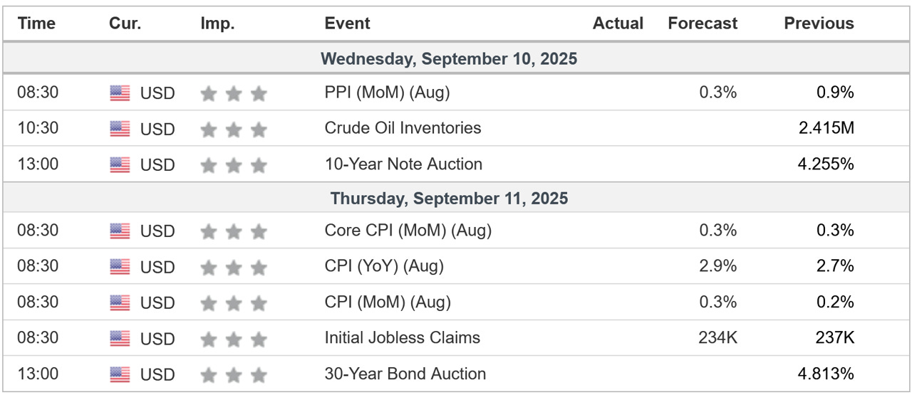
We’ll get our next look at inflation this week with the releases of PPI and CPI. The market will be watching these closely.
🗺️ The Market Map - S&P 500
We use this section each week to “Map the Market” using our proprietary, systematic methodology to gauge a) the current trend of the market and b) where the market may be heading over the medium term.
Most of our readers are long-term investors, so we focus on the weekly charts; however, our methodology can be used on any timeframe.
Let’s start by looking at the weekly chart.
The S&P 500 was up 0.33% last week and remains in an uptrend.
If all you had was the weekly chart, you’d be right to think “Nothing wrong with this picture…onward and upward!”
However, I’d like you to focus on the stochastic indicator in the bottom panel of the chart below.
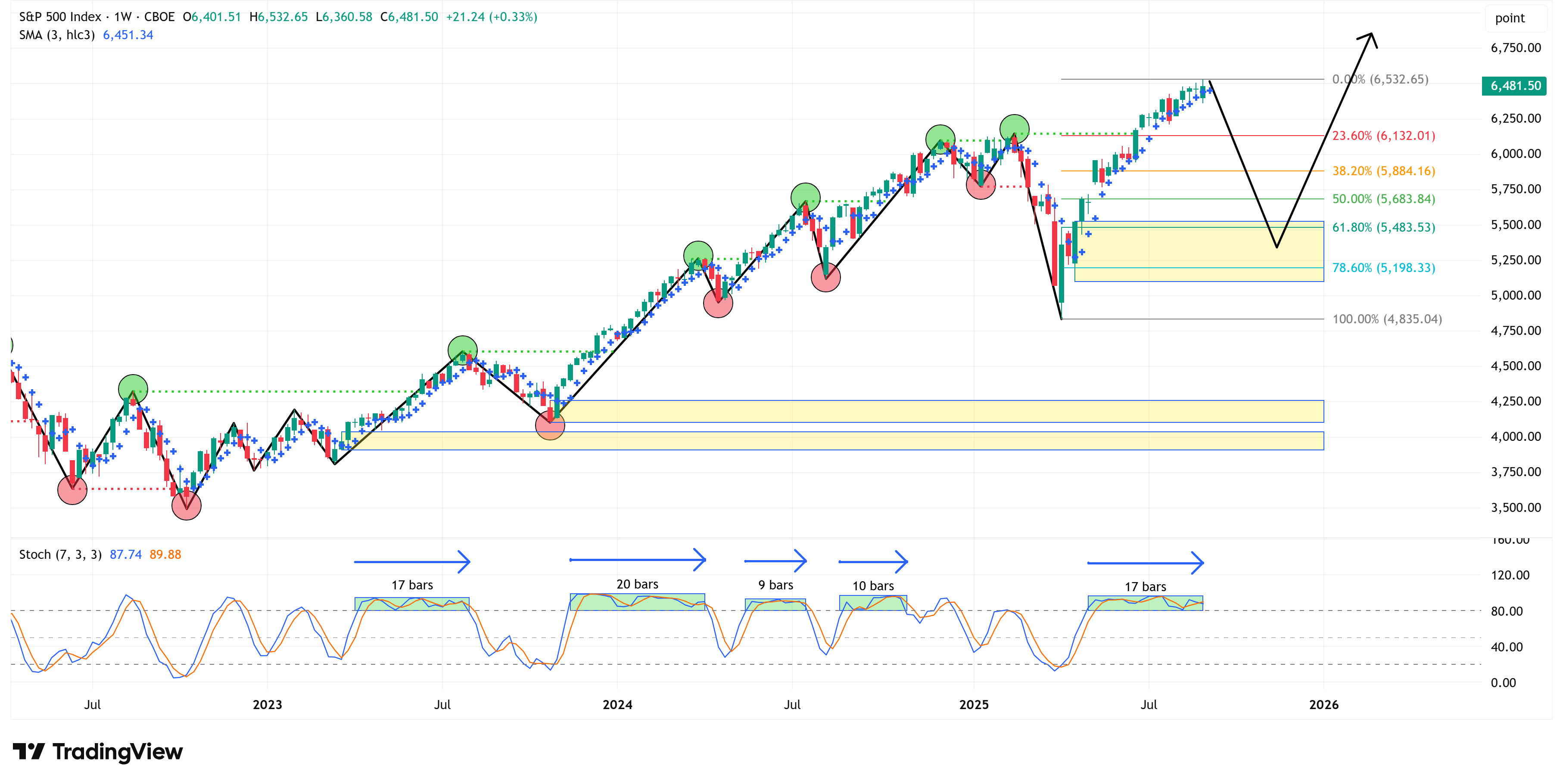
I have highlighted five instances (including the current one) where the stochastic indicator remained in an “overbought” condition for an extended period of time. (Note: “bars” = weeks, so “17 bars” = 17 weeks).
Let me be very clear, just because the stochastic has remained in an “overbought” condition for an extended amount of time, does not mean the market is about to turn lower.
The market could remain “overbought” for many weeks or months to come.
I’m simply pointing out that we’ve gone quite a while without any sort of meaningful pullback.
Further, if/when said pullback occurs, my work would suggest that the market will attempt to clear the yellow box by “tagging” into it. The black line/arrow is one possible path.
4-Hour Chart
If we shift to the 4-hour chart, we notice a couple of interesting things.
Last week, I presented this chart.
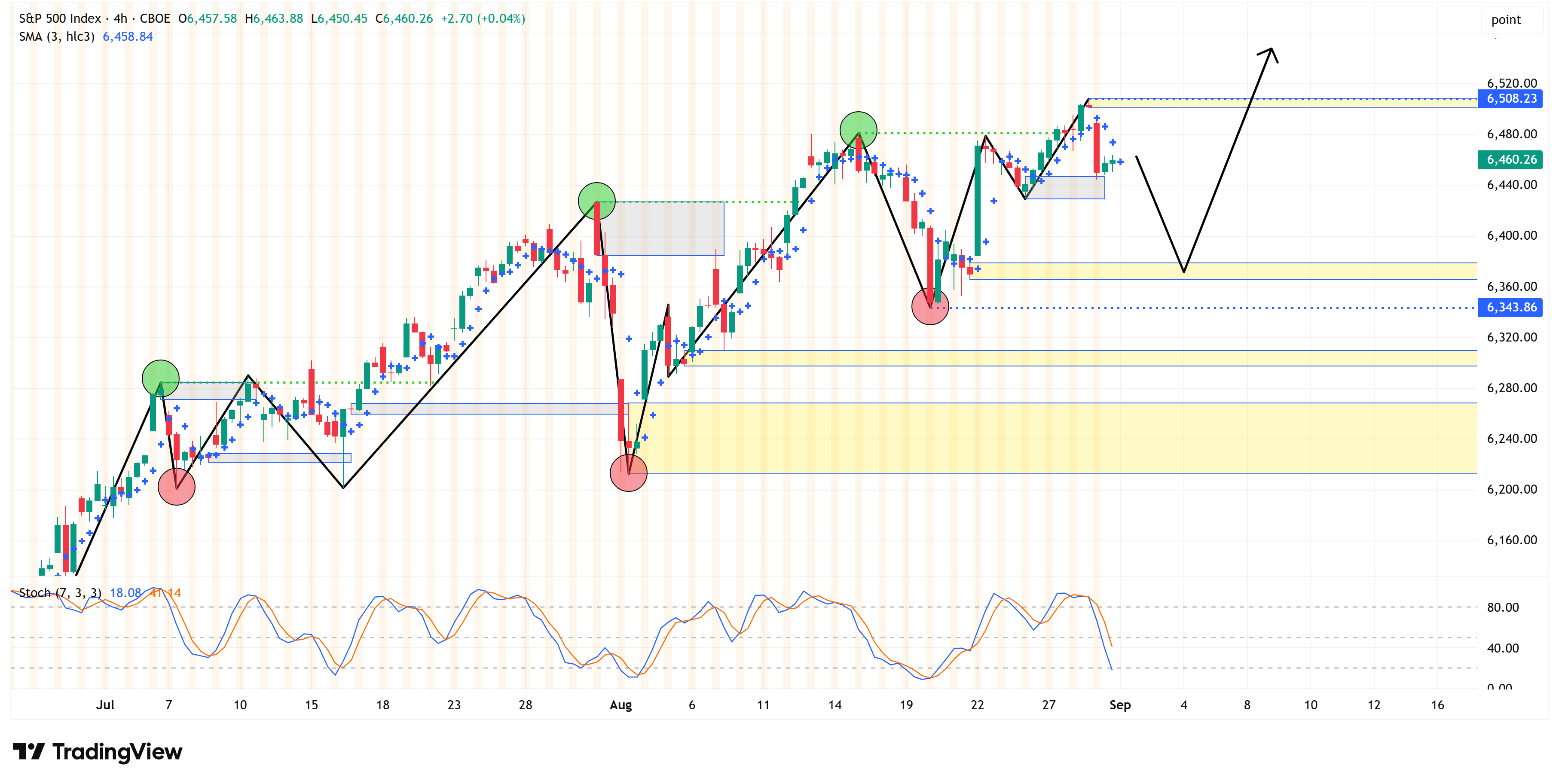
Anyone who has read my work for some time now knows that the yellow boxes are where I believe prices will gravitate towards over time.
Further, the grey boxes are the previous yellow boxes that got “tagged”.
Fast forward a week, and here is the updated chart.
Note how the market took out two of the yellow boxes.
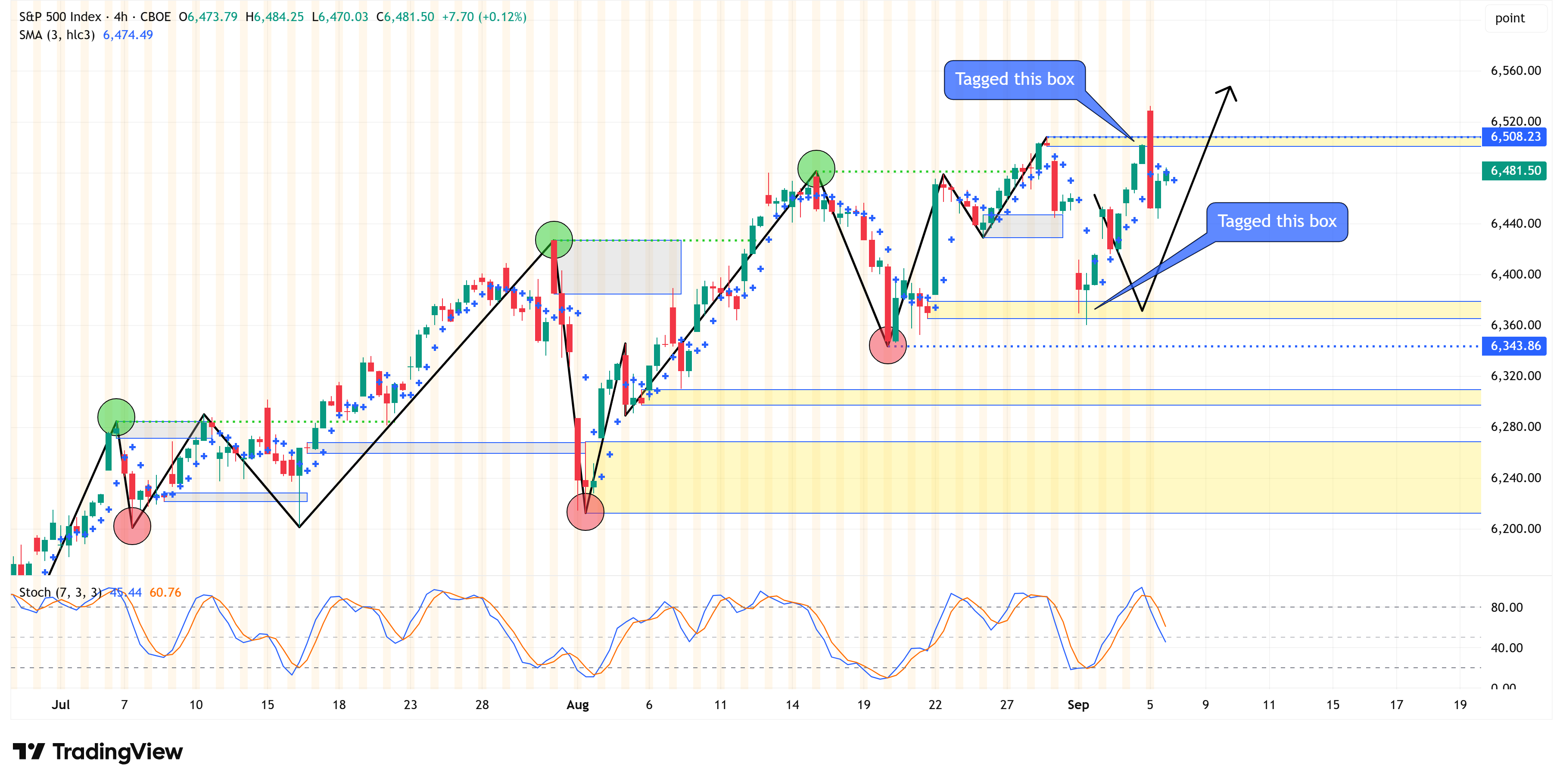
Once we clean it up, here’s what we’re left with for this week.
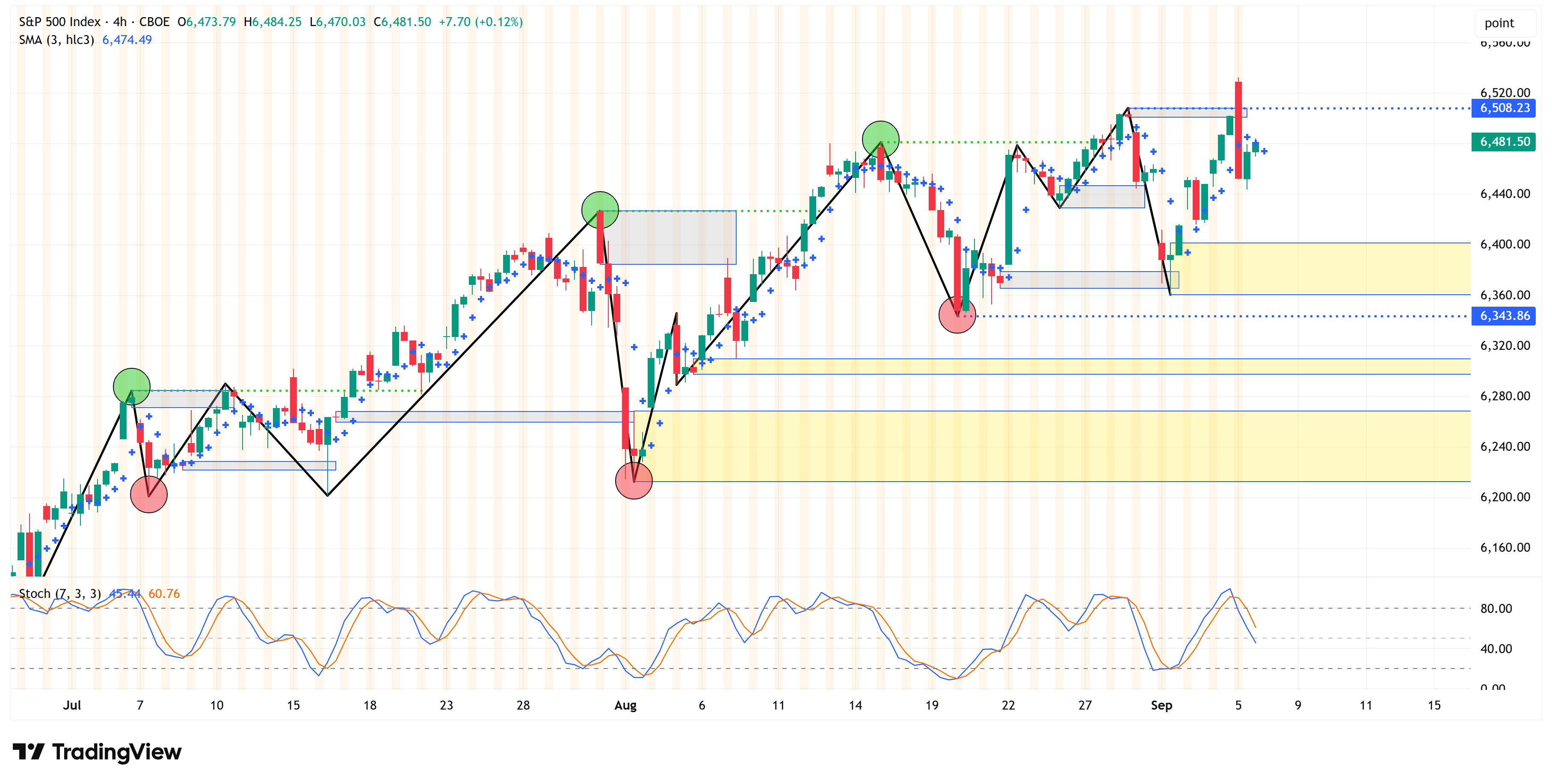
The key takeaway is that despite all of the volatility from last week, we never closed above or below the key levels I presented last week:
Swing high = 6,508.23
A close above this level pushes the bullish trend higher.
Swing low = 6,343.86
A close below this level will be the first sign of a possible correction.
This means that for now, both the 4-hour chart and the weekly chart remain bullish, and we’ll be looking for a close above 6,508.23 to confirm the next leg higher or a close below 6,343.86 to start thinking about the possibility of a correction.
Deep Dive
Watch UST 2yr and US Small Caps…
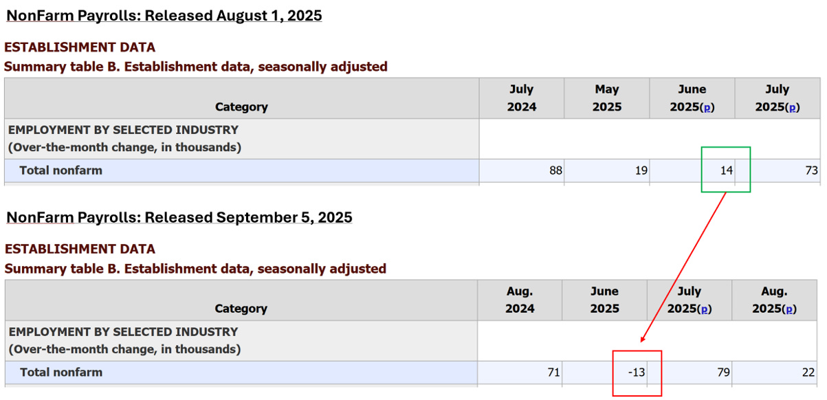
On Friday, we had the release of the NonFarm Payrolls and the Unemployment Rate.
NonFarm payrolls came in at +22,000, which was well below consensus estimates of +75,000.
The Unemployment Rate came in at 4.3% (which was inline with estimates), but up from last month’s print of 4.2%.
The market initially moved higher with these releases, which is typically because the market now believes there is further room for the Fed to cut rates.
However, the market quickly turned south, and I think it may have something to do with the revisions to the June 2025 NonFarm payrolls number, which were revised from +14,000 to -13,000.
This is the first negative NonFarm payrolls number since December 2020.
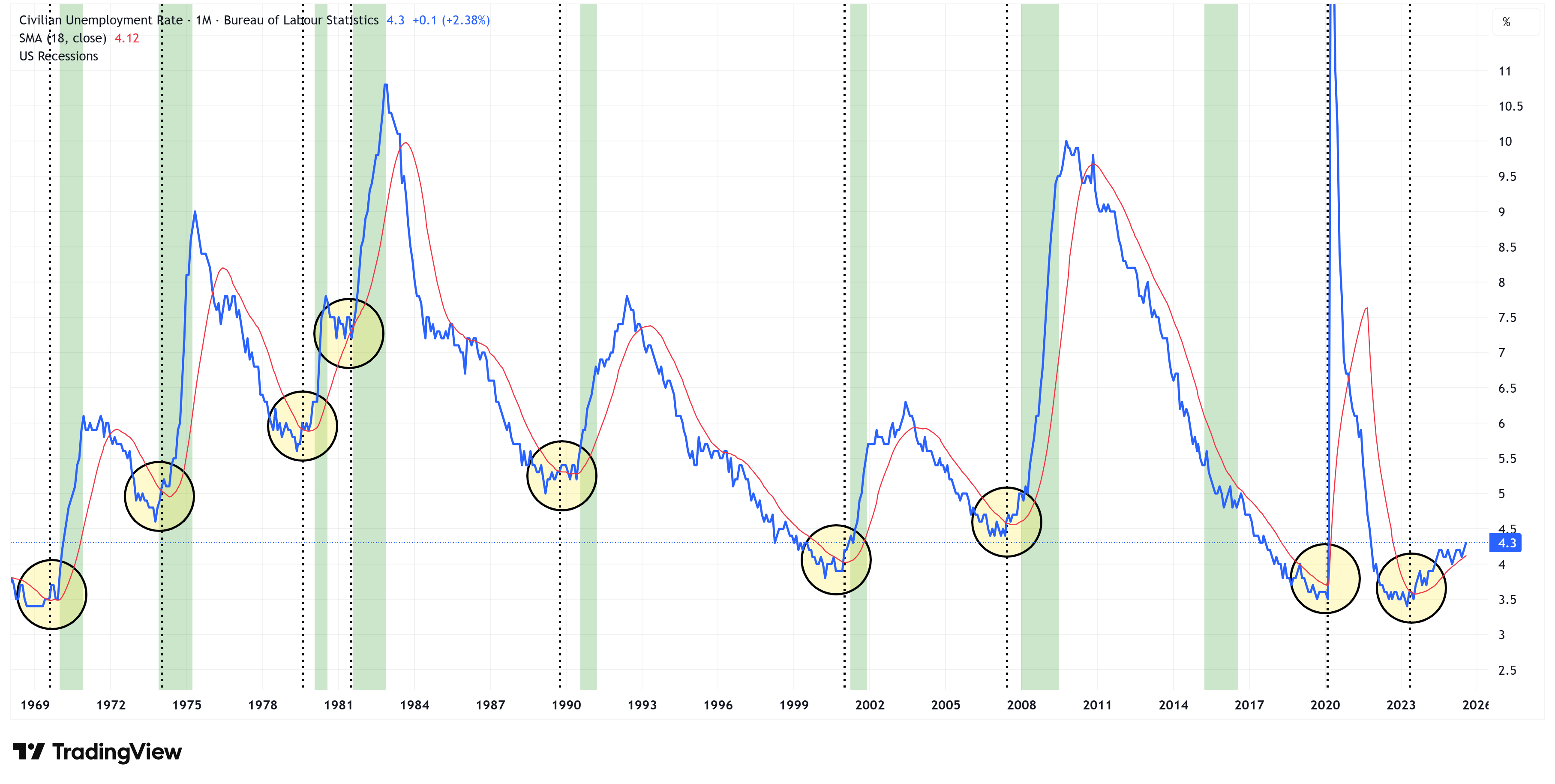
I’ve shown this chart a number of times in the past, but it’s worth showing again.
Every time the unemployment rate moves up and through its 18-month moving average, it leads to a recession.
Note: green bars = recessions.
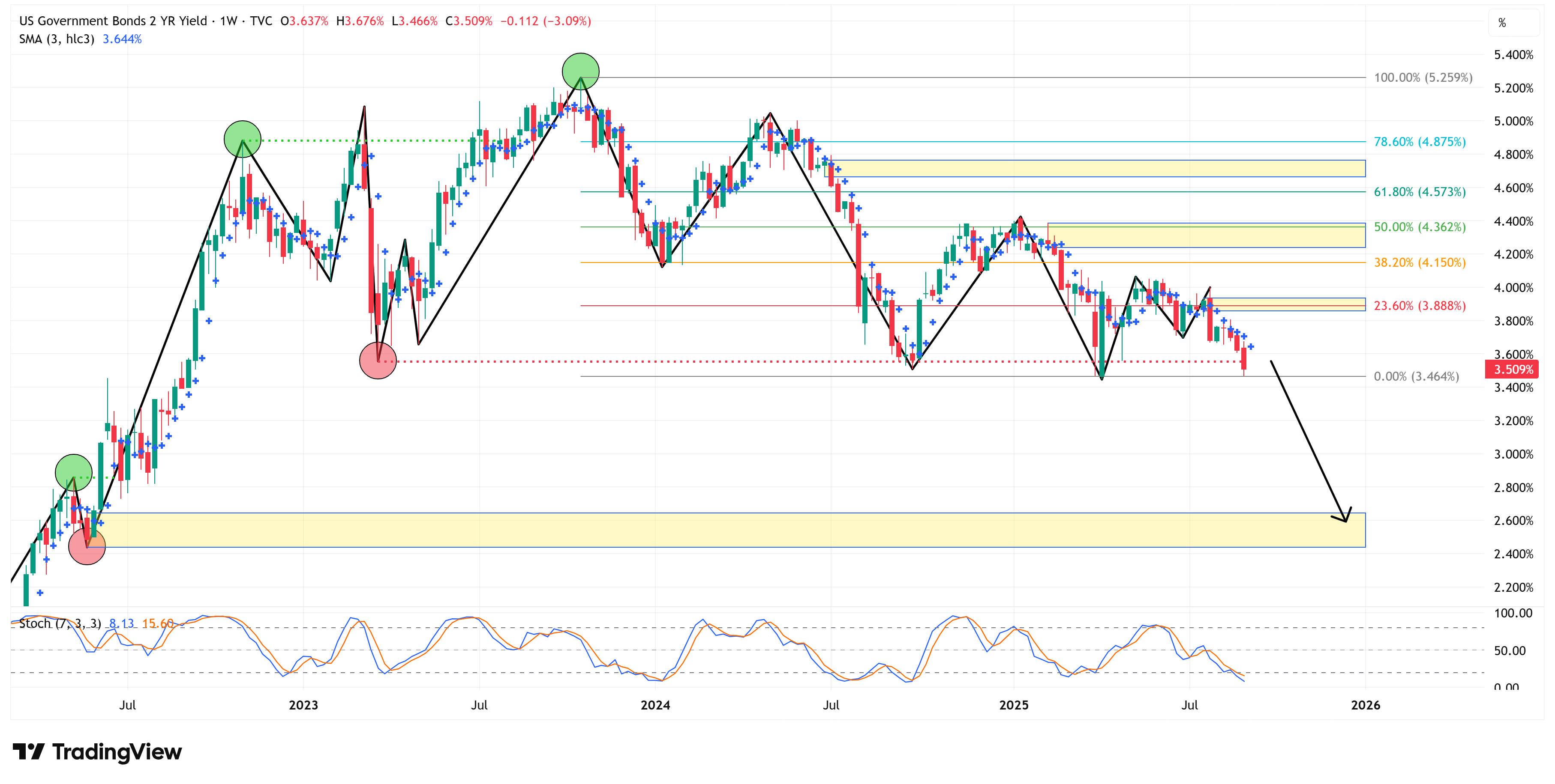
In other news, US Treasuries rallied on the weak jobs data.
I want to call your attention to the UST 2-year. It has now shifted to a downtrend, and I’m calling for a target of 2.44% - 2.64%. It won’t get there in a straight line, but that’s the next likely stopping point.
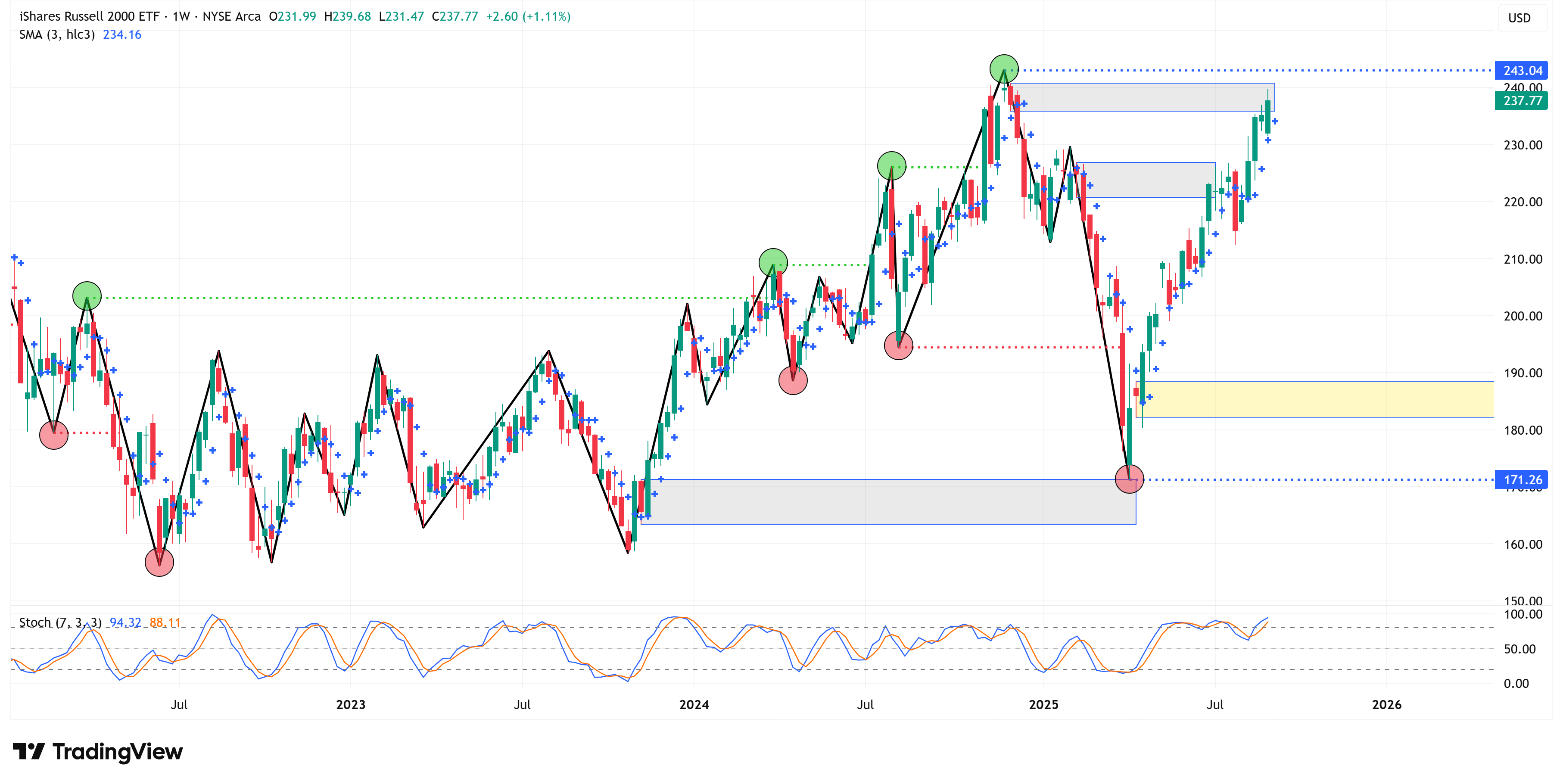
Lastly, I want us to keep an eye on US small caps. They have had one heck of a run of late, but they are approaching what could be (and I emphasize “could be”) a turning point.
Here is the weekly chart of IWM.
By my work (i.e., “The Market Map”), they have had a rally within a bear market structure and have now “tagged” the relevant price levels (grey boxes) needed to clear the way for a move lower.
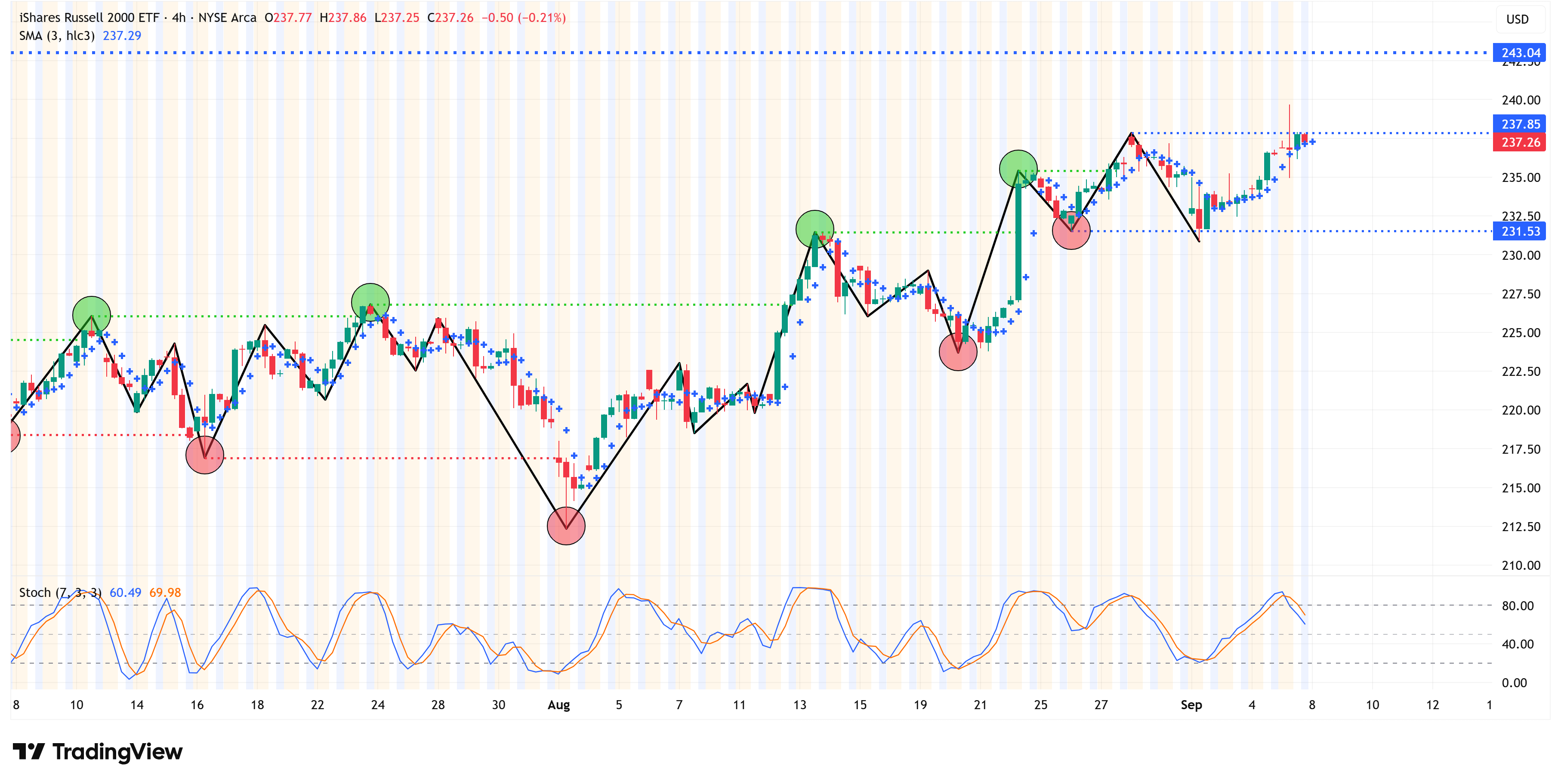
Let’s shift to the 4-hour chart for additional clues.
The 4-hour chart remains bullish for now.
A 4-hour close above 237.85 would strengthen the 4-hour bull case.
A 4-hour close below 231.53 would increase the likelihood of a correction.
Just to be clear, I’m not suggesting that US Small caps are about to rollover; I’m simply suggesting that they are ripe for that possibility from a technical standpoint.
If IWM has a weekly close above 243.04, IWM will officially shift to an uptrend. If it is unable to do that, I think it will trade back down to somewhere in the neighborhood of 182 - 188.
Again, look to the 4-hour chart for clues to a possible turn lower.
The following sections are for paid subscribers only.
In these sections, we will discuss our proprietary:
S&P 500 Fair Value Model
This model provides a guide for:
a) How far the S&P 500 could decline in the next recession.
b) When to get back into the market after it has declined.
The Market Map - Extended Analysis
We will call out specific price objectives (up trends vs. down trends, targets, stop losses, etc.) on the following:
Major US Indices
11 Major US Equity Sectors
US Treasuries
Currencies
Commodities
Fixed Income
If you would like exclusive access to the proprietary data below, be sure to take advantage of our “The Market Map Pro ($99/Year)” special offer!
Keep reading with a 7-day free trial
Subscribe to Skillman Grove Research to keep reading this post and get 7 days of free access to the full post archives.