
Weekly Chart Review
5,000!

It felt like the market wanted to close above 5,000 last week, it took until Friday to do it, but that’s exactly what we got!
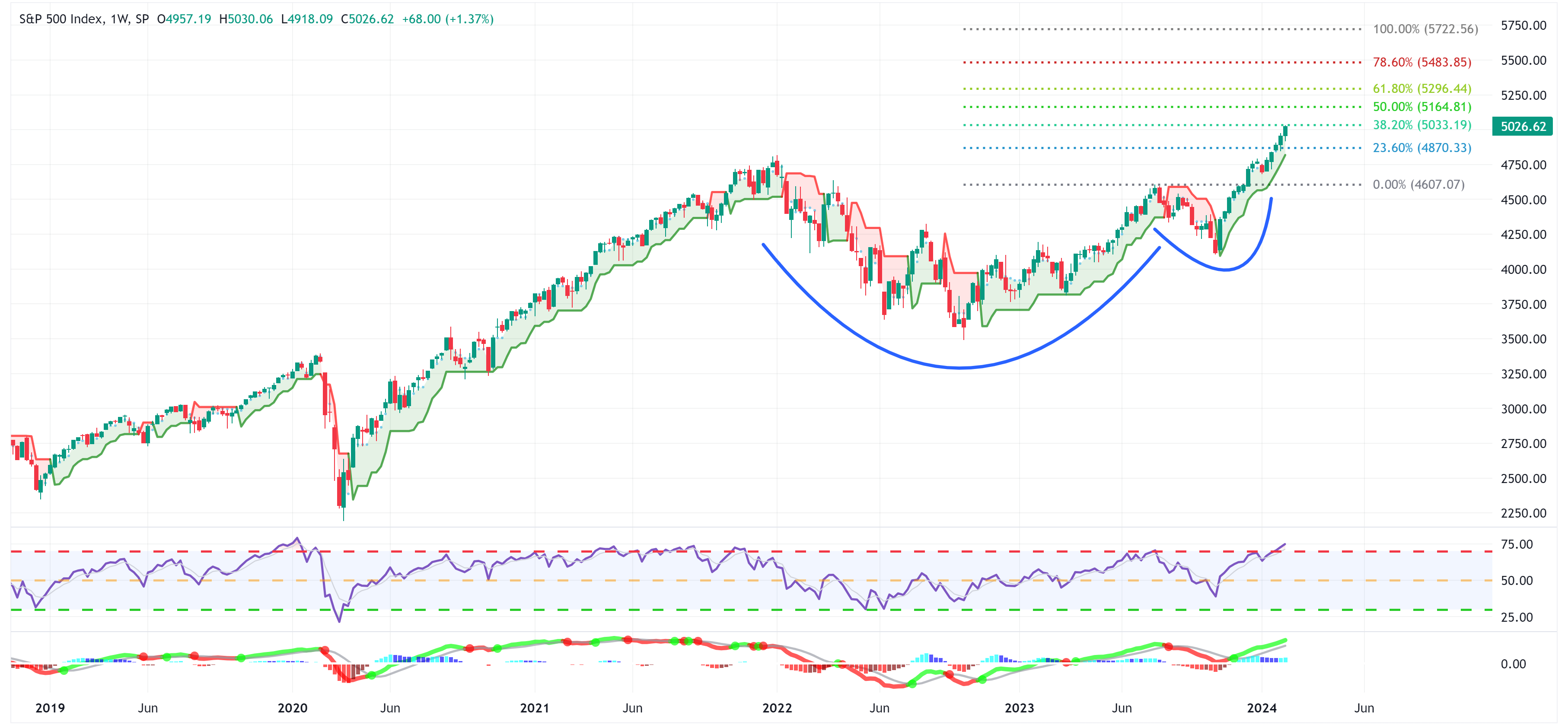
If the “cup and handle” pattern continues to play out, the next stop is 5,164 or +2.60% higher from here for the S&P 500.
Note that the S&P 500 closed out the week almost perfectly in line with the 38.2% Fibonacci extension level and that it continues to remain above the trailing stop loss which are all net positives.
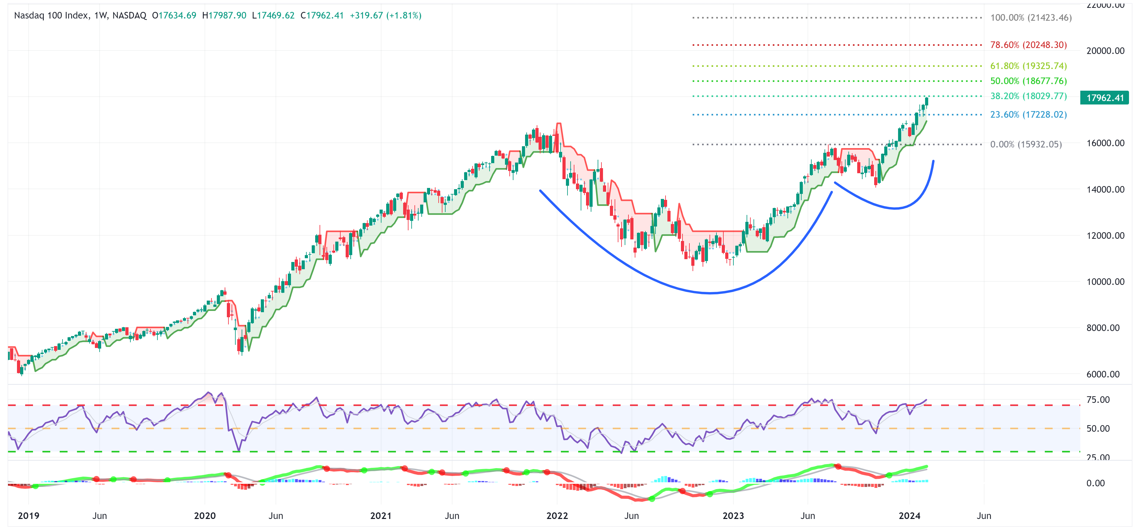
There is a similar story for the NASDAQ as it closed right at the 38.2% Fibonacci extension level and remains above the trailing stop loss as well.
The next stop for the NASDAQ is 18,677 or +3.59% higher from here should the “cup and handle” pattern remain in place.
Proceed With Caution
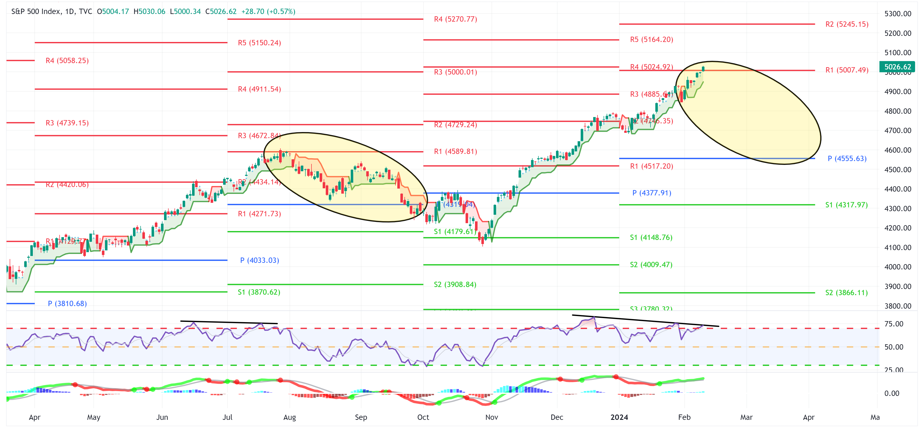
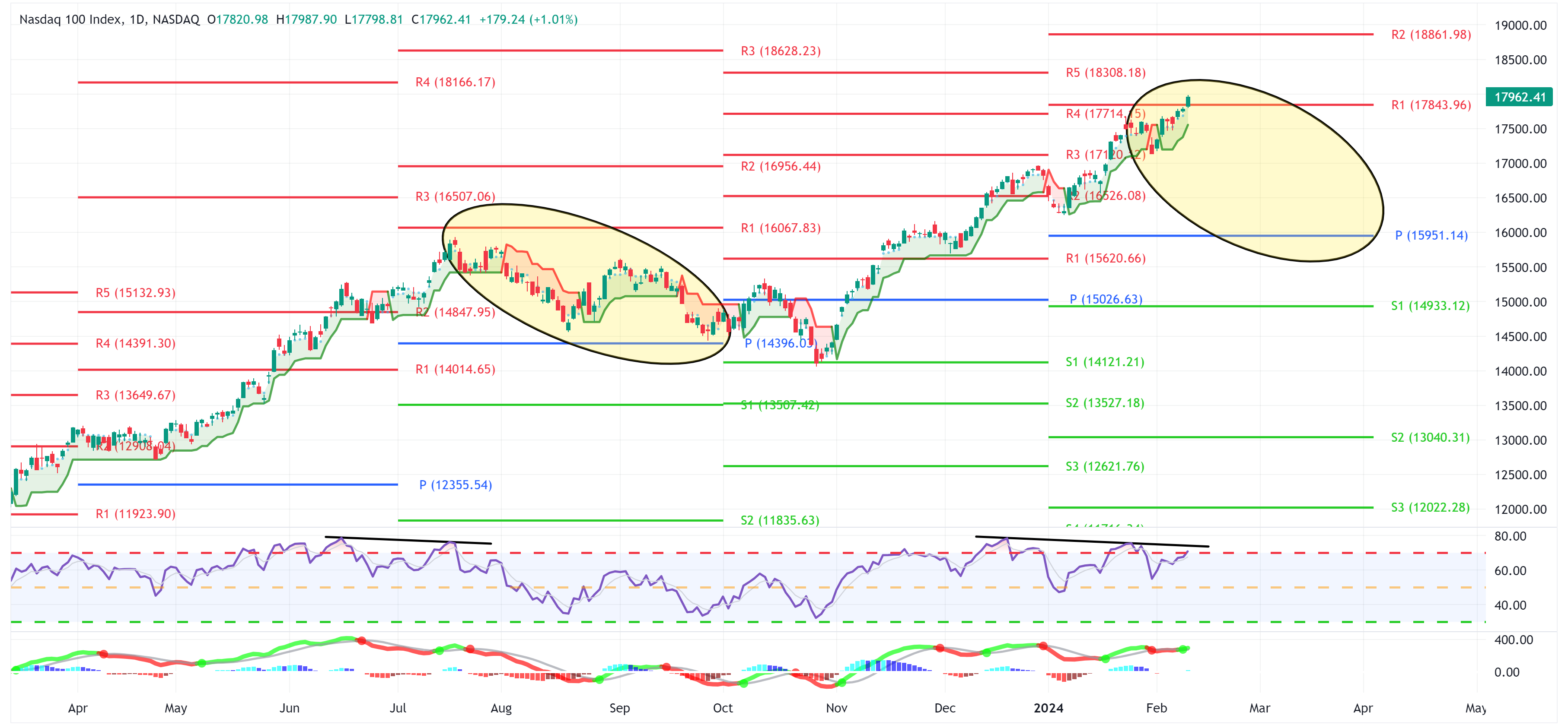
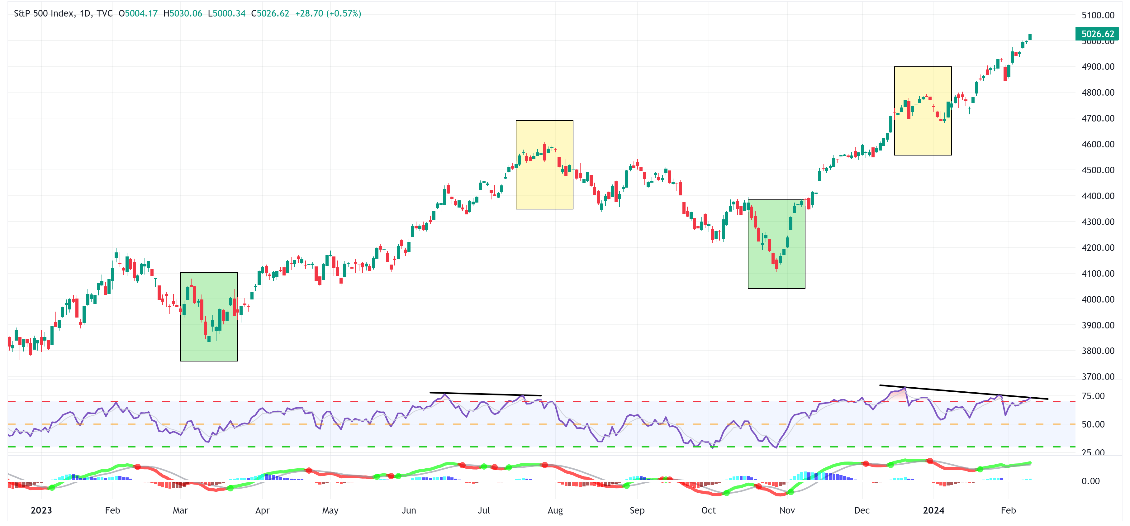
Last week, I warned that even though the S&P 500 and NASDAQ have been on a tear of late, we have “negative divergences” developing that may lead to a pause in the continued move higher.
You can see on the two daily charts below that those “negative divergences” remain in place but it is important to note that both the S&P 500 and NASDAQ closed above their respective “R1” resistance levels of 5,007 and 17,844 which is net bullish.
This would suggest that the S&P 500 and NASDAQ could continue to run to their “R2” resistance levels of 5,245 and 18,862, respectively.
S&P 500 Index
NASDAQ
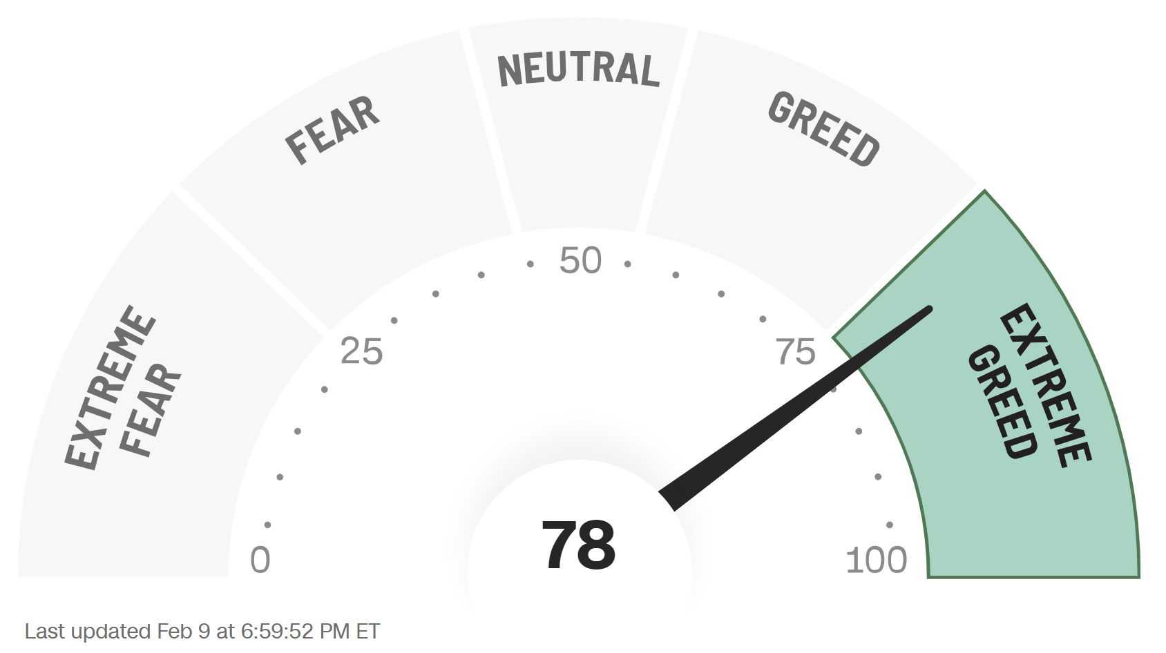
Fear and Greed
This is the CNN “Fear and Greed” Index's most recent reading from after the close on Friday.
Note that we are now in the “Extreme Greed” category (i.e., above 75).
In the image below, I’m showing the same “Fear and Greed” Index as above but on a time series so that you can see the daily changes.
I have added horizontal lines (red and green) to the chart to show relative highs and lows for the index. Further, I have highlighted with yellow and green boxes periods where the index hovered around the relative high or low.
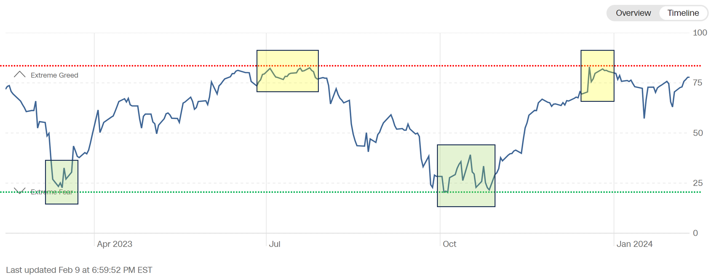
The yellow and green boxes in the “Fear and Greed” Index chart above coincide with the yellow and green boxes on the S&P 500 chart below.
All else being equal, historically, we find that sustained rallies typically begin when the “Fear and Greed” Index is closer to the “Extreme Fear” side of the equation.
The opposite is also true, sustained rallies typically pause or reverse course once we’ve reached the “Extreme Greed” side of the equation.
The point here is to suggest that while we’ve seen a massive move higher for the S&P 500 and NASDAQ of late and our chart patterns suggest a continued move higher, there are some underlying warning signals that we want to make sure we are considering.
Let me be clear, this does not mean that the market is about to plummet, it simply means that the market is reaching a point where it may need to consolidate by moving sideways or modestly lower before continuing to rally further.
It may not be a bad time to book some profits on a portion of your holdings and then rerack if/when the market consolidates at a lower level.
Asset Class Overview
Let’s turn now to our asset class overview.
