Weekly Chart Review
"May you live in interesting times..."
An interesting week last week to say the least.
First, let’s start with the S&P 500’s mid-week about-face. The S&P 500 was down almost -2.00% at one point intra week only the finish the week higher by +0.87%. Any way you slice it or dice it, that’s a strong finish for the week!
The mid-week about-face came largely on the heels of strong earnings from Meta, Microsoft, and Alphabet. With that said, the market “strength” is not broad-based.
The following chart was published by James Bianco of Bianco Research and he notes the following:
The year-to-date return of the S&P 500 (through April 26) was 5.13%.
The top eight FAANG+ MNT (names on the chart) contributed 5.57% to the overall 5.13% return of the S&P 500.
The “other 492” contributed -0.44% return to the S&P 500; the “other 492” have collectively dragged the S&P 500 lower.
Typically, in a “strong” market, you want to see wider participation across multiple companies and multiple sectors. This is not the case currently.
Second, economic releases last week came in counter to expectations. For instance, GDP (1Q23) was weaker than expected (actual = 1.1% vs. estimate = 2.0%) while inflation (Core PCE) came in hotter than expected (actual = 4.6% vs. estimate = 4.5%). This all but ensures the FOMC will raise rates by a quarter point this week at the May 2-3 meeting.
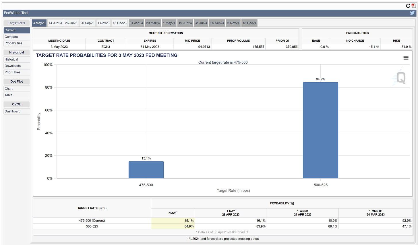
The image below shows that there is currently an 84.9% chance that the FOMC will raise rates by 0.25% on Wednesday.
The following image shows that Fed Funds Futures are suggesting that after the FOMC hikes rates by 0.25% this week, they will be on hold for the next two meetings before beginning to cut rates at the September meeting.
You can see in the image below that the FOMC believes the “appropriate monetary policy” rate for the balance of 2023 should be north of 5.00% (note the light blue dots). Compare that to the market-implied rate (red dot) for year-end 2023 which is 4.50%.
Further, note that the FOMC is forecasting an “appropriate monetary policy” rate of 4.125% for 2024 vs. a market-implied rate of 3.00%.
That’s quite the divergence between what the FOMC is saying and what the market is forecasting. Who will win…the FOMC or the market? I’ll put my money on the market.
The bigger question you should be asking is why does the market believe rates are going to be so much lower than what the FOMC is suggesting?
I believe the answer is that the market believes the FOMC has already gone too far in its rate-hiking campaign and has likely already begun the process of “breaking something”. To offset that which has been broken, the market is suggesting that the FOMC will have to be more aggressive than expected in reducing rates when they are forced to “come to the rescue”.
Third, we have another bank in trouble as it looks like First Republic Bank is on the verge of being taken into receivership by the FDIC. As of this writing, this has not officially happened, but I believe it is likely a foregone conclusion short of First Republic Bank being acquired by a larger bank early this week. Again, typically in a strong economy, we are not spending the weekend reading headlines akin to “Banks wait on US to decide fate of First Republic”.
Where does this leave us?
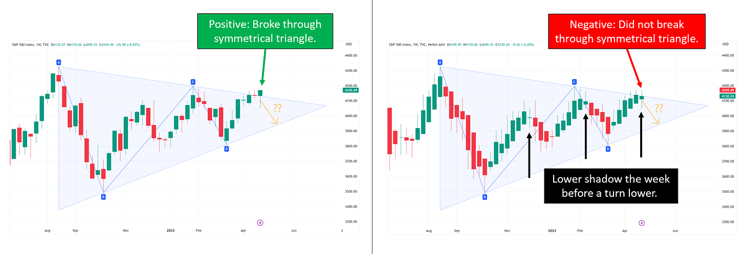
In the image below, I am showing the exact same chart but using the “candlestick” version on the left and the “Heikin Ashi” version on the right.
As I’ve said a number of times in these posts, I prefer to use the “Heikin Ashi” chart to determine trends vs. your standard “candlestick” chart.
These charts are telling two completely different stories.
On the left, we see a market that finally broke free of the symmetrical triangle which is an extremely strong bullish signal. The most ideal situation would be for the market to come back and “test” the upper bound of the symmetrical triangle and then go on to rally further from there. The next couple of weeks should give us this answer.
Alternatively, on the right, we see a market that has yet to break free of the symmetrical triangle and in addition to that, is beginning to show a “lower shadow” or “lower wick” on the most recent candle. This can be indicative of a market that is about to start trending lower. Again, we’ll need a couple of weeks to see how this plays out but the market is sending mixed signals as we look at these two charts.
Sector Review
Lastly, let’s take a quick look at our most recent sector review. The chart on the left is from 04/21/23, and the chart on the right is from 04/28/23.
First, is the absolute view. Note that Technology and Consumer Staples are now at the 2.0 standard deviation mark and that the S&P 500 and Communication Services have pushed even further into overbought territory.
Second, is the relative view. Fairly similar positioning vs. last week. With that said, Communication Services is pushing further toward the 1.0 standard deviation mark.
Summary
Never a dull moment when it comes to the markets. If this is the start of another bull run, we have to see broader participation than 8 companies. Until that happens, I think you have to err on the side of believing that this market still has more room lower than it does higher.
Until next time…


