Weekly Chart Review
How to know when the recession has begun.
Every time the yield curve inverts, the calls for a recession begin. Further, every time a recession doesn’t begin shortly thereafter, the narrative shifts to “See, we didn’t have a recession…the yield curve inversion is wrong this time…”
The key thing to remember is that it’s not when the yield curve inverts that we have a recession, it’s when the yield curve un-inverts that we have a recession.
There are several ways to measure a “yield curve inversion” but one of the most popular is to look at the “2’s 10 curve” which is calculated by taking the yield on the US Treasury 10-year note and subtracting the yield on the US Treasury 2-year note. If the resulting yield is below 0.00%, the curve is inverted.
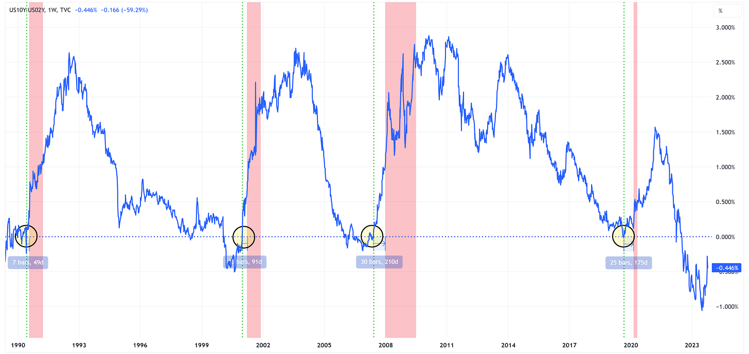
When we do that and plot it over time, we get the following chart.
In the chart above, I have marked the “un-inversion” with a vertical green line. The vertical red bars are recessionary periods. You can see that in each of the last four recessions, it wasn’t until the “2’s 10 curve” un-inverted that the recession began.
The time from un-inversion to the beginning of the recession ranged from 49 days to 210 days or an average of 131 days which equates to a little over 4 months.
Where are we today?
If we zoom in on the current “2’s 10” chart, we find that the curve inverted on July 5, 2022, and has remained inverted ever since.
From a technical standpoint, the chart has formed a “double-bottom” which calls for a target of 0.557% which would mean that the curve would be un-inverted at that point.
The difficult part is trying to determine the time frame over which this target is achieved. With that said, it is worth pointing out that from September 21st to October 6th (or 12 trading days), the curve increased by +0.50%. Another such increase would put the curve well into positive (i.e., un-inverted) territory.
Over the last week, the “2’s 10 curve” has made an about-face and has come off the pace of un-inversion that we saw in the yellow highlighted box area in the chart.
Will the move lower continue or will it resume its march higher? Either way, -0.268% has proven to be an important level twice so far so look for a break of this level to suggest that we are heading towards an un-iversion.
Once said “un-inversion” occurs, that’s when you need to have your antenna up for the beginning of the recession. With that said, remember that a recession will not be declared by the National Bureau of Economic Research (NBER) until many months/quarters later.
Instead, what you want to look for are recession-type activities which include, but are not limited to:
Jobless claims increasing.
The unemployment rate moving higher.
“Something breaking” leading to a credit event of some sort.
Equities trading lower.
The Fed reducing short-term rates to support the economy.
It’s impossible to determine the timing and order of the events above but history would suggest that one or more of them are coming. Therefore, the prudent thing to do is to take precautionary steps in advance. This doesn’t mean that you have to do everything at once.
For instance, if I thought it was going to rain today, I’d probably take an umbrella when I left the house, but I wouldn’t walk around with the umbrella open all day. Instead, I’d probably wait until I saw some clouds rolling in and the wind picking up before I got my umbrella out but I can’t get my umbrella out if I didn’t bring it. That’s the point.
Net/net, I am not suggesting that you sell everything and move to cash but you should look at your portfolio and think about your desired portfolio positioning if we were to have a recession. Then, go do some (not all) of that.
Absolute Value & Relative Value
Here are the weekly Absolute & Relative Value charts.
Absolute Value - Equities
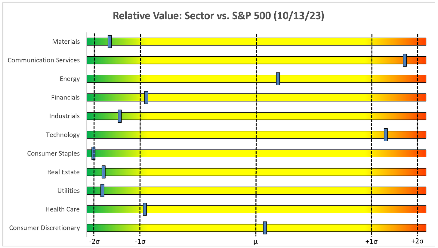
Relative Value - Equities
Absolute Value - US Treasuries
Chart Review
Remember, the goal with these charts is simply to stay on the “correct” side of the trailing stop loss as these trends often last for several weeks or months.
I have added the following weekly exponential moving averages (EMA) to the charts: 8, 21, 34, 55, and 89. Watch for the “bullish stack” and the “bearish stack” and in particular, the point where the chart shifts from one to the other. This can be the beginning of an extended trend.
Bullish Stack = 8 EMA > 21 EMA, 21 EMA > 34 EMA, 34 EMA > 55 EMA, 55 EMA > 89 EMA.
Bearish Stack = 8 EMA < 21 EMA, 21 EMA < 34 EMA, 34 EMA < 55 EMA, 55 EMA < 89 EMA.
S&P 500 Index
The S&P 500 is below the trailing stop loss which is a net negative but continues to find support at the 34 EMA and has two overhead gaps that need to be filled.
Watch the RSI for a clue as to the next move. If it can break higher than its moving average, the S&P 500 might have a chance at an extended move higher. If it rejects the moving average, the S&P 500 could be heading lower.
Technology
XLK has started to roll over and remains below the trailing stop loss.
Similar to the S&P 500, watch the RSI for a clue to the next move.
Communication Services
XLC continues to remain above its trailing stop loss and the target remains at 74.80.
Consumer Discretionary
XLY has recently fallen below the trailing stop loss but has found support at multiple moving averages and still has an overhead gap that needs to be filled.
Industrials
XLI remains below its trailing stop loss and popped higher last week to fill the overhead gap. For this to be bullish, I would have preferred to have seen the gap fill and then move higher. That did not happen.
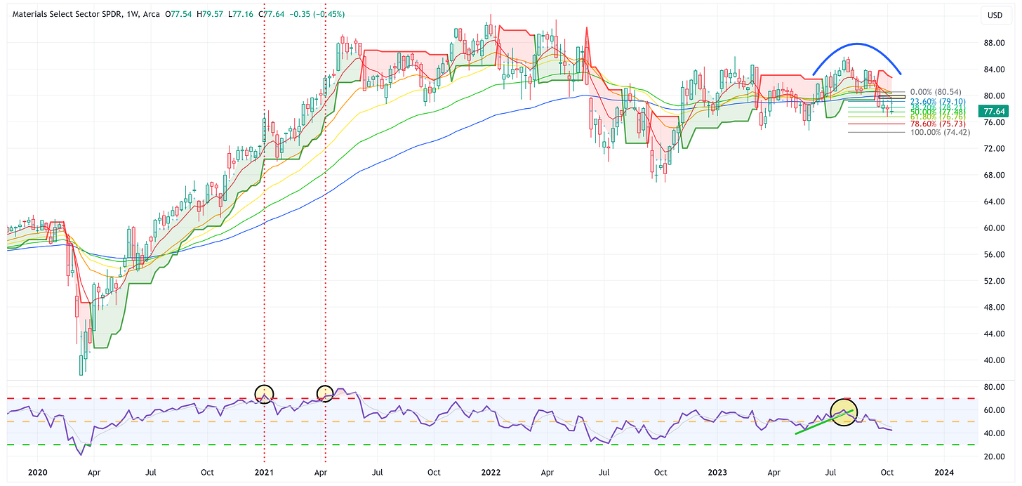
Materials
XLB did not fill its overhead gap and finished at the low end of its range last week. This is net bearish therefore the target of 74.42 remains.
Energy
XLE bounced off the trailing stop loss the week before last and closed last week above the 8EMA. The uptrend remains intact and the target remains 111.94.
Financials
XLF continues to remain within the wedge. I’d stay away from XLF until it decides which way it wants to break out of the wedge pattern.
Real Estate
A nice rally last week for XLRE but the downtrend remains; therefore, I’m maintaining the target of 31.89.
Consumer Staples
This chart continues to look ugly and we’re getting close to achieving a “bearish stack”. With that said, note that the RSI has reached the point of being oversold which could translate into a modest bounce over the next few weeks.
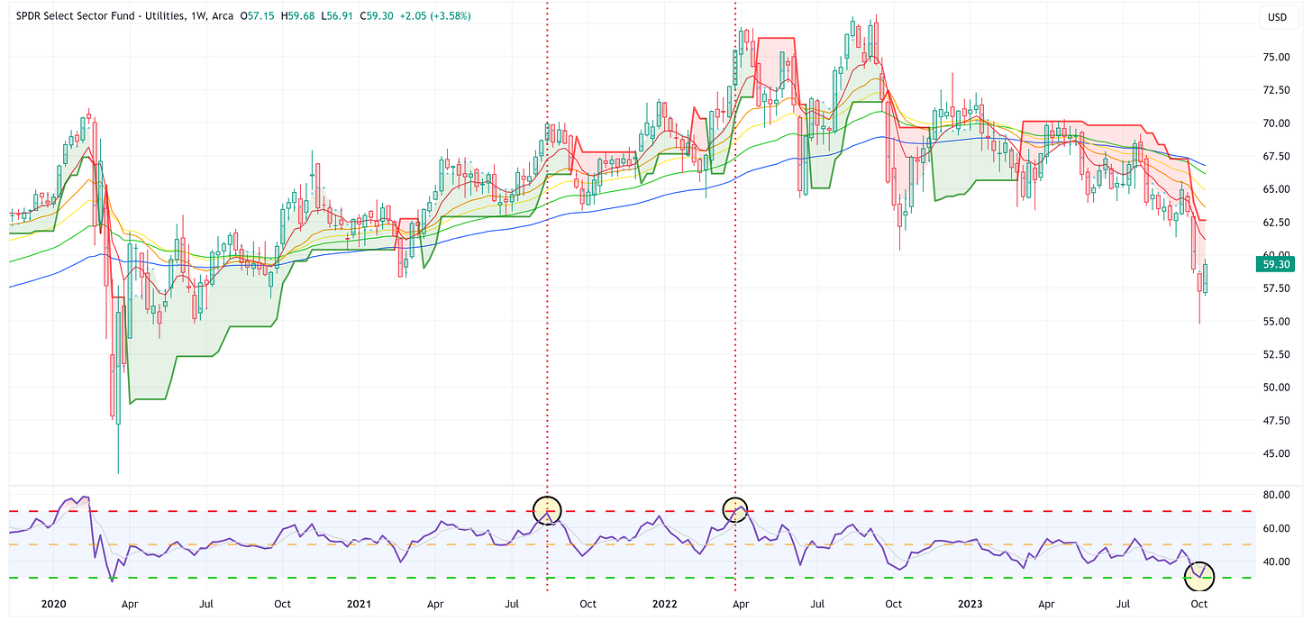
Utilities
XLU had a solid week last week which was likely in response to the move in US Treasuries. Note that it had recently gotten to the point of being oversold on the RSI so the bounce is not overly unexpected. Key question is what does it do from here?
Health Care
XLV continues to move largely sideways. Watch to see if a “bearish stack” sets up over the coming weeks/months.
US Treasury Review
Last week I wondered aloud if US Treasuries could be setting up for a bounce when I said:
In general, US Treasuries took it on the chin last week, and in several cases, “oversold” became even more “oversold”. Could they be setting up for a bounce?
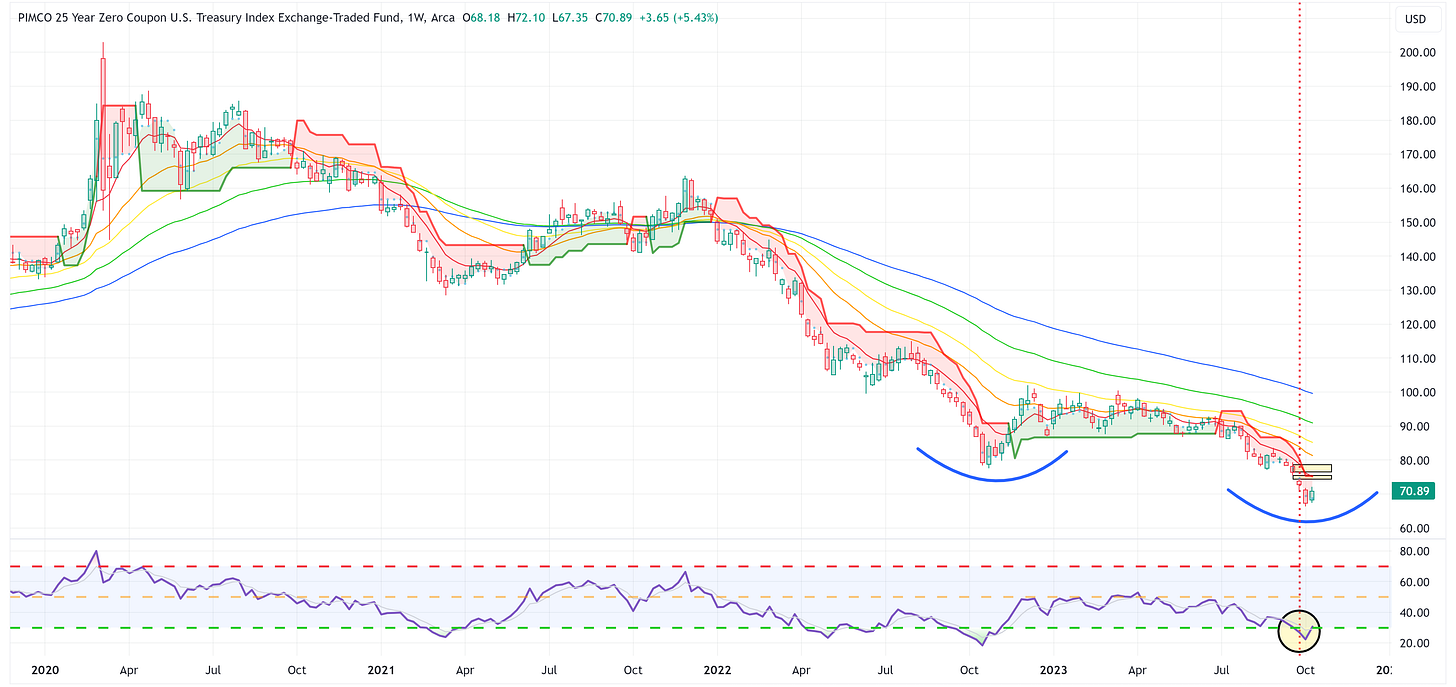
We got that bounce in several cases last week but the “bearish stack” on most means they’ve got some work to do to have a sustained rally. Worth noting, most still have overhead gaps that need to be filled which is a positive.
ZROZ: 25+ Year UST
TLT: 20+ Year UST
TLH: 10 - 20 Year UST
IEF: 7 - 10 Year UST
IEI: 3 - 7 Year UST
SHY: 1 - 3 Year UST
Average Investor Allocation to Equities - Daily Chart Model
I will conclude this week with a snapshot of the daily version of my “Average Investor Allocation to Equities” model.
How to use this chart.
The blue line is the S&P 500.
The red line is my “fair value” model for the S&P 500.
“Current Value to Fair Value” is the amount the S&P 500 would “need” to decline from its current level to the “fair value” level.
“Current Z-Score Value” is a representation (in standard deviation terms) of the delta between the current price of the S&P 500 and the “fair value” price.
Historically, major corrections do not end until the Z-Score falls to somewhere between -3.0 & -4.0. The yellow circles denote the price of the S&P 500 the last four times this happened. Note where the price was at these points relative to the “fair value” line.
Let’s make it a great week!











Just curious, and without knowing what goes into the model, would you get a similar Z-score for an index like QQQ or the Dow??