What is the "Average Investor Allocation to Equities" Telling Us?
Sneak Peak: How does a -0.07% annualized return for the next 10 years for the S&P 500 Index sound?
It is time for the quarterly update of my favorite chart, the “Average Investor Allocation to Equities” chart.
This is one of the most important charts you will see as it is extremely helpful in providing a glimpse into what to expect over the next decade for US equity prices and other major asset classes.
Let’s start with a definition.
The blue line in the following chart shows the “Average Investor Allocation to Equities”. As the name would imply, this line shows how much (i.e., what percentage) of the average investor’s portfolio is allocated to equities at any given time as opposed to other asset classes (i.e., fixed income, commodities, cash, etc.) This line maps to the left-hand scale of the chart.
The yellow line in the following chart shows the “10-Year Forward Annualized Price Return” of the S&P 500 Index. This is telling us what the 10-year forward return was for the S&P 500 Index from the corresponding point on the blue line. This line maps to the right-hand scale of the chart and the values have been inverted to better show the relationship between the two metrics.
How do we interpret this chart?
Very simply, the higher the blue line (i.e., the “Average Investor Allocation to Equities”), the lower the subsequent 10-year return for the S&P 500 Index and vice versa.
Given the tightness of fit for these two lines (note the correlation figure in the top left-hand corner of the chart), I have created a model to project forward returns for the S&P 500 Index (see chart below).
The current “Average Investor Allocation to Equities” figure is 46.23% as of March 31, 2023 (our most recent update). This corresponds to a projected annualized return of -0.07% over the next 10 years for the S&P 500 Index.
It is important to remind readers that this does not mean that we should expect a return of approximately -0.07% every year for the next 10 years. Instead, what it means is that over the next decade, we will likely see a market that has very dramatic sell-offs followed by very dramatic rallies which will net out to effectively no return over the next 10 years.
Digging deeper.
The following chart is the same as the first chart in this article but I have added a few elements to it.
I have segmented the chart into three sections. Each section represents a full cycle of the “Average Investor Allocation to Equities” cycle. Note that the first two cycles took 29 years and 27 years, respectively. I used an average of the first two cycles to suggest that this current cycle may take 28 years in total. For the record, it could be longer or shorter, this is simply an educated guess based on the last two cycles.
The key takeaway here is not the length of the cycle but to understand where you are in the cycle. The first half (“green arrows”) of the cycle is typically associated with rising equity prices as the equity allocation in an investor’s portfolio steadily increases. Alternatively, the second half (“red arrows”) is typically associated with lower equity prices and increased volatility as the equity allocation in an investor’s portfolio steadily declines.
When we translate the above logic/metrics to the S&P 500 Index, we get the following chart. The “green arrows” below are the first half of the cycle, and the “red arrows” are the second half of the cycle.
At best, during the “red arrow” portions of the cycle, the S&P 500 Index moves sideways to lower, but note the dramatic swings within the period.
Here is a zoomed-in image of the “red arrow” period from 1968 - 1982. Note the dramatic swings in prices and the fact that we had four recessions (grey vertical bars) during this period.
Here is a zoomed-in image of the “red arrow” period from 2000 - 2009. Again, note the dramatic swings in prices and that we had two recessions during this period.
Where does this leave us today?
We are currently in the back half or “red arrow” portion of the current cycle. As noted above, this would suggest that we should expect the following market/economic conditions over the next decade: 1) increased market volatility, 2) sideways to lower returns for the S&P 500 Index, and 3) a recession or two.
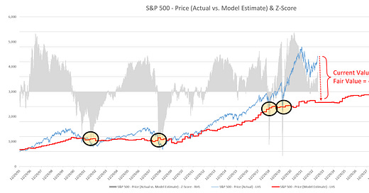
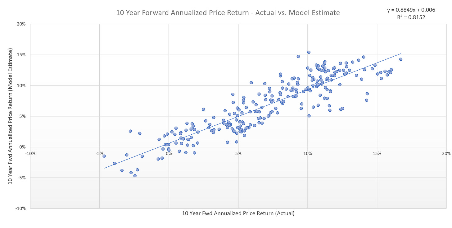
To get a bit more specific with regard to the S&P 500 Index and where it may be headed, I have created a “fair value” model. Here are the model results plotted against actual results. While no model is perfect, an R-Squared value of 0.81 is pretty decent.
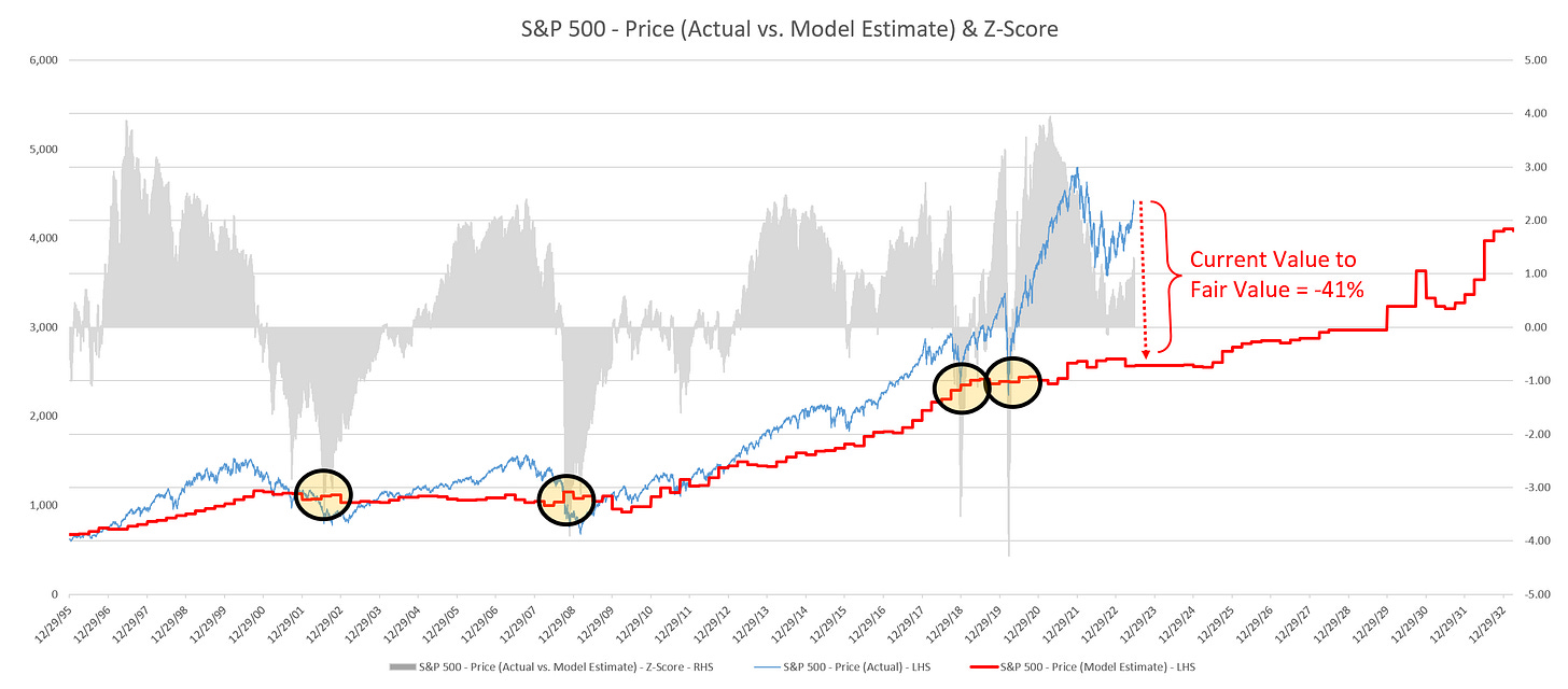
When we take the results of the model and plot them against the S&P 500 Index and into the future, we get the following chart.
The model suggests that the fair value for the S&P 500 Index is currently 2,567. Compare this figure to the current value for the S&P 500 Index (4,365) and this would suggest that the S&P 500 Index would need to decline by approximately -41% to reach fair value.
While this may seem like a large decline (and it is), it’s not unprecedented. Note the four highlighted areas on the chart (yellow circles). These circles represent the point at which the S&P 500 Index reached its fair value after having been severely extended like we are today.
In two of these instances, the S&P 500 Index would go on to decline well through the fair value line. In the other two instances, the decline stopped at the fair value line.
The average peak-to-trough decline in these four episodes was -39% with two of these episodes registering declines greater than -50%.
How will we know when we’ve reached the market bottom?
Unfortunately, no one rings a bell and says that the selling is over and that’s it time to get back to buying. However, we can make a couple observations.
First, in each of the four highlighted scenarios outlined above, the market fell to or through the fair value line. With that said, we should expect the S&P 500 Index to decline to its fair value line at some point in this cycle.
Second, in all four instances, the market bottom was not reached until our Z-score metric (grey histogram in the chart) reached a value between -3.0 to -4.0. In the chart below, I have highlighted with red circles when this occurred. As a point of reference, the current Z-score is +1.23 so we have a ways to go.
What does this mean for other asset classes?
The above framework suggests that we should expect lower equity values as we move forward over the next decade. It also suggests that we are likely to have a recession or two. While we cannot forecast with any certainty when these recessions may start or their magnitude or duration, we can look at what has happened in previous recessions to get a sense what could happen going forward.
Recessions are generally associated with a decline in gross domestic product (GDP) which signifies reduced demand for goods and services in the US economy. This tends to lead to lower equity prices as well as lower prices for various commodities, especially those on which the economy runs, namely crude oil and gasoline.
As visible in the charts below, economy supported commodities like crude oil and gasoline tend to run up in value just before a recession, only to be followed by a fairly dramatic move lower once economic demand declines.
Are the peaks of last year in crude oil and gasoline telling us that we’re already in a recession or should we expect one last rally before a recession sets in?
Crude Oil
Gasoline
Alternatively, as I made the case in What Should We Expect After the FOMC Pauses Next Week?, once the recession sets in (or is perceived to be coming in short-order), the FOMC will attempt stimulate the economy by reducing rates and likely reinstating quantitative easing. In doing so, US Treasury yields will fall (prices will rise) as evidenced in the following chart of the US 10 Year Treasury bond.
Is it time to buy US Treasuries in advance of said recession?
Summary
While I hate to be the bearer of bad news by suggesting that US equities may have close to 0% return over the next decade, my goal is to arm you with the knowledge needed to profit from these potential outcomes.
Let me be clear, I am not suggesting that a recession is imminent or that we should expect equities to decline by -41% in the short-term; however, I am suggesting that there is a high probability that these things will happen over the medium-term given what history has shown us. The timing is always the hard part.
Recessions and down markets can be an emotional roller coaster for many people. That is why I believe it is always best to develop a systematic process to remove emotions from the decision making process. In doing so, you dramatically increase your chances of making better decisions and having better results in the portion of the cycle that is often more difficult.


