How Low Can We Go?
An analysis of where the S&P 500 could decline to in this current cycle.
In my recent “Bear Stearns” piece, I suggested that the current market rally is not overly unexpected given what happened directly after the collapse of Bear Stearns in 2008.
More specifically, I noted the following in reference to the period directly after the failure of Bear Stearns:
“Over the next 63 days, the S&P 500 would go on to appreciate by 14.58% (intra-day low to intra-day high). That was followed by a 291-day period where the S&P 500 fell by -53.70% (intra-day high to intra-day low).”
I provided this chart as a reference:
Fast forward to 2023 and the S&P 500 has appreciated by 8.51% (intra-day low to intra-day high) since the collapse of Silicon Valley Bank (see chart below).
It is conceivable that the S&P 500 will go on the appreciate further from here. Where it stops, no one knows, but what you should be planning for is how to handle the period after this recent rally has been exhausted.
In the very last line from the “Bear Stearns” piece, I noted the following:
“Until then, the prudent bet is to err on the side of being defensive. In a subsequent post, I will address how to know when to get back into the market and ratchet up your aggressiveness.”
For the remainder of this piece, I want to address the part of the above quote where I said: “How to know when to get back into the market and ratchet up your aggressiveness.”
I will do this by leveraging the analysis I provided in my piece titled “What is the Average Investor Allocation to Equities Telling Us?”
As a quick refresher, in the above piece, I provided the following chart and made the following points with regard to the importance of the chart and how to read it:
“This chart is incredibly important because of the relationship between the average investor allocation to equities and the subsequent 10-year return for the S&P 500. Very simply, the higher the allocation to equities today, the lower the 10-year return will be for the S&P 500 from that point forward and vice versa.”
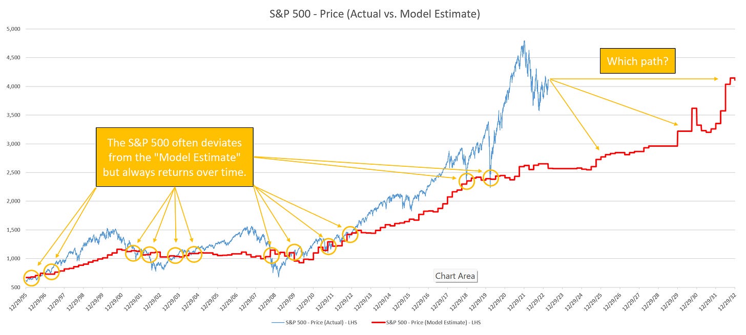
Given the historical relationship between the two lines in the above chart, we can construct a “model estimate” which can be used as a decent proxy for a “fair value” assessment for the S&P 500.
When we do that, here is what it looks like. The blue line is the S&P 500. The red line is the “model estimate” or “fair value” for the S&P 500.
A few takeaways:
The S&P 500 often deviates from the “model estimate” but always returns to it over time as evidenced by the yellow circles in the above chart.
Notable peak-to-trough deviations (i.e., S&P 500 vs. “model estimate”):
March 23, 2000 = +51% —> October 7, 2002 = -30%
October 12, 2007 = +52% —> March 9, 2009 = -37%
September 27, 2018 = +33% —> December 24, 2018 = +2%
February 19, 2020 = +42% —> March 23, 2020 = -6%
Recent deviations that have yet to fully correct:
September 2, 2021 = +87%
Current deviation = +59%
In the following chart, I am showing the same chart as above, but I have added a Z-Score figure which shows how many standard deviations the S&P 500 is from the “model estimate”.
A few takeaways:
Major market deviations (red circles), typically do not begin the correction process until the Z-Score has fallen to somewhere in the -3.0 to -5.0 range (green circles in the yellow shaded box).
Current Z-Score = +0.84
Translation = we still have some wood to chop.
Similar to a pendulum - the further the dislocation in one direction, the further the correction in the opposite direction. Recall, Newton’s Third Law states that for every action (force) in nature there is an equal and opposite reaction.
The most recent Z-Score peak happened on September 16, 2021 at 3.95. This is the highest value ever recorded in my model which goes back to the 1960’s.
Translation = I don’t see how we get out of this current dislocation without trading to at least the “model estimate” if not below it (similar to 2002 & 2009).
Speed matters.
In the peak-to-trough declines that began in 2000 & 2007, those corrections took place over three calendar years, ending in 2002 & 2009, respectively.
These corrections took the S&P 500 well below the “model estimate”.
In the peak-to-trough declines that began in 2018 & 2020, those corrections took place over a matter of months but were fairly violent in nature.
These corrections stopped at almost exactly the “model estimate”.
Summary
Given the current market dislocation (S&P 500 vs. “model estimate”), history would suggest that one of the following two options are most likely:
A slow, methodical grind lower similar to 2000 - 2002 and 2007 - 2009 that ends with the S&P 500 significantly below the “model estimate”.
A sharp, violent correction that stops at the “model estimate”.
For context, the current “model estimate” value is 2,572 or -37.1% lower than today’s closing price.
The third option, which we should never rule out, is that this time is indeed different and the market finds a way to deny history. Let’s hope for option #3 but plan for the possibility of #1 or #2.


