
The Market Map
Unraveling?

Hey everyone — it’s Jim.
I hope you had a great weekend!
Let’s jump right into this week’s newsletter.
Proprietary Buy/Sell Indicator - Chart of the Week
For several weeks, I have discussed potential concerns regarding private credit.
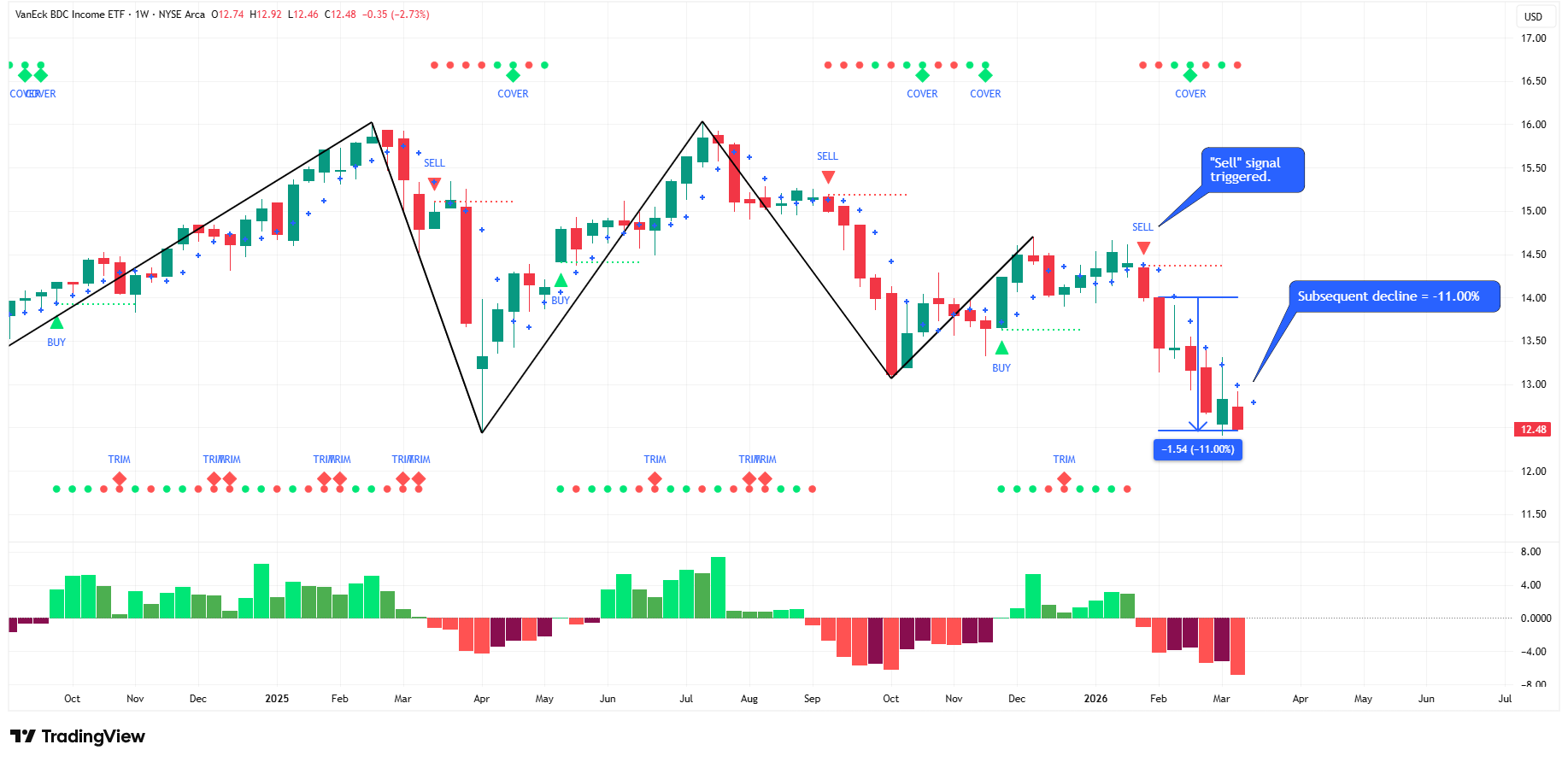
One of the most popular ETFs for private credit exposure is the VanEck BDC Income ETF (ticker: BIZD).
To be clear, BIZD is not investing in the loans themselves, but in the publicly traded equities of Business Development Companies (BDCs).
A Business Development Company (BDC) is a publicly traded investment company that lends money to small and mid-sized private businesses and sometimes takes equity stakes in them.
On the BIZD website, they have a section asking, “Why BIZD”?
The first bullet point under that section is:
Private credit exposure: BDCs lend to small and midsize private companies
The point here is that while BIZD is not investing in the loans themselves, it is still a good proxy for private credit exposure.
On January 30th, our proprietary “Buy/Sell” indicator triggered a “Sell” signal on BIZD.
Since then, BIZD has declined 11.00%.
This is just another example of how our proprietary “Buy/Sell” signal can help you get ahead of the move before the headlines become mainstream.
Would you like to learn more about how to get access to our proprietary “Buy/Sell” indicator so you can stay ahead of the game?
If so, please join us for our next FREE LIVE WEBINAR on Tuesday, March 24th @ 7:00 pm ET.
Click here to register: March 24th Webinar Registration
The Market Map
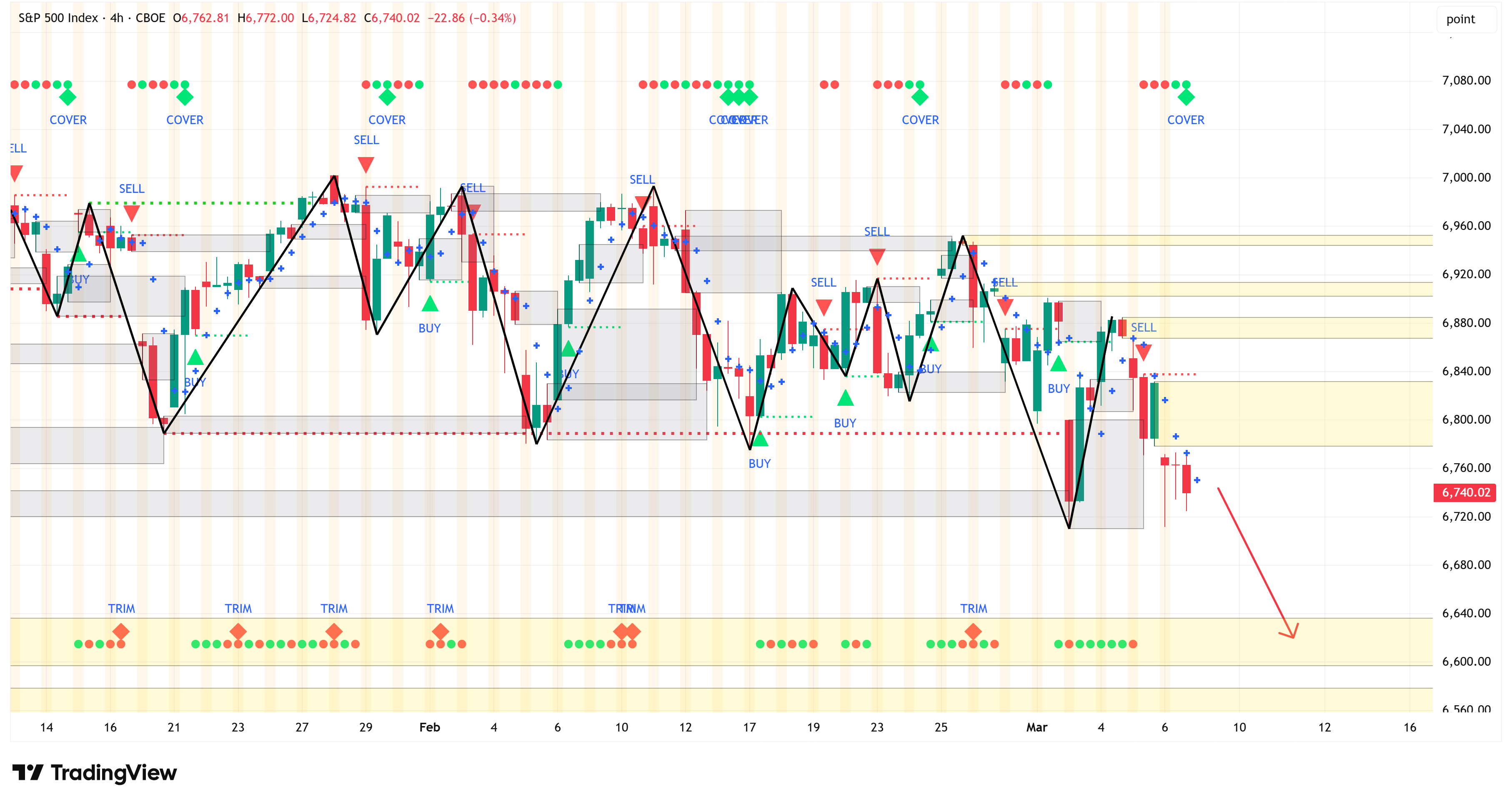
Each week, we break down the S&P 500 using our proprietary systematic process called “The Market Map” to understand where the market may be heading next.
To do that, we start by analyzing the bigger picture (weekly chart) and then look for confirming evidence by shifting to a lower time frame (4-hour chart).
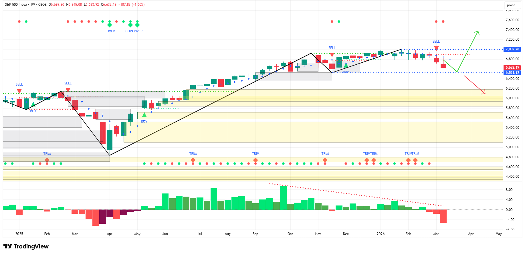
Last week, I said:
“If the decline continues, the next logical target is 6,597 - 6,636 (red arrow).”
I used this chart, and the red arrow, to highlight my target region:
Fast forward one week, and the S&P 500 closed at 6,632, perfectly within the range I forecasted.
Weekly Chart
Last week, I highlighted that the S&P 500 had triggered a “Sell” signal on the weekly chart.
The S&P 500 closed lower by 1.60% for the week after triggering a “Sell” signal the week prior.
Last week, I also noted:
“The bulls will want to see 6,522 hold and reverse higher from there (green arrow).
If that doesn’t happen, somewhere in the neighborhood of 6,000 - 6,200 is the next target (red arrow).”
This thesis remains true as we head into this week.
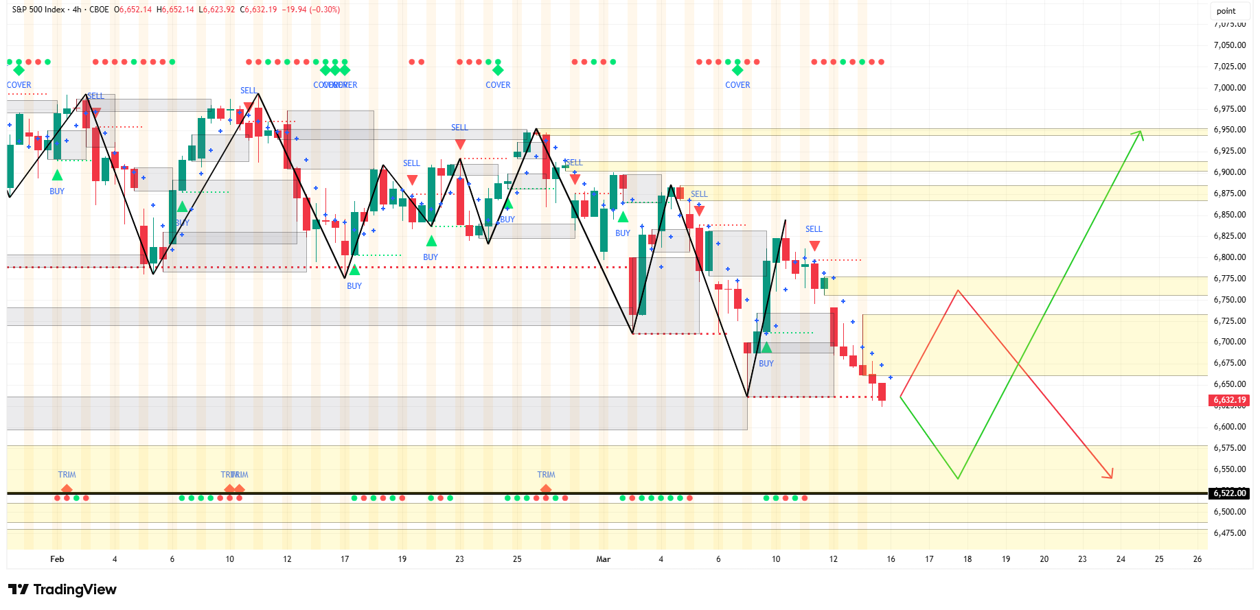
4-Hour Chart
The 4-hour chart is closing in on the critical value of 6,522 (solid black line in the chart below) as mentioned above in the weekly section.
What the S&P 500 does relative to that line will be very important.
In the 4-hour chart below, I’ve created two different scenarios:
Red arrow: S&P 500 moves higher early in the week only to finish the week at or near the 6,522 level.
Green arrow: S&P 500 moves lower early in the week, finds support at or near 6,522, and uses that as a catalyst to move higher.
Summary
What the S&P 500 does relative to the value of 6,522 is going to be very important for what the S&P 500 does over the medium term.
Watch that level very closely in the coming weeks.
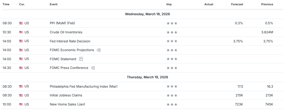
Economic Calendar
Last Week
No major surprises last week concerning CPI or Core PCE as they came in as the estimates had forecasted.
With that said, Core PCE was higher than last month, which suggests inflation isn’t out of the woods yet, and the recent run-up in crude and related products will only weigh on that measure next month.
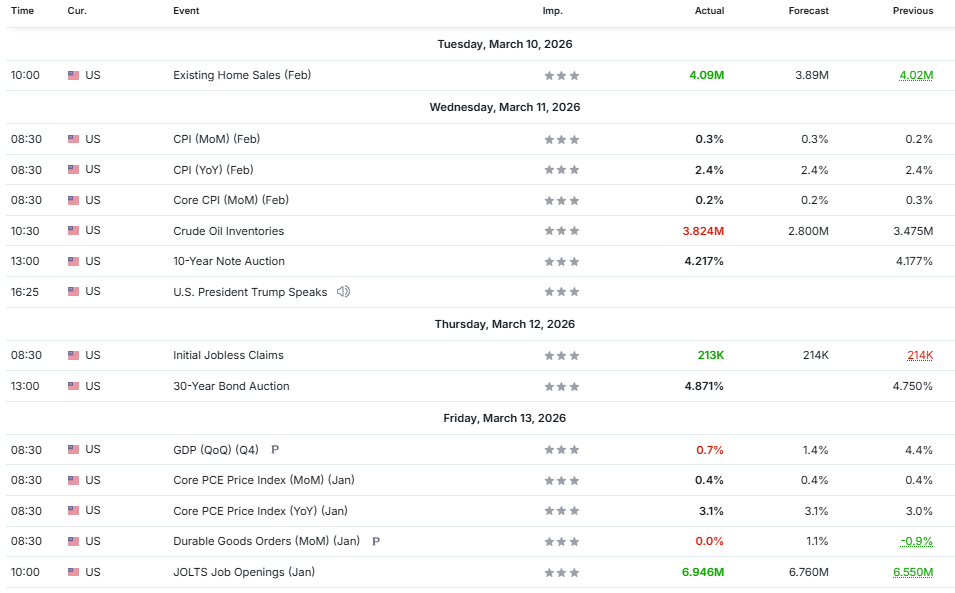
This Week
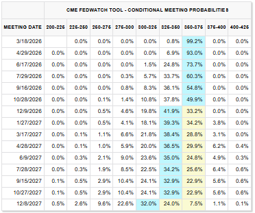
Watch PPI this week for another measure of inflation and the FOMC rate decision on Wednesday.
As of right now, there is a 99.2% that the Fed will leave rates unchanged at this week’s meeting.
As it pertains to the FOMC rate decision, the bigger question will be how the probability of future rate cuts will adjust.
As you can see in the table below, Fed Funds futures are not pricing in a rate cut until December at the earliest.
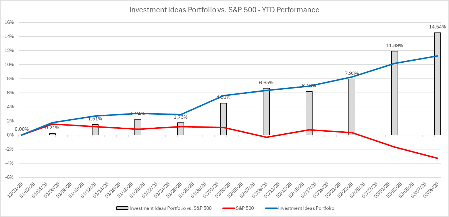
Investment Ideas (Paid Section Below)
Last week, our “Investment Ideas” portfolio (behind the paywall) yielded an average return of 1.05% compared to a -1.60% return for the S&P 500.
This equates to outperformance of 2.65% vs. the S&P 500 for our picks last week.
Year-to-date, our “Investment Ideas” portfolio has outperformed the S&P 500 by 14.54%.
Would you like to see our Investment Ideas selections each week?
Become a paid subscriber by clicking on the link below.
The following sections are available only to paid subscribers.
For subscribers who want to go deeper, we also offer a paid tier.
The Market Map – Elite
Elite subscribers receive everything included in the Free version, plus full access to our proprietary research, including:
An additional 30+ charts with our “Buy/Sell” signal clearly displayed on each chart covering these major asset classes:
Major Equity Indices
US Equity Sectors
US Treasuries
Currencies
Commodities
Fixed Income
Access to our “Investment Ideas” portfolio selections each week.
Access to our proprietary S&P 500 Fair Value Model.
And more…
For those who want to learn “The Market Map” methodology, we also offer one-on-one coaching and cohort-based learning for larger groups.
If that is of interest, email jim@skillmangroveresearch.com to inquire.
If you would like exclusive access to our proprietary data, be sure to click on the link below to become a paid subscriber.
