
The Market Map
Using History as a Guide...

Hey everyone — it’s Jim.
I hope you had a great weekend!
Let’s jump right into this week’s newsletter…
SGR - Turn Signal
Let’s take a look at one of the Top Performing and Worst Performing stocks in the S&P 500 last week.
Top Performer:
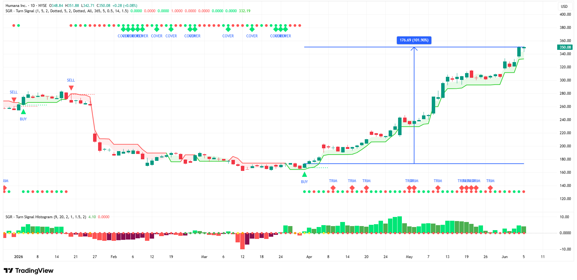
Humana Inc. (HUM) returned 14.62% last week.
The SGR - Turn Signal initiated a “Buy” signal for HUM on March 31, 2026.
Since then, HUM has returned 101.9%.
With the SGR - Turn Signal, you could have been in HUM months before last week’s breakout.
Worst Performer:
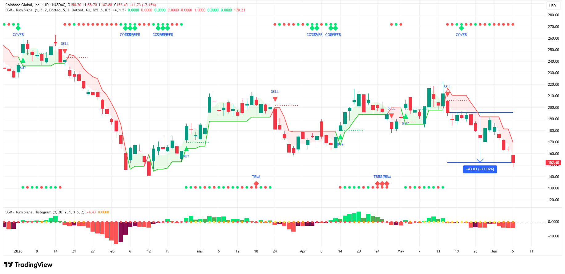
Coinbase Global, Inc. (COIN) returned -19.38% last week.
The SGR - Turn Signal initiated a “Sell” signal for COIN on May 15, 2026.
Since then, COIN has returned -22.02%.
With the SGR - Turn Signal, you could have gotten out of COIN a full two weeks in advance of last week’s drawdown.
Do you have a system in place to give you this kind of intel to keep you on the right side of the trade?
If not, consider joining our FREE LIVE webinar on Wednesday, May 10th at 7:00 pm, where you can learn more about the SGR - Turn Signal and how you can get access to it.
The webinar will last 30-45 minutes, with plenty of time at the end for Q&A.
Can’t join live? No worries, the presentation and recording will be provided to all who register.
👉 Click here to grab your seat: Webinar Registration
👉 Follow me on LinkedIn to receive daily “signal” alerts.
The Market Map
Each week, we break down the S&P 500 using our proprietary systematic process, which we call “The Market Map.”
The Market Map is an analysis of market structure. Understanding market structure can provide clues as to where the market may be heading next.
To do this, we start by analyzing the bigger picture (weekly chart) and then look for confirming evidence by shifting to a lower time frame (4-hour chart).
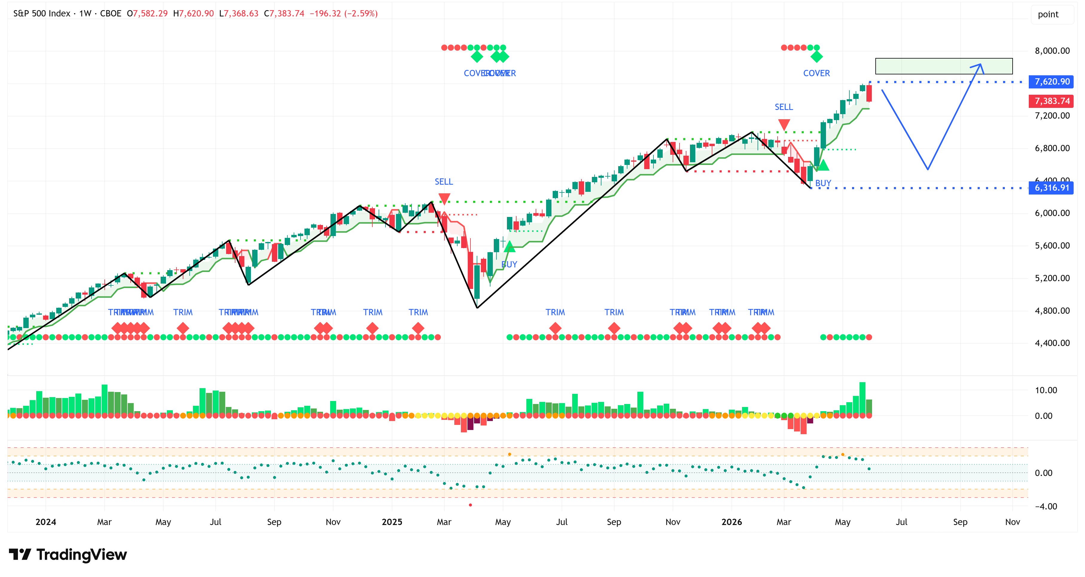
Weekly Chart
Even though last week broke the 9-week winning streak, the S&P 500 didn’t cross below its trailing stop loss on the weekly chart, and structure remains bullish.
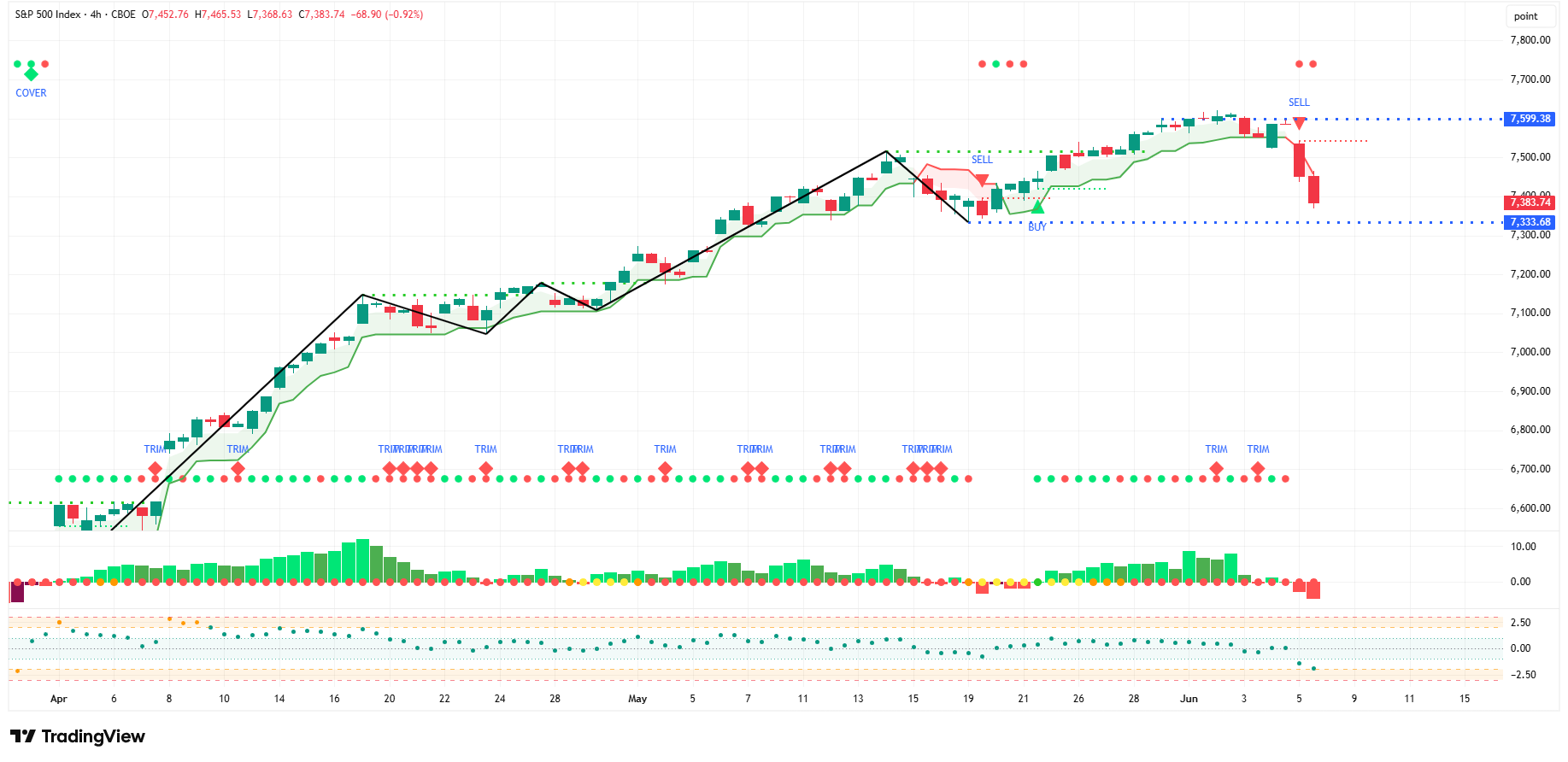
4-Hour Chart
Here again, last week was a tough week, but structure remains bullish as we have not closed below 7,333.
Summary
Make sure to see the analysis below as it provides some important context for what may be next for the S&P 500 and other market barometers.
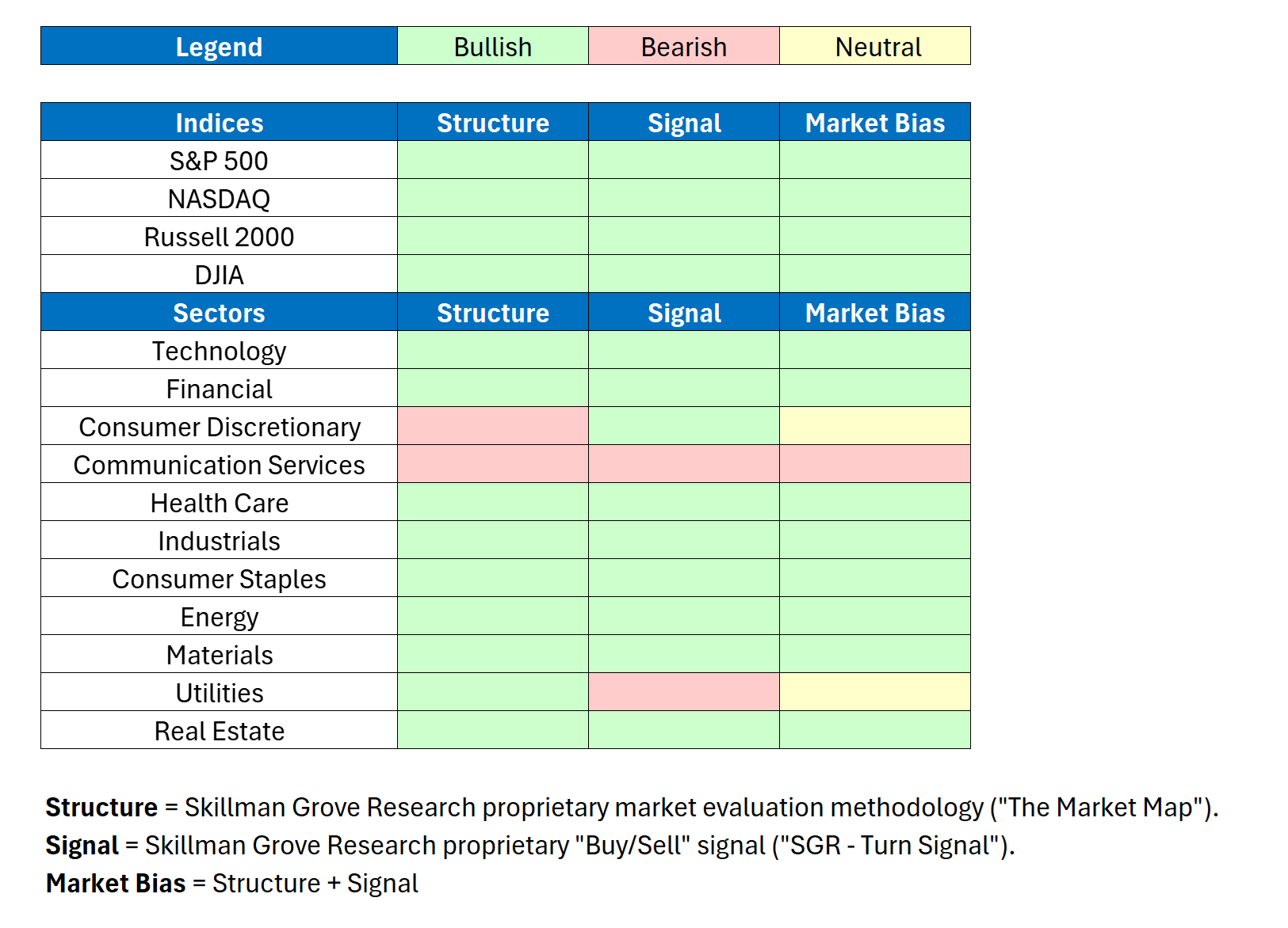
Market Bias
When we combine our structural analysis (“The Market Map”) with our signal analysis (“SGR - Turn Signal”), we create what we call the “Market Bias.”
The Market Bias tells us the possible direction (bullish 🟢, bearish 🔴, or neutral 🟡) of each market over the short- to medium-term.
Note: We use the weekly chart for this analysis to smooth out the day-to-day price volatility.
Here’s a quick snapshot of our Market Bias analysis for the major US indices and sectors.
There were two changes on a week-over-week basis.
Communication Services
Strucutre → Unchanged
Signal → Bearish
Market Bias → Bearish
Health Care
Structure → Unchanged
Signal → Bullish
Market Bias → Bullish
Would you like to see our Market Bias for even more asset classes so that you can stay on the right side of the market?
If so, in our paid section below, we detail 30+ securities/charts each week.
The charts include various indices, equity sectors, US Treasuries, currencies, commodities, and fixed income.
Investment Ideas
In addition to the 30+ securities/charts noted above, each week, we use our “Market Bias” methodology to sift through hundreds of securities to create a portfolio of our best “Investment Ideas”.
Year-to-date, our “Investment Ideas” portfolio has returned 13.82% and has outperformed the S&P 500 by 6.04%.
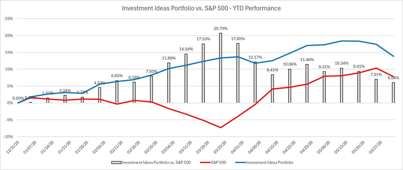
Would you like access to our “Investment Ideas” portfolio so you can see our buys and sells in real-time?
If so, consider becoming a paid subscriber by clicking the link below.
Using History as a Guide…
Let’s start with the elephant in the room…Friday was ugly, especially for the NASDAQ.
Here’s a 5-minute chart of the NASDAQ Composite Index:
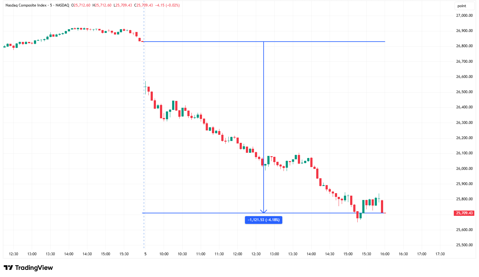
The inception date for the NASDAQ Composite Index was February 5, 1971.
This means there have been 13,949 trading days since the beginning of its existence.
How rare was Friday?
June 5th closed down -4.18%. Going back to February 1971 (13,949 trading days), exactly 85 prior days were equal to or worse than that — 86 including Friday itself.
That’s 0.62% of all sessions, or roughly 1 day in every 162. Statistically, it was a 3.3-sigma move against a daily mean of +0.05% and a 1.27% standard deviation.
So a genuinely uncommon day, but nowhere near the extremes — the worst on record was -12.3% (March 16, 2020), and 1987, 2000, and 2008 all produced -9% to -11% sessions.
Where does that leave us now?
Friday’s decline was unique in that it happened within ~5% of the one-year highs. Most other drawdowns of similar magnitude were well into larger, more sustained drawdowns.
In fact, only four other similar cases go back to 1971.
Nov 1991, Jun 2020, Sep 2020 → all recovered, +18% to +48% over the next year. Effectively, they were flushes within ongoing bull trends.
Jan 4, 2000 → that was the dot-com top. -33% over the next year, -41% peak-to-trough.
So three of four were buyable dips; one was the first domino.
A single -4% day from near the highs has essentially no standalone predictive power for a larger drawdown — the base rate says fade it, but the one time it mattered, it really mattered, and nothing in the price action of that one day distinguished it in advance.
If you read my piece from last week (here), I highlighted that there have been 11 occurrences (including the most recent one) in which the S&P 500 had advanced for 9 consecutive weeks or more.
Here’s where things get interesting.
7 of the 10 previous occurrences stopped at 9 weeks (the other three advanced by 13, 10, and 12 weeks before having a down week).
Of those 7 nine-week occurrences, here’s what happened afterwards:
#1: The S&P 500 was lower for 1 week, then went on to advance for 3 more consecutive weeks.
#2: The S&P 500 was lower for 1 week, then went on to advance for 3 more consecutive weeks.
#3: The S&P 500 was lower for 1 week, then went on to advance 1 more week.
#4: The S&P 500 was lower for 1 week, then went on to advance for 6 more consecutive weeks.
#5: The S&P 500 was lower for 2 weeks, then went on to advance for 3 more consecutive weeks.
#6: The S&P 500 was lower for 1 week, then went on to advance for 2 more consecutive weeks.
#7: The S&P 500 was lower for 1 week, then went on to advance for 5 more consecutive weeks.
Putting it all together, history suggests that after a 9-week run, the S&P 500 is usually down for one week (or two) and then continues to rally for another ~3 weeks or so.
With that said, we want to manage our risk.
In the following charts, I will go through each of the major US equity indices and the 11 major US equity sectors and define a specific level where “if we have a weekly close below this level, we might have a problem…”
Let’s dive in…
