
The Market Map
Keep an eye on the move in US Treasuries...

Hey everyone — it’s Jim.
I hope you had a great weekend and that you’re enjoying your President’s Day!
Proprietary Buy/Sell Indicator
Last week, we put the buy/sell indicator to the test, specifically calling out four US equity sectors where the indicator had triggered a buy or sell signal.
Let’s see how it did.
Here are the sectors, the signal, and the week-over-week percentage gain or loss.
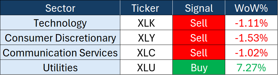
I’d call that a win for the indicator!
The following information is for educational purposes only. This content does not constitute investment advice. I am not a registered investment advisor, and no advisory relationship is formed. Any investment decisions or trades you make are solely your responsibility.
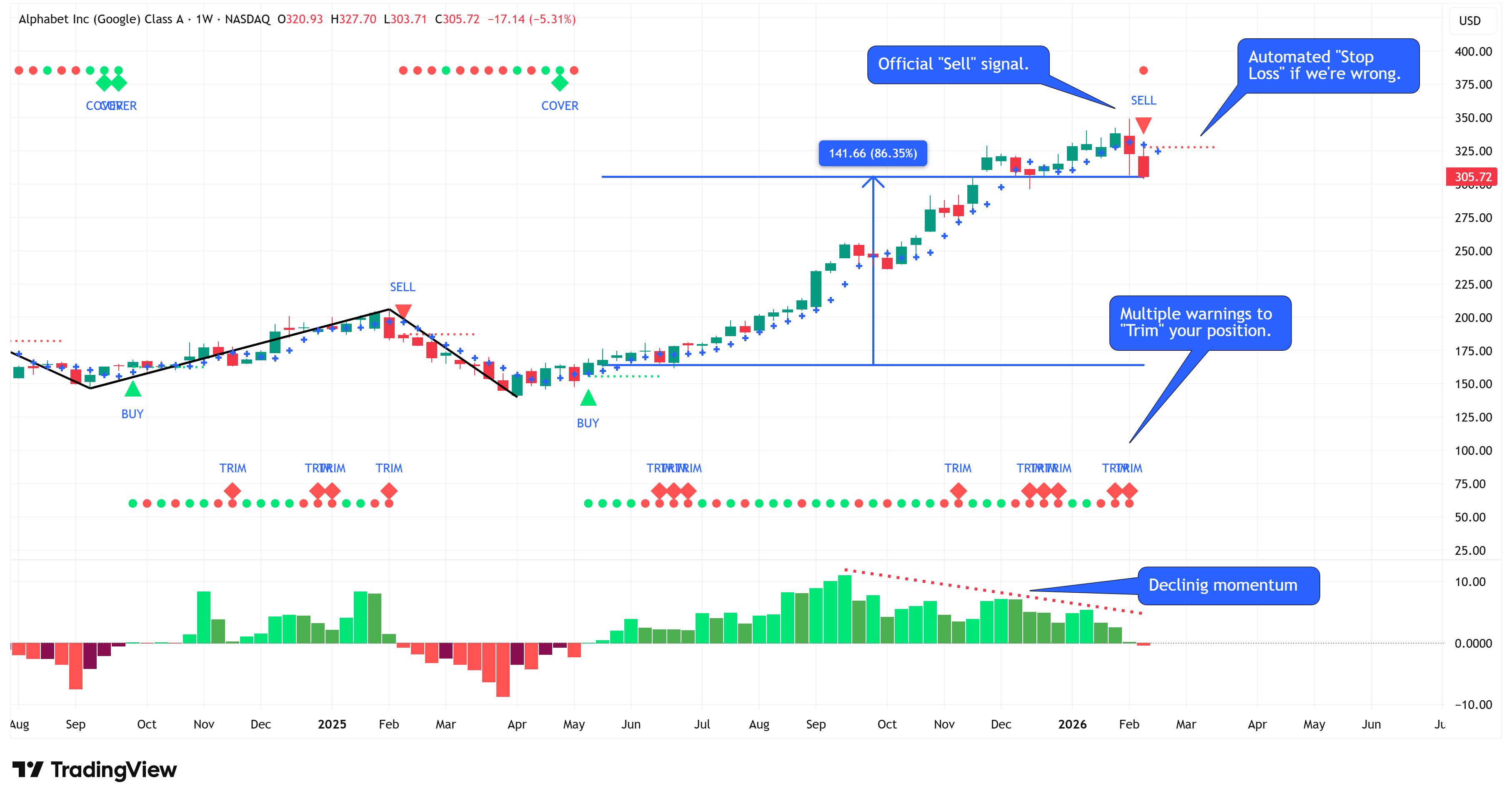
Typically, I reserve the following information for paid subscribers, but I want to bring this to your attention as we head into a new week.
Alphabet Inc. (Google) has appreciated by 86.35% since our signal triggered a “Buy” the week of May 12, 2025.
At the close of last week, it triggered a “Sell” signal.
In addition to the “Sell” signal, notice that:
In 5 of the last 8 weeks, the indicator was suggesting that investors should begin to “Trim” their position.
We can visually see several months of declining momentum (providing further confidence in the “Sell” signal).
The signal also provides an automated “Stop Loss” in the event our “Sell” signal is incorrect.
The signal has all your bases covered so that you can trade/invest with confidence!
If you think having insights like this would benefit your investment process, may I suggest the following:
Become a paid subscriber to this newsletter by clicking the button below.
Consider adding our proprietary buy/sell indicator to your investment process.
To learn more about how to do this, I invite you to join our next live webinar on March 5th at 7:00 pm ET.
Click here to register: March 5th Webinar Registration
If you can’t wait until March 5th, here is the replay from our last webinar and the presentation:
Webinar: Webinar Replay
Password: Mg#5x=bd
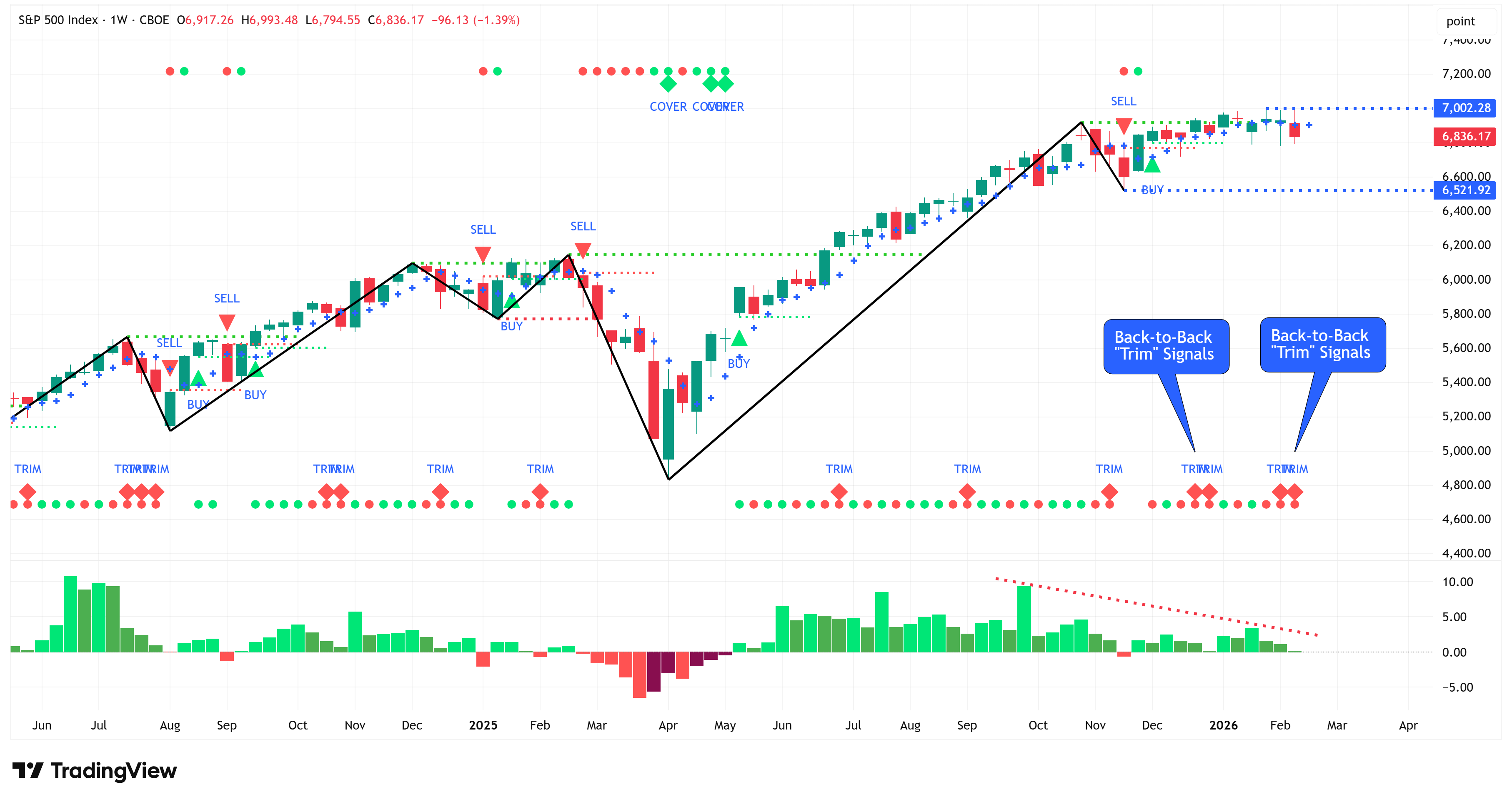
The Market Map
Each week, we break down the S&P 500 using our proprietary systematic process called “The Market Map” to understand where the market may be heading next.
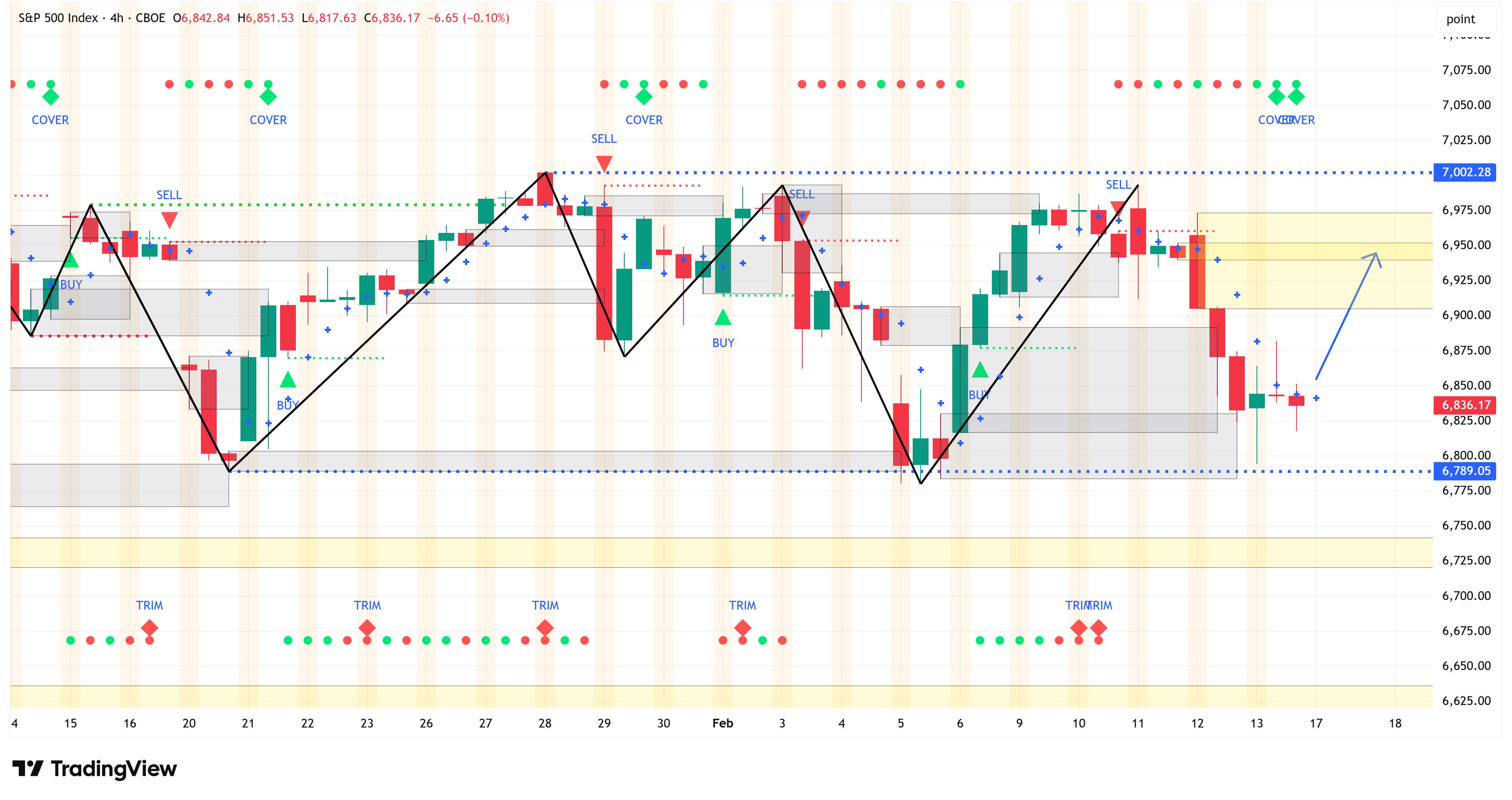
To do that, we start by analyzing the bigger picture (weekly chart) and then look for confirming evidence by shifting to the lower time frame (4-hour chart).
Last week, I made the following statement regarding the 4-hour chart:
“I expect the S&P 500 to continue along the blue line, ultimately taking out the yellow box above current levels.”
And I presented this chart:
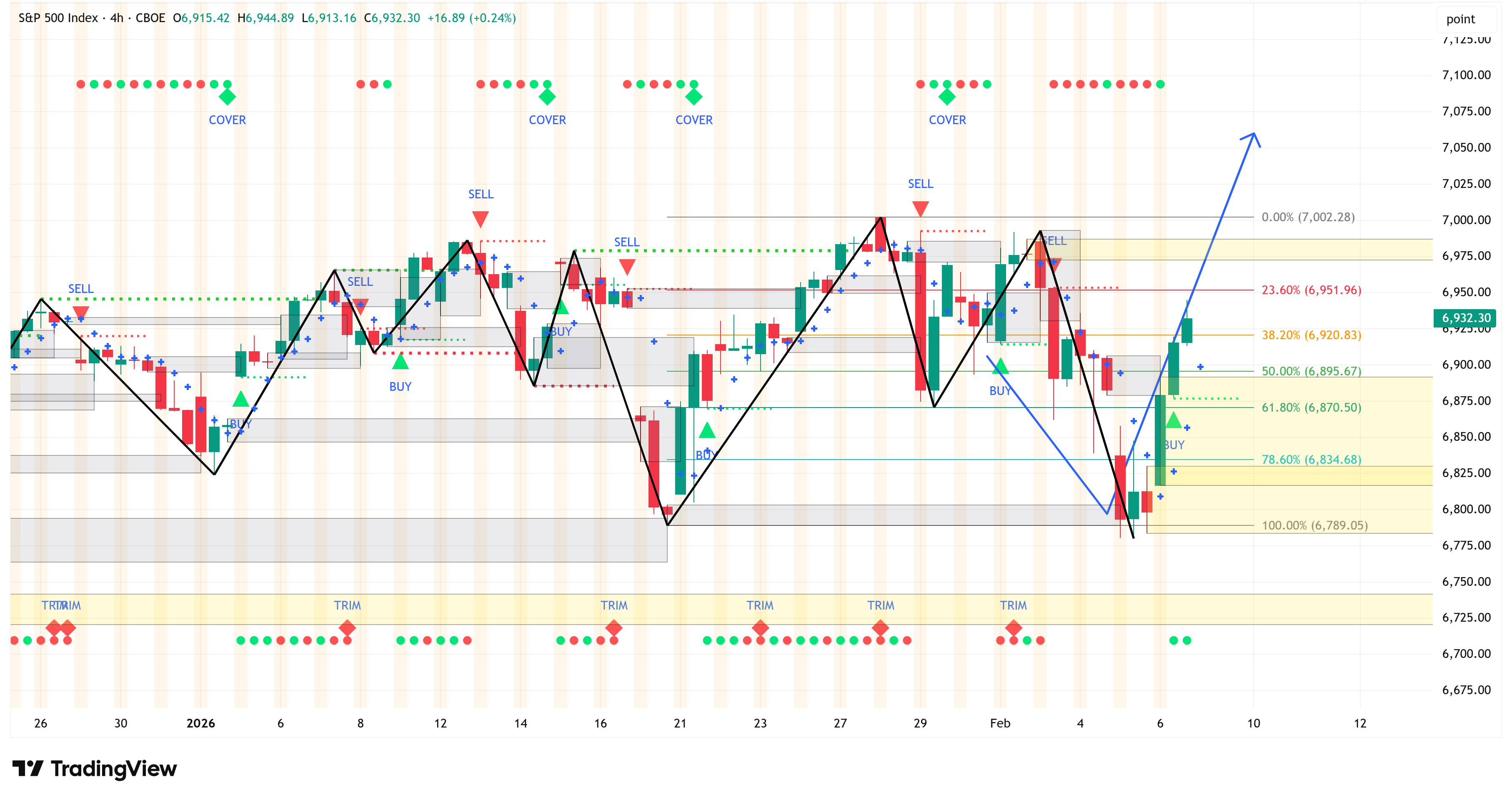
Fast forward one week, and here is the same chart with the updated price action.
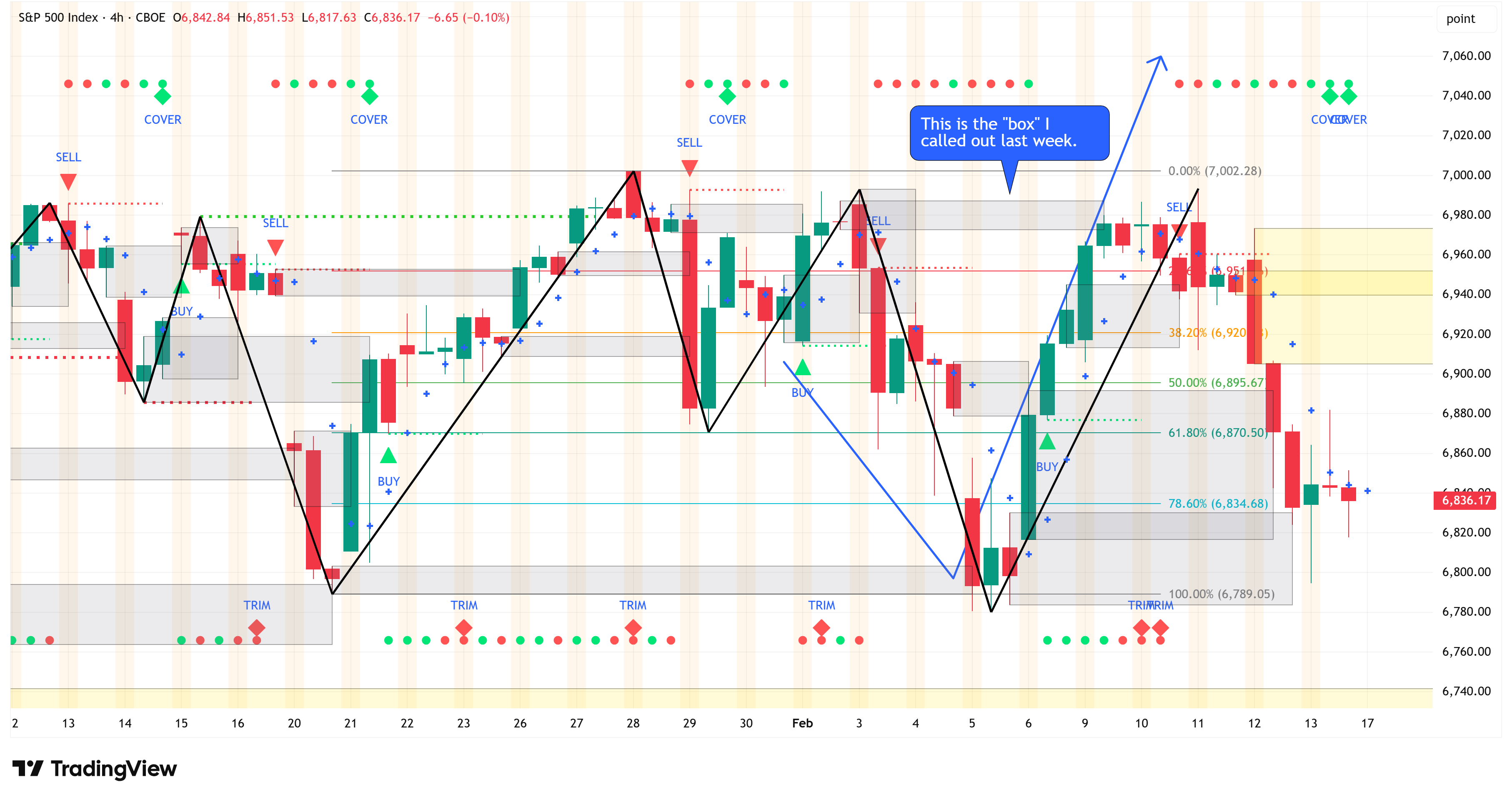
Notice that the price action:
Did follow along the blue line.
Did take out the “yellow box” (note: when a box is “taken out”, it shifts to grey).
Weekly Chart
From a technical standpoint, the good news is that the weekly chart a) continues to remain in a bullish structure, and b) continues to remain on a “Buy” signal.
The bad news is that the S&P 500 was just a whisper away from triggering a “Sell” signal with last week’s close.
A down week this week, and it will likely trigger a “Sell” signal.
Note the multiple weeks of back-to-back “Trim” signals and the declining momentum.
These do not give me a ton of confidence that the bulls are still in control.
4-Hour Chart
The 4-hour chart performed as expected last week, but I’m less sure about how things will go this week.
The weekly chart is suggesting that we’re very close to triggering a “Sell” and that has implications for the 4-hour chart.
We may see the 4-hour chart initially move higher to grab the yellow boxes I’ve highlighted on the chart, and then head lower.
Summary
While the weekly and 4-hour charts are technically in a “bullish” structure, other surrounding factors leave me skeptical of a substantial move higher in the short run.
Keep an eye on the move in US Treasuries…
Here’s a chart of SPY (S&P 500) vs. several US Treasury ETFs over the last month.
Specifically, we are comparing SPY vs. the following:
iShares 3-7 Year US Treasury Bond (IEI)
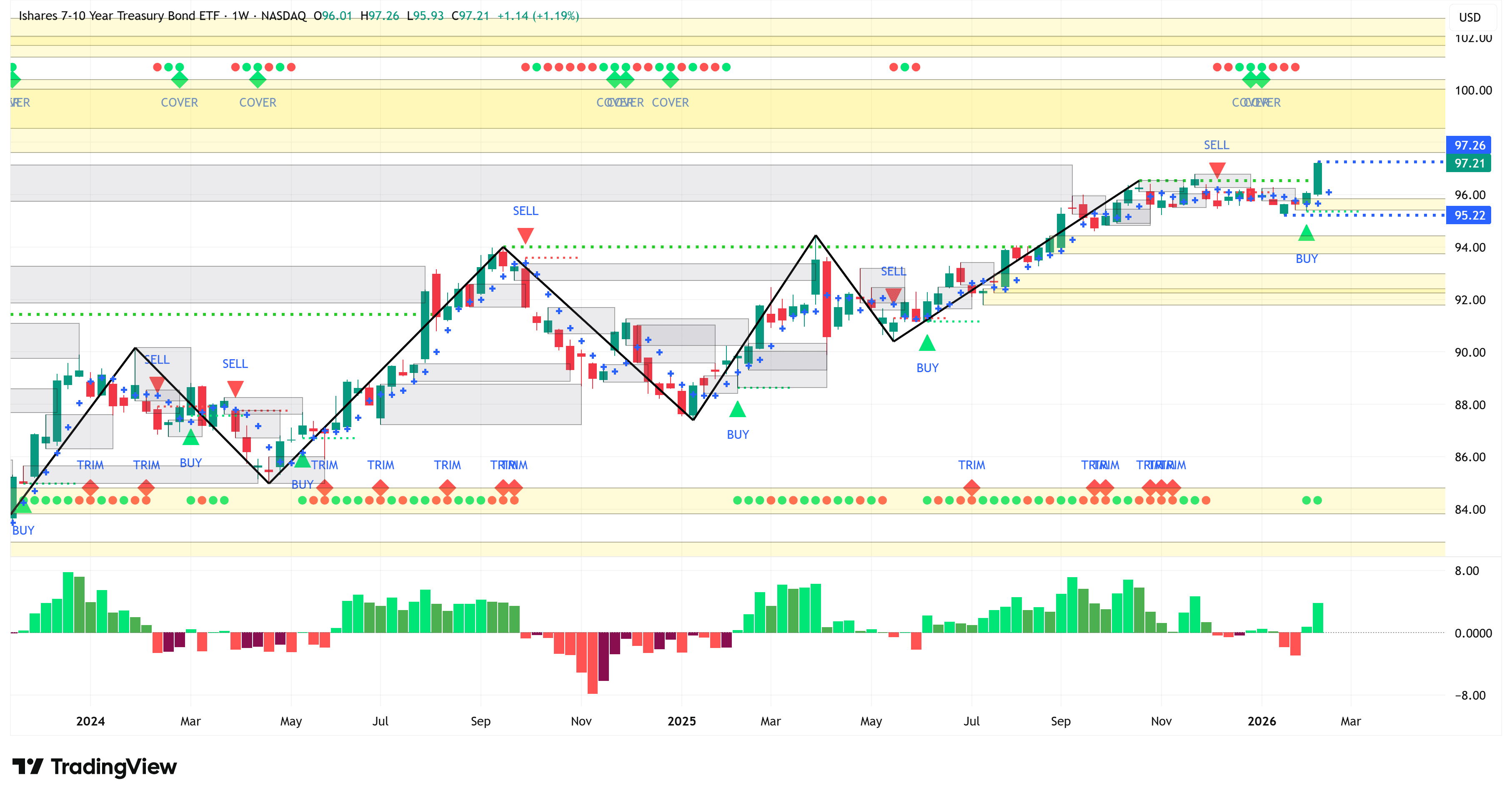
iShares 7-10 Year US Treasury Bond (IEF)
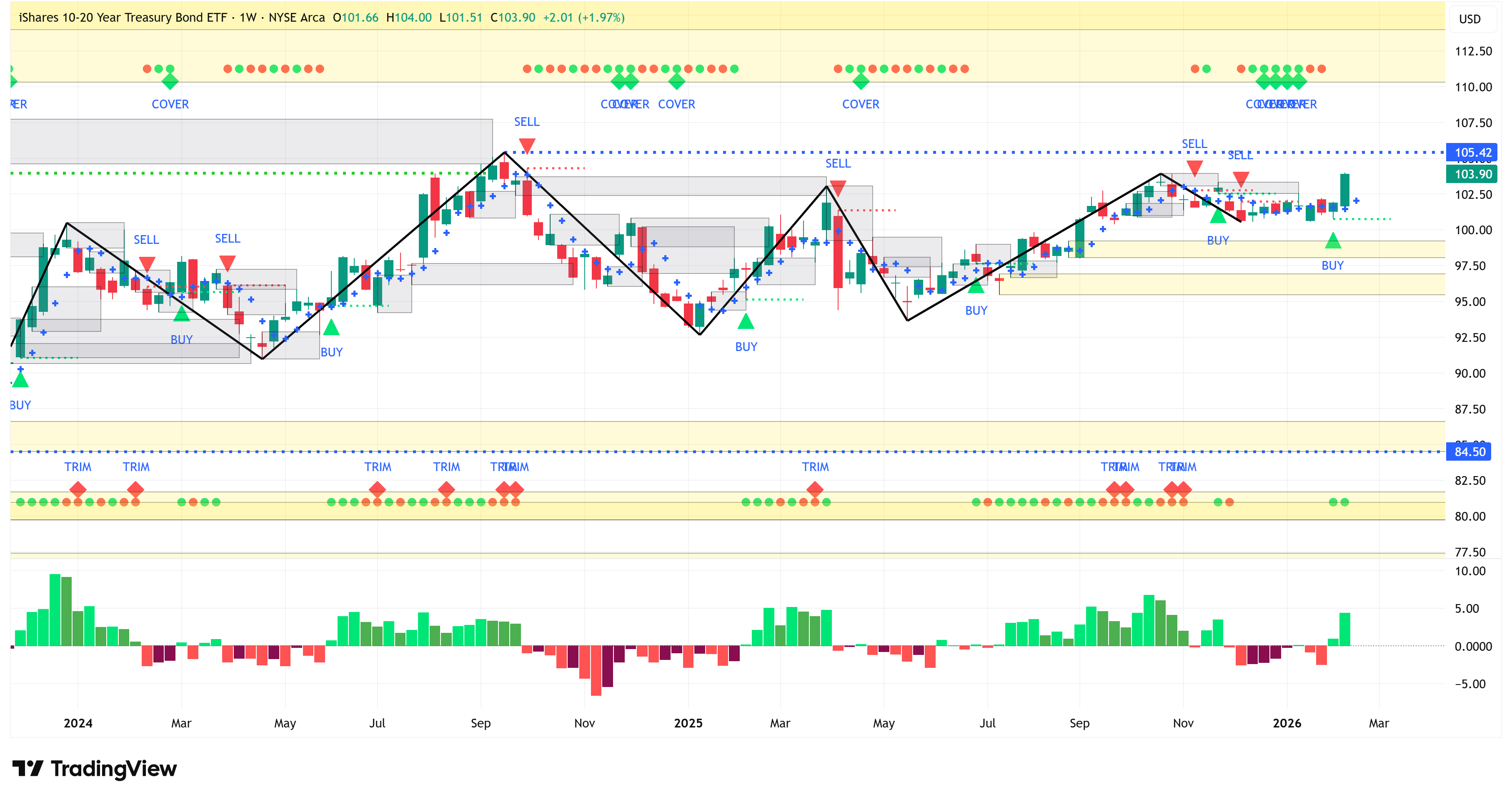
iShares 10-20 Year US Treasury Bond (TLH)
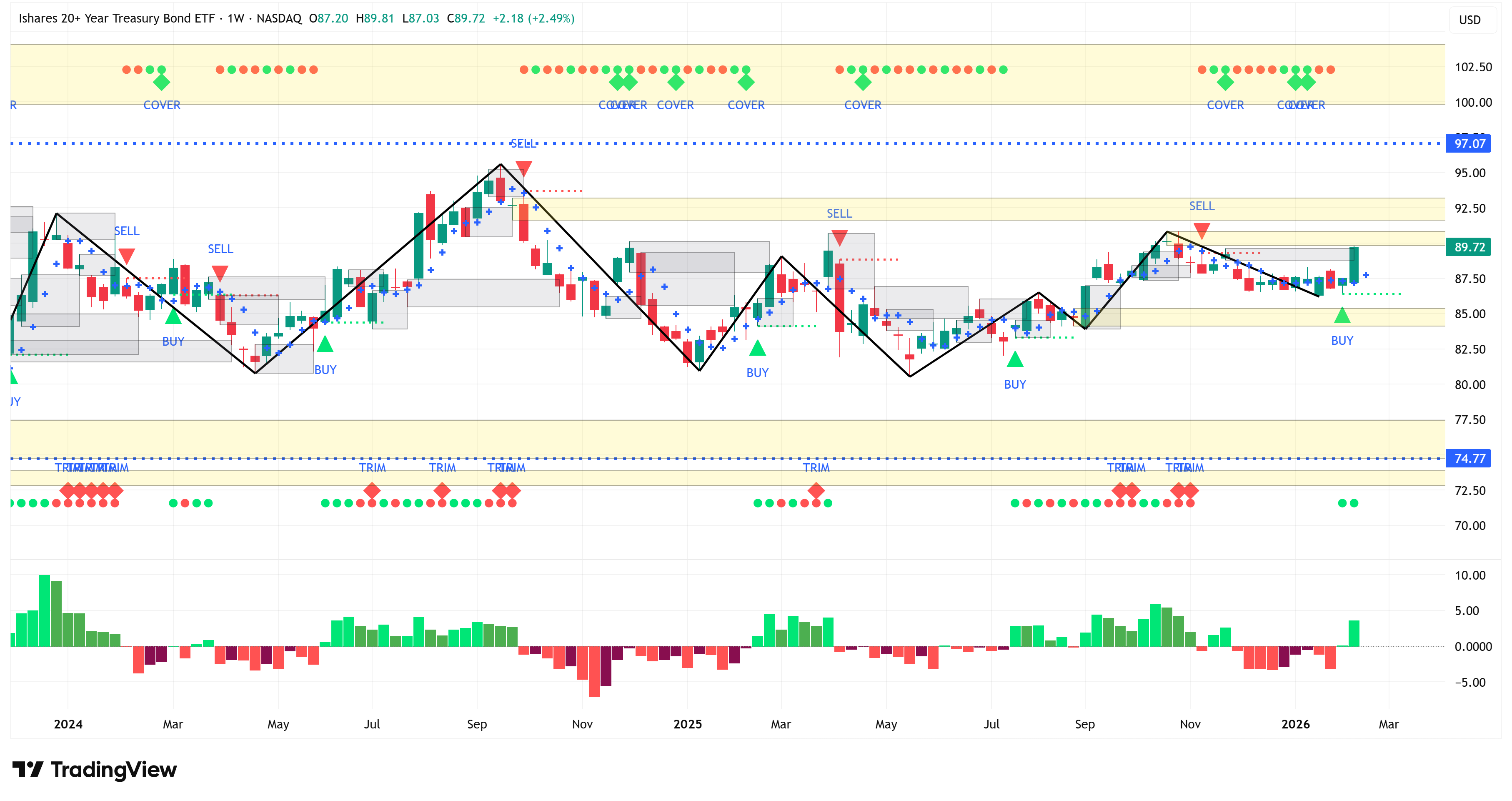
iShares 20+ Year US Treasury Bond (TLT)
PIMCO 25 Year Zero Coupon US Treasuy Bond (ZROZ)
Note: When the price of US Treasury ETFs increases, that means US Treasury yields are decreasing.
For most of the last month, the US Treasury ETFs tracked largely in line with SPY.
However, since last Monday (February 9th), they have begun to diverge quite significantly.
It’s also notable that all duration buckets are outperforming the S&P 500.
This is important because it suggests (at least for now) that the entire Treasury curve is shifting lower.
I have been in the camp of thinking that the US economy was doing well enough (although not great) that further rate cuts were not justified.
Further, my fear was that if the Fed cut rates anyway, it could spark a new round of inflation, which may cause the longer end of the curve to move higher.
This is suggesting something different.
It tells me that one or more of the following are happening:
Investors are seeking safe-haven assets because they are worried about risk assets.
Inflation might be coming down sustainably.
The economy is weaker than people think.
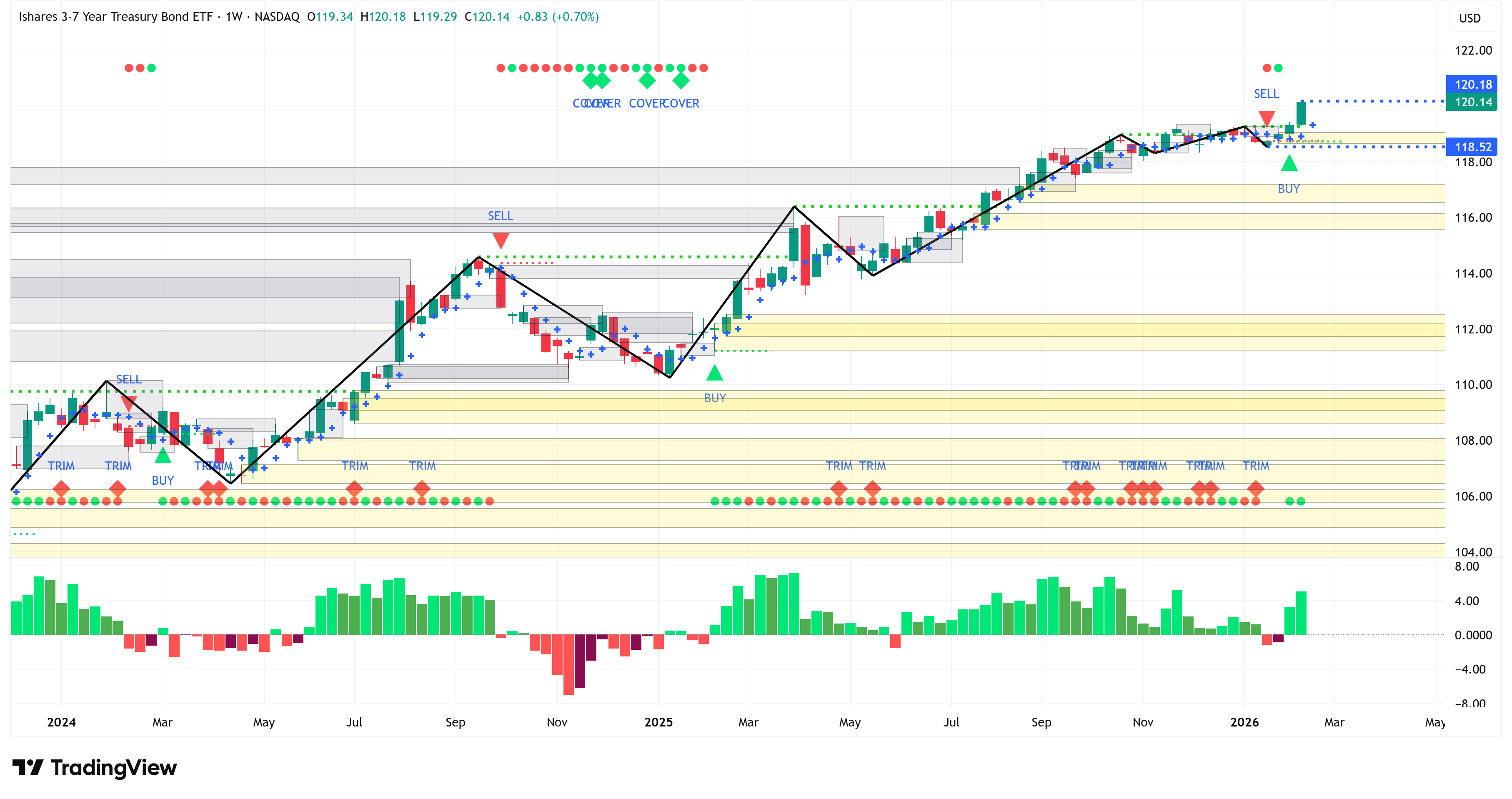
What’s even more interesting is that our indicator caught this move on February 6th, when it initiated a “Buy” signal in IEI, IEF, TLH, and TLT.
Not to be outdone, ZROZ initiated a “Buy” signal at the close of last week on February 13th.
Here are the charts:
iShares 3-7 Year US Treasury Bond (IEI)
iShares 7-10 Year US Treasury Bond (IEF)
iShares 10-20 Year US Treasury Bond (TLH)
iShares 20+ Year US Treasury Bond (TLT)
PIMCO 25 Year Zero Coupon US Treasuy Bond (ZROZ)
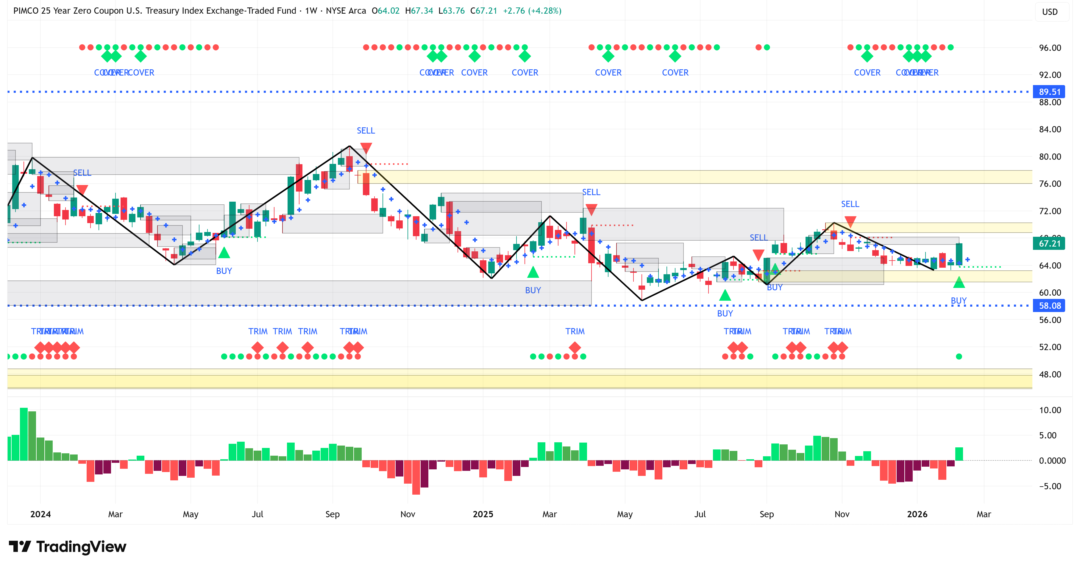
Was this a one-week phenomenon, or are Treasury yields poised to continue moving lower?
Keep an eye on it, as this will have ramifications for the economy as a whole.
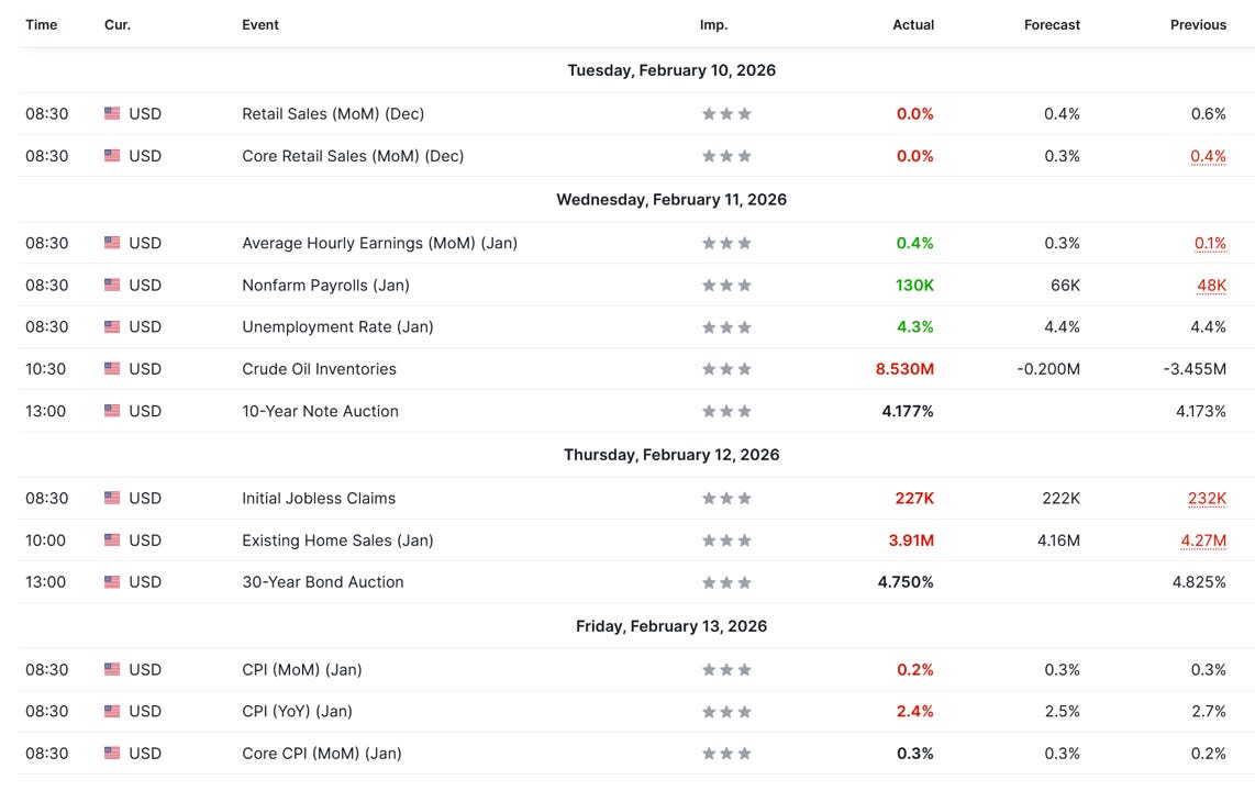
Economic Calendar
Last Week
Nonfarm payrolls came in substantially better than anticipated; however, the BLS announced changes to its “establishment survey”.
In accordance with annual practice, the establishment survey data released today have been
benchmarked to reflect comprehensive counts of payroll jobs for March 2025. These counts are
derived principally from the Quarterly Census of Employment and Wages (QCEW), which counts
jobs covered by the Unemployment Insurance (UI) tax system. The benchmark process results in
revisions to not seasonally adjusted data from April 2024 forward. Seasonally adjusted data
from January 2021 forward are subject to revision. In addition, data for some series prior to 2021, both seasonally adjusted and unadjusted, incorporate other revisions.

The seasonally adjusted total nonfarm employment level for March 2025 was revised downward by 898,000. On a not seasonally adjusted basis, the total nonfarm employment level for March 2025 was revised downward by 862,000, or -0.5 percent. Not seasonally adjusted, the absolute
average benchmark revision over the prior 10 years is 0.2 percent.
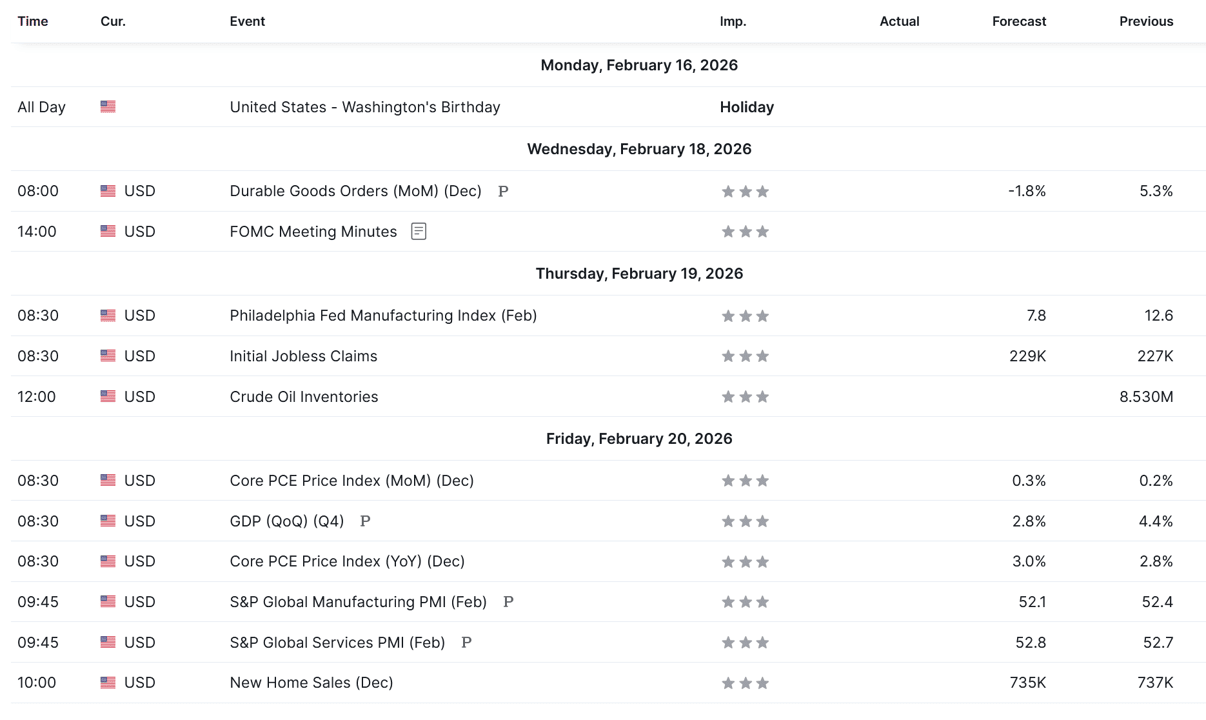
This Week
Investment Ideas (Paid Section Below)
Last week, our investment ideas (behind the paywall) yielded an average return of 0.70% compared to a return of -1.39% for the S&P 500.
This equates to outperformance of 2.09% for our picks last week.
Year-to-date, our investment ideas have outperformed the S&P 500 by 6.38%.
Would you like to see our investment ideas each week? Become a paid subscriber by clicking on the link below.
The following sections are available only to paid subscribers.
For subscribers who want to go deeper, we also offer a paid tier.
The Market Map – Elite
Elite subscribers receive everything included in the Free version, plus full access to our proprietary research, including:
Additional Market Map charts and analysis
A minimum of two investment ideas per month
S&P 500 Fair Value Model
The Market Map tutorials and walkthroughs
And more…
For those who want to learn “The Market Map” methodology, we also offer one-on-one coaching and cohort-based learning for larger groups.
If that is of interest, email jim@skillmangroveresearch.com to inquire.
If you would like exclusive access to our proprietary data, be sure to click on the link below to become a paid subscriber.
Do you have any other feedback?
If so, feel free to reply to this email or email me directly at jim@skillmangroveresearch.com!
I read and respond to every email, and I value your opinion!
