In last week’s post, we examined the most recent update of my favorite chart, the “Average Investor Allocation to Equities”. It paints a very unfavorable picture of where the market could go during the next recession.
Despite that, the market continues to grind higher, and as the old saying goes, “You’ve got to play the hand you’re dealt.”
This week, we will focus on what’s driving the market and how far we think it can go from here.
S&P 500 - Sectors
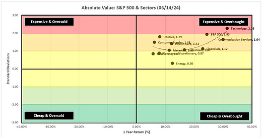
In the scatterplot below, we can see that the S&P 500 and the underlying sectors have had a great run over the last year placing them in the upper right “Expensive & Overbought” quadrant.
Just because the S&P 500 and underlying sectors are “Expensive & Overbought” doesn’t mean they can’t get more “Expensive & Overbought”, so this isn’t a signal to go out and sell anything. This is simply an acknowledgment of where we are at this point in time.
Using the same concept as above, in the chart below, I am looking at the relative performance of each sector vs. the S&P 500 over the last year.
We can see pretty quickly that the Technology sector is driving the bus on a relative basis.
Keep reading with a 7-day free trial
Subscribe to Skillman Grove Research to keep reading this post and get 7 days of free access to the full post archives.


