Weekly Chart Review
Apple "Fills The Lower Price Gap"...Where Does Apple (And The Market) Go From Here?
Happy Monday, everyone! Let’s get right to it!
Last week, I made the following comment regarding Apple:
“Note that last week’s price stopped right at the top end of the gap that I suggested needs to be filled. For this gap to be filled this week, at some point, Apple “needs” to move lower by -1.14% relative to Friday’s close.”
Instead of a -1.14% decline, Apple declined by -1.86% last week and filled the price gap I highlighted between 175.77 and 176.57.
Here is what it looks like on the daily chart.
There’s a good news / bad news story developing with respect to the recent price action for Apple and by extension, the US equity market.
Let’s start with the good news:
The price gap between 175.77 and 176.57 has been filled which removes this from the equation.
Apple (and the S&P 500) closed out the week on a good note with a positive return on Friday.
The RSI is pegged at “oversold” levels, thus suggesting that a rally is not only possible but probably overdue.
Apple has an overhead price gap between 187.38 and 190.69 that needs to be filled. This would suggest a price appreciation of around +9.28% from Friday’s close over the medium term.
Now, the bad news:
The next logical area of support is around 170.45 (black dotted horizontal line on the chart above). This suggests we could see a decline of -2.31% relative to Friday’s close before finding support.
The downward slope of the moving averages continues thus suggesting that the current downtrend may not be over.
See chart below.
In the chart below, I have removed the moving averages and the horizontal support line and I have added a trailing stop loss indicator.
Very simply, a “stop loss indicator” is used to indicate when to exit a position (in this case, a long position). This is indicated on the chart where the green-shaded area turns into a red-shaded area. While not perfect, it does give us a mechanical way of knowing when we should consider exiting/entering a long position.
With respect to Apple, you can see on the chart above that the call to exit a long position took place on August 4th and it has yet to trigger an indication to enter a long position by turning from red to green. That means that this indicator believes that Apple could continue to fall further.
Note: I am not suggesting that you buy or sell Apple (or any other stock, index, etc.) based on this (or any other) indicator, I am simply showing what one specific indicator on my charting platform is displaying.
I am going to use this trailing stop loss indicator on each of the charts we review today to see if it gives us any further insight into our analysis.
Leaders & Laggards
Here is a quick snapshot of the “Leaders” & “Laggards” we have been reviewing for the last five weeks.
On a YTD basis, the “Leaders” continue to dominate the “Laggards” but it really comes down to the “Big 3”: Communication Services, Technology, and Consumer Discretionary.
Last week was a tough week for everyone, but the “Laggards” outperformed the “Leaders” by +0.50%.
Over the last five weeks, the “Laggards” have outperformed the “Leaders” by +3.70%. I am still of the opinion that we are in the early innings of a rotation out of the “Leaders” and into the “Laggards”.
Absolute Value & Relative Value
Here are the weekly updates for my absolute value and relative value charts.
Absolute Value
We still have most of the sectors and the S&P 500 residing in the upper-right “Expensive & Overbought” quadrant but they have come in from where they were a month or so ago.
Relative Value
Given that the market has been driven by primarily three sectors this year, it’s not unusual to see so many other sectors in the -1.0 standard deviation camp. This is where I believe we will see flows move once we get a bigger corrective move for the market as a whole.
Sector Review
We will start with the S&P 500 and work our way through each of the sectors.
Take note of the trailing stop loss indicator that I referenced above on each of the charts and recall that these charts are always weekly charts unless indicated otherwise.
S&P 500 Index
Positive:
Look for the 23.6% Fib (4,321.46) to provide support followed by potential support at 4,134.32.
Negative:
Price is now on the “sell” side of the trailing stop loss.
RSI continues to fall after breaking the support level.
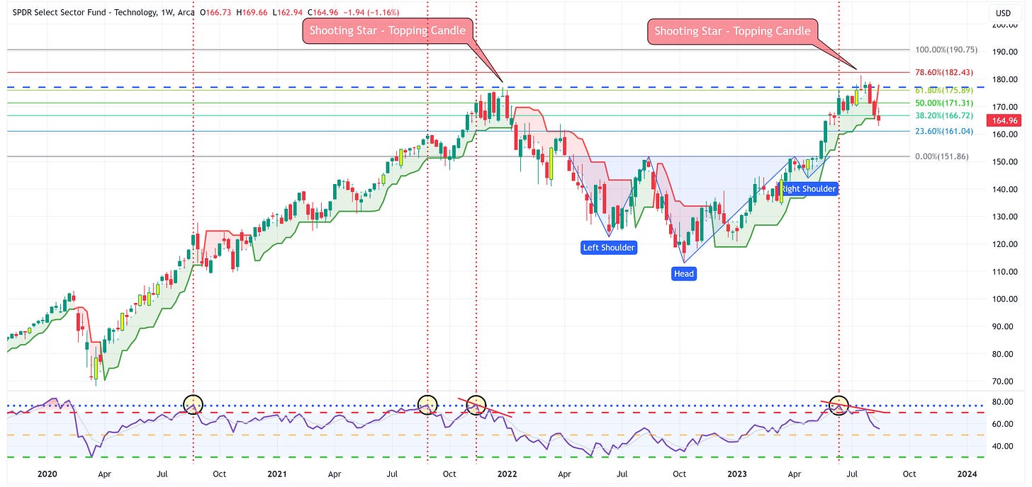
Technology
Positive:
Similar to the S&P 500 Index, look for the 23.6% Fib (161.04) to provide support followed by potential support at 151.86.
Negative:
Price is now on the “sell” side of the trailing stop loss.
RSI continues to fall after creating a bearish divergence.
Communication Services
Positive:
Trailing stop loss has not triggered a “sell”.
Look for the trailing stop loss to provide support.
Negative:
The more recent uptrend (blue line) has been broken.
Clearly looks to be forming a rounding-top pattern.
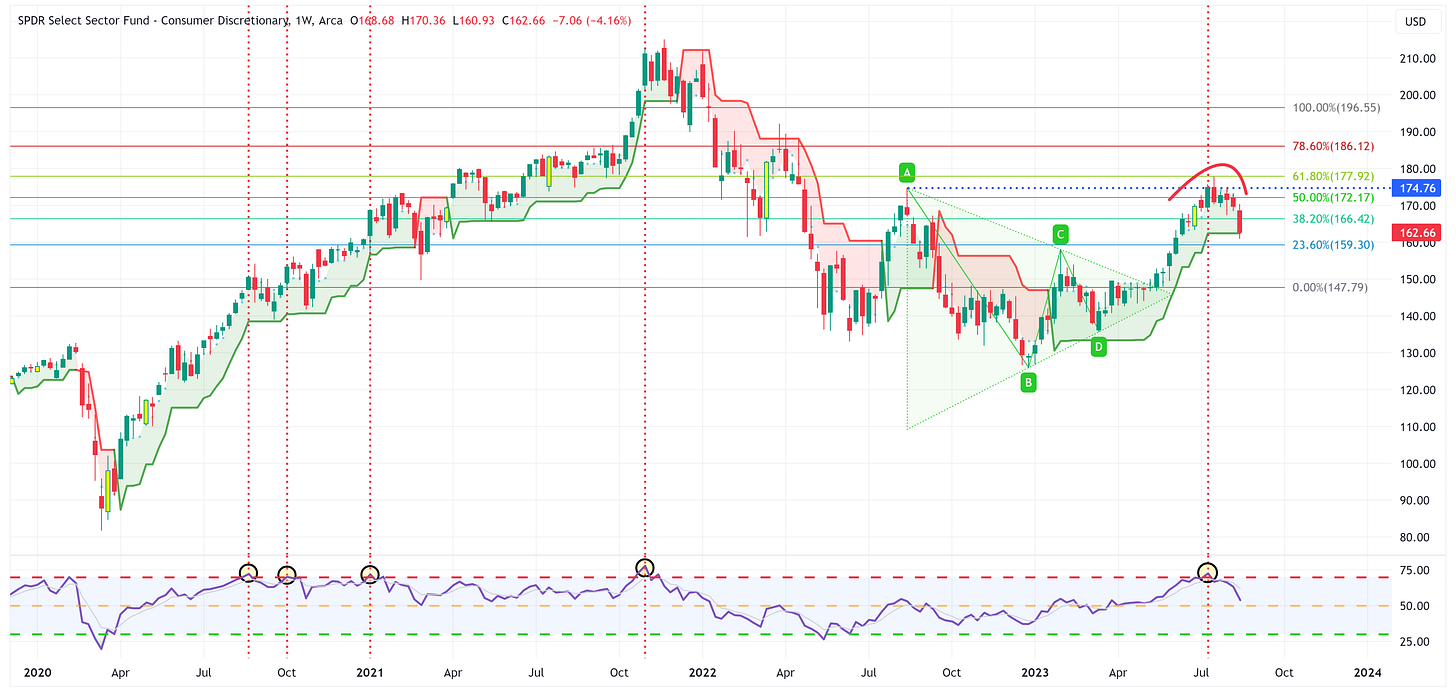
Consumer Discretionary
Positive:
Trailing stop loss is providing support.
Negative:
RSI continues to move lower.
Clearly looks to be forming a rounding-top pattern.
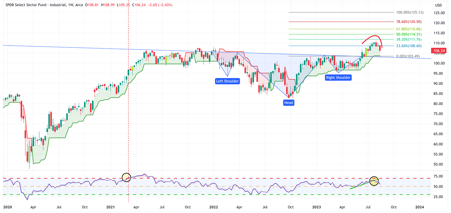
Industrials
Positive:
Trailing stop loss has not triggered a “sell”.
Look for the trailing stop loss to provide support.
Negative:
RSI continues to move lower after breaking through its recent uptrend.
Clearly looks to be forming a rounding top pattern.
Materials
Positive:
Trailing stop loss has not triggered a “sell”.
Look for the trailing stop loss to provide support.
Negative:
RSI continues to move lower after breaking through its recent uptrend.
Clearly looks to be forming a rounding top pattern.
Energy
Positive:
The uptrend remains intact even after a pullback last week.
The target remains 111.94.
Negative:
RSI beginning to weaken but remains above the midline.
Saw a pullback last week, pullback becomes a concern below 87.66 and then below the stop loss.
Financials
Positive:
Trailing stop loss has not triggered a “sell”.
Look for the trailing stop loss to provide support.
Negative:
Becoming more convinced that the right shoulder of a head & shoulders pattern has formed.
Clearly looks to be forming a rounding top pattern.
Real Estate
Positive:
XLRE continues to hang on to the triangle pattern which means it still has a chance to break to the upside.
Negative:
Despite the previous “positive” bullet point, XLRE remains below the trailing stop loss which would suggest that it is more likely to break the triangle pattern to the downside. If that happens, the target becomes 23.47.
Consumer Staples
Positive:
There aren’t many other than the fact that Consumer Staples typically become a safe haven play once we start to move into a recession.
Negative:
Price remains below the trailing stop loss.
RSI is breaking lower.
Utilities
Positive:
Similar to Consumer Staples, this chart really doesn’t have much going for it other than people tend to flock to “defensive” plays like Utilities in the midst of a recession.
Negative:
Price remains below the trailing stop loss level.
The triangle pattern has been breached to the low side. The target becomes 53.99.
Health Care
Positive:
Price remains above the trailing stop loss.
The break of the triangle pattern to the upside calls for a target of 149.34.
Negative:
RSI moving lower but remains above the midline.
The bulls need 132.78 to provide support.
Bonus Chart: US Treasury 10YR
Positive:
The double bottom pattern remains in play and calls for a target of 4.927%.
Negative:
The UST 10 Year continues to have trouble clearing its previous high of 4.335%. Watch this level.
Summary
It continues to feel as though we are late cycle with yields and commodity prices rising.
Here is a chart of the unemployment rate (blue line) and the 18-month moving average (green line) for the unemployment rate. The black line is the price for the Energy sector (XLE).
A few observations:
The US typically does not go into a recession until after the unemployment rate has moved “up and through” the 18-month moving average.
The unemployment rate currently stands at 3.50% while the 18-month moving average is 3.58%. It won’t take much of a move from here to get the unemployment rate above the 18-month moving average.
Note the ramp-up in the Energy sector prior to each recession and how we’re seeing the same thing currently.
The stage is set. We just need a catalyst. The continued rise of US Treasury yields may be the spark but we won’t know until we get there.
With that said, it may seem counter-intuitive to think about buying US Treasuries in this environment but the following chart is quite compelling.
This is a chart of the PIMCO 25-Year Zero Coupon US Treasury ETF (ticker: ZROZ). While it’s not at its lowest level ever, the potential returns from here are worth considering.
For instance, if we look at the highs from the Covid era and think about returns relative to various levels of retracement between present levels and the Covid highs, we find the following.
A retracement to the:
23.6% Fib = 38.2% return
38.2% Fib = 61.8% return
50.0% Fib = 80.9% return
61.8% Fib = 100.0% return
78.6% Fib = 127.2% return
100.0% Fib = 161.9% return
It’s unlikely that we’ll ever time the exact bottom on the ZROZ chart perfectly, but with potential returns like this, it may be worth “being wrong” for a bit so that you are pre-positioned to participate in the larger move later.
Until next week…


