
Weekly Chart Review
Higher before lower...

Hey everyone, it’s Jim.
I hope you had a great weekend!
Let me start by thanking everyone who completed the survey. I got tons of great information, and I will be announcing the winners of the one-year paid subscription to The Weekly Chart Review next week.
With that said, you have one last chance to complete the survey and enter yourself in the drawing for a one-year paid subscription to The Weekly Chart Review.
If you haven’t already done so, please take a moment to complete the survey by clicking on the link below. It takes less than 60 seconds to complete and would be a huge help.
Okay, with that out of the way, let’s jump into this week’s newsletter!
🗺️ The Market Map - S&P 500
Last week, I made the following statement concerning the S&P 500:
For the rally to continue, the S&P 500 needs to do two things as it pertains to the 4-hour chart:
Break above the current trendline.
Reestablish a close above 6,764.58.
Let’s see how it did — it accomplished both!
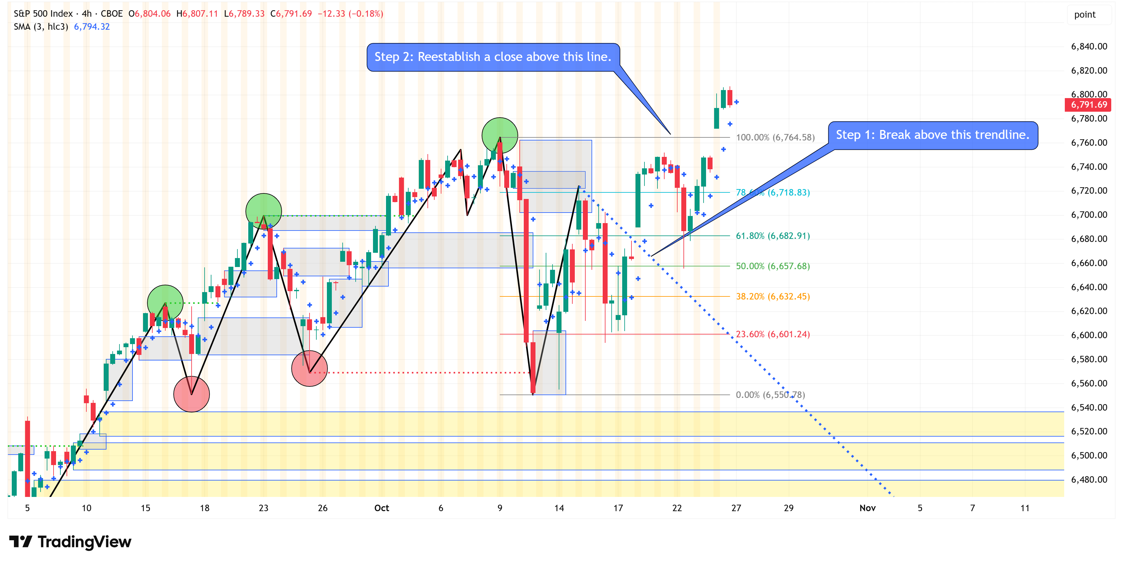
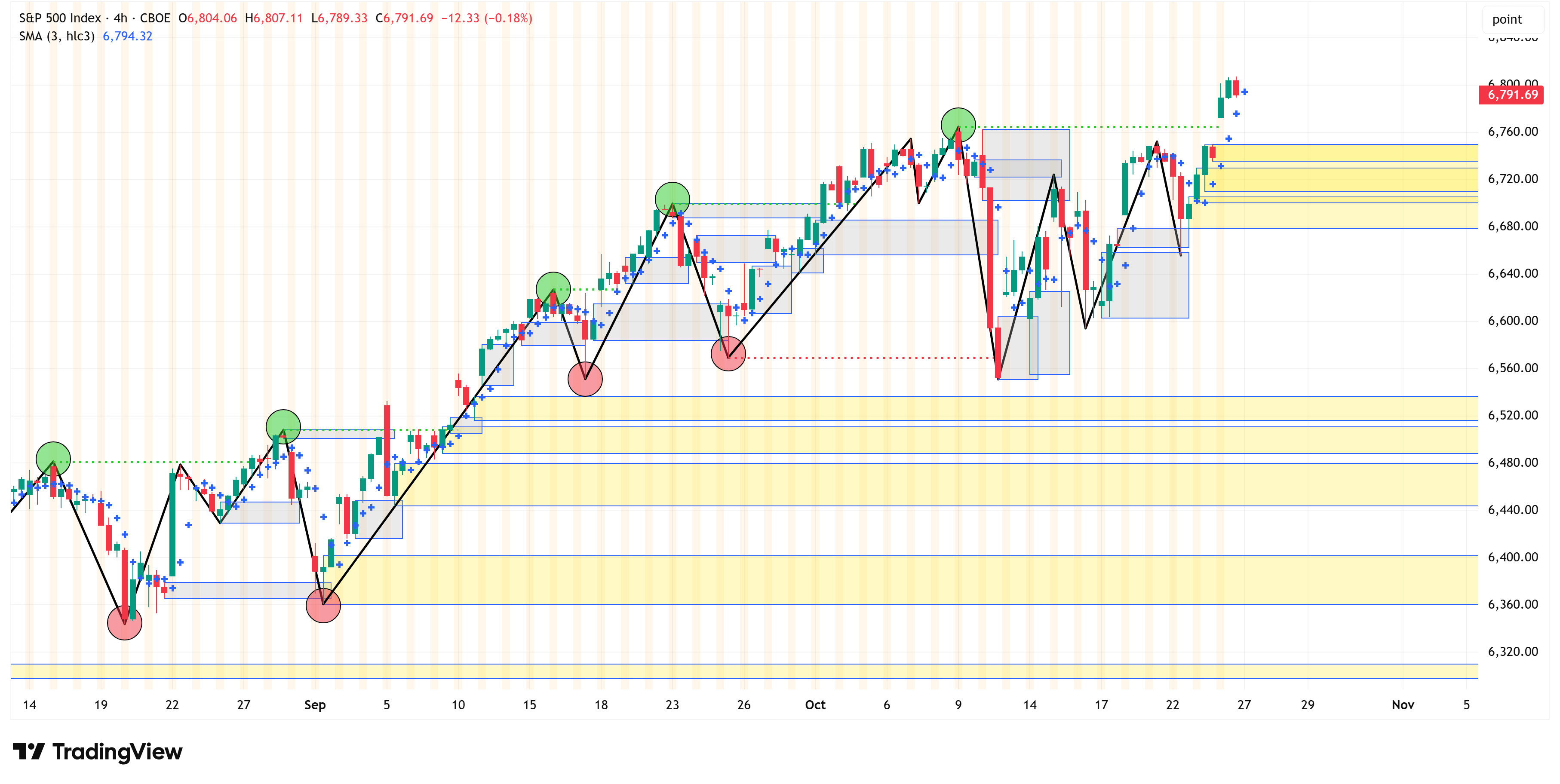
That leaves us with a confirmed uptrend on the 4-hour chart…
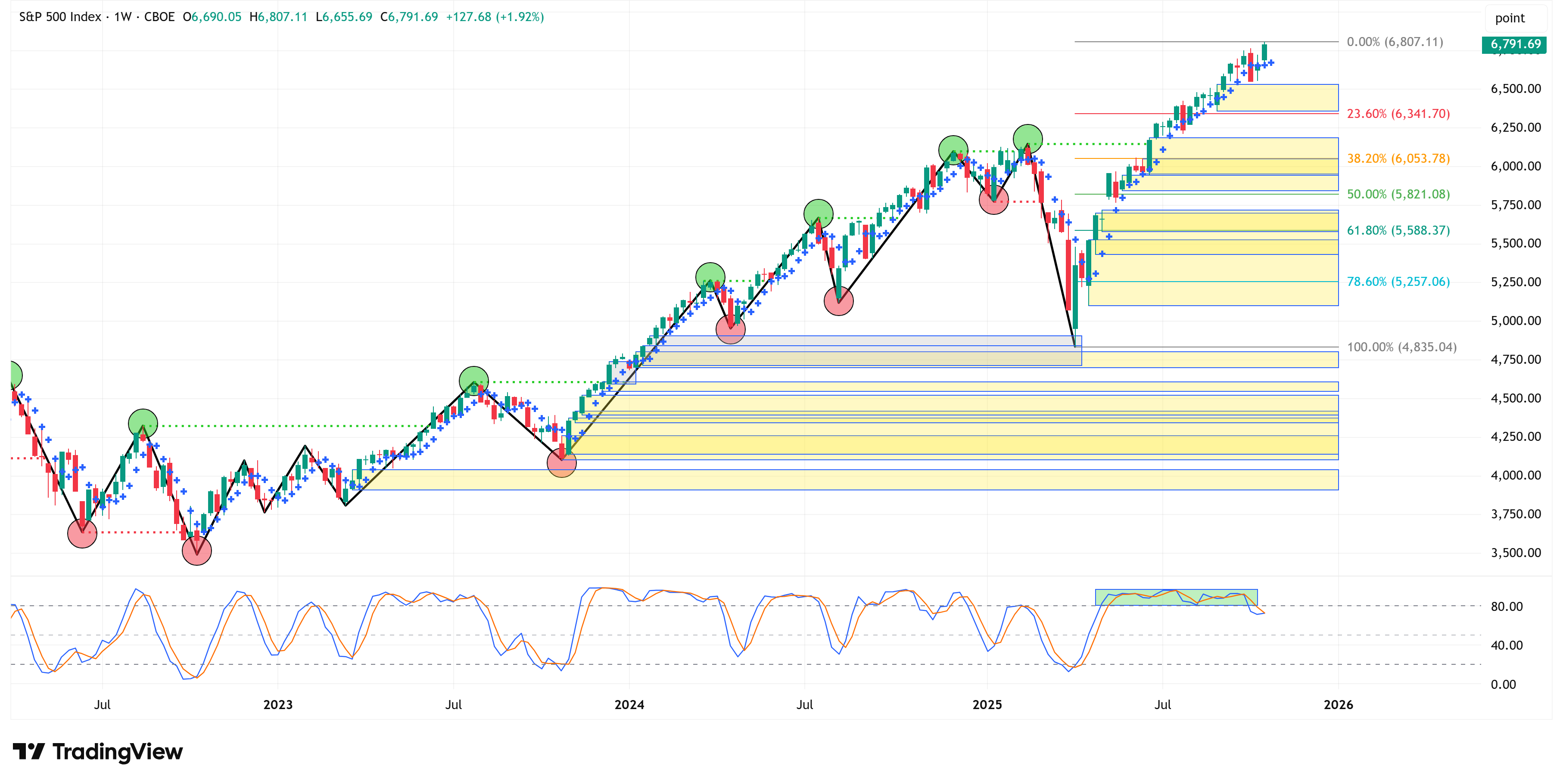
And a confirmed uptrend on the weekly chart…
This is a great example of why it is always important not to overreact…if you recall, I made the following statement last week:
“Let me stress, this does not mean you sell everything and move 100% to cash. It simply means that you tighten up your stops, maybe lock in some gains that you have, and, where prudent, reduce some risk at the margin.”
More below on the S&P 500, so read on…
📰 Stay Informed
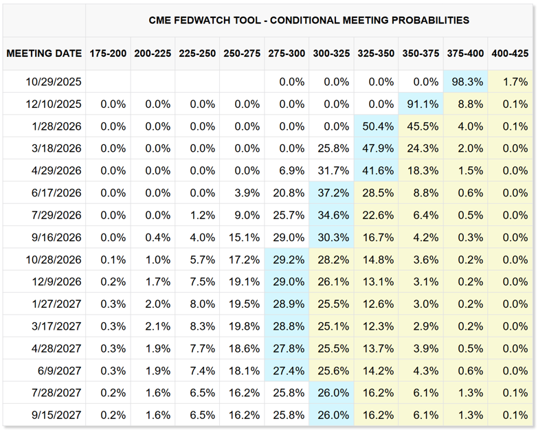
The Federal Open Market Committee (FOMC) meets this week and is expected to announce its latest interest rate decision.
There is currently a 98.3% chance that the FOMC will cut rates by 25 basis points at this week’s meeting to a range of 3.75% - 4.00%.
Further, Fed Funds futures are pricing in a 91.1% chance of another cut in December to a range of 3.50% - 3.75%.
Beyond this, Fed Funds futures suggest the Fed will continue to cut rates through most of 2026, ultimately bottoming out around 2.75% - 3.00% in October 2026.
Why does this matter?
There is a belief that rate cuts will come to the rescue and save the economic day.
I’m not convinced that I believe that, and history would also suggest otherwise.
In the chart below, the blue line represents the “upper limit” of the Fed Funds rate.
For instance, the current interest rate range is 4.00% - 4.25% so the “upper limit” is currently 4.25%.
The vertical red bars are historic recessionary periods, and the green line is the projected path of the “upper limit” of the Fed Funds rate based on current Fed Fund futures pricing.
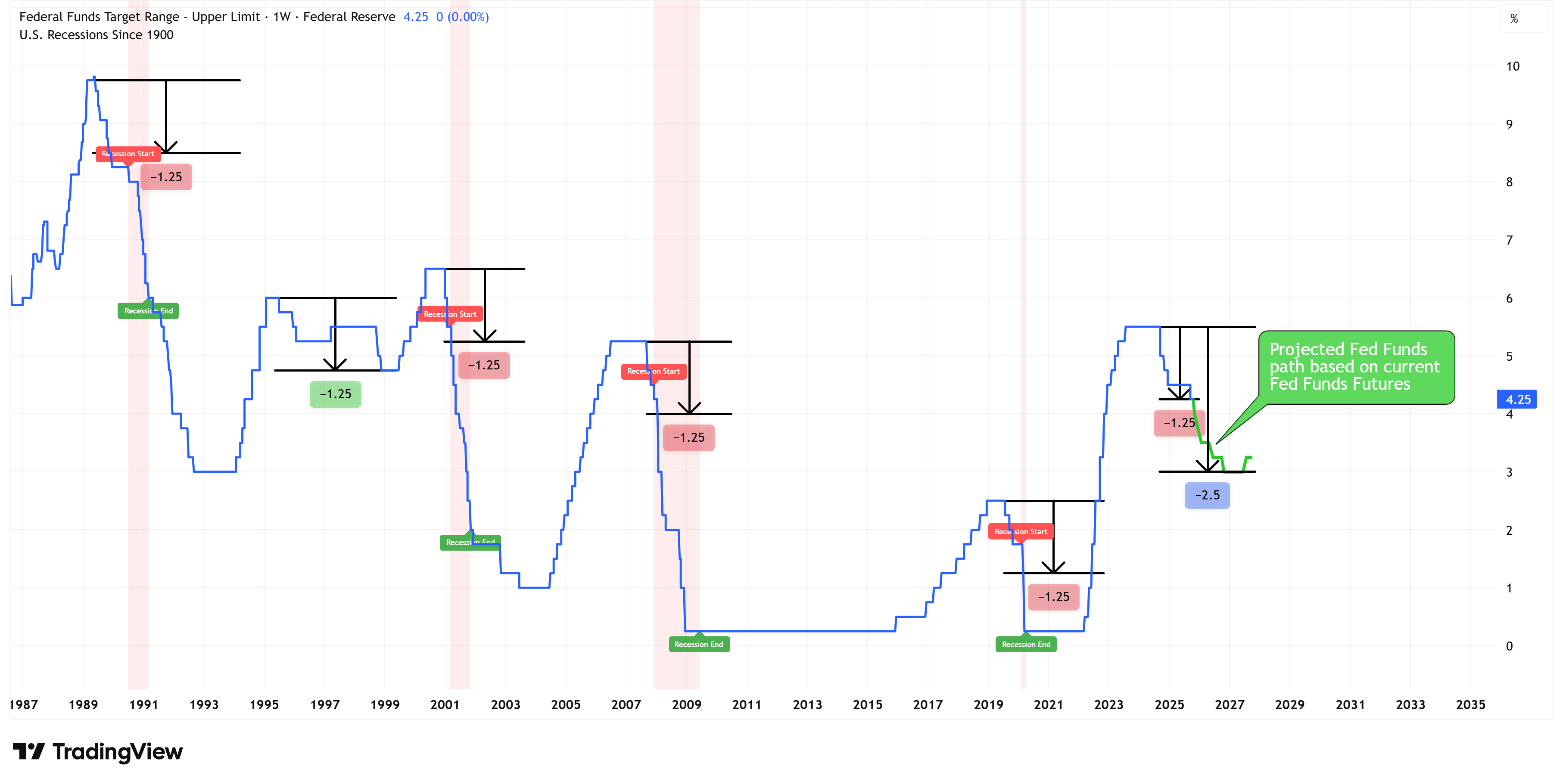
The key observation from the chart above is that since the late 1980s, there has only been one instance where the Fed Funds rate was reduced by 125 basis points or more from its cycle peak, and the US did not go into a recession.
That instance was in the mid-to-late 1990s, and in that scenario, the Fed reduced rates by 75 basis points, raised rates again, then reduced rates by another 75 basis points for a total move (peak to trough) of 125 basis points lower.
You can see on the chart that after that collective 125 basis point move lower, the Fed started to raise rates again through the turn of the century before pausing and then reducing rates as the Early 2000s Recession began.
We are in a very different situation right now. There is no sign that the Fed intends to raise rates. Instead, the Fed is cutting rates, and as noted above, Fed Funds futures are suggesting that the Fed is going to be cutting rates through most of 2026.
As it stands right now, the Fed has already cut rates by 125 basis points from the peak of 5.50% last year. This means that if the Fed cuts at all this week, they will have surpassed the 125 basis point threshold.
Historically, this has ended in a recession and not a magical rescue of the economy.
History as a guide…
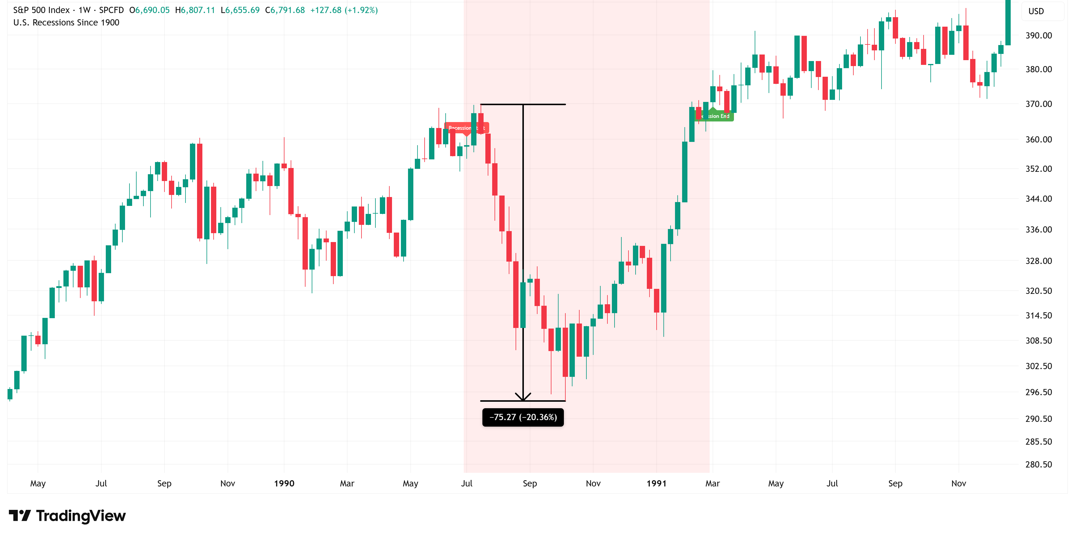
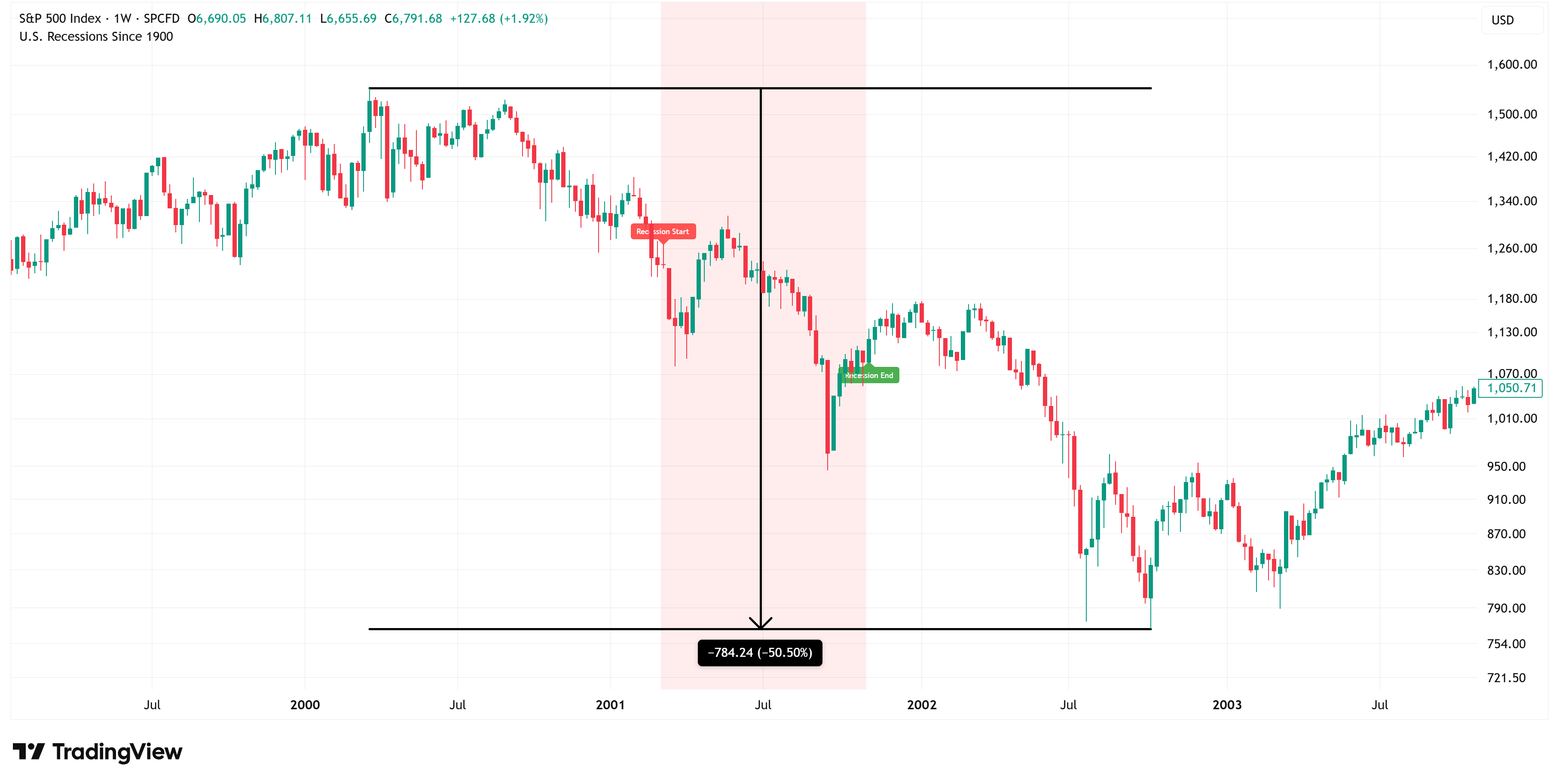
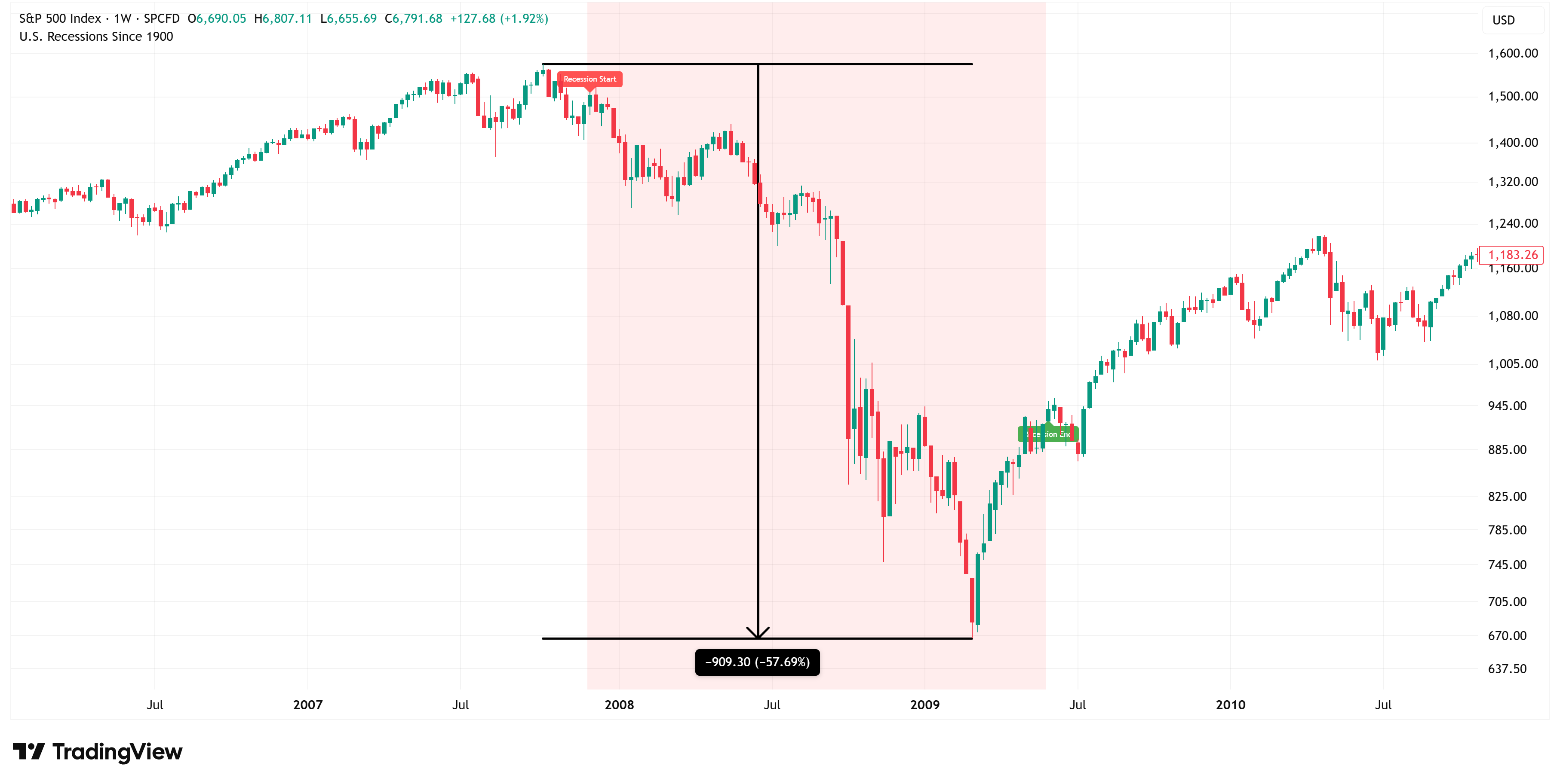
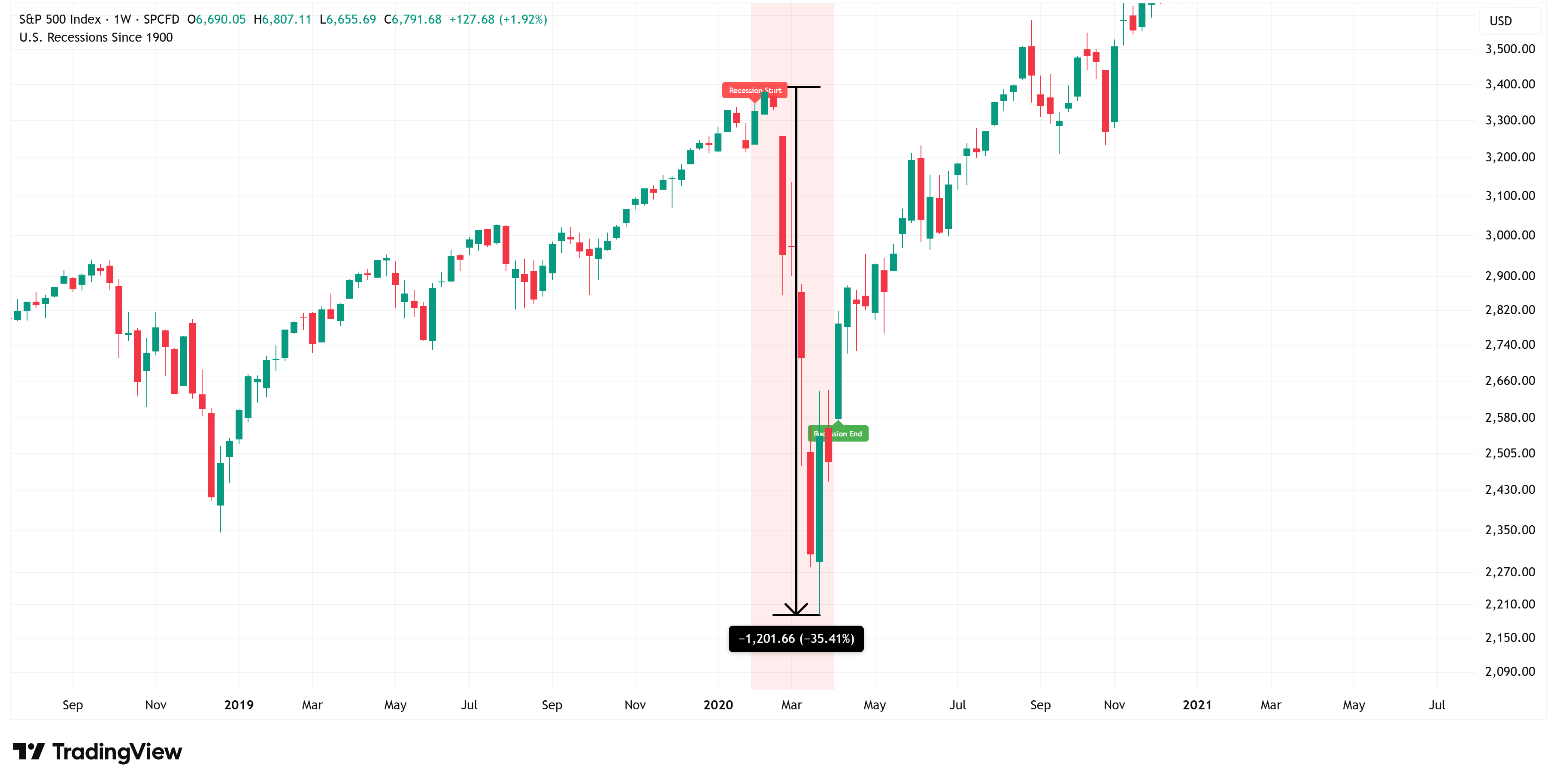
Here is a snapshot of how the S&P 500 performed in each of the recessionary periods noted above.
Early 1990s Recession (-20.36%)
Early 2000s Recession (-50.50%)
Great Financial Crisis (-57.69%)
Covid Recession (-35.41%)
The conundrum…
I’m absolutely convinced that we are knocking on the door of a recession. We are probably not there yet, but the stage is being set.
If I were a betting man, I would bet that once the National Bureau of Economic Research (NBER) formally declares that a recession has begun (which can take up to a year after it has already started), I bet they point to the 4Q 2025 or 1Q 2026 as the start of said recession.
Here’s the issue…it wouldn’t be uncharacteristic for the S&P 500 to continue to grind higher (i.e., the proverbial “blow off top”) until we reach some sort of an inflection point that finally pushes the market lower.
Inflection points tend to be credit-related, so we need to have our antenna up for that (which we’re already starting to see some signs of, just review my piece from last week).
But until then, we’ve got a market that continues to shake off bad news and push higher.
Even using our own proprietary “Market Map” methodology, we got a “warning sign” a couple of weeks ago with the move lower on the 4-hour chart, but the market quickly shook it off.
We need to continue to watch the 4-hour chart to see if/when it starts to bleed into the weekly chart. So far, it hasn’t, but at some point it will.
Until then, it pays to continue to ride the move higher, just make sure you have an exit plan.
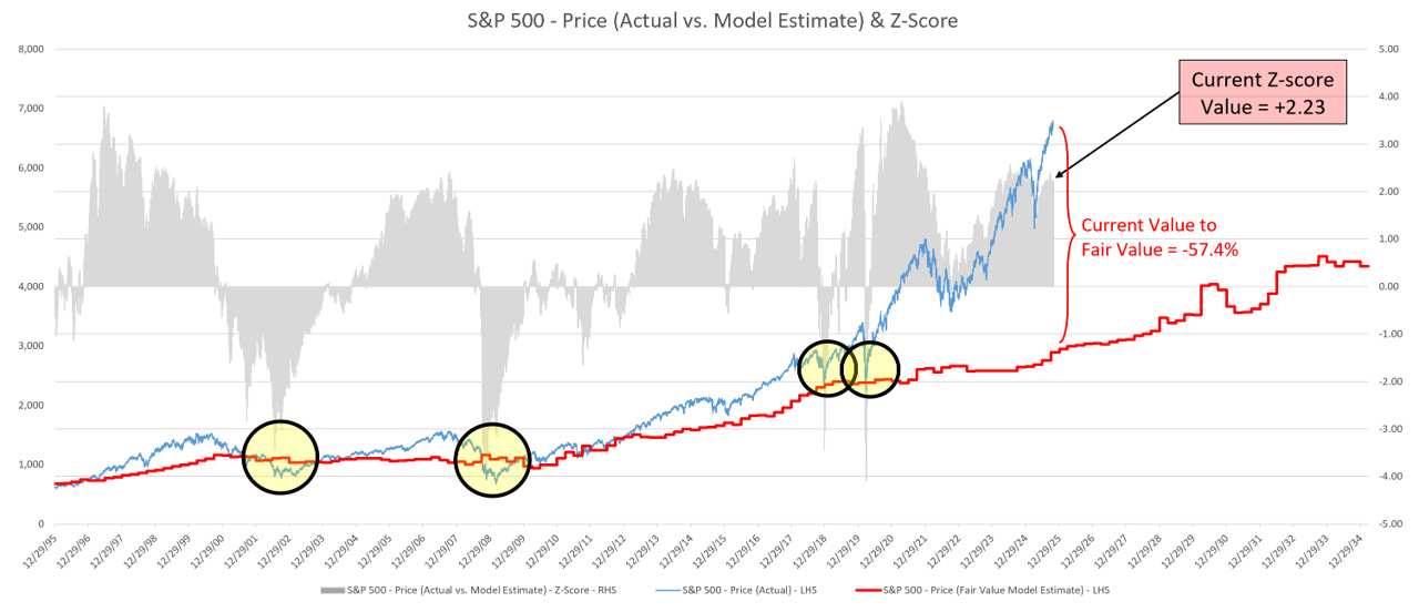
I usually reserve my S&P 500 Fair Value model for paid subscribers, but I’m sending it to everyone this week.
I’m doing this because I want you to be armed with the knowledge that this model is calling for the possibility of a -57.4% correction in the S&P 500.
I’m not saying this for clickbait or dramatics, I’m trying to make sure everyone is prepared.
If you follow my work, you’ll know that once the market starts to turn, we’ll see it first on the 4-hour chart. We may get a few head fakes along the way (like we did over the last couple of weeks), but ultimately, one of those warnings on the 4-hour chart will turn into the real thing.
I’ll keep you abreast of those developments as we move forward.
Further, the S&P 500 Fair Value model below also gives us a good indication as to when to get back into the market after the downturn occurs. Paid subscribers will benefit from this market intelligence once this occurs.
S&P 500 Fair Value Model
Here are the updated results from our proprietary S&P 500 fair value model.
The red line in the chart below is the fair value we have constructed for the S&P 500. Based on our model, the current fair value for the S&P 500 is 2,890.09.
Friday’s close on the S&P 500 was 6,791.68.
This means it would take a decline of -57.4% from the S&P 500’s current value to achieve our model-derived fair value.
Note: The market can remain well above fair value for extended periods. However, in deeper corrections (i.e., 2002, 2008, 2018, 2020, and in previous historical periods not shown on the chart below), the market always corrects back to the fair value line and often well below the fair value line (i.e., 2002, 2008, etc).
Thank you, as always, for your continued support of this newsletter!
Let’s make it a great week!
Take care,
Jim Colquitt
Do you have any other feedback?
If so, feel free to reply to this email and let me know!
I read and respond to every email, and I value your opinion!
The Weekly Chart Review is a publication of Skillman Grove Research LLC.
All opinions and views expressed herein are based on our judgments as of the date of writing and are subject to change at any time.
The content of this newsletter is for educational purposes only and should not be construed as investment advice.
Investing involves risk, including loss of principal, and past performance may not be indicative of future results.
Do your research and, where appropriate, seek the advice and counsel of a reputable financial advisor.
Matthew 6:33