


Weekly Chart Review
Charts, Charts, and More Charts... + The Market Map - Lesson #4

Hey everyone, it’s Jim.
I hope you had a great Mother’s Day weekend!
Let’s jump right into this week’s newsletter.
In this week’s newsletter:
Stay Informed
Key Macro Events From Last Week (ICYMI)
Key Macro Events To Watch This Week
The Market Map - Lesson #4
Application - S&P 500
Deep Dive
Charts, Charts, and More Charts…
S&P 500 Fair Value Model
Stay Informed
Key Macro Events From Last Week (ICYMI)
Here’s a brief recap of the major U.S. financial economic news releases for May 5–9, 2025.
ISM Non-Manufacturing PMI (May 5, 2025)
The ISM Non-Manufacturing PMI rose to 51.6, up 0.8% from 50.8, surpassing the forecast of 50.2, marking 10 consecutive months of service sector expansion (above 50 indicates growth). (Link)
Key components showed strength: Prices Paid jumped to 65.1 (highest since January 2023), New Orders rose to 52.3, though Employment remained in contraction at 49.0.
FOMC Rate Decision (May 7, 2025)
The Federal Reserve maintained the federal funds rate at 4.25%–4.50%, with a unanimous vote, citing a solid economy but increased risks to unemployment and inflation. (Link)
Fed Chair Powell emphasized a “wait-and-see” approach due to uncertainties around tariffs and their potential stagflationary impact, with markets eyeing a possible rate cut in July. (Link)
Initial Jobless Claims (May 8, 2025)
Initial jobless claims for the week ending May 3 dropped to 228,000, down 13,000 from the prior week’s 241,000, beating the forecast of 235,000. (Link)
The decline suggests a stabilizing labor market, though concerns persist due to recent volatility and tariff-related economic uncertainty. (Link)
Key Macro Events To Watch This Week

This week, CPI and PPI will be critical as they are a lens into the current inflationary environment.
The Market Map - Lesson #4
This week, we’ll jump into Lesson #4. If you didn’t catch the previous three lessons, please go back and review those first (Lesson #1, Lesson #2, Lesson #3).
This week’s lesson will build on our “internal vs. external” structure lesson from last week and add an additional timeframe to our analysis.
Last week, I provided the following graphic to represent “internal” vs. “external” structure.
The green and red circles represent the boundaries of the “external” structure, while everything within the grey box represents the “internal” structure.

We have been conducting our analysis on the weekly timeframe.
This week, we will add a lower timeframe (the 4 hour chart) to the analysis to see if we can get an early read on when the market might turn.
In the graphic below, you see a typical downtrend playing out with a series of lower highs and lower lows.
Let’s focus on the area between the most recent swing high/low (aka the “trading zone”) as denoted by the horizontal dotted black lines.
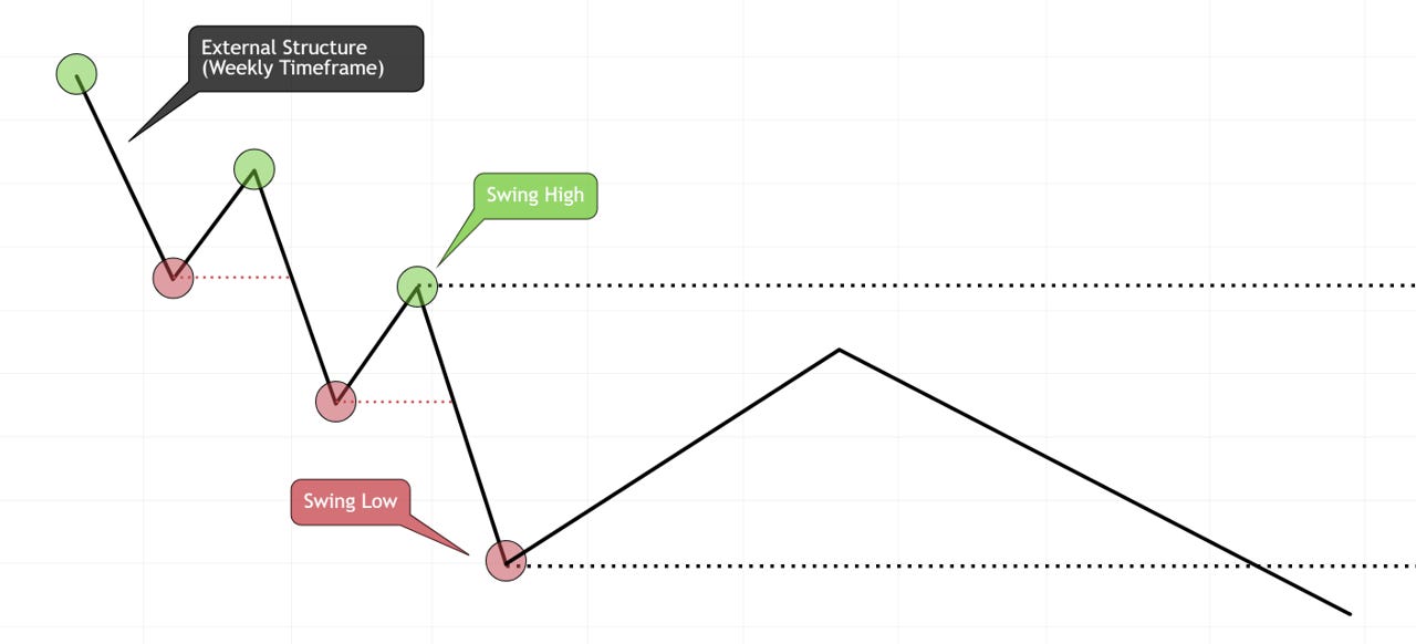
As we learned last week, everything between the most recent swing high/low is simply “internal structure”.
However, if we move to a lower timeframe (4 hour - blue line) for the price action within the “trading zone”, we will find that it looks something like this.

Remember, the 4 hour price action is traveling the same route as the weekly price action, it’s just giving us more observations along the way.
Here’s what the “trading zone” would look like if you were showing both the weekly and 4 hour charts at the same time.

When the market is in a downtrend, we are looking for a pullback to get short again.
There are different Points of Interest (POI’s) we can talk about in future lessons, but for now, we want to look to get short from somewhere above the 50% Fibonacci retracement level.
Ideally, somewhere in the neighborhood of the 61.8% - 78.6% Fibonacci retracement level (or higher), as this provides a better risk-to-reward on the entry.
In the chart below, the blue box highlights the area where we would like to get short based on the parameters above.

Do we go short immediately upon price reaching the blue box? No, because what if it keeps going and this downtrend turns into an uptrend.
Instead, we want to use the lower timeframe to give us further confirmation that the market intends to go lower.
Given the fractal nature of the market, we can look for the same market structure setup on the lower timeframe that we observe on the higher timeframe.
Here’s how it would look if we continue our example from above.
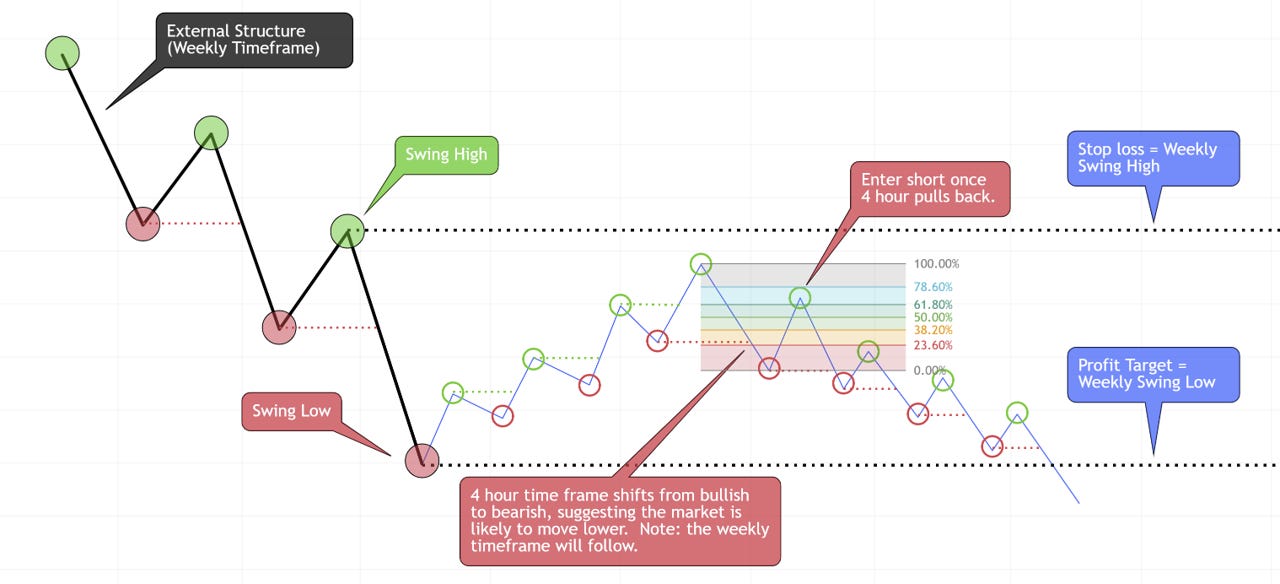
This structured approach also provides a specific stop loss and profit target.
Note: if the market is to remain in a downtrend, you should consider only taking a portion of the position off at the profit target and letting the remainder ride while moving your stop loss lower along the way.
That’s it for this week’s lesson. We’ll use what we’ve learned above in our S&P 500 application below.
The Market Map - Application - S&P 500
For the last several weeks, we have been looking at the following weekly chart of the S&P 500 and suggesting that a reversal could potentially occur as we got into the region between the 61.8% - 78.6% Fibonacci levels.
Further, notice that the blue box with the black border around it has already been an area of reversal in the past. This lends further relevance to suggest that it could lead to a similar outcome again.
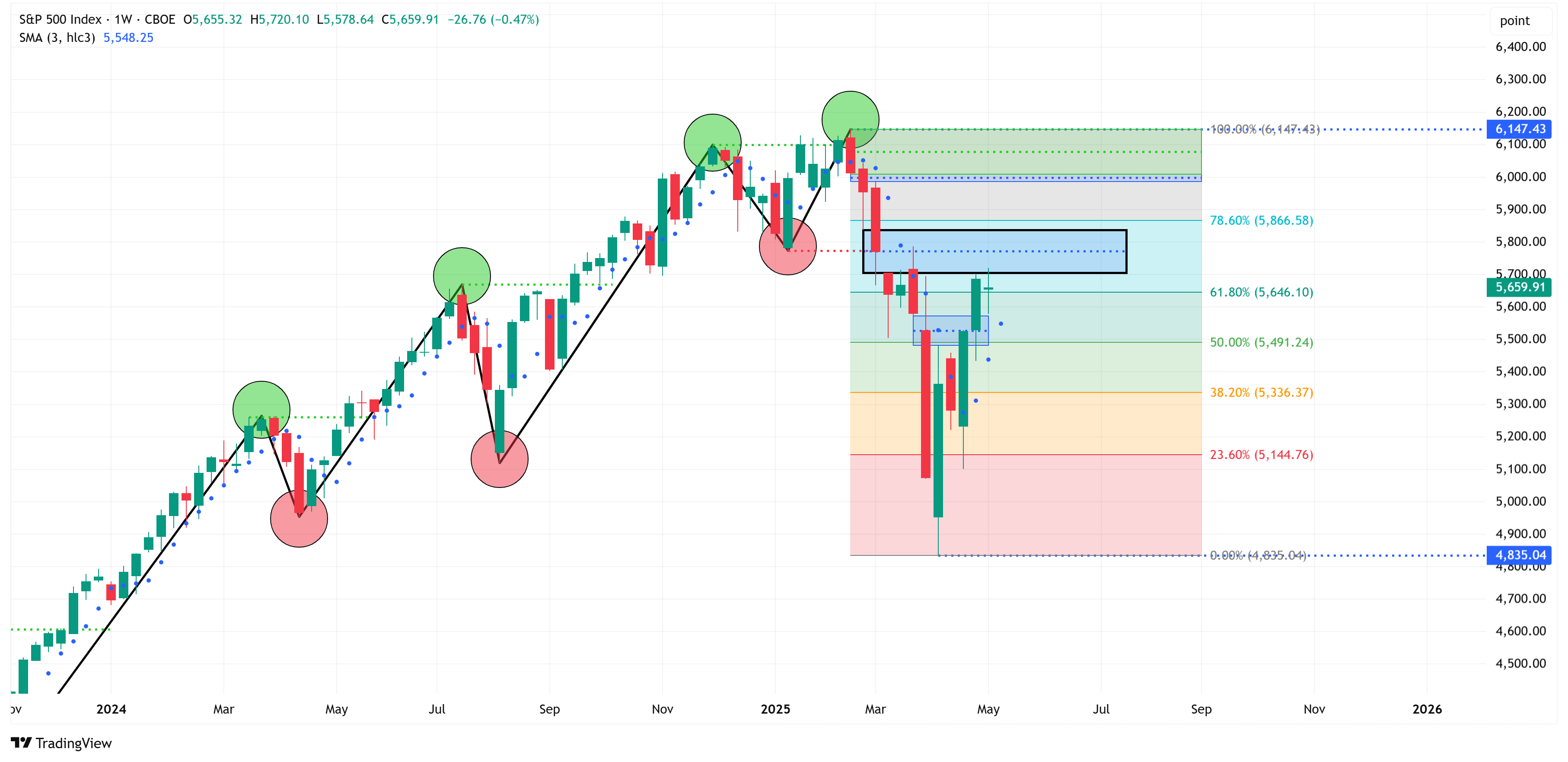
Let’s move to the same chart as above, but on the 4 hour timeframe. If a reversal is going to occur, we’ll likely see it happen on the 4 hour chart before the weekly chart.
One possible scenario is to follow the red line I’ve drawn in the chart below. If this scenario were to play out, the blue box would be a good place to enter a short.
If a short is taken, your stop loss would be the weekly swing high (6,147), and your price target would be the weekly swing low (4,835).

Please note, this is not a recommendation to short the market. I am simply applying our methodology to a live chart to show readers how it would work in real-time.
Please speak with a registered financial advisor, who can assess your entire financial situation, before making trades in the market.
Deep Dive
Charts, Charts, and More Charts…
I am putting this piece together on Saturday. This is the same day that the US and China are set to have “tariff talks” in Switzerland.
Our relations with China, especially around the issue of tariffs, are the biggest elephant in the room for the global macro picture, in my opinion. I believe these talks could create a binary outcome that is extremely positive or negative for markets in the coming days/weeks.
Not knowing how these talks will shake out, I thought it would be a better use of time this week to provide as many charts as possible.
A couple of takeaways before we get into the charts:
Most of these charts, and the S&P 500 fair value model, are behind the paywall each week. I’m sharing them with everyone this week because I believe we’re at a critical juncture in the tariff negotiations, and I want our subscribers to be informed.
If you find value in these charts, you should consider becoming a paid subscriber. If you click on the link below, you’ll receive a 70% off discount for life. That translates to a cost of less than $10/month for institutional quality analysis.
As you look through the charts, notice that chart after chart is setting up for a potential move lower. I know the recent rally has felt good, but the charts suggest we could be in for another move lower. 2025 is looking eerily similar to 2022, where we had a move lower only to rally back (but not eclipse the previous high), rinse and repeat.

Okay, now the charts…
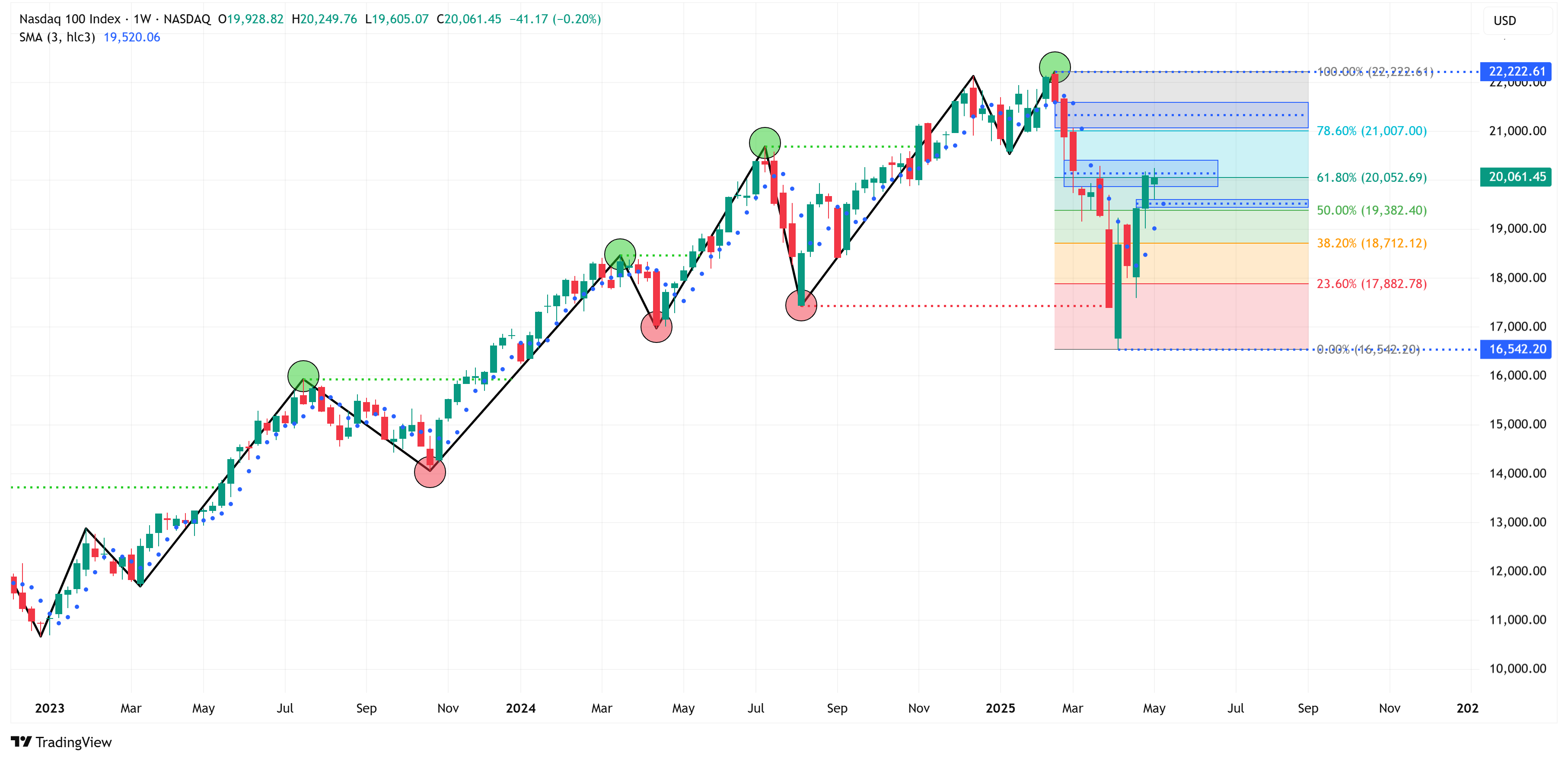
Note: all of the charts below are on the weekly timeframe and therefore provide more of a medium-term analysis vs. a tactical short-term or daily analysis.
Indices:
NASDAQ 100
Trend = Down
Target = 16,542
Stop Loss = 22,223
Russell 2000
Trend = Down
Target = 1,733
Stop Loss = 2,466

Sectors:
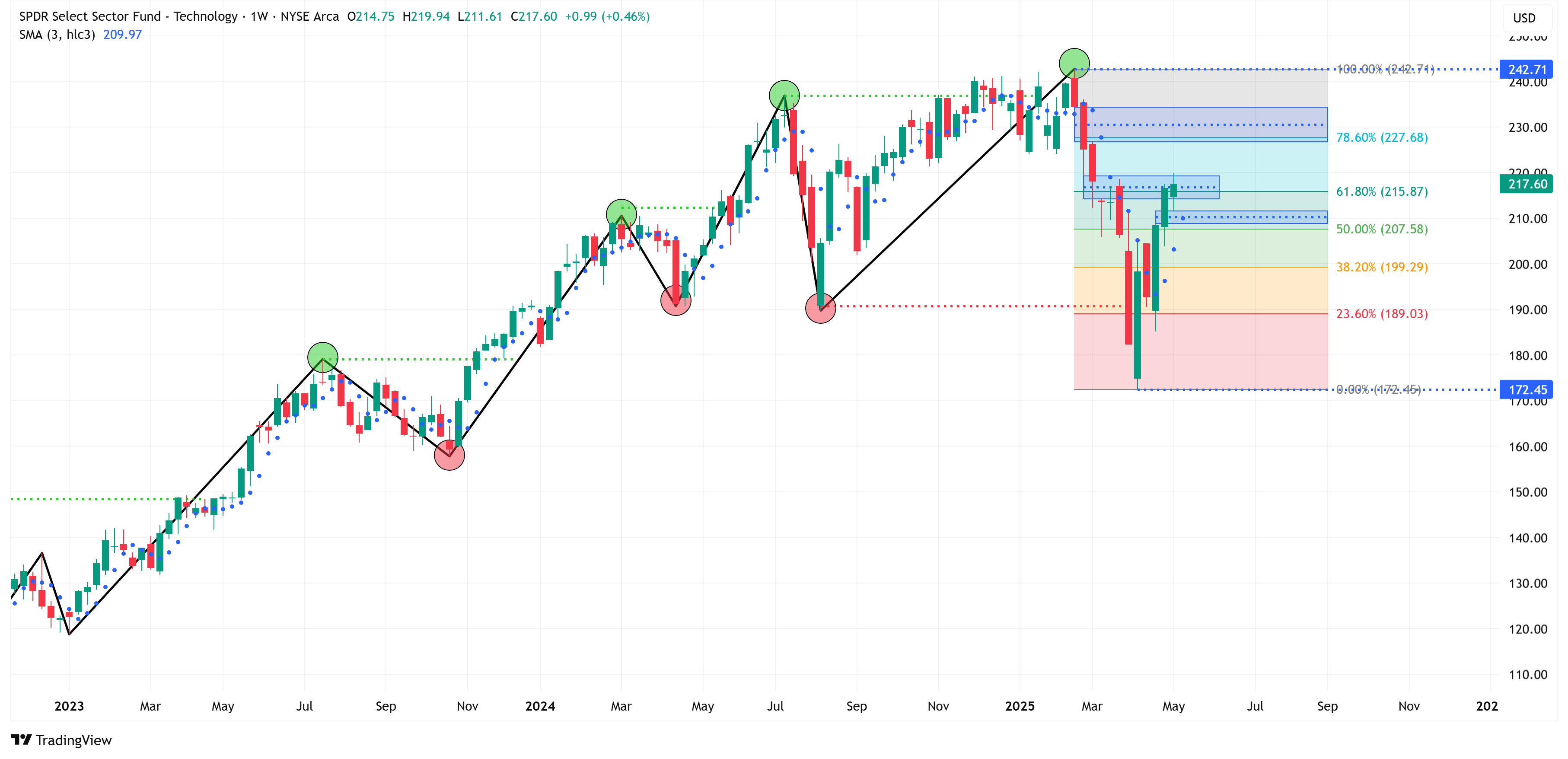
Technology
Trend = Down
Target = 172.45
Stop Loss = 242.71
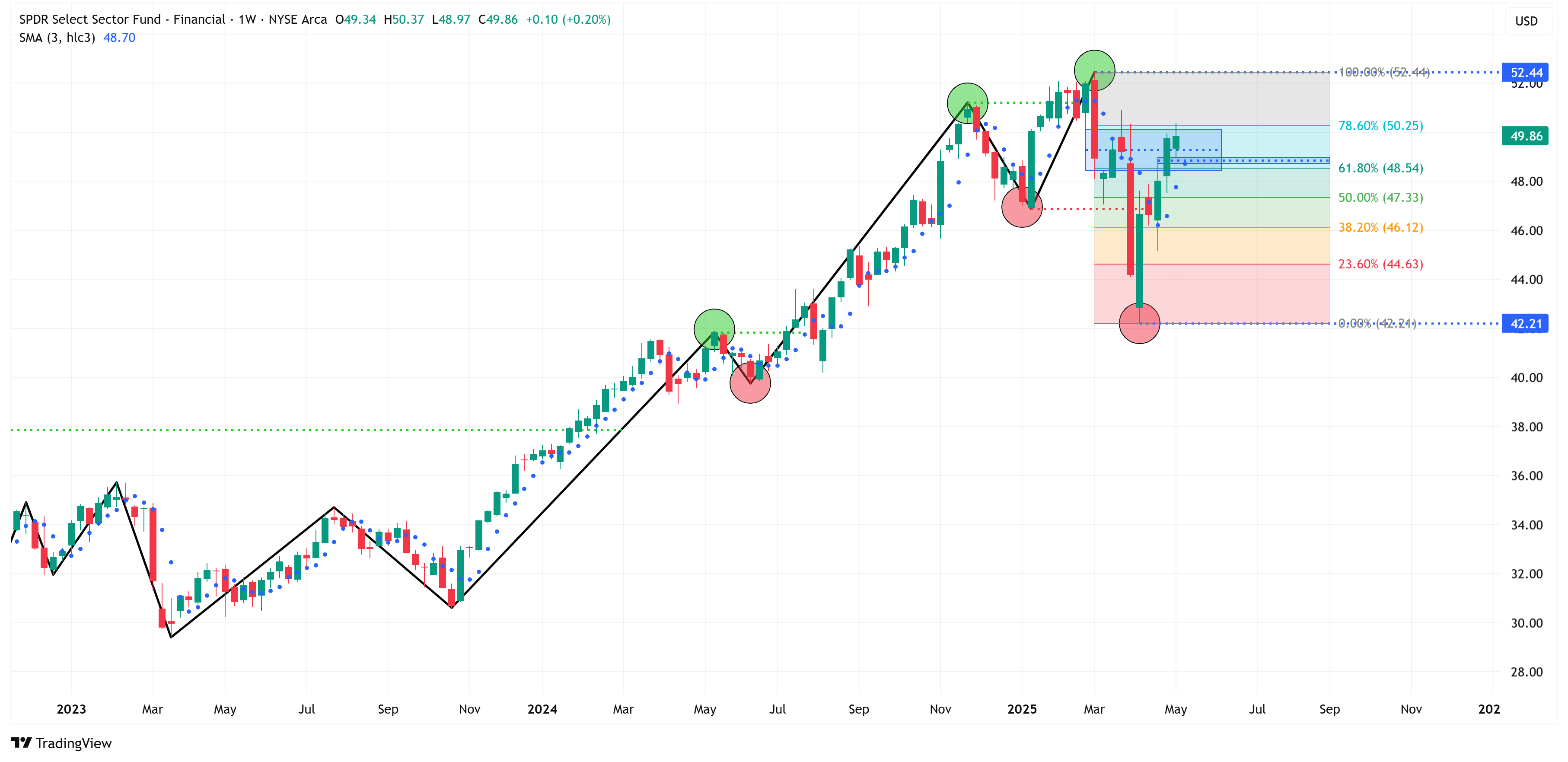
Financial
Trend = Down
Target = 42.21
Stop Loss = 52.44
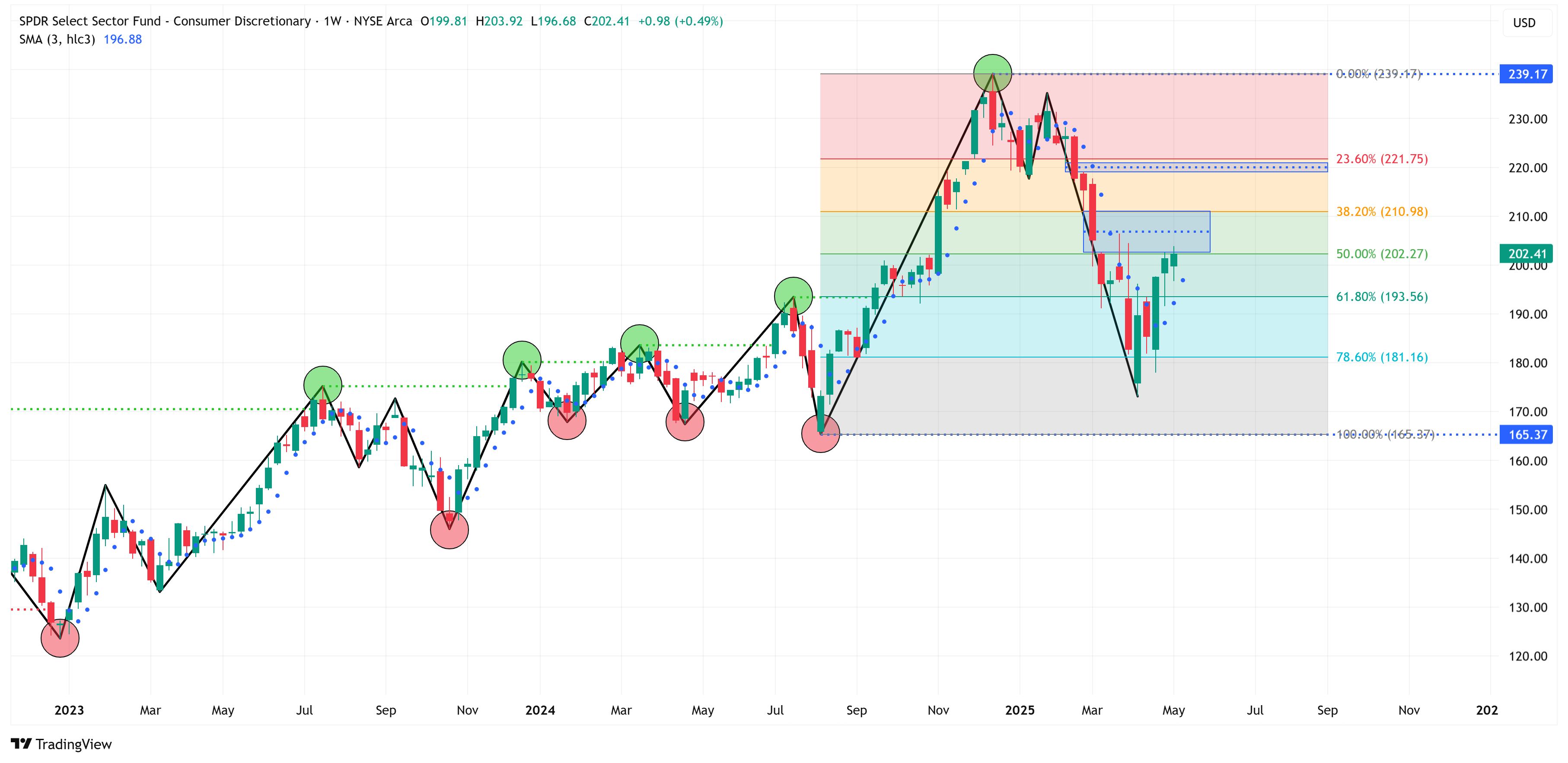
Consumer Discretionary
Trend = Up
Target = 239.17
Stop Loss = 165.37
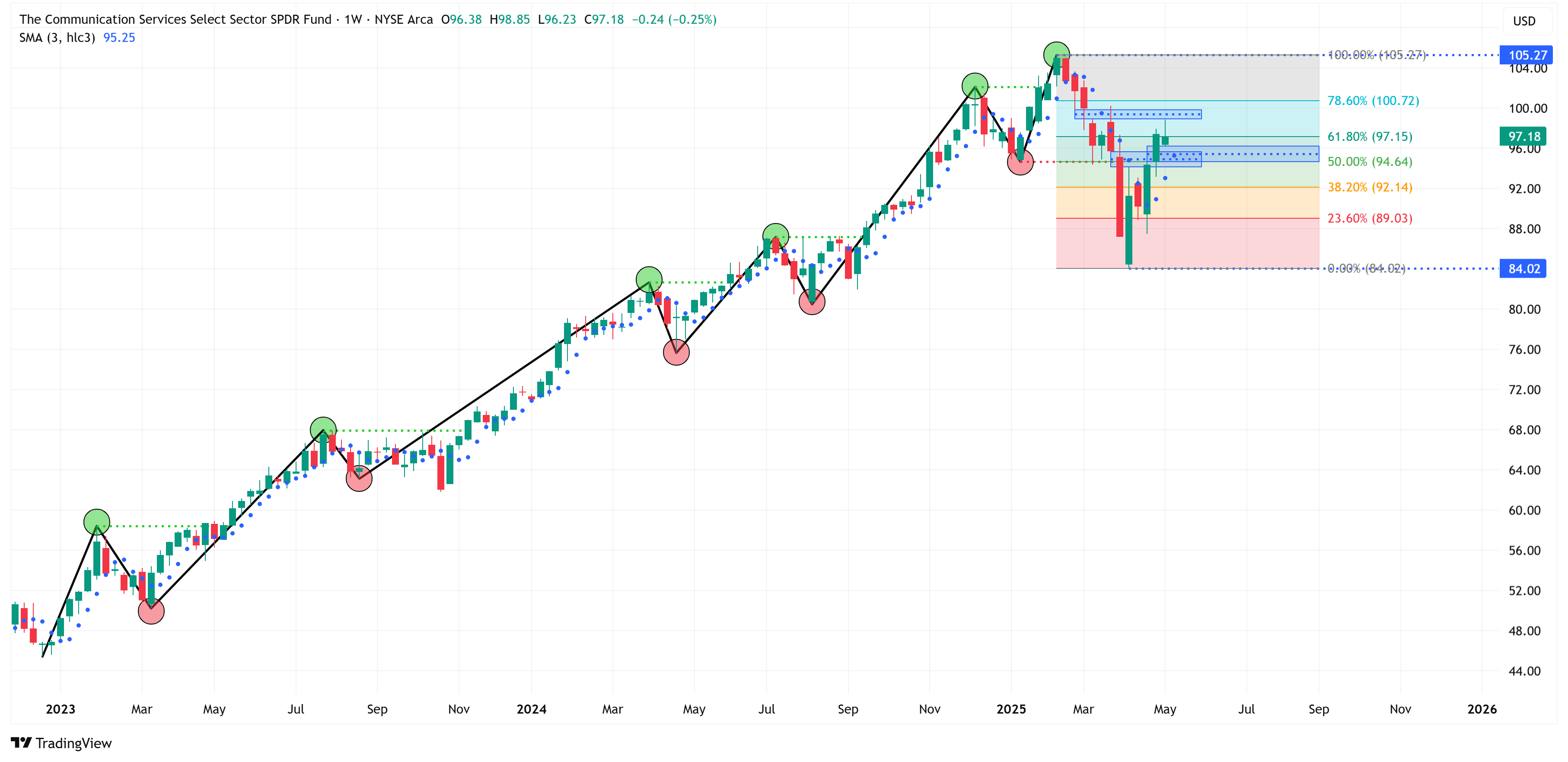
Communication Services
Trend = Down
Target = 84.02
Stop Loss = 105.27
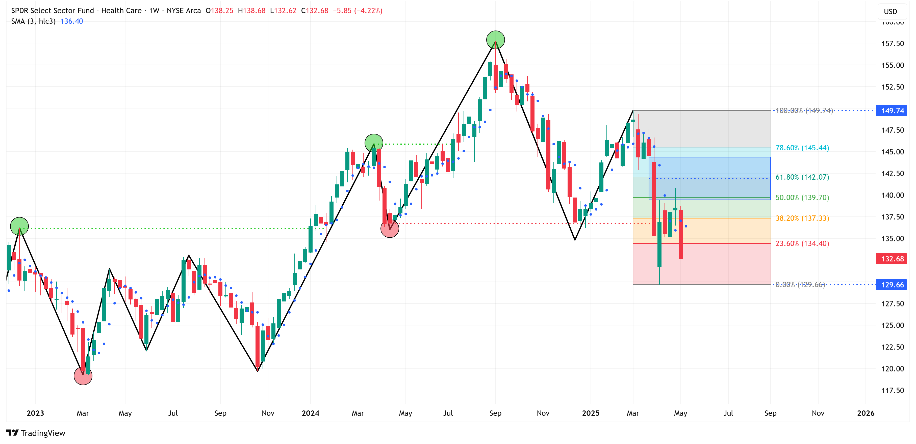
Health Care
Trend = Down
Target = 129.66
Stop Loss = 149.74
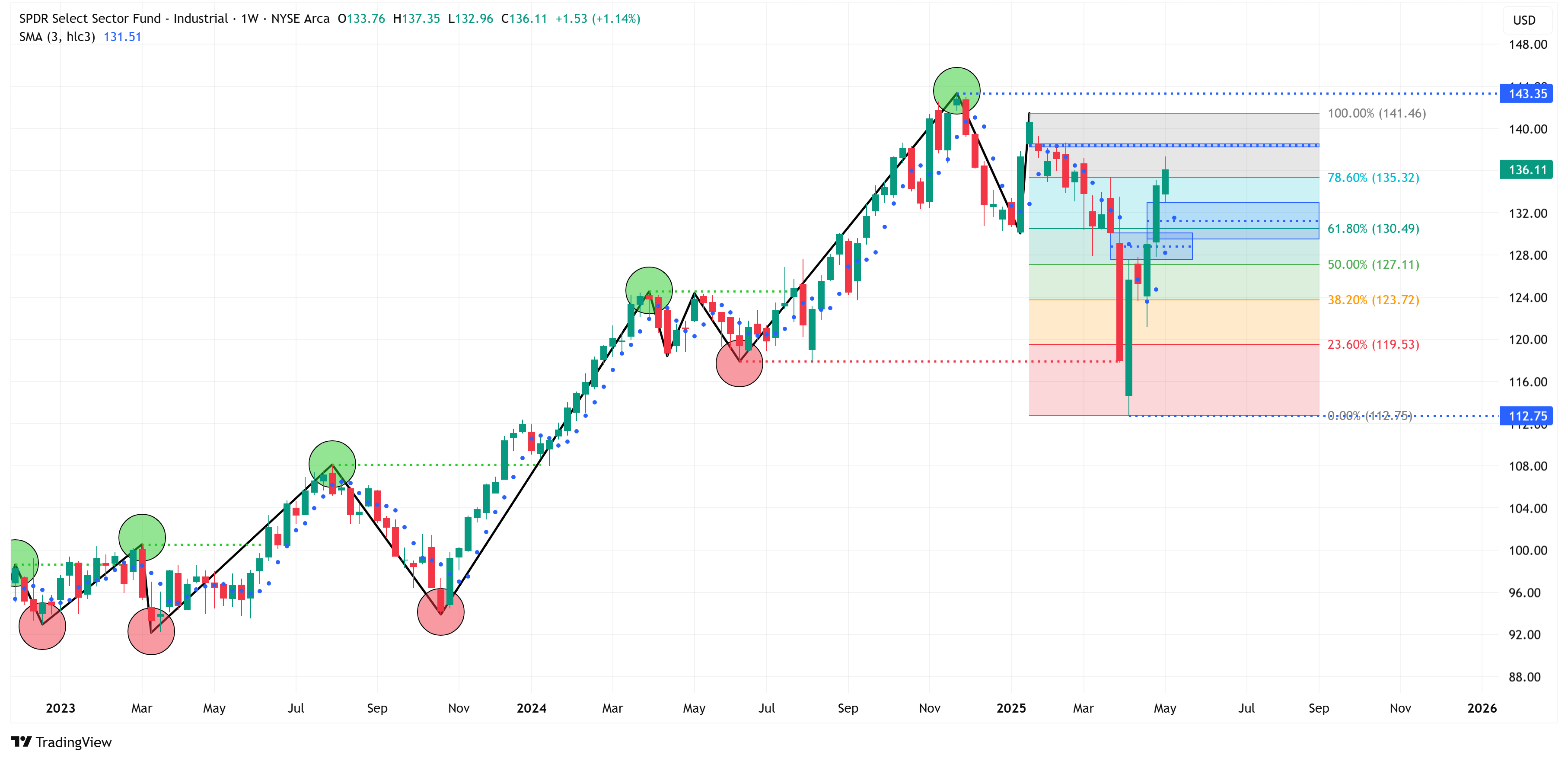
Industrials
Trend = Down
Target = 112.75
Stop Loss = 143.35
Consumer Staples
Trend = Up
Target = 83.01
Stop Loss = 71.08

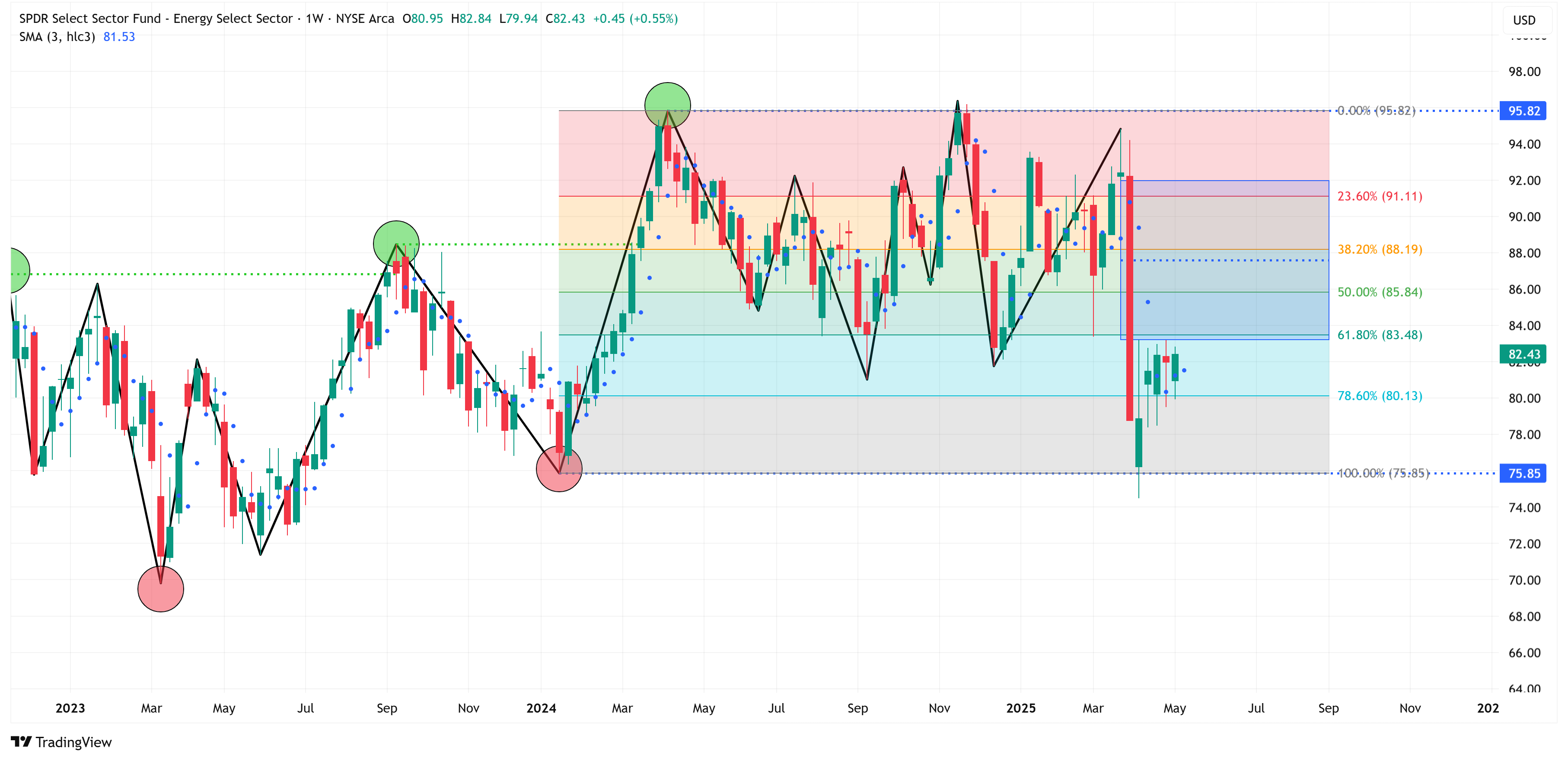
Energy
Trend = Up
Target = 95.82
Stop Loss = 75.85
Materials
Trend = Down
Target = 73.12
Stop Loss = 90.56

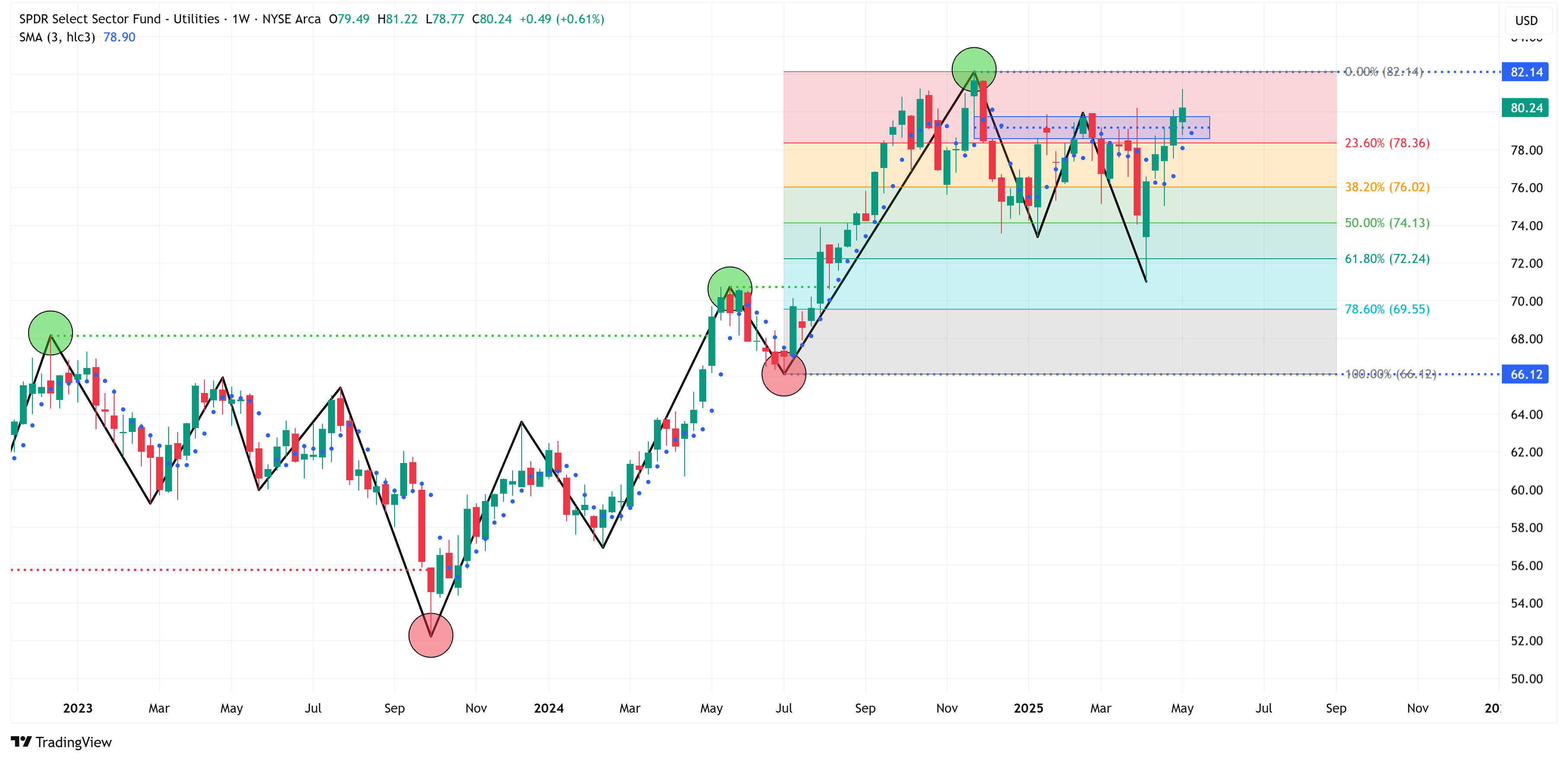
Utilities
Trend = Up
Target = 82.14
Stop Loss = 66.12
Real Estate
Trend = Up
Target = 44.71
Stop Loss = 30.35

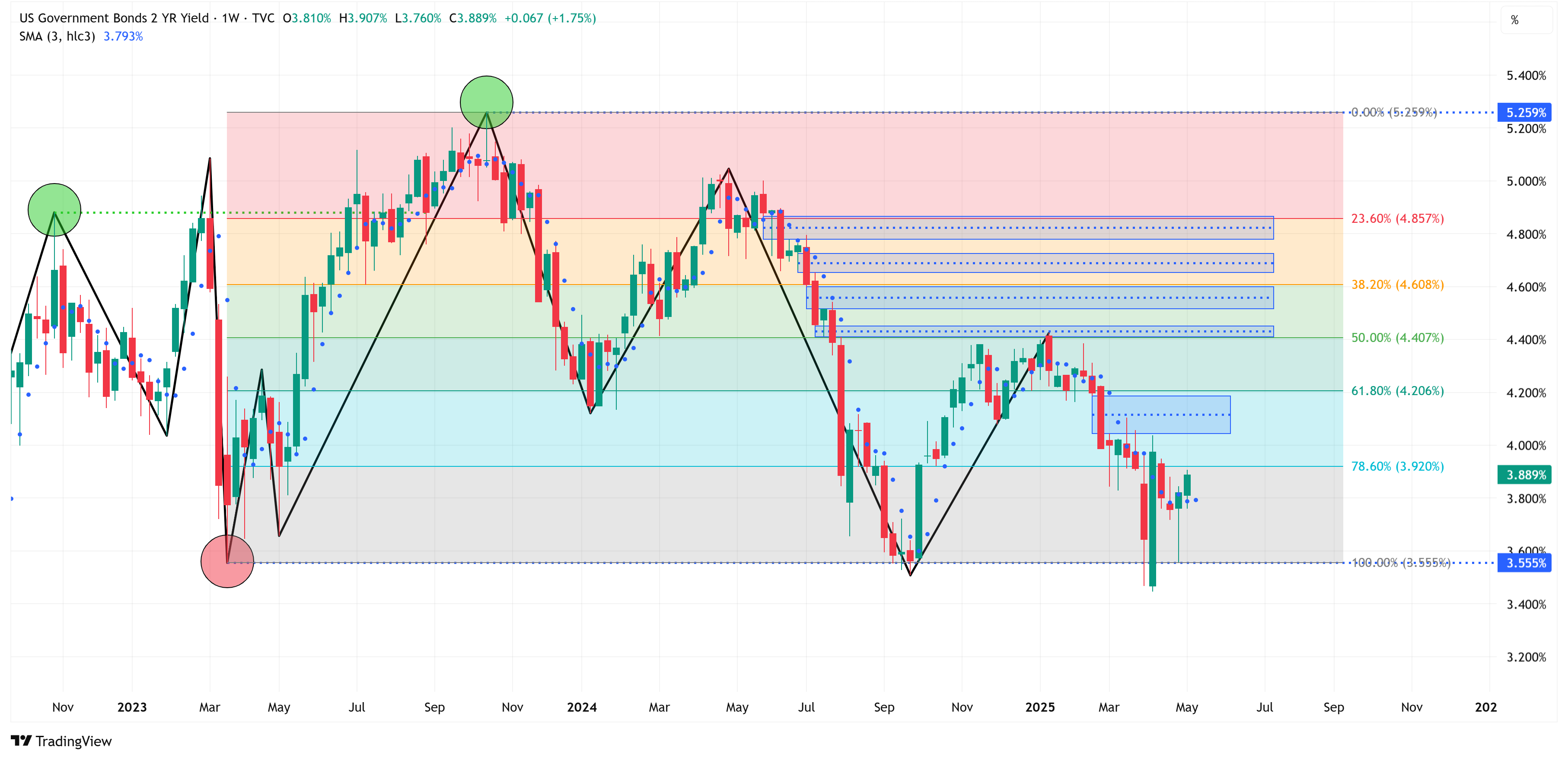
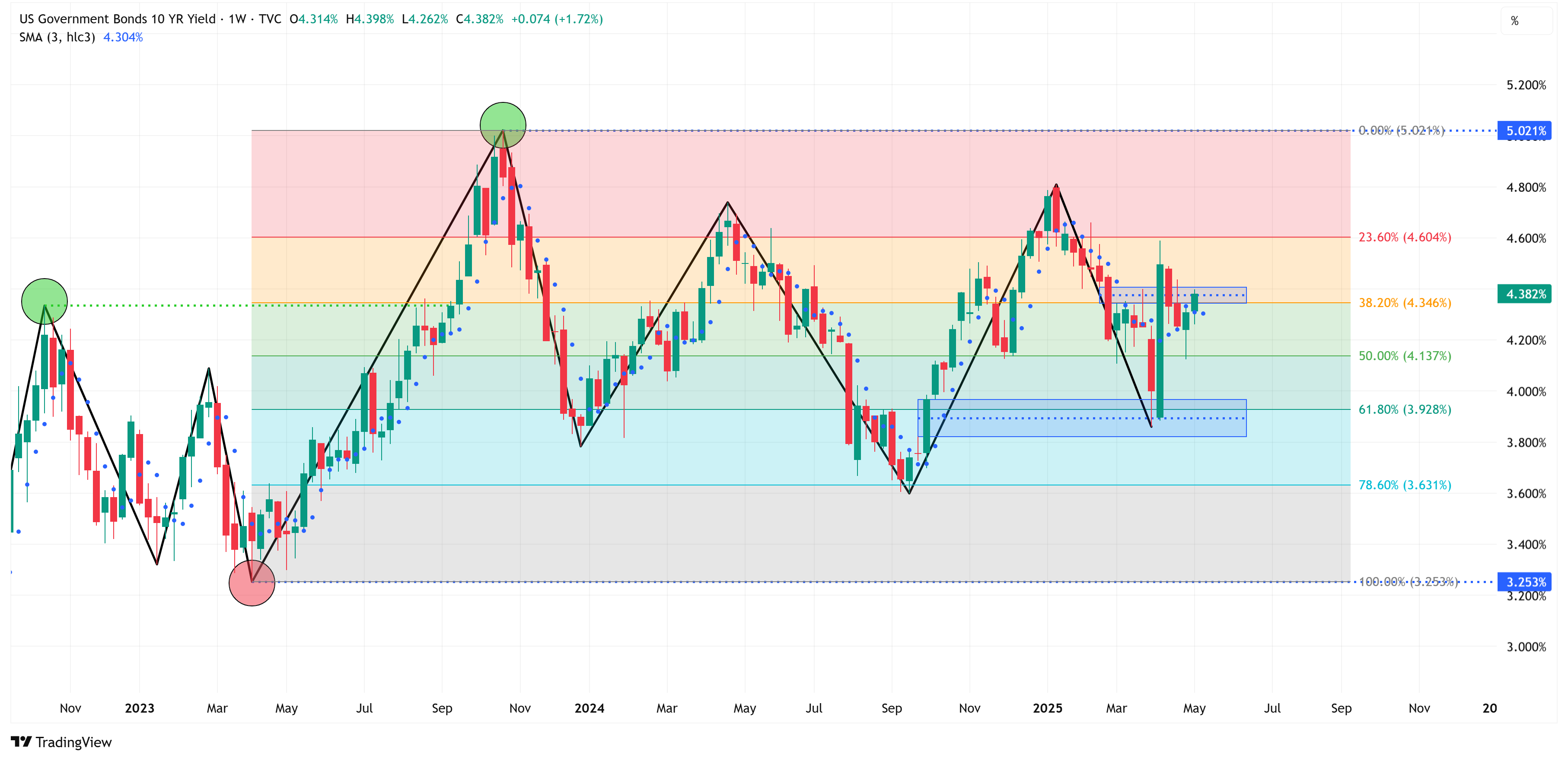
US Treasuries:
UST 2Y Yield
Trend = Up
Target = 5.259%
Stop Loss = 3.555%
UST 5Y Yield
Trend = Up
Target = 4.997%
Stop Loss = 3.204%

UST 10Y Yield
Trend = Up
Target = 5.021%
Stop Loss = 3.253%
UST 30Y Yield
Trend = Up
Target = 5.178%
Stop Loss = 3.407%

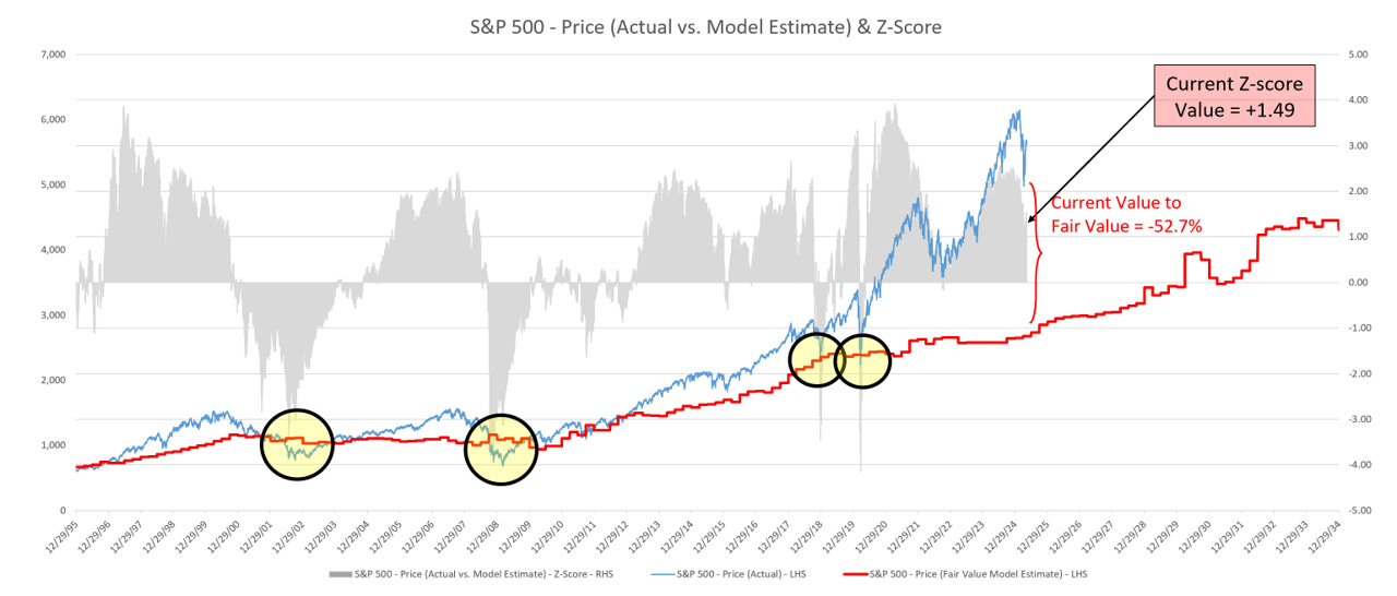
S&P 500 Fair Value Model
Here are the updated results from my proprietary S&P 500 fair value model.
The red line in the chart below is the fair value I have constructed for the S&P 500. Based on my model, the current fair value for the S&P 500 is 2,678.95.
Friday’s close on the S&P 500 was 5,659.90.
This means it would take a decline of -52.7% from the S&P 500’s current value to its fair value.
The market can remain well above fair value for extended periods. However, in deeper corrections (i.e., 2002, 2008, 2018, 2020, and in previous historical periods not shown on the chart below), the market always corrects back to the fair value line and often well below the fair value line (i.e., 2002, 2008, etc).
Thank you, as always, for your continued support of this newsletter!
If you have found it helpful, please consider sharing it with a friend or colleague so that we can grow our community.
To do so, please click on the button below. Thank you in advance!
Let’s make it a great week, and don’t forget to take advantage of the “70% off for life” offer!
Take care,
Jim Colquitt
The Weekly Chart Review is a publication of Skillman Grove Research.
All opinions and views expressed herein are based on our judgments as of the date of writing and are subject to change at any time.
The content of this newsletter is for educational purposes only and should not be construed as investment advice.
Investing involves risk, including loss of principal, and past performance may not be indicative of future results.
Do your own research and, where appropriate, seek the advice and counsel of a reputable financial advisor.
Matt 6:33
It appears that we will be blowing UP through the blue box today. I think it's wrong that politicians can talk the market up or down via social media and speeches. The Fed Governors have been doing it forever. One particular word or sentence and the market can react wildly. Same with Trump and his various social media exploits and sound bites to media members.