


Weekly Chart Review
S&P 500 market structure based price targets and an outstanding offer!

A quick programming note before we jump into this week’s newsletter.
Given the resounding success of our “70% Off For Life!!!” promotion from a couple of weeks ago, we are bringing it back for this week!
This equates to less than $10/month for institutional quality analysis that can pay for itself multiple times over for you and your clients.
Note: this week’s newsletter will be free to all of our subscribers (paid and unpaid) so that you can see our research in its entirety; however, next week we’ll move back to our usual method of keeping the “good stuff” behind the paywall and hence why I urge to you to take advantage of this special offer today!
New all-time highs…
Before last week, the S&P 500's all-time high was 6,118.73, which is denoted in the chart below by the black horizontal dotted line.
The S&P 500 surpassed this record close with new record closes on Tuesday (blue horizontal dotted line) and Wednesday (green horizontal dotted line) of last week.
S&P 500 (SPX) - 5 Minute Chart
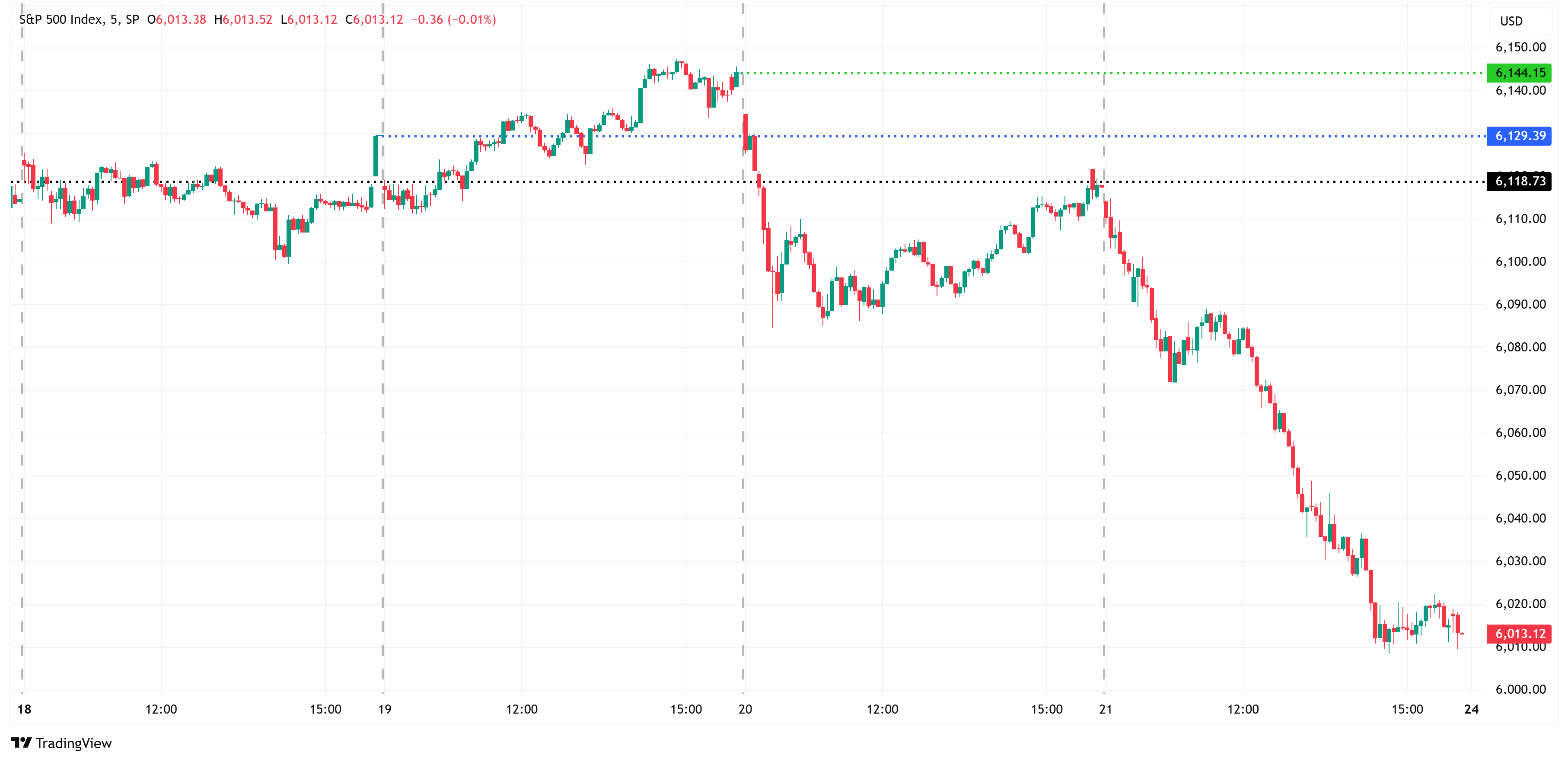
The market was modestly lower on Thursday (-0.43%) but then had a tough day on Friday falling -1.71%.
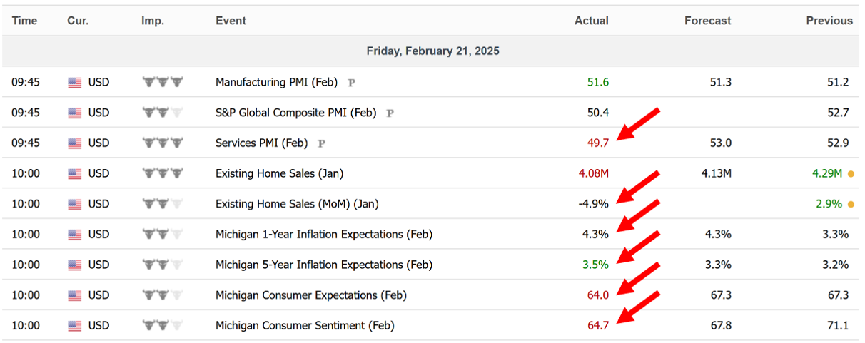
As denoted in the 5-minute chart above, Friday started lower on the back of generally weak economic data (see table below) and then picked up the pace on news of a “potentially pandemic-inducing Coronavirus being found in China”.
I’m not sure it’s time to dust off the pandemic playbook just yet, but it certainly wasn’t a good headline.
Is the fear trade back???
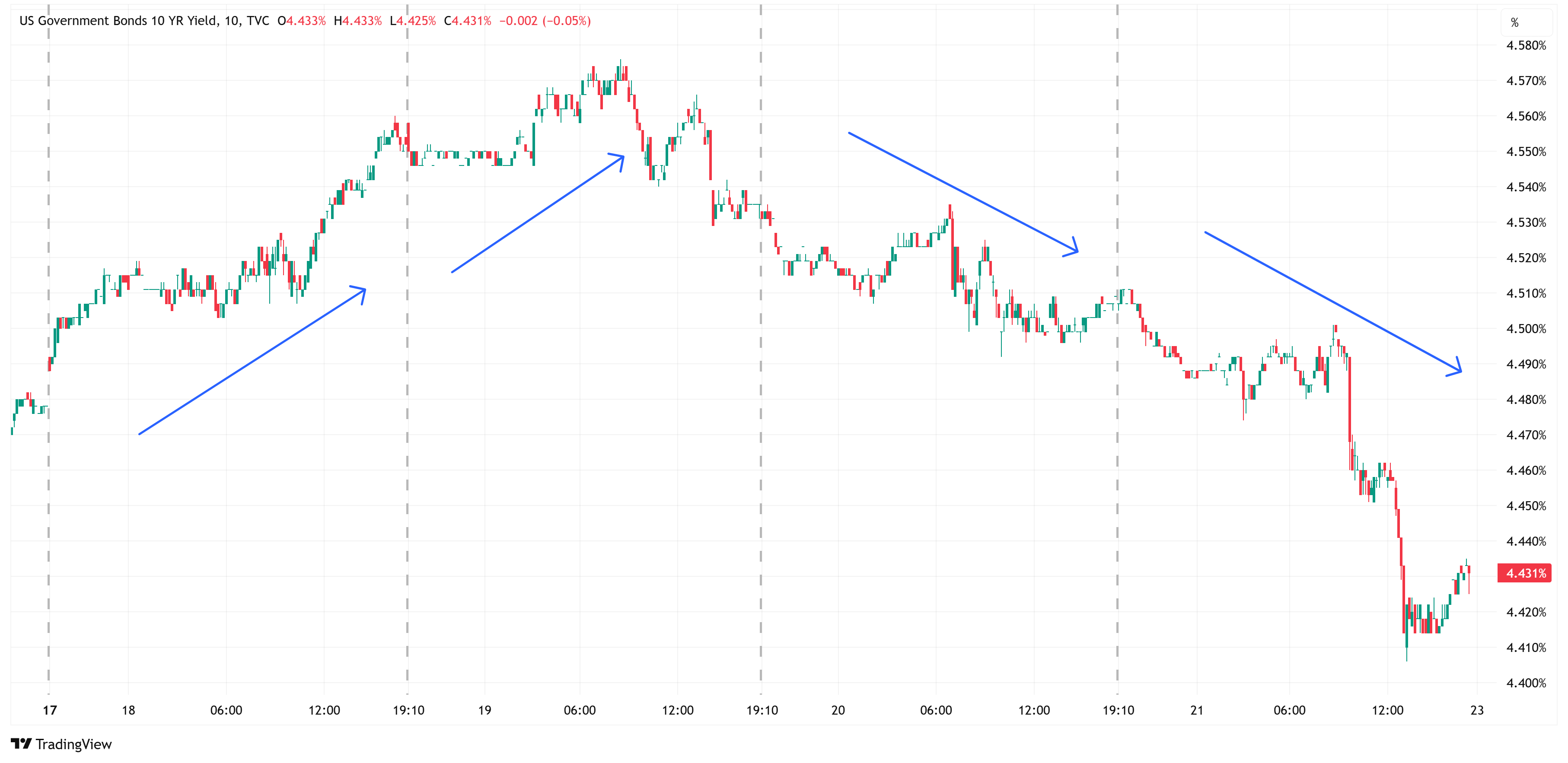
The pandemic headline kicked the “fear” trade into high gear with equities selling off and US Treasuries rallying (yields falling).
Below is a 10-minute chart of the US Treasury 10-year yields.
Note how yields were generally increasing on Tuesday/Wednesday as the stock market was marching towards new highs, but then fell Thursday/Friday as the stock market weakness ensued.
From peak to trough, US Treasury 10-year yields fell 17 basis points (4.576% —> 4.406%) from Wednesday to Friday.
US Treasury (10-Year) - 10 Minute Chart
Where do we go from here…
Given the market moves of last week, let’s dive into where we think the S&P 500 could go in the days/weeks ahead.
We’ll do this by analyzing the market through the lens of “market structure”.
Market structure is simply a process of breaking the market down into smaller pieces to get a sense of the highest probability direction the market may take going forward.
When analyzing market structure, it is always best to look across multiple time frames, starting with the higher time frames and then working your way down to the lower time frames.
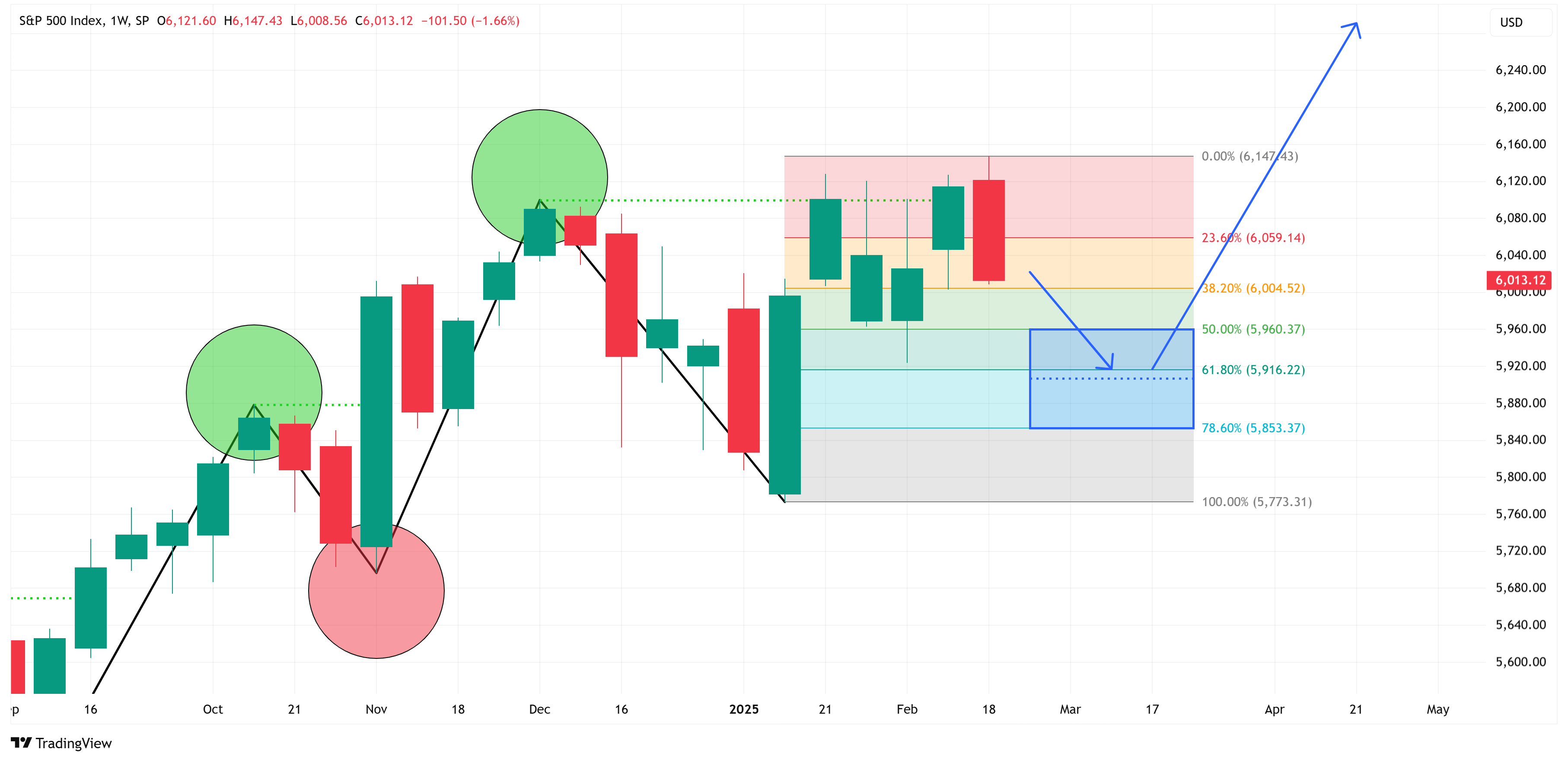
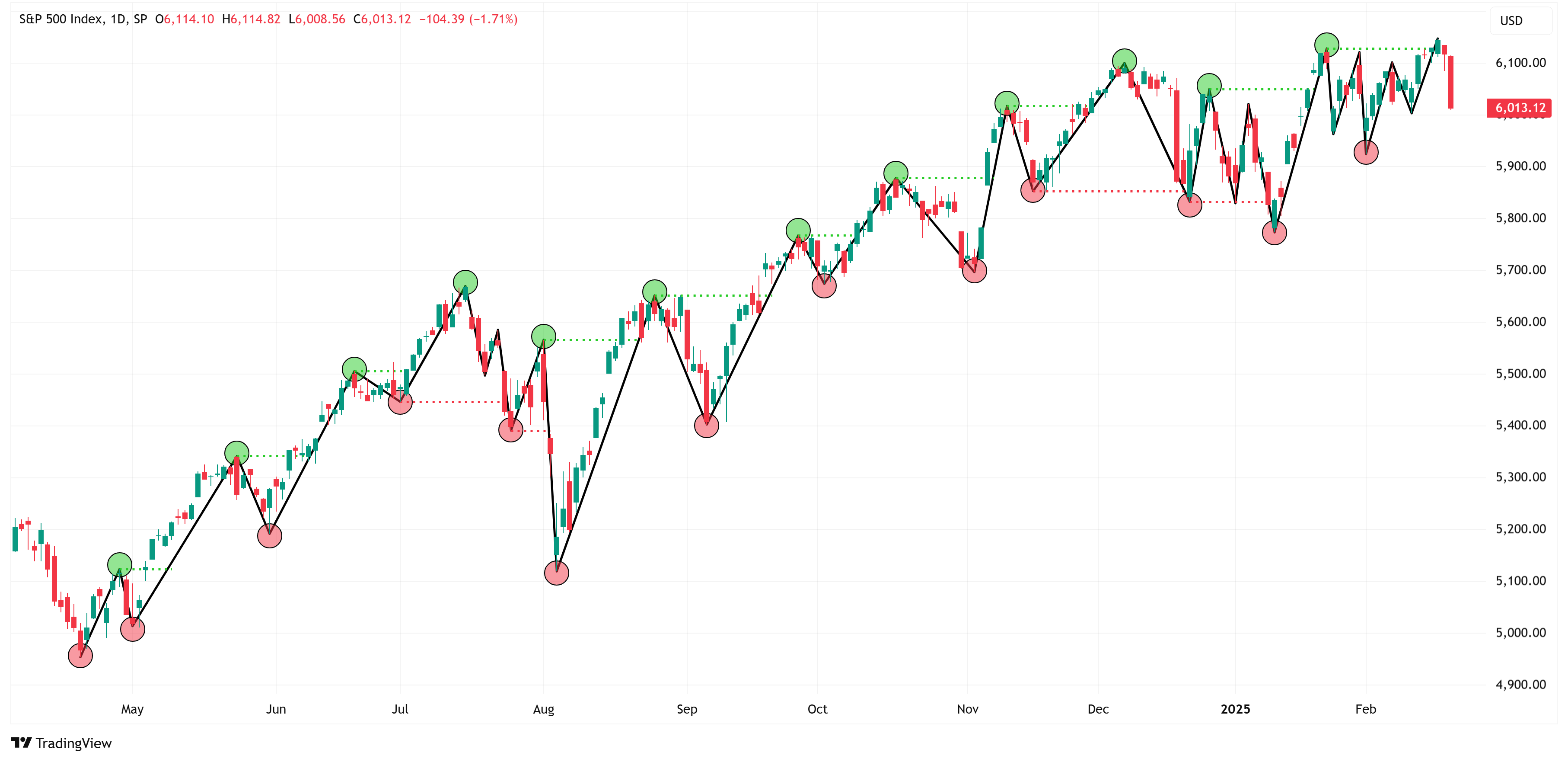
Let’s start with the weekly chart of the S&P 500.
S&P 500 (SPX) - Weekly Chart

In the chart above, I have marked out the swing highs (green dots) and swing lows (red dots).
You can see that the S&P 500 has largely been in a bull market since the beginning of 2023 with a series of “higher highs” and “higher lows”.
On the weekly time frame, the market is still considered to be “bullish”. With that said, notice that every time the horizontal green line is broken to the upside, there is always a pull-back.
Think of the market as a coil that contracts and then expands, contracts and then expands. After a period of expansion, the market has to contract to gain strength to take the next leg higher. Rinse and repeat.
The S&P 500 closed above the horizontal green line with its close on Friday, February 14th. This suggests that we should be on the lookout for a pullback.
You can see in the chart above that pullbacks can happen shortly after crossing the horizontal green line or many weeks after crossing the horizontal green line but they always happen.
How far will the pullback go?
If we take the same chart as above but add on a Fibonacci retracement tool, we find something pretty interesting.
The vast majority of pullbacks decline to somewhere between the 50% - 78.6% retracement level (see below).

If we know that, we can use this information to our advantage.
Let’s zoom in on the chart above to the period encompassing the last few months.
If we assume that last week’s high was the relevant high (this could be a correct or incorrect assumption, only time will tell), this would suggest that the S&P 500 “needs” to pull back to somewhere between 5,960 (50% Fibonacci) and 5,853 (78.6% Fibonacci) before it can move higher.
Now, let’s move down to the daily time frame and see if that gives us any additional clues.
S&P 500 (SPX) - Daily Chart
Given that the daily chart is just a more granular version of the weekly chart, we would expect to see a chart that has been in an uptrend thereby making a series of higher highs and higher lows and that is exactly what we see in the chart above.
It is noteworthy that even amid the multi-year uptrend on the weekly chart, the daily chart showed brief pullback periods that “technically” turned into downtrends (on the daily chart).
You can see this on the chart above where the price action moved below the red horizontal dotted line. These “downtrends” quickly evaporated, turning back into “uptrends” thus feeding the overarching bullish nature of the weekly chart.
Digging deeper…
Now, let’s look at the daily chart in more detail and see if it gives us any clues as to its next move and further if there are any confluences of evidence when comparing the weekly chart to the daily chart.
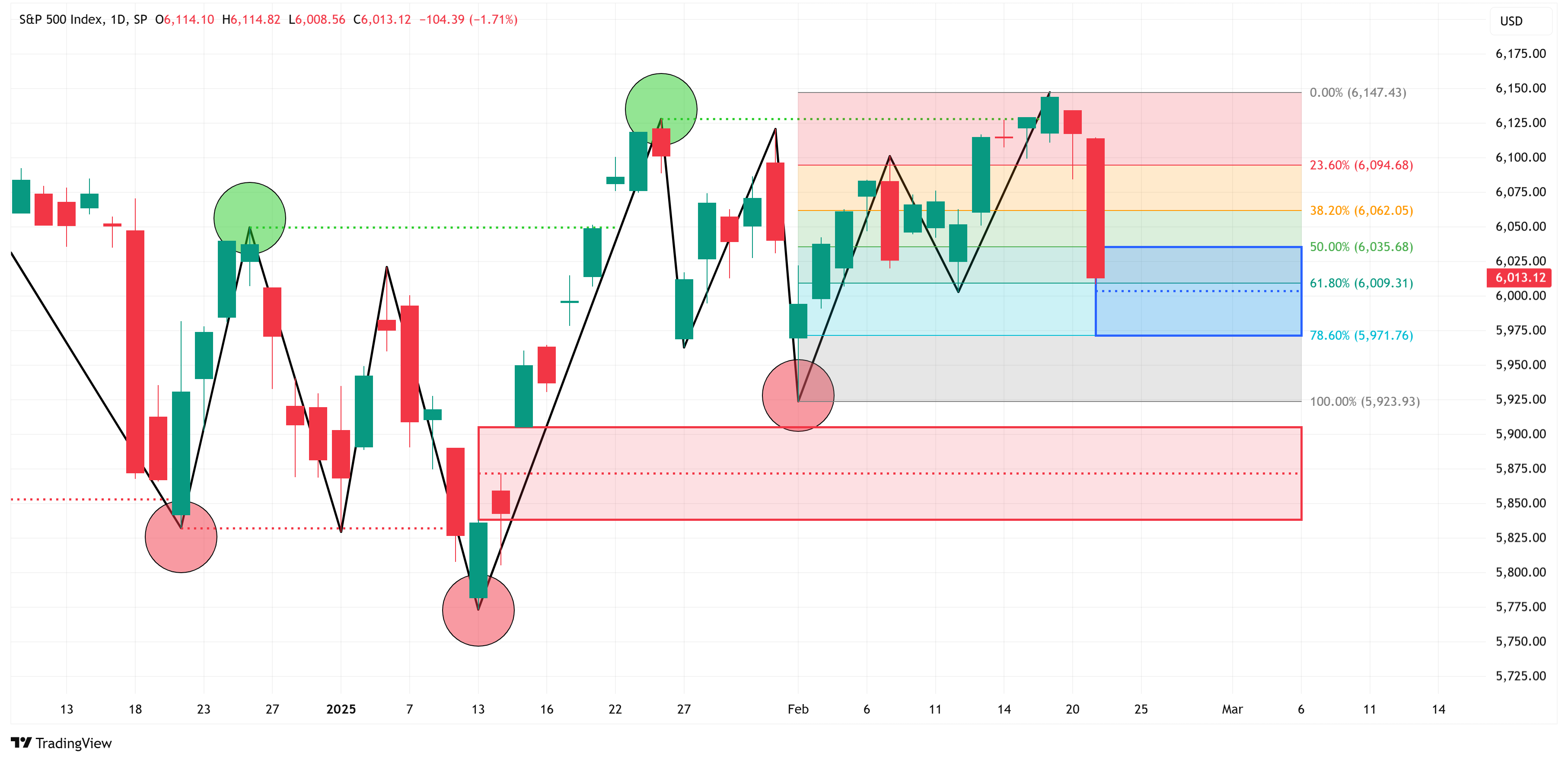
In the chart above, we can see that Friday’s pullback put it squarely in the 50% - 78.6% Fibonacci pullback area which we referenced in the previous charts above.
On the one hand, this would suggest that Friday’s pullback could be all that the market needed to reload and continue its bullish march higher.
With that said, I want to draw your attention to the red box on the chart. This represents a “fair value gap” that “needs” to be filled. We won’t go into this in detail in this newsletter but suffice it to say, this is an important area of interest.
Confluences (daily + weekly)…
Now, let’s see if we can gain any clues by looking at what we learned from the weekly chart.
The image below is the same as the one directly above; however, I have drawn a green box that represents the area of interest from the weekly chart (recall, that was the blue box on the weekly chart).
Notice how the green and red boxes overlap in the chart below. This tells me that there is now a greater probability that Friday’s downturn may not have been all that we can expect so let’s talk through a couple of scenarios.

Scenario #1
Friday’s downturn was enough for the market to rebuild strength and continue the move higher. Follow the blue arrow.

Scenario #2
The weekly chart scenario plays out and we get a pullback into the green and red boxes and then the market moves higher from there. See the blue arrows on the weekly chart or the blue arrows below on the daily chart.
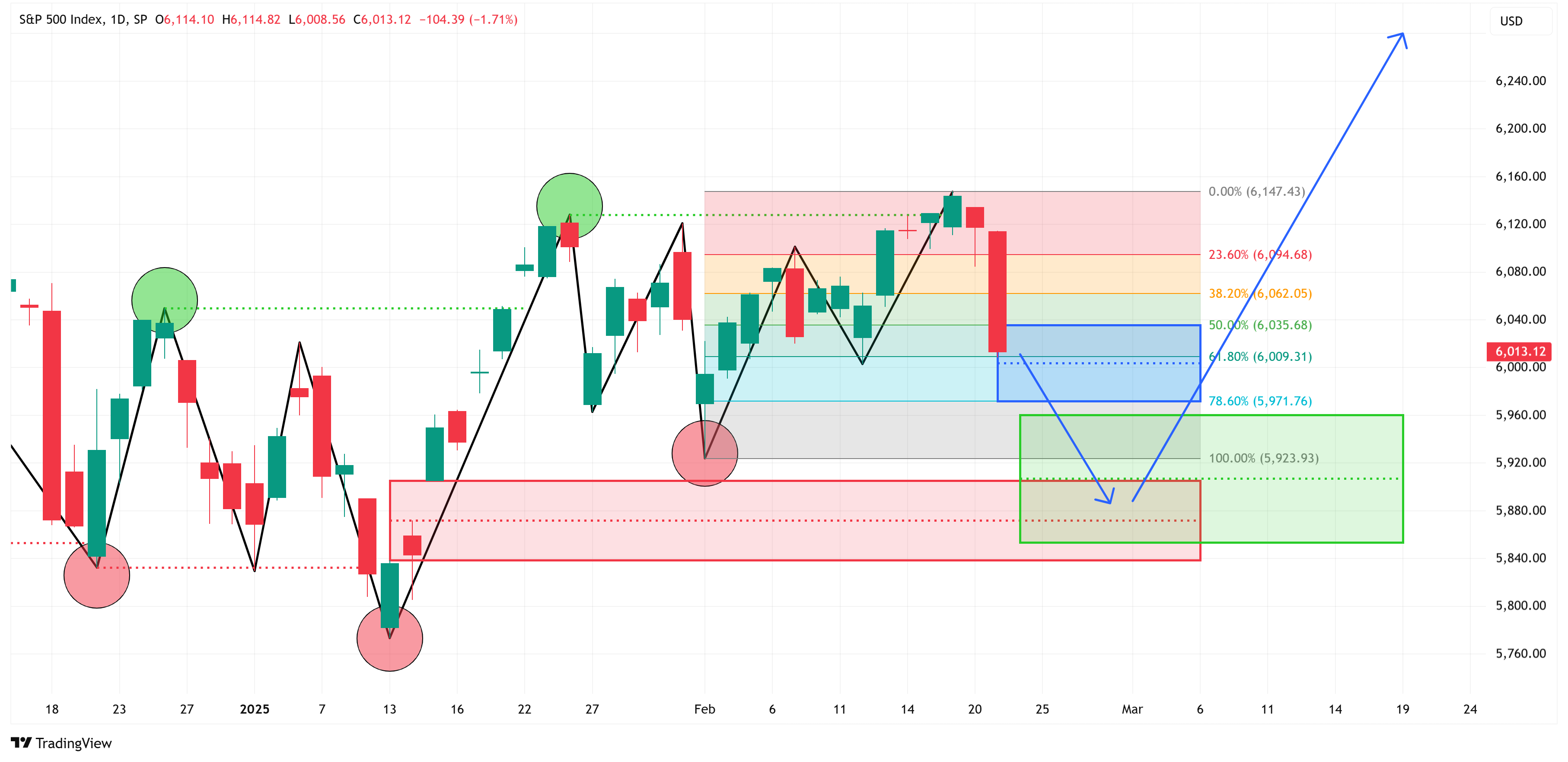
Scenario #3
Friday’s pullback is the beginning of a bigger downtrend that starts by pulling back into the green/red box region outlined above, retraces back to gain strength for an extended move lower, and then falls lower taking out the daily chart swing lows at 5,923 and 5,773.

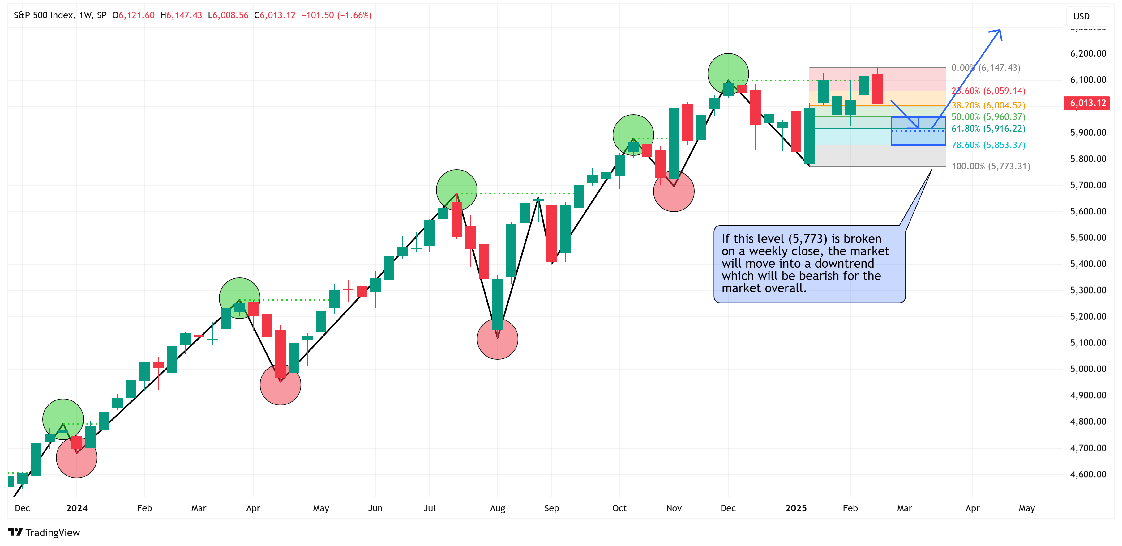
Watch this key level…
Watch for a close below 5,773 on the weekly chart. If that happens, the market will have moved into a structural downtrend for the first time in two years.
Nvidia earnings this week…
Watch for Nvidia’s earnings after the close on Wednesday.
Even after Nvidia’s recent rally, it is still technically in a downtrend from a structural standpoint and has recently retraced back to the 78.6% Fibonacci level.
This would suggest that it will likely be biased to move toward the recent swing low (113.01) and there are two fair value gaps along the way that will act as a magnet pulling the price lower.
With that said, earnings reports can be binary events with massive swings up or down. How Nvidia performs after its earnings will probably be some indication as to how the overall market will likely lean (especially the NASDAQ).
Nvidia (NVDA) - Daily Chart

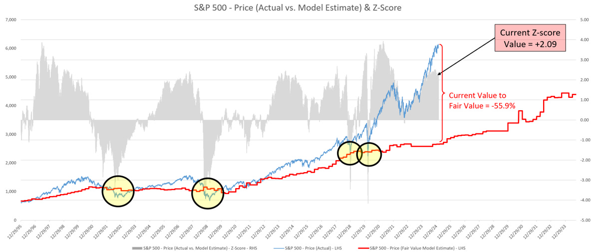
S&P 500 - Fair Value
Let’s close this week with an update on my S&P 500 fair value model.
The red line in the chart below is the fair value I have constructed for the S&P 500. Based on my model, the current fair value for the S&P 500 is 2,652.56.
Friday’s close on the S&P 500 was 6,013.13.
This means it would take a decline of -55.9% from the S&P 500’s current value to its fair value.
Thank you, as always, for your continued support of this newsletter!
If you have found it helpful, would you consider sharing it with a friend or colleague so that we can grow our community? Simply click on the button below to do so.
Let’s make it a great week and don’t forget to take advantage of our 70% off for life promotion!
Take care,
Jim Colquitt
The Weekly Chart Review is a publication of Skillman Grove Research.
All opinions and views expressed herein are based on our judgments as of the date of writing and are subject to change at any time.
The content of this newsletter is for educational purposes only and should not be construed as investment advice.
Investing involves risk, including loss of principal, and past performance may not be indicative of future results.
Do your own research and where appropriate, seek the advice and counsel of a reputable financial advisor.
Matt 6:33