

Hey everyone, it’s Jim.
I hope you had a great weekend!
We continue to receive a lot of interest in our upcoming webinar on September 23rd from 7:00 to 8:00 pm, and it’s not too late to sign up.
See below for the details…
🚀 New for Paid Subscribers: Monthly Live Webinars 🚀
Starting this month, your Weekly Chart Review subscription comes with a powerful new feature: a live webinar every month.
In each session, you’ll get:
Step-by-step “Market Map” Training → Learn our systematic process so you can read the market like a pro.
Interactive Chart Talk → We’ll pull up your requested charts in real time and share where we think they’re headed.
Open Mic Q&A → Ask anything about markets, charts, or our process.
🔒 This benefit is only available to annual paid subscribers.
👉 Subscribe now for just $99/year
If you’re a paid subscriber and would like to join our monthly webinar, please reply to this email and say “Count me in!”.
This week, we’re going to do a couple of things a little differently.
First, we’re going to focus almost exclusively on the Quarterly Update to our Average Investor Allocation to Equities Model.
Second, we’re going to open up this week’s entire newsletter to all subscribers (i.e., not just paid subscribers) as I want everyone to benefit from the quarterly results of our Average Investor Allocation to Equities Model.
I should note, paid subscribers receive weekly updates to the Average Investor Allocation to Equities model, which provides real-time access to changes in the model (instead of only quarterly) and investment implications based on said changes to the model.
If you would like to become a paid subscriber, simply click on the link below to get our “Market Map Pro” promotional rate of $99/year. Paid members also have access to our upcoming webinar (see above) and other exclusive research.
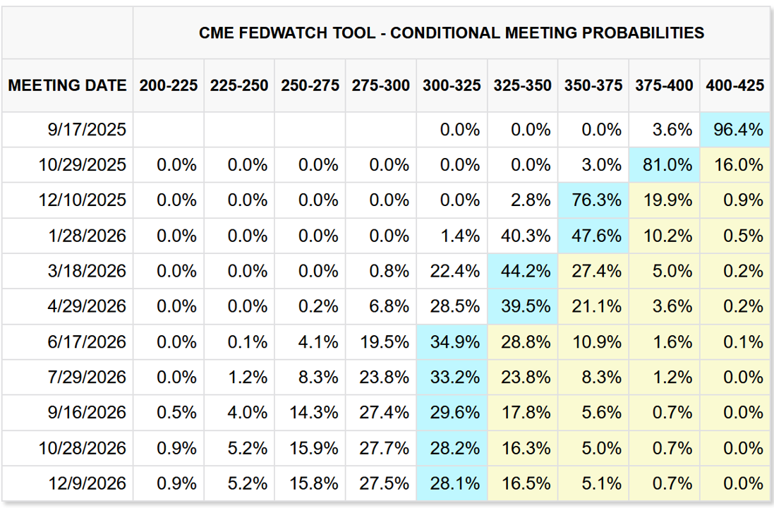
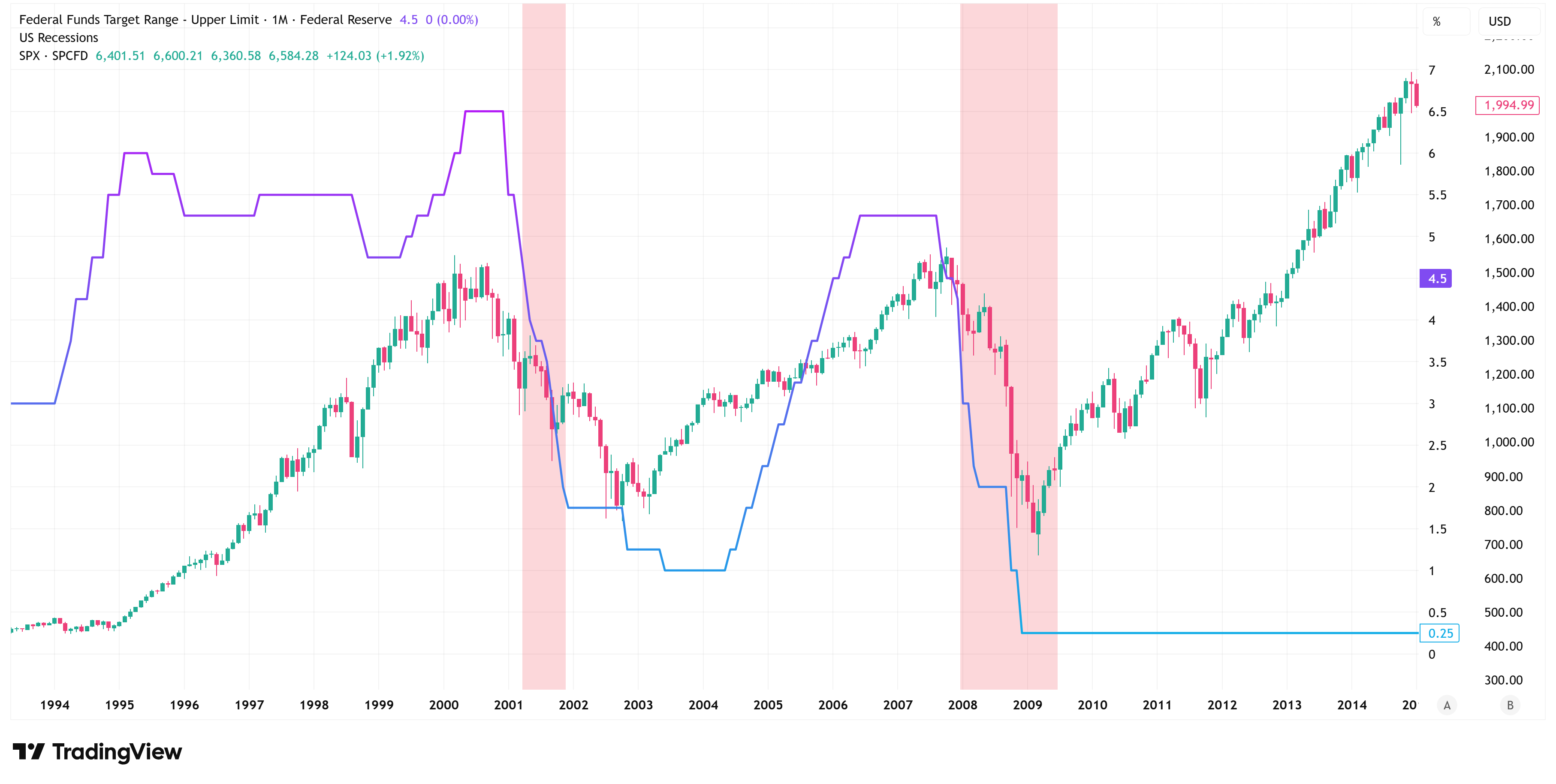
With all of that said, I would be remiss if I didn’t point out that the FOMC has a meeting this week (Tuesday/Wednesday), after which they will announce their latest interest rate policy update.
Since J. Powell’s speech at Jackson Hole in August, it has largely been a foregone conclusion that the Fed will cut rates this week, but the question has been by how much?
Current Fed Funds Futures suggest there is a 96.4% chance of a 25 basis point cut and a 3.6% chance of a 50 basis point cut.
Current probabilities also suggest a total of three rate cuts between now and year-end (25 basis points at each of the remaining three meetings this year).
Unless we have a dramatic turn of events early in the week, I think the Fed will cut 25 basis points on Wednesday.
Outside of any potential geopolitical developments, this will be the key financial news story of the week and drive most of the price action across markets.
Deep Dive
Quarterly Update: Average Investor Allocation to Equities Model…
Let’s start with the chart and then get into the analysis and takeaways.
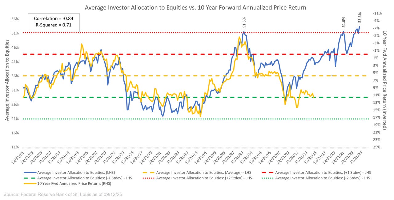
For those who may be new to our newsletter and this model, here is how to read the chart above:
“The blue line in the chart shows the “Average Investor Allocation to Equities”. As the name would imply, this line shows how much (i.e., what percentage) of the average investor’s portfolio is allocated to equities at any given time as opposed to other asset classes (i.e., fixed income, commodities, cash, etc.) This line maps to the left-hand scale of the chart.
The yellow line in the chart shows the “10-Year Forward Annualized Price Return” of the S&P 500 Index. This tells us what the 10-year forward return was for the S&P 500 Index from the corresponding point on the blue line. This line maps to the right-hand scale of the chart and the values have been inverted to better show the relationship between the two metrics.”
Next, we want to understand how to interpret this chart:
“Very simply, the higher the blue line (i.e., the “Average Investor Allocation to Equities”), the lower the subsequent 10-year return for the S&P 500 Index and vice versa.”
Our current reading of the Average Investor Allocation to Equities is 53.3%. This is the highest reading in the history of our dataset, which goes back to 1945.
This suggests that the market has never been more overvalued than it is right now.
Here’s the problem: just because this is the highest value we’ve ever seen doesn’t mean it can’t go higher, so by no means do I want to suggest “this is the top”.
Instead, we’ll use our “Market Map” methodology to get a better sense of what we should look for when the market does start to turn lower (more on this below).
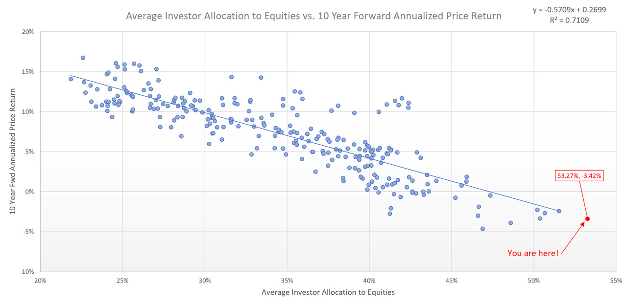
You are here!
In the chart below, the blue dots represent actual historical data.
X-Axis = Actual historical “Average Investor Allocation to Equities” values.
Y-Axis = Actual historical “10 Year Fwd Annualized Price Return” values.
Note the “You are here!” value (red dot).
This marks our most recent model value of 53.3%, which we then combine with a regression-based model to forecast the 10-Year Fwd Annualized Price Return of the S&P 500, which equates to -3.42%.
This means that over the next 10 years (June 30, 2025, to June 30, 2035), our model suggests that the S&P 500 will have an annualized return of -3.42%.
Historic Examples
The two closest examples we have from history are the 10-year periods:
June 30, 1999 - June 30, 2009 —> -3.93% (annualized)
June 30, 2000 - June 30, 2010 —> -3.39% (annualized)
Here’s what those periods looked like on a chart (blue arrows connect the beginning to the end of the periods noted above):
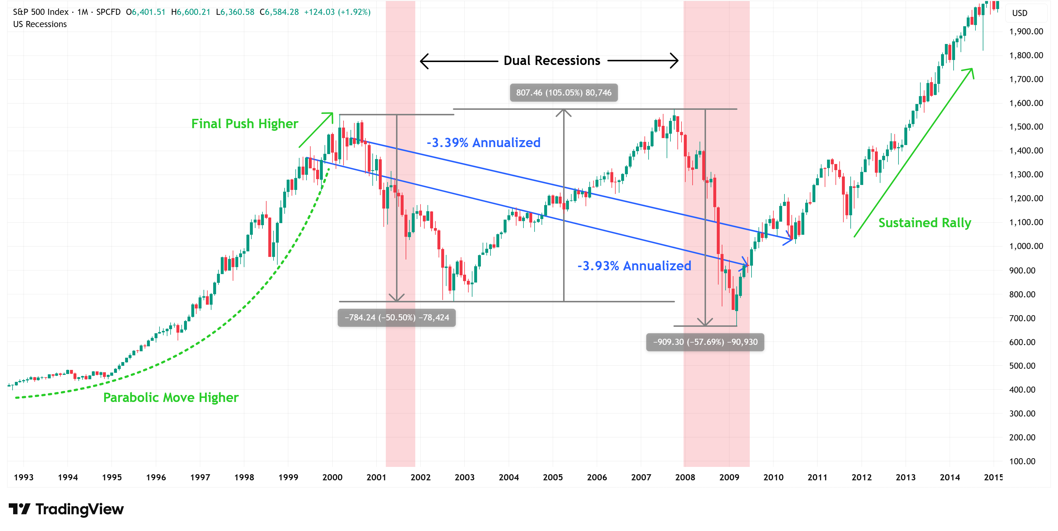
A few key observations regarding the return periods noted above:
They were preceded by a parabolic move higher in equity prices (not too dissimilar to today).
The market had a final push higher even from the starting points noted above.
The 10-year periods included:
Two recessions.
Drawdowns of -50.5% & -57.7%.
A rally of +105.1%.
Once these periods concluded, they were followed by a multi-year sustained rally.
There is close to 0% chance that the current era will play out exactly as the era noted above; however, there are some general takeaways that we can glean.
The current rally may not be over.
Volatility may increase.
We could see dramatic drawdowns followed by dramatic rallies.
The Fed will likely cut rates multiple times (see chart below).
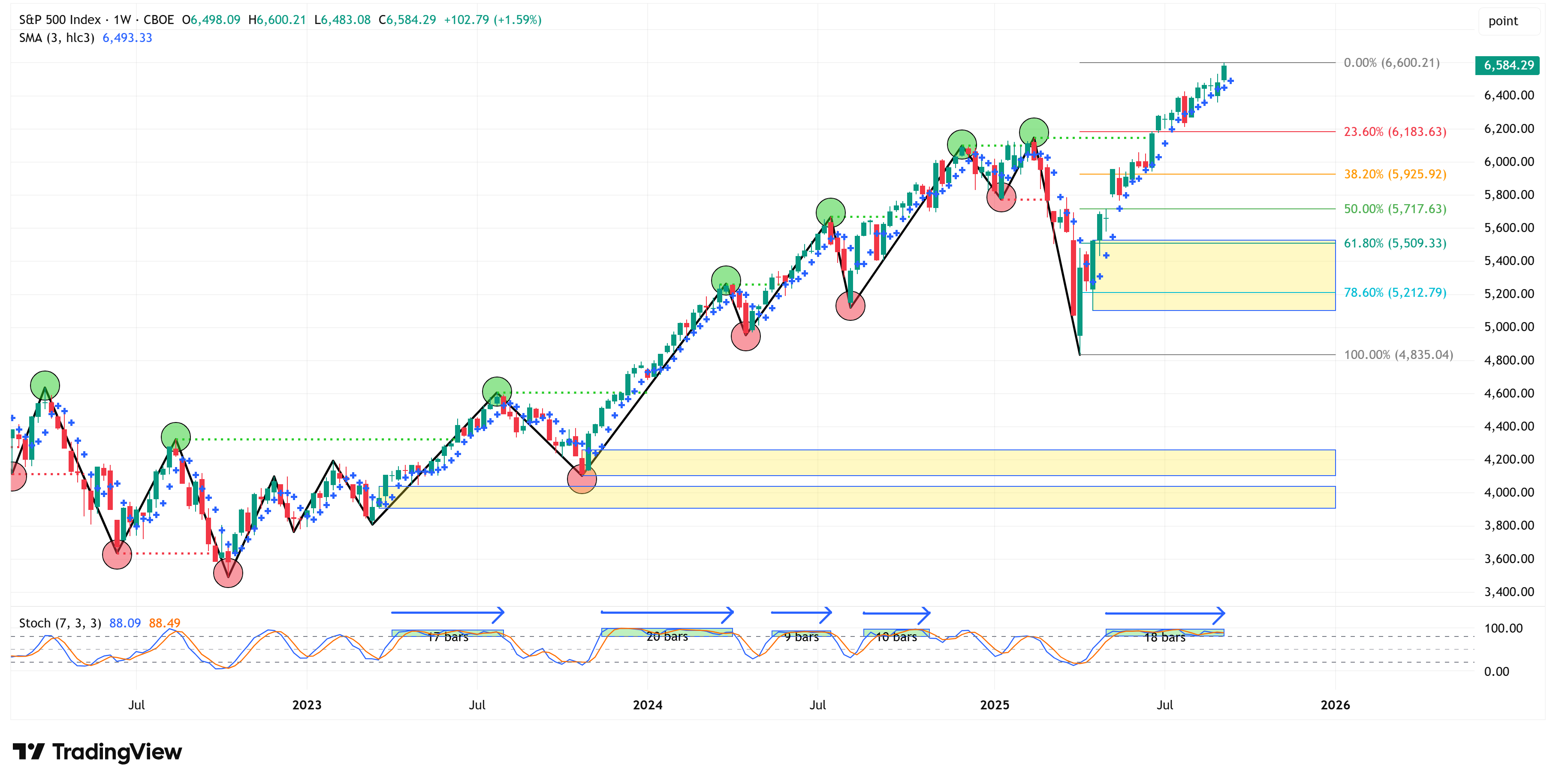
🗺️ The Market Map - S&P 500
We use this section each week to “Map the Market” using our proprietary, systematic methodology to gauge a) the current trend of the market and b) where the market may be heading over the medium term.
Most of our readers are long-term investors, so we focus on the weekly charts; however, our methodology can be used on any timeframe.
As usual, let’s start with the weekly chart.
The S&P 500 returned +1.59% last week and remains in an uptrend.
Honestly, it’s hard to find much wrong with the following chart, as it is not giving us any signs of wanting to slow down.
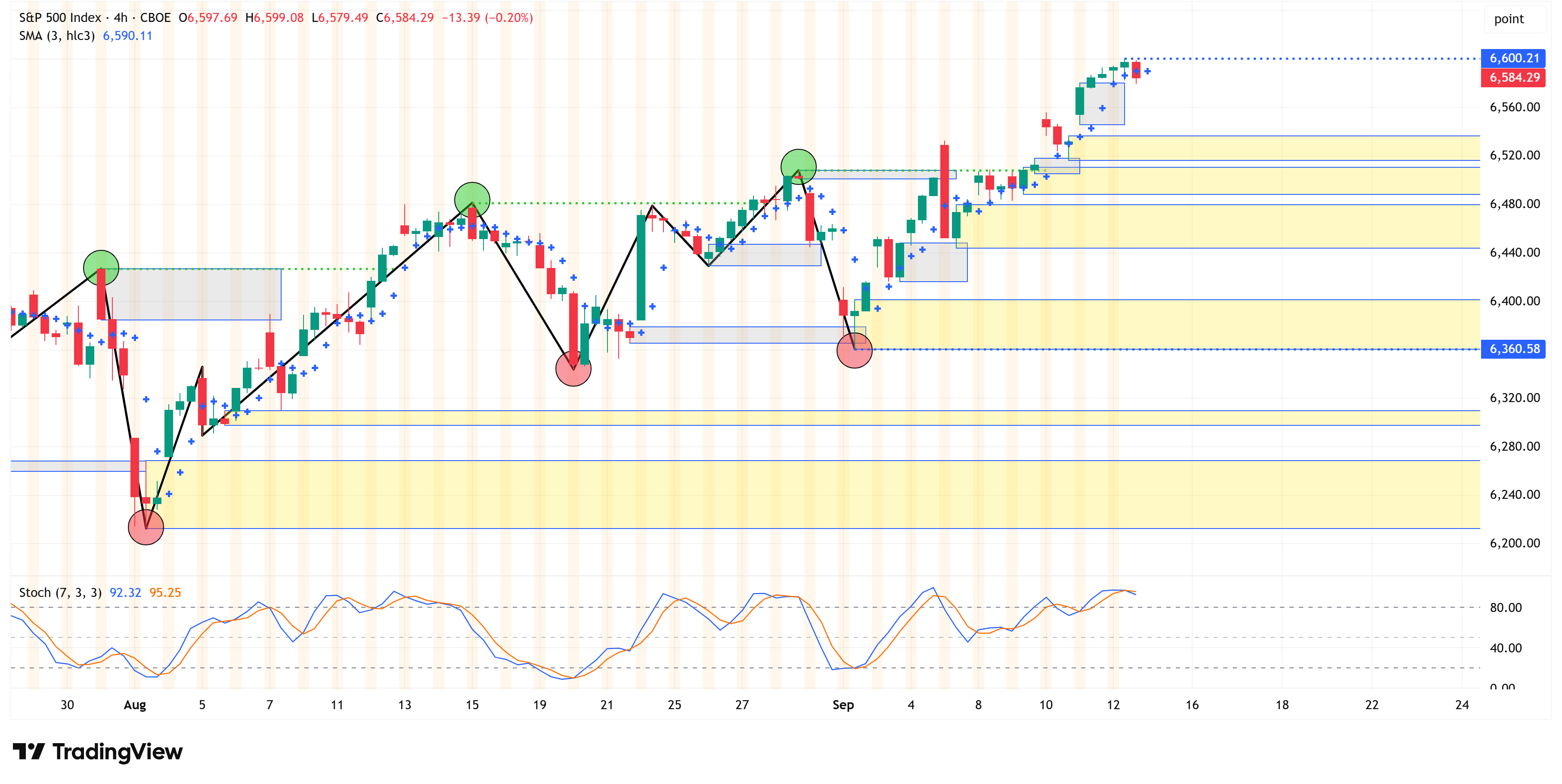
4-Hour Chart
If we turn to the 4-hour chart, we see a very similar picture as it continues to remain in an uptrend as well.
Given the current market structure, we would need to see a 4-hour close below 6,360 to begin thinking about a correction.
Putting it all together
The stock market continues to grind higher, and depending upon the Fed’s narrative (and actions) on Wednesday, it could continue to run even higher.
With that said, by our own metrics and those of many other market practitioners, the market is severely overvalued.
Valuation models are terrible timing tools, but they do allow us to get a sense for which side of the boat everyone is on.
Once the rubber band gets stretched too far, it will eventually snap back. It’s hard to say when that exact moment will be, but the valuation models suggest you should have your antenna up.
We use a systematic process, which we call our “Market Map” methodology, that tells us when we believe this correction is beginning to happen.
The “Market Map” lays out very specific price targets/levels, so it removes the guesswork from the analysis, which we believe leads to better investment decision-making.
Let’s see what the Fed does this week and how the market reacts.
Thank you, as always, for your continued support of this newsletter, and please consider becoming a paid subscriber if you found this information valuable.
Let’s make it a great week!
Take care,
Jim Colquitt
Do you have any other feedback?
If so, feel free to reply to this email and let me know!
I read and respond to every email, and I value your opinion!
The Weekly Chart Review is a publication of Skillman Grove Research LLC.
All opinions and views expressed herein are based on our judgments as of the date of writing and are subject to change at any time.
The content of this newsletter is for educational purposes only and should not be construed as investment advice.
Investing involves risk, including loss of principal, and past performance may not be indicative of future results.
Do your research and, where appropriate, seek the advice and counsel of a reputable financial advisor.
Matthew 6:33
How much of the average investors allocation to Equities is concentrated in a handful of stocks? How much of the market is undervalued?