The “no landing” and/or “soft landing” camp are not going to like this article. With that said, I’m just trying to call it like I see it regardless of who that may offend.
Francois Trahan recently posted an interesting chart comparing the NAHB Index to the Unemployment Rate. The thesis was/is that if you want to see where the Unemployment Rate is likely to go, look no further than that housing market, and specifically, the NAHB Index.
What is the NAHB Index?
“The NAHB/Wells Fargo Housing Market Index (HMI) is based on a monthly survey of NAHB members designed to take the pulse of the single-family housing market. The survey asks respondents to rate market conditions for the sale of new homes at the present time and in the next six months as well as the traffic of prospective buyers of new homes.”
The NAHB Index can range between 0 and 100. Higher values equate to a stronger market whereas lower values equate to a softer market.
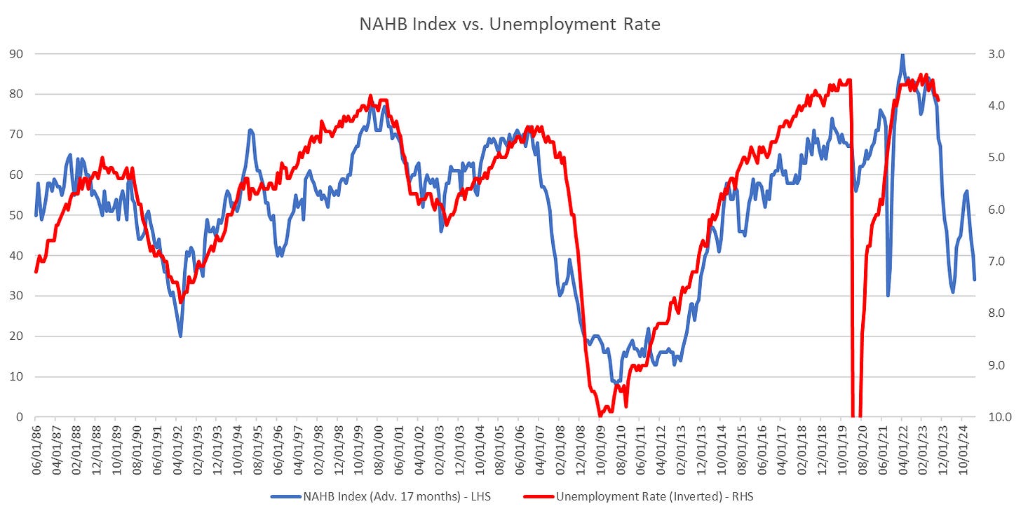
When comparing the historical datasets, I found that when we advance the NAHB Index by 17 months (Francios used 18 months), it has the greatest predictive value for the Unemployment Rate.
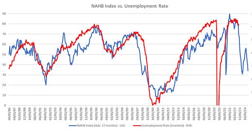
Here is what it looks like on a chart. Note: the Unemployment Rate (RHS) has been inverted for comparison purposes.
Further, note the tight relationship between the two when we look at it on a scatterplot (correlation = -0.7726, r-squared = 0.5969).
If we remove the Covid-era plots, the correlation = -0.8597, r-squared = 0.7392.
The “eye test” would suggest that the Unemployment Rate should continue to increase in the coming months.
Next logical question: “How much should the Unemployment Rate increase in the coming months and what are the implications for the US economy?”
Given the tight relationship between the two datasets, it’s fairly easy to create a simple regression model whereby we use the actual NAHB Index values to predict future Unemployment Rate values.
When we do this and test our “estimated” values vs. “actual” values, we get the following results. Again, a pretty tight fit.
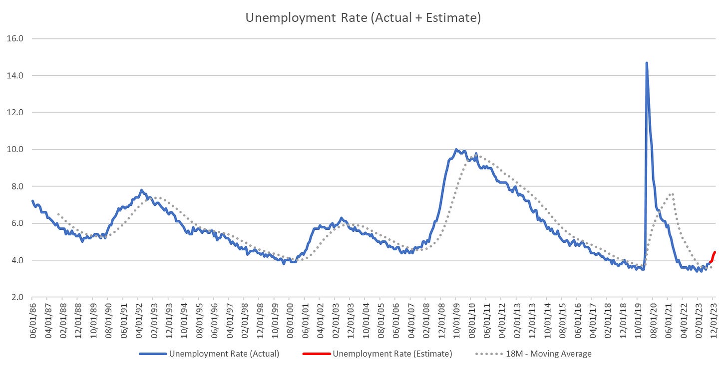
Putting it all together, the model estimates that the Unemployment Rate over the next several months should be as follows:
October 2023 = 3.90% (actual) - Release Date —> 11/03/23
November 2023 = 3.95% (estimate) - Release Date —> 12/08/23
December 2023 = 4.28% (estimate) - Release Date —> 01/05/24
January 2024 = 4.45% (estimate) - Release Date —> 02/02/24
Here’s what it looks like on a chart:
You’re probably thinking: “An Unemployment Rate of 4.45% for the January 2024 report (released 02/02/24)…that doesn’t sound terrible…”
In the grand scheme of things, it isn’t terrible, but it’s the change that matters.
Couple the “change” with the “eye test”, and we’re heading in the wrong direction.
Sahm Rule
On November 6th, I put out a piece where I did a deep dive into the “Sahm Rule” (you can read the entire piece here).
The Sahm Rule is defined as follows:
“Sahm Recession Indicator signals the start of a recession when the three-month moving average of the national unemployment rate (U3) rises by 0.50 percentage points or more relative to its low during the previous 12 months.”
If the Unemployment Rate does increase as the model suggests, the December 2023 figure of 4.28% (released 01/05/24) would trip the Sahm Rule and suggest that a recession has begun in the US.
Unemployment Rate vs. 18-Month Moving Average
On September 5th, I put out a piece detailing the relationship between the Unemployment Rate and its 18-month moving average (you can read the entire piece here).
To summarize:
“Each time the Unemployment Rate has had a sustained move “up and through” its 18-month moving average, we have had a recession begin within the next three quarters.”
Further, with regard to how much “advanced notice” this signal provides:
“The range of outcomes over the course of the previous 8 recessions is anywhere from 0 months to 9 months of “advanced notice” with an average of 3.25 months and a median of 3.00 months.”
It is worth noting that the Unemployment Rate crossed “up and through” its 18-month moving average with the May 2023 report.
This means that the December 2023 report would be the 8-month mark and historically, we’ve never gone beyond 9 months without a recession beginning.
I know what you’re thinking: “This time is different…the massive amount of stimulus the government provided changed the rules and therefore you can’t make the same comparisons you’ve always made…”
Maybe that’s right and I’ll be the first to admit that I don’t have a crystal ball but we’re at the point where we have multiple indicators triangulating on the possibility of a recession beginning sometime over the next few months.
Recession Dating
In the US, recessions are “determined” by the National Bureau of Economic Research (NBER) and oftentimes they do not declare the beginning or end of a recession until well after it has started and oftentimes not until it has already ended.
The classic example was in 2008 when the NBER put out a press release on December 1, 2008, stating:
“The Business Cycle Dating Committee of the National Bureau of Economic Research met by conference call on Friday, November 28. The committee maintains a chronology of the beginning and ending dates (months and quarters) of US recessions. The committee determined that a peak in economic activity occurred in the US economy in December 2007. The peak marks the end of the expansion that began in November 2001 and the beginning of a recession.”
For those of us in the market at that time, I think everyone and their brother knew we were in a recession about 5 minutes after Lehman Brothers collapsed (if not earlier).
2008 was an election year and I suspect the NBER did not want to release a “recession declaration” in advance of the Presidential election (November 4, 2008) so as to not have any potential impact (real or perceived) on the election.
2024 is also an election year and I could very easily see a scenario whereby the NBER drags its feet on declaring the beginning of a recession just as it did in 2008.
All of this is to say that no one is going to ring a bell telling you that the recession has begun. You need to prepare in advance of said “recession declaration”.
As a friendly reminder, here is how the S&P 500 performed from the beginning of the recession to the date that the NBER told you that you were in a recession.
For those keeping score at home, that’s a decline of -38.95%. It’s also worth noting that -14.73% of that decline came before Lehman Brothers collapsed.
Falling on the sword
The inherent problem with putting out a piece like this is that there is a very high likelihood that even if I am “correct”, it will not be proven for another year or so when the NBER gets around to declaring the beginning of the next recession.
Further, if over the next several months, the Unemployment Rate comes in better (i.e., lower) than my model estimates, there will be a large contingency out there that will gladly point out that my call was wrong and that we are in fact heading for a “soft or no landing”.
As Yogi Berra once said, “It is difficult to make predictions, especially about the future…”
My goal with this piece, and each of the pieces that I write, is to use data to suggest that there is possibly a different narrative out there than what you’re hearing on CNBC or other places.
Lastly, and very importantly, by no means am I suggesting that you should sell everything and move to 100% cash or US Treasuries.
Instead, what I am suggesting is that you should consider assigning a probability of outcome to the scenario I’ve outlined above. Once you’ve done that, you should consider working with a reputable financial advisor to see if it makes sense to adjust a similar portion of your portfolio to securities/holdings that could possibly benefit if the above scenario does play out.
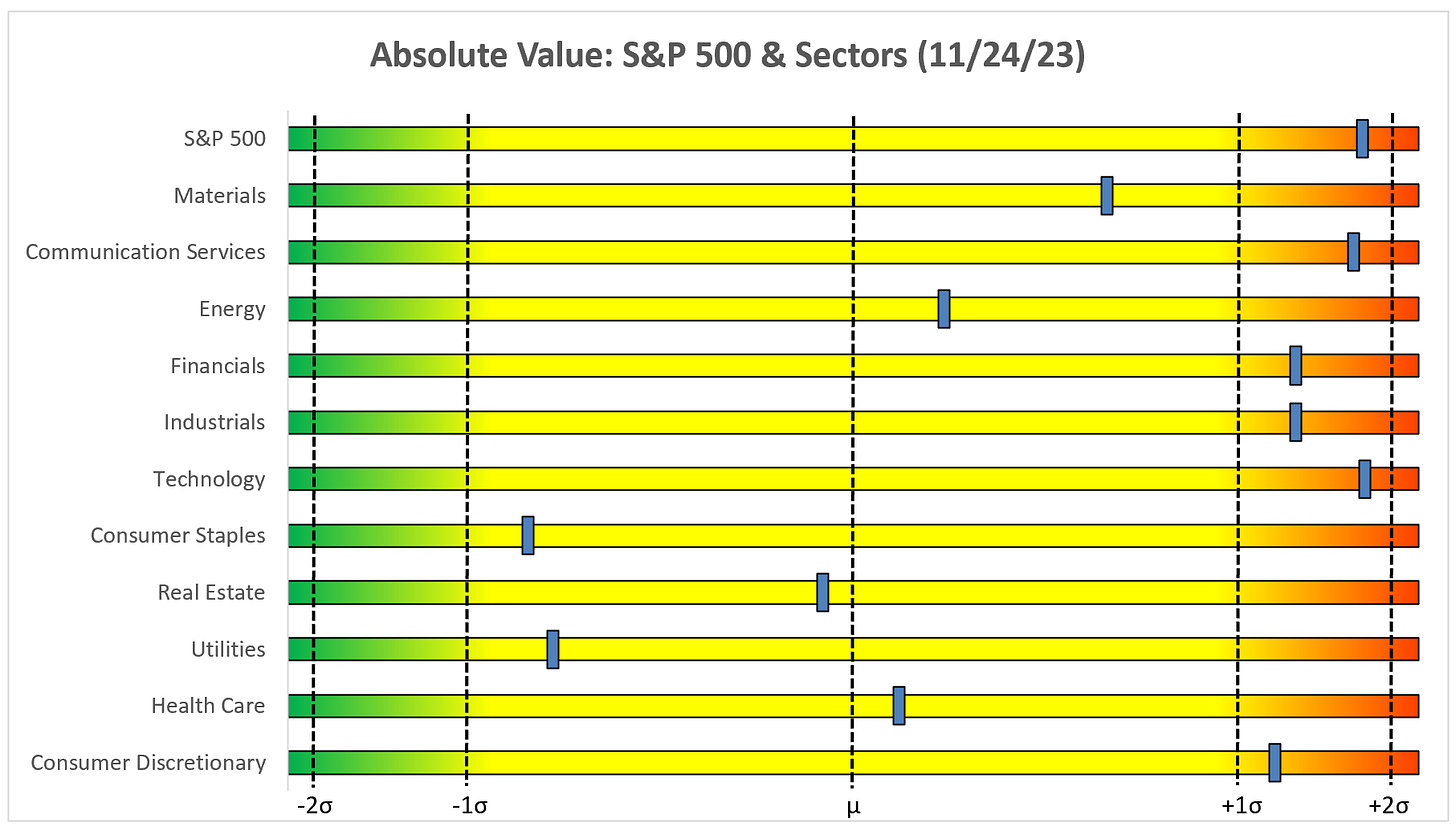
Absolute Value & Relative Value
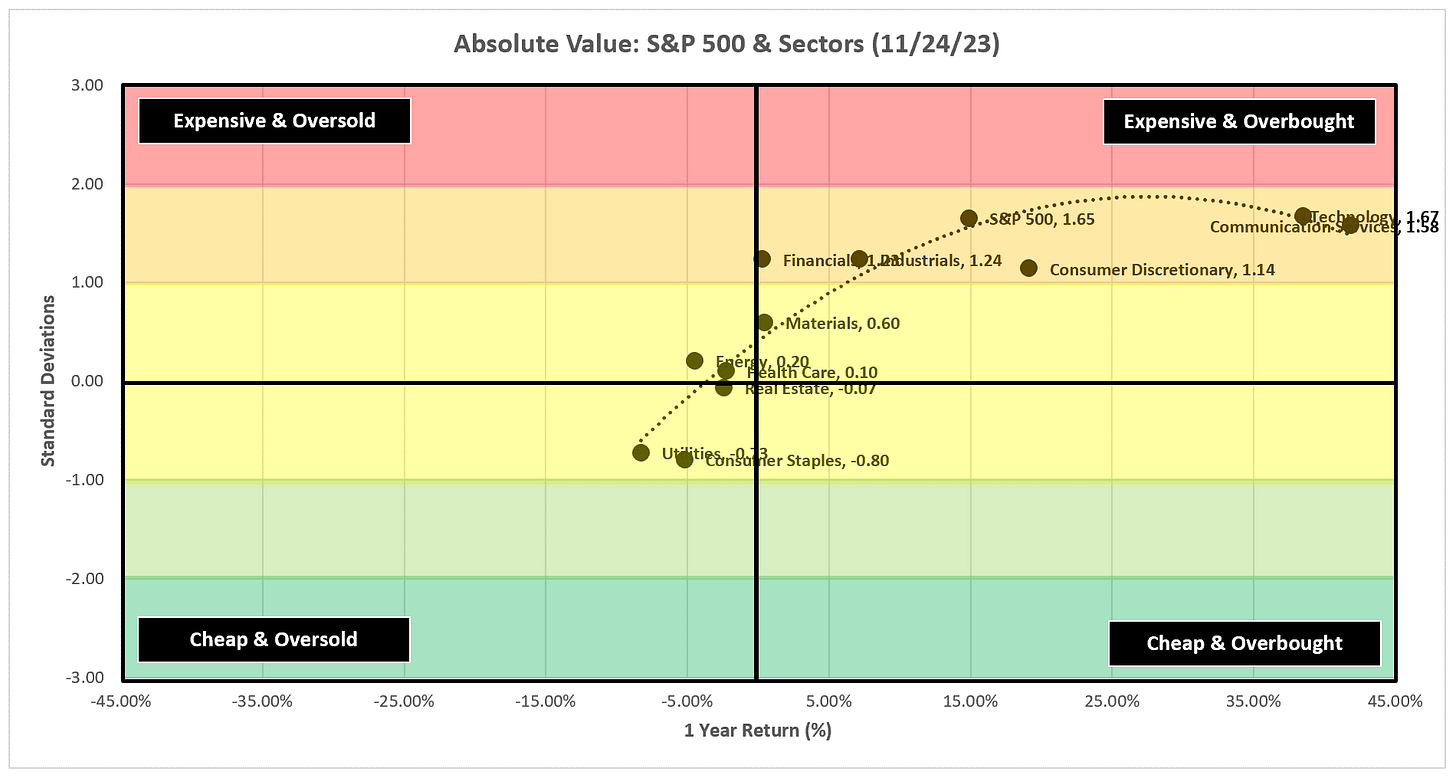
Here are the weekly Absolute & Relative Value charts.
Absolute Value - Equities
Relative Value - Equities
Absolute Value - US Treasuries
Chart Review
Regular readers know that I typically like to look at weekly charts in this section as I think weekly charts take out some of the “noise” of the day-to-day price action which I feel helps provide a better picture of where we’re heading over the short-to-medium term.
With that said, as I was looking through the charts this week, it became apparent that several of the charts have detail that is only visible on the daily charts that I believe is worth highlighting this week. I’ve also added the MACD (moving average convergence divergence) indicator to the charts.
Without further ado…
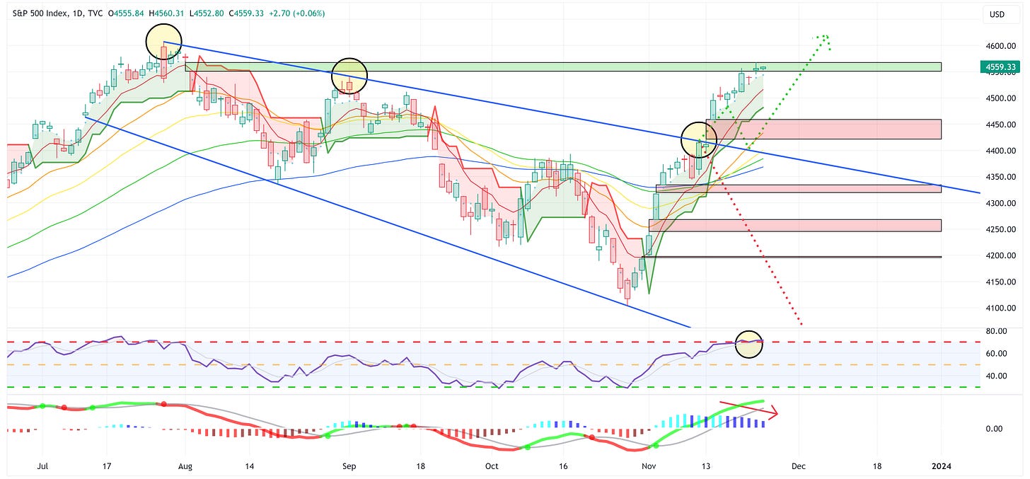
S&P 500 Index
A couple of weeks ago, I pointed out that the S&P 500 had been in a channel and that if it was going to make a move higher, it had to break out of that channel and if it did, it may have its sights on the overhead gap that had been created in late July.
Well, it did break out of that channel and if you look at the zoomed-in image of the chart below, you’ll notice that on Wednesday (blue arrow), it closed the gap perfectly.
If you focus your attention on the first S&P 500 chart above, you’ll notice that the RSI has reached “overbought” levels and the histogram on the MACD chart is beginning to suggest (note the red arrow) that the recent rally may be losing some steam.
If you’re a bull, you’ll want to see the S&P 500 pull back a bit to work off some of the “overbought” conditions and then take the next leg higher. A good place for that pullback to end would be the upper end of the channel noted on the chart.
If the S&P 500 falls below that upper end of the channel, I think it could make a run at the open gaps below.
Technology
XLK appears to be losing steam as we are starting to see a rounding top, overbought conditions on the RSI, and a MACD that is losing steam. Further, current price levels are right at the place where we would call our initial target on the H&S pattern I have drawn on the chart.
Note the gaps that need to be filled below current levels. With that said, XLK remains on the “correct” side of the trailing stop loss.
Communication Services
Everything I said above for XLK could be said for XLC.
Consumer Discretionary
XLY looks very similar to XLK and XLC except that it is not as “overbought” as the other two. With that said, note what appears to be a small double-top over the last week or so of trading.
Industrials
XLI is overbought on the RSI and the MACD appears to be losing steam. It also appears to be sufficiently extended beyond the 8EMA (red line) which suggests it may need to come in a bit relative to that line.
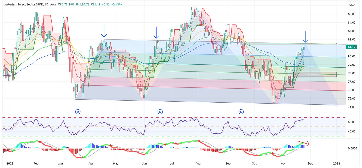
Materials
There’s a lot going on with the XLB chart above so hang with me for a minute.
I continue to believe, XLB could be in the process of forming a H&S pattern (note the light blue shading).
The Fibonacci channel has been touched perfectly twice before and could form the top of the right shoulder with a third touch. That third touch would conveniently close an overhead gap as well.
RSI is moving towards “overbought” and the MACD is losing steam.
Energy
XLE looks like it might have some room to run higher as the RSI and MACD are both turning in a positive direction and have plenty of room to run. The key will be whether or not XLE can break above the trailing stop loss.
Financials
XLF is “overbought” on the RSI and the MACD is losing steam. Watch for the two dotted lines to become resistance.
Real Estate
While not completely “overbought”, XLRE looks to be losing steam and that’s what the MACD is showing us as well.
Consumer Staples
XLP has had a good run of late and may still have a little gas in the tank. Note the two blue arrows, if this rally is to continue, it has to clear these two levels which conveniently are located at the 89EMA (blue line).
Utilities
Similar to XLP, if XLU is going to make a go of this, it needs to definitively clear the blue dotted line as that has proven to be resistance several times.
Health Care
XLV could have room to run here. It’s not completely “overbought” yet and the MACD doesn’t appear to be losing steam. Watch for the blue dotted line to be resistance.
In the charts above, the overarching theme seems to be that outside of the defensives and energy, most sectors look like they may be setting up to take a bit of a breather.
With that said, it’s not uncommon to see a rally towards the end of the year and especially a rally in the sectors that have performed well during the year as everyone wants to make sure that they’ve done the proper amount of “window dressing” so that their year-end statements look how they’d like.
US Treasury Review
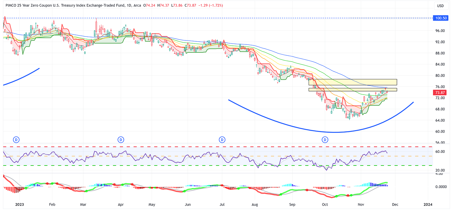
With rates rising modestly last week, the US Treasury ETFs that we track came off a bit and their MACDs look like their recent rallies could be losing a little steam.
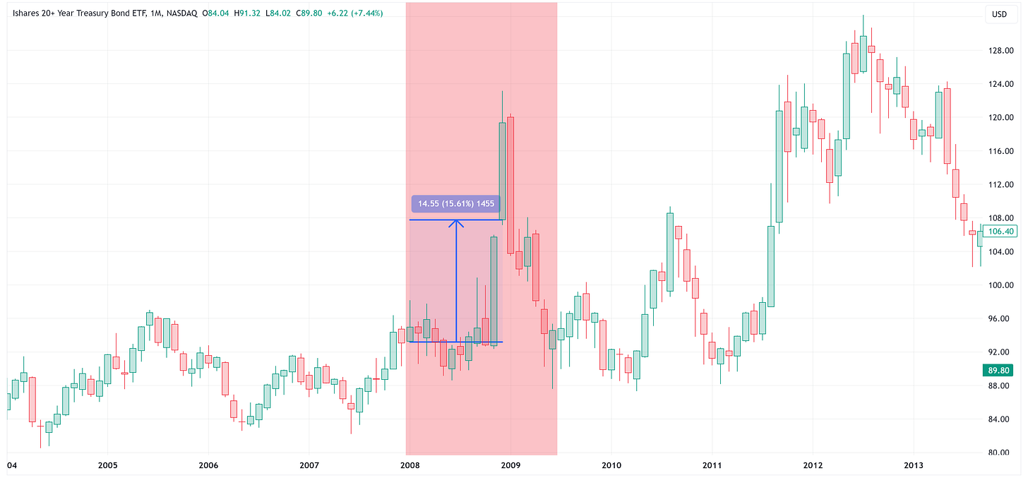
With that said, if I am even directionally correct on my “recession” call from the first section of this piece, I think it is fair to use TLT during the 2008 era as a rough approximation of what may happen going forward for some of these US Treasury ETFs.
This is a chart of TLT from the start of the recession to the 1st of December when the NBER declared that the US was in a recession. Note the stark difference in how TLT performed vs. how the S&P 500 performed in a previous chart I highlighted, over that same period and that TLT went on to rack up even more gains throughout the remainder of December 2008.
ZROZ: 25+ Year UST
TLT: 20+ Year UST
TLH: 10 - 20 Year UST
IEF: 7 - 10 Year UST
IEI: 3 - 7 Year UST
SHY: 1 - 3 Year UST
Average Investor Allocation to Equities - Daily Chart Model
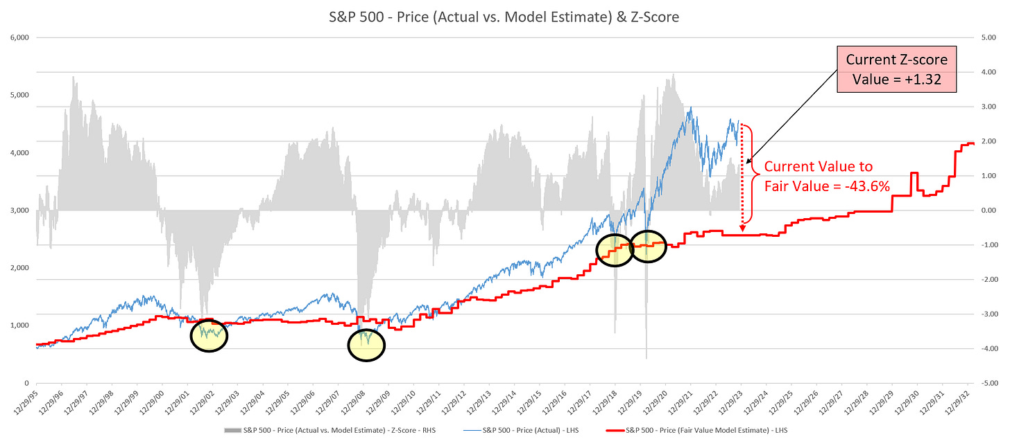
I will conclude this week with a snapshot of the daily version of my “Average Investor Allocation to Equities” model.
How to use this chart.
The blue line is the S&P 500.
The red line is my “fair value” model for the S&P 500.
“Current Value to Fair Value” is the amount the S&P 500 would “need” to decline from its current level to the “fair value” level.
“Current Z-Score Value” is a representation (in standard deviation terms) of the delta between the current price of the S&P 500 and the “fair value” price.
Historically, major corrections do not end until the Z-Score falls to somewhere between -3.0 & -4.0. The yellow circles denote the price of the S&P 500 the last four times this happened. Note where the price was at these points relative to the “fair value” line.
This was a longer piece than usual so thank you for sticking with me until the end. Never hesitate to reach out if you have any questions and if you found value in this piece, please consider sharing it with a friend or colleague.
Until next week…














Very interesting labor-housing correlation there; thanks so much. It is my thesis that "this time is different" in that the retiring baby boomers tamp down Unemployment such that labor stats may not act as they historically have. HOWEVER, despite a willingness to spend and maintain lifestyle, those boomers will curb their spending on a dime once the inevitable contraction occurs. I am watching consumer spending very closely. Keep up the great work, terrific posts & charts!
Good piece Jim... thanks for putting so much work into this. Love the Yogi Berra comment