Weekly Chart Review
BIG ANNOUCEMENT! + Quarterly Update: Average Investor Allocation to Equities
BIG ANNOUNCEMENT!
I have been writing the “Weekly Chart Review” for the better part of the last year and quite honestly, it is one of the highlights of my week! This is truly a passion for me and stems from my desire to help others avoid the pitfalls I’ve seen happen over and over again in this business.
I love the discipline of analyzing the markets each week and trying to extract insights for our 35,000 subscribers that may allow them to look at things through a different lens and hopefully benefit from that alternate perspective.
To that end, this newsletter takes a lot of time and effort each week and that is why I am announcing that the “Weekly Chart Review” will be moving to a paid subscription.
Further, with this transition, I am launching “Skillman Grove Research”. Over the next several months, I will transition away from “Jim’s Substack” to “Skillman Grove Research” and with that, I will be adding new features such as expanded research, model portfolios, etc.
What do I get for my paid subscription?
The “Weekly Chart Review” is an unbiased institutional quality research publication on financial markets which is published each week and delivered to your inbox on Monday mornings at 7:45 am ET.
The format is simple. I provide an analysis of:
What happened last week?
What we should expect this week?
What we can do to benefit going forward?
I typically do this by reviewing important economic data that was released the previous week, highlighting potential market-moving data for the upcoming week, and reviewing various charts to get a sense of where the market is potentially heading.
You will also receive access to all historical posts as well as any new features that get added as Skillman Grove Research expands its offering.
How much will it cost?
There are two tiers:
Monthly = $45/month (or the equivalent of $540/year)
Annual = $396/year (or the equivalent of $33/month)
For the remainder of this year, I will be offering a “15% discount for life” to anyone who signs up for an annual subscription.
Annual (15% Discount) = $337/year (or the equivalent of $28/month)
What is the value proposition?
The 15% annual discount equates to less than $1 a day.
There was a study done last year that found in 2022, Americans spent an average of $314/month on impulse purchases. This was up from $276/month in 2021 and $183/month in 2020.
Instead of spending $314/month on “impulse purchases”, would you consider spending $28/month on unbiased institutional quality investment research that may allow you to make better investment decisions for yourself and/or your clients?
This newsletter currently has over 35,000 subscribers, most of which are financial advisors. Financial Advisors…Would you be willing to spend $28/month if it meant you could provide additional value for your clients? What I have found is that providing value for one client often translates into growing your entire client base over time through positive feedback.
I can’t tell you how many times I’ve heard the following statement from financial advisors who read this newsletter:
“I shared your work with my clients which created an opportunity to discuss potential changes to their portfolios to take advantage of current market conditions…”
That is why I do this. My hope and desire is to provide better financial outcomes for our subscribers and our subscribers’ clients.
Will you join me on this quest by becoming a paid subscriber?
Quarterly Update: Average Investor Allocation to Equities
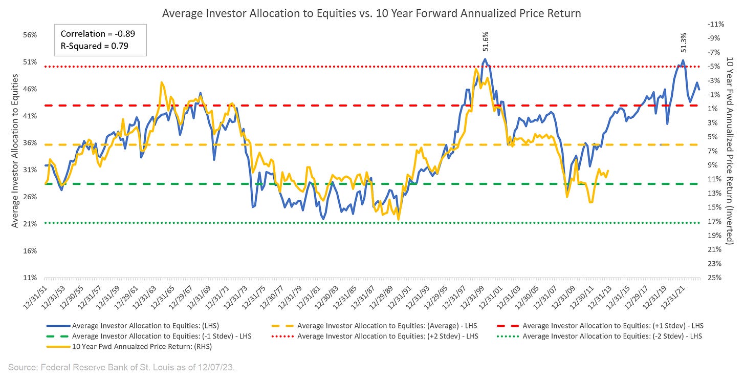
Long-time readers of this newsletter know that I have a favorite chart that I update each quarter which is called the “Average Investor Allocation to Equities”.
The data for the chart comes from the Federal Reserve Bank of St. Louis and is updated quarterly.
I’ll start with the chart and then get into the analysis.
I find that it is helpful to start with a definition:
“The blue line in the chart shows the “Average Investor Allocation to Equities”. As the name would imply, this line shows how much (i.e., what percentage) of the average investor’s portfolio is allocated to equities at any given time as opposed to other asset classes (i.e., fixed income, commodities, cash, etc.) This line maps to the left-hand scale of the chart.
The yellow line in the chart shows the “10-Year Forward Annualized Price Return” of the S&P 500 Index. This is telling us what the 10-year forward return was for the S&P 500 Index from the corresponding point on the blue line. This line maps to the right-hand scale of the chart and the values have been inverted to better show the relationship between the two metrics.”
Next, we want to understand how to interpret this chart:
“Very simply, the higher the blue line (i.e., the “Average Investor Allocation to Equities”), the lower the subsequent 10-year return for the S&P 500 Index and vice versa.
Given the tightness of fit for these two lines (note the correlation figure in the top left-hand corner of the chart), I have created a model to project forward returns for the S&P 500 Index (see chart below).”
The current “Average Investor Allocation to Equities” figure is 45.93% as of September 30, 2023 (our most recent update).
This corresponds to a projected annualized return of 0.11% over the next 10 years vs. a historical average of 7.58% since 1946.
Your starting point matters…a lot.
Taking it a step further
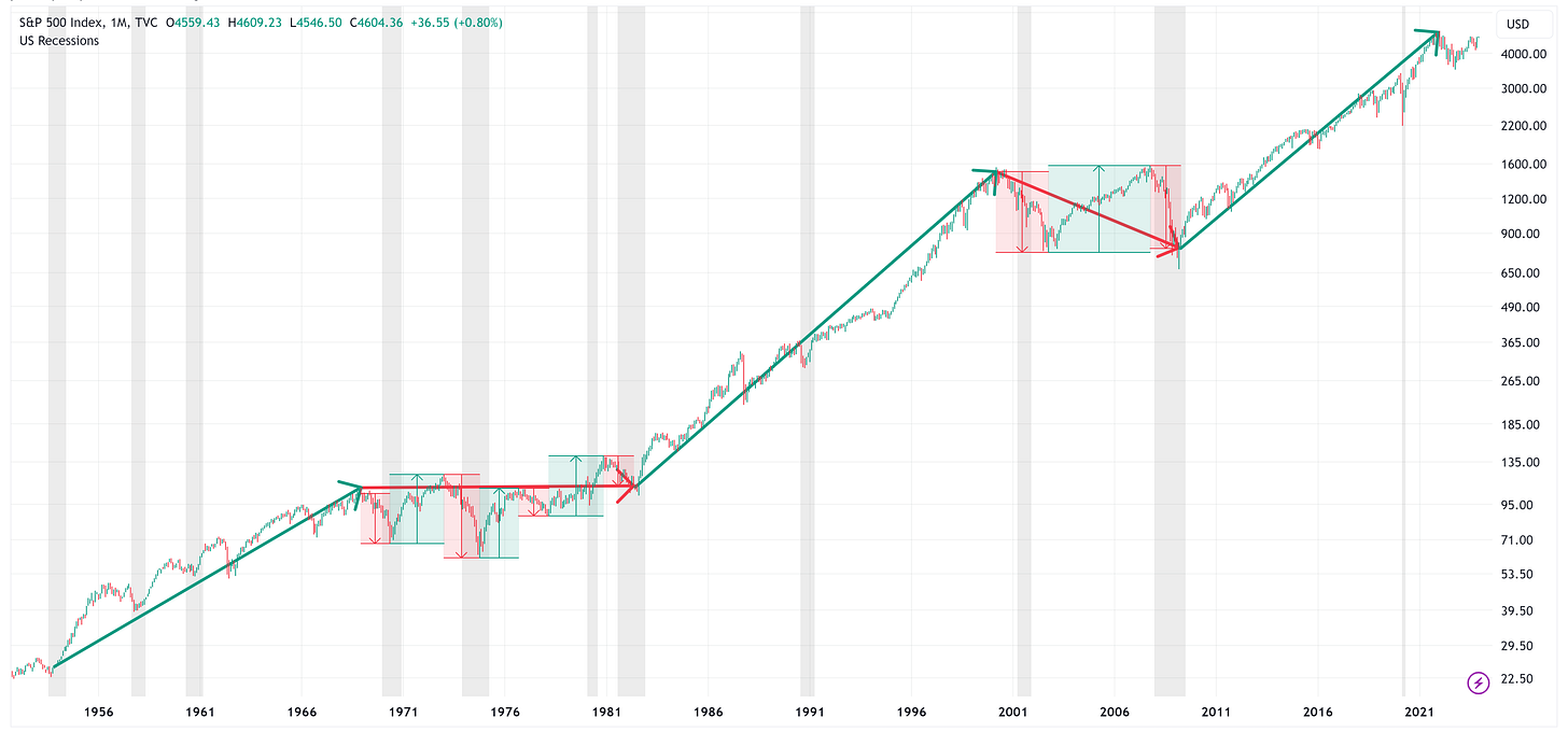
The following chart is the same as the first one above but I’ve broken it down into three different segments.
The first two segments represent a full cycle (i.e. trough-peak-trough) for the Average Investor’s Allocation to Equities.
The third segment is the current cycle which has yet to complete.
Note in the chart above that I have used green/red arrows to denote up/down trends for the Average Investor’s Allocation to Equities.
Here is what those same periods look like when we chart the S&P 500.
Note: the grey vertical bars represent US recessions.
The immediate takeaway is that during the “green arrow” periods, you can pretty much close your eyes, go long the S&P 500, and you will fare quite well.
Alternatively, the “red arrow” periods are a bit more challenging and typically end with a sideways or negative return.
During the “red arrow” periods, it is not uncommon to have very dramatic sell-offs followed by very dramatic rallies.
Where are we now?
We are in a “red arrow” period; therefore, as referenced above, over the next 10 years, we should expect a return of approximately 0.11% on an annualized basis.
Coupled with this, it would not be uncommon to have a recession or two and some dramatic selloffs/rallies associated with those recessions or corrections.
The million-dollar question remains: “When are we going to have a recession and one of the selloffs you mentioned?”
The honest answer is that I don’t know the answer (nor does anyone else) but I have written a few pieces recently that may serve as a guide (spoiler alert - it may be here sooner than you think):
Please feel free to go back and read these pieces by clicking on the following links:
As noted above, the data for the “Average Investor Allocation to Equities” comes out quarterly, but I have created a model that extrapolates the quarterly data into daily values so that we don’t have to wait 3 months for each update.
This is the same chart that I put at the end of my newsletter each week.
Very simply, the blue line is the current value for the S&P 500 Index and the red line is the “fair value” model for the S&P 500 that I have created.
What we find is that it is not uncommon for the S&P 500 to deviate from its fair value line, but eventually, it always comes back to fair value (or below it), typically, during corrective periods in the market.
These “corrective” periods are usually associated with a recession and thus provide a good proxy for how far we should expect the S&P 500 to decline when the next recession occurs.
You can see in the chart above that the S&P 500 would need to decline by -44.1% to get back to its fair value line. This won’t happen overnight, but it will likely happen during the next recession.
Once the S&P 500 falls to (or through) the fair value line, it typically creates a generational buying opportunity for the S&P 500 and risk assets in general.
We will know when to go long risk assets again by watching the Z-Score figure on the chart. Typically, most corrective periods do not end until the Z-Score figure falls to somewhere between -3.0 and -4.0. Currently, the Z-Score figure is +1.38 so we have a ways to go.
Fair Value for the NASDAQ 100
The last time I posted this quarterly update, one of our readers asked if I had ever looked at this through the lens of the NASDAQ 100.
I thought that was a great question (I love receiving your feedback so never hold back) so I looked into it for this piece.
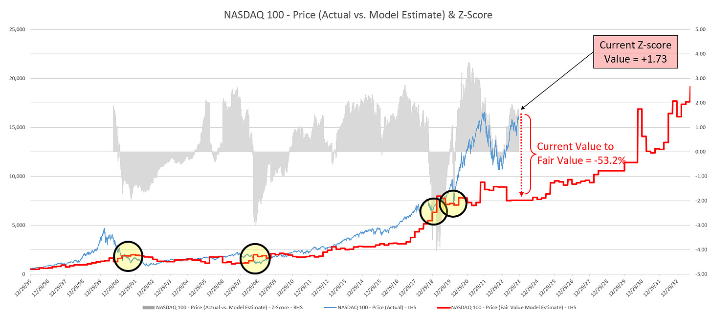
Here is the same chart as above but for the NASDAQ 100.
This would suggest that during the next major correction/recession, the NASDAQ 100 “needs” to decline by -53.2% to get back in line with its “fair value”.
Similar to the S&P 500, that feels like a scary figure but not if you prepare for it in advance. Further, it is worth emphasizing that if/when that happens, it will create a generational buying opportunity on the other side of it.
If you read the pieces I referenced above, you’ll find that I think the “next recession” is probably going to happen sooner rather than later which means that corrections on the order of -44%/-53% for the S&P 500/NASDAQ 100 are not out of the cards over the medium term.
I would never bet the ranch on a singular outcome, but it may be prudent to think about how or if you would change your current portfolio allocations if you believed there was a possibility of this type of outcome in the not-too-distant future.
Absolute Value & Relative Value
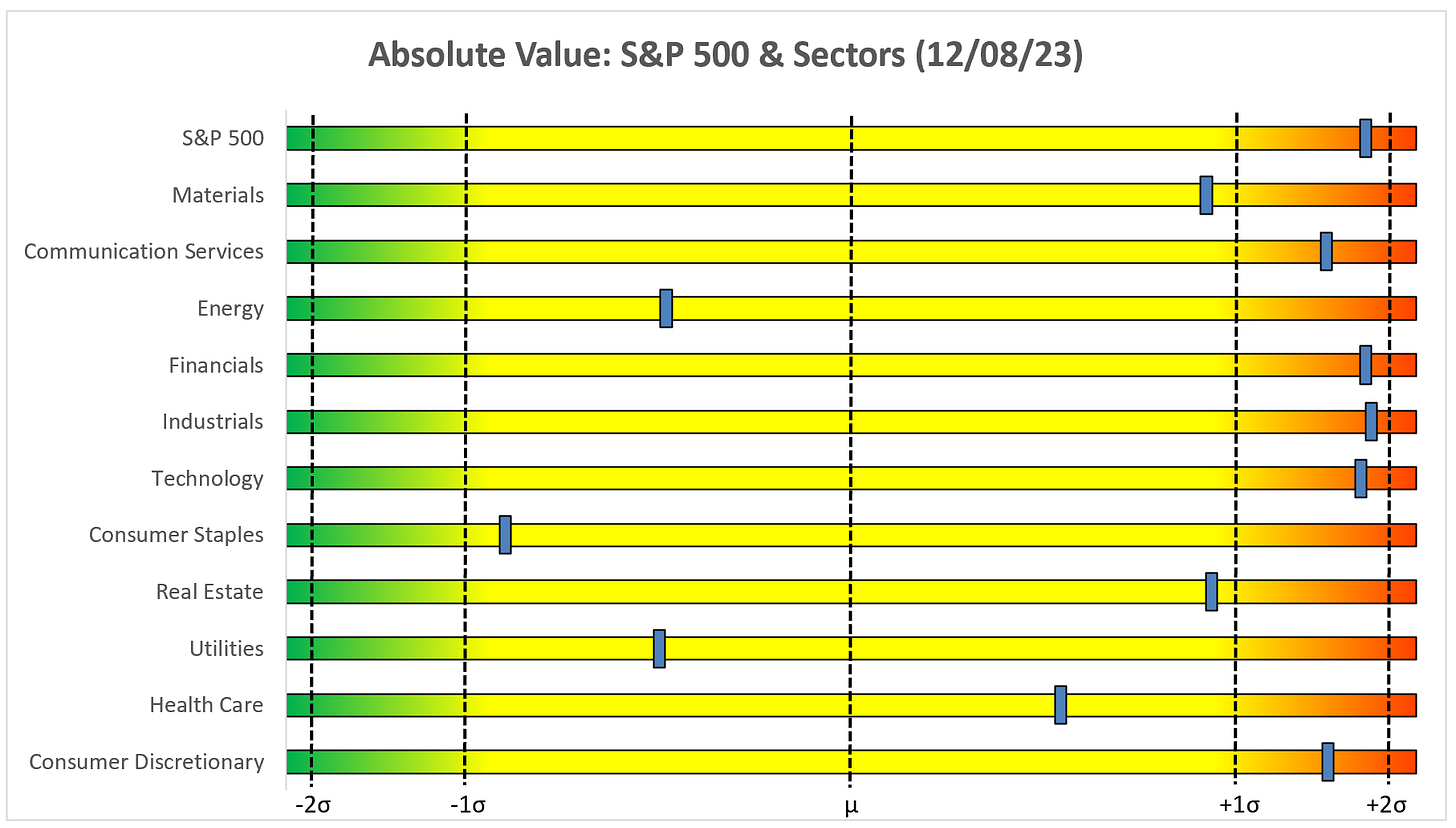
Here are the weekly Absolute & Relative Value charts.
Absolute Value - Equities
Relative Value - Equities
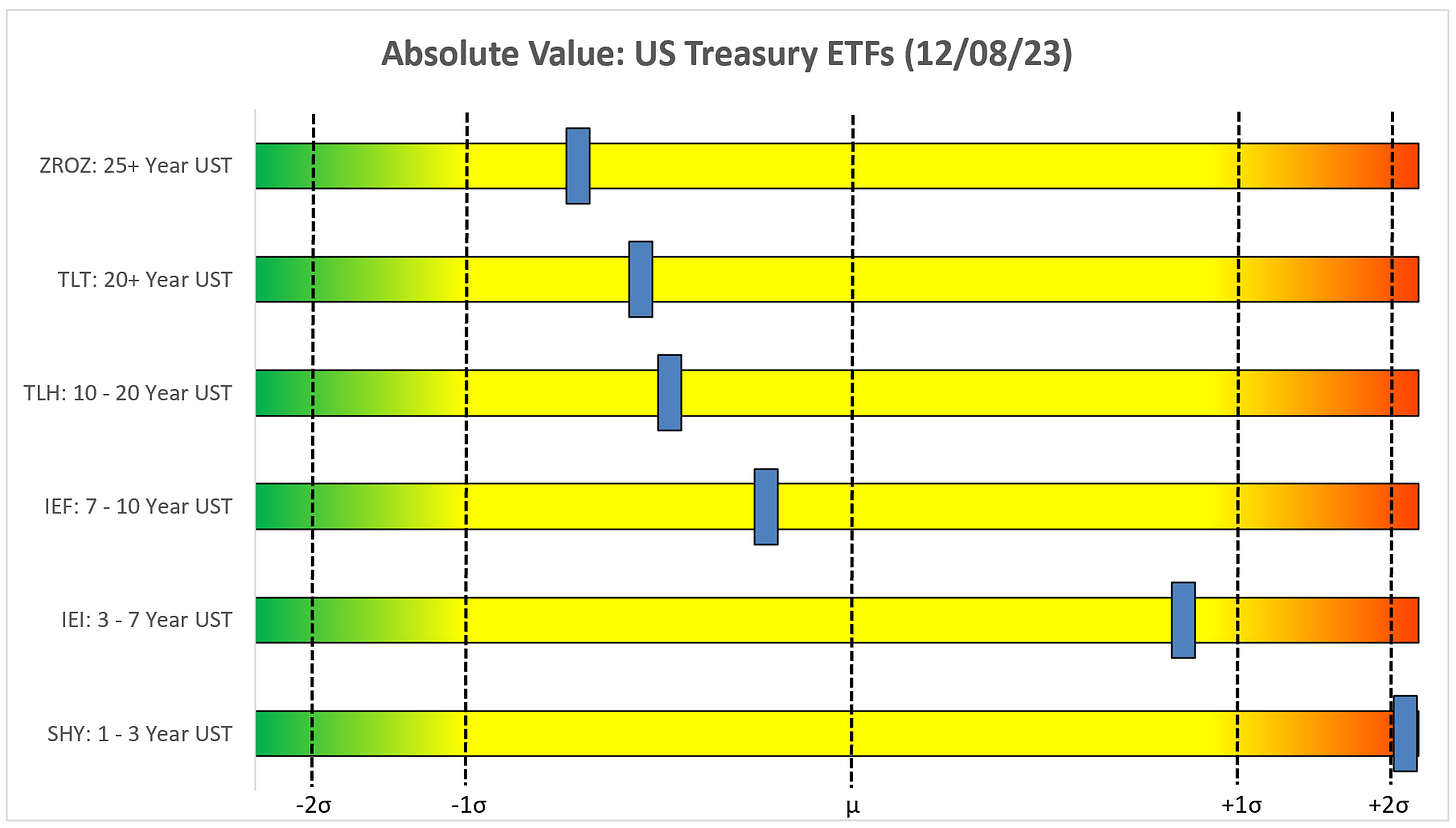
Absolute Value - US Treasuries
Chart Review
As a quick reminder regarding the following charts. All else being equal, the goal is to be on the “correct” side of the trailing stop loss indicator (red/green line).
If the price on the chart is above the green line, the bias would be towards being long.
If the price on the chart is below the red line, the bias would be towards being short or not invested in the particular index/sector.
Beyond the trailing stop loss, I use technical analysis, coupled with familiar indicators like the Relative Strength Index (RSI) and the Moving Average Convergence/Divergence (MACD), to discern whether or not the current rally/decline has room to run or if it may be getting a bit long in the tooth.
Remember, no analysis is perfect and is always subject to change, the goal is simply to put the probabilities in our favor and bring to light any “warning signs” that may be in our path.
S&P 500 Index
Modest gains for the S&P 500 last week despite slightly better-than-expected non-farm payroll and unemployment reports.
The S&P 500 continues to bump up against the YTD high (4,607.07) from July. For the S&P 500 to take the next leg higher, it needs to break through this level and continue the march higher. Alternatively, we have to be mindful of all the gaps (red boxes) that need to be filled below current levels.
Technology
XLK initiated a MACD sell signal on November 29th but continues to tread water. If XLK can maintain a sustained break of the 186.35 level and shake off the MACD sell signal, it could have a shot at the next target of 198.09.
Communication Services
XLC recently initiated a MACD sell signal and subsequently went on to fill one of the gaps below. To make the next move higher, it needs to clear 71.50.
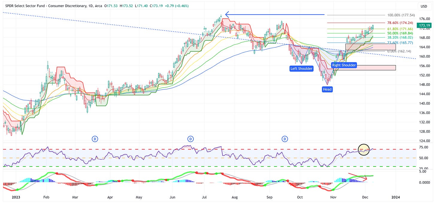
Consumer Discretionary
XLY continues to march higher with 177.54 as the current target. Watch the MACD though as it appears to be losing some steam.
Industrials
XLI had trouble with the 109.15 level we identified last week. It needs to clear this level to continue the march higher.
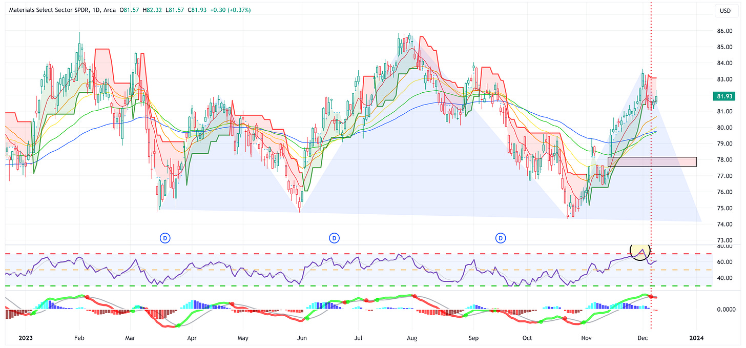
Materials
XLB appears to now be forming the right shoulder of the head & shoulders pattern I proposed some time ago. XLB also recently triggered a MACD sell signal. Watch for the moving averages to provide some support, if not, XLB is heading towards the neckline around ~74.00.
Energy
XLE finally capitulated and broke down and through the lower bound of the wedge pattern as it triggered a MACD sell signal. This calls for a target of 54.93.
Financials
XLF has had a strong run of late but recently triggered a MACD sell signal. If it can shake off the sell signal, the next line of resistance is 36.24, otherwise, look for the gap below to be in play.
Real Estate
XLRE appears to be rolling over but it continues to remain above the trailing stop loss and above the downward trend line. For the bulls, you want to see XLRE hold at the trendline and reestablish a move higher. If it falls below the trendline, the gaps below may be in play.
Consumer Staples
XLP just triggered a MACD sell signal but it remains above the trailing stop loss. Let’s see if the trailing stop loss can hold.
Utilities
XLU continues to steadily march higher and note how it continues to ride right along the 8EMA (red line). The MACD suggests that some of the strength may be waning but the price action has not proven that just yet.
Health Care
Similar to XLP, XLV has had a strong run but the MACD appears to suggest a slowing of the recent rally. On a positive note, XLV has broken through resistance at 131.92, it just needs to sustain it.
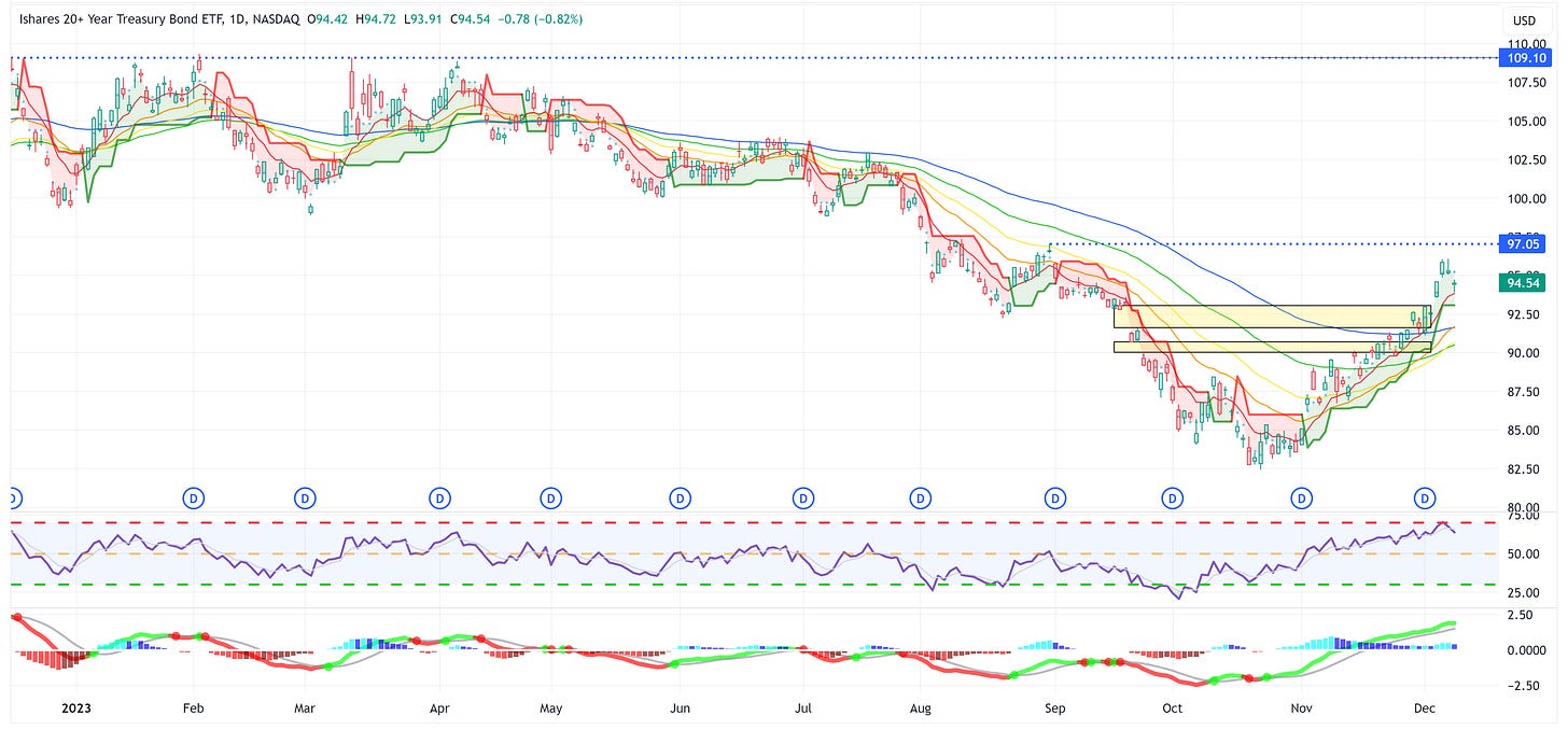
US Treasury Review
Last week, I made the following observation:
“It wouldn’t surprise me to see a bit of a pullback sometime over the next week or two as gaps have been filled and RSI’s are approaching overbought levels; however, I think the bigger move higher is still to come.”
I still think there may be more short-term room to the downside but ultimately, I think these UST products are likely to move substantially higher over the medium-to-longer term.
ZROZ: 25+ Year UST
TLT: 20+ Year UST
TLH: 10 - 20 Year UST
IEF: 7 - 10 Year UST
IEI: 3 - 7 Year UST
SHY: 1 - 3 Year UST
As always, thank you for reading this newsletter and I hope you’ll join us as a paid subscriber going forward!















Wow those are some sizeable (and gutsy) projections to the downside for the markets. I remain hopeful. Merry Christmas and thanks for your fabulous work.
Hi Jim,
I really respect and appreciate your work. And I’m not surprised you’re going to subscription. You deserve to be paid for your great work.
I’m recently retired at age 66 after having worked in the nonprofit sector for very low wages for the last 35 years, and only saved a small nest egg.
I am now embarking on improving my investing and asset allocation skills so I don’t make any dumb mistakes with my humble savings.
Anyway, I have no idea if you ever offer a partial scholarship or not. But thought I would run it by you because I am mostly doing this self study via free resources and two very inexpensive subscriptions.
Thanks for reading this lengthy note.
Best to you,
Derek