On August 7th, I posted the following chart…
And made the following comment…
“Over the last 5 years, we’ve had 4 instances where the VIX has declined to very low levels thus creating the wedge patterns you see in the lower panel of the chart (remember, the lower panel is inverted so “very low levels” on the VIX correspond to elevated levels on the VIX in the chart).
When those wedge patterns broke, it was typically not very good for the S&P 500.
We need to watch the VIX, and especially the 15-day moving average, in the coming days and weeks.”
Fast forward to last Friday, and here is the updated chart.
Note that the VIX did break out of its wedge pattern (highlighted with the yellow circle) and as expected, the S&P 500 has moved lower.
In the chart below, you’ll see that the S&P 500 has fallen by -8.88% since the August 7th post.
In the August 7th piece, I also noted the following:
“In the four periods prior to now when the VIX broke its wedge pattern (red vertical line), the S&P 500 had the following max peak-to-trough declines before the VIX peaked again (green vertical line): -11.84%, -18.94%, -35.33%, and -14.61% for an average decline of -20.18%.”
If we use the above historical declines as a guide, this would suggest that we may have some room to decline further if this cycle has similar results.
To that end, let’s look again at the following chart but this time zooming in on the portion showing the S&P 500.
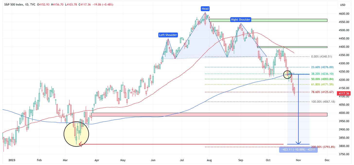
Take note of the horizontal lines that I’ve drawn on the chart. These are the predicted price targets based on the Head & Shoulders pattern that has recently formed.
Target #1 = 4,067.18
Target #2 = 3,793.85
Target #3 = 3,520.52
Target #4 = 3,247.19
It is interesting to note that even though these targets are based on the Head & Shoulders pattern you see in the top right of the chart, they line up almost perfectly with other inflection points on the chart (which I have highlighted with yellow boxes).
Each of these targets should be considered a very important support level. If the support level doesn’t hold, the next most likely stopping point is the target below it.
For instance, if the S&P 500 continues lower from here, it really needs to hold the 4,067.18 level. If it doesn’t, the assumption should be that 3,793.85 is the next realistic chance to find support. Rinse and repeat as we move through the four targets mentioned above.
If you’d like to read the entire piece from August 7th, feel free to go here.
Absolute Value & Relative Value
Here are the weekly Absolute & Relative Value charts.
Absolute Value - Equities
Relative Value - Equities
Absolute Value - US Treasuries
Chart Review
Remember, the goal with these charts is simply to stay on the “correct” side of the trailing stop loss as these trends often last for several weeks or months.
We had several charts this week where we flipped from one side to the other with regard to the trailing stop loss. It’s not uncommon to see a reversal week after a big move; therefore, my preference is always to wait for a confirmation week (which would be this week) before assuming we have established a new trend in a new direction.
S&P 500 Index
In the chart above, we’re looking at a daily chart of the S&P 500.
Note that we’ve continued lower from our break of the 200-day moving average which I highlighted last week and the short-term target remains 4,067.18. You can read last week’s piece here.
In the chart below, we’re looking at a weekly chart of the S&P 500.
Note that since 2020, when the weekly chart fell below the 89EMA (blue moving average line), which it did last week, it continued lower by -19.15%, -11.80%, and -13.95%, respectively, or an average of -14.97%.
Technology
XLK continues its trend lower. The Head & Shoulders pattern is calling for a target of 144.70.
Communication Services
XLC is one of the sectors noted above that “flipped” last week. The -5.16% move last week feels a little extreme, I wouldn’t be surprised to see this rally back a bit this week.
Net/net, let’s give this a week to confirm the move lower before thinking we’ve moved to a new downtrend.
Consumer Discretionary
XLY double-top remains in place calling for a target of 144.06.
Industrials
XLI appears to be in trouble here as it has closed below the 89EMA (blue moving average line) two weeks in a row. Also, note that the RSI hasn’t reached “oversold” conditions so this could have further to fall.
Materials
XLB closed right at what could be considered a potential neckline for a potential Head & Shoulders pattern. If that is the case, we could see a rally to form the right shoulder before moving lower again. With that said, this could be entirely wishful thinking on my part.
Energy
XLE had a tough week last week and similar to XLC, it is one of the sectors that “flipped” last week.
Worth noting that it closed right at the trendline I’ve had drawn for several weeks. Let’s give this another week to confirm itself before assuming a new downtrend is in place.
Financials
XLF is on the verge of breaking down and through the triangle pattern. If that happens, the target becomes 23.94.
Real Estate
XLRE looks like the XLF chart, just a few weeks ahead of it as it has broken down and through the triangle pattern which calls for a target of 27.92.
Consumer Staples
Same song for XLP as a break of the triangle pattern calls for a target of 56.32.
History would suggest that often times Consumer Staples will outperform the S&P 500 when the market goes “risk off”. That doesn’t mean it won’t be down, it just may not be down as much as the S&P 500. The same can be said for Utilities and Health Care and hence why people like to “hide out” in these “defensive” sectors during times of trouble.
Utilities
XLU had a nice rebound last week and seems to be holding the 61.8% Fib. Let’s see if this can continue this week.
Health Care
XLV had a definitive break of the triangle pattern last week. This calls for a target of 106.52.
US Treasury Review
The summary analysis for the products below is that if rates continue to move higher, these ETFs will suffer.
With that said, there will come a risk-off moment at some point when “something breaks” and at that point, these ETFs will appreciate and will likely appreciate quickly.
I still like the idea of pre-positioning ahead of the “something breaks” moment, but you will have to be willing to be “wrong” until that time.
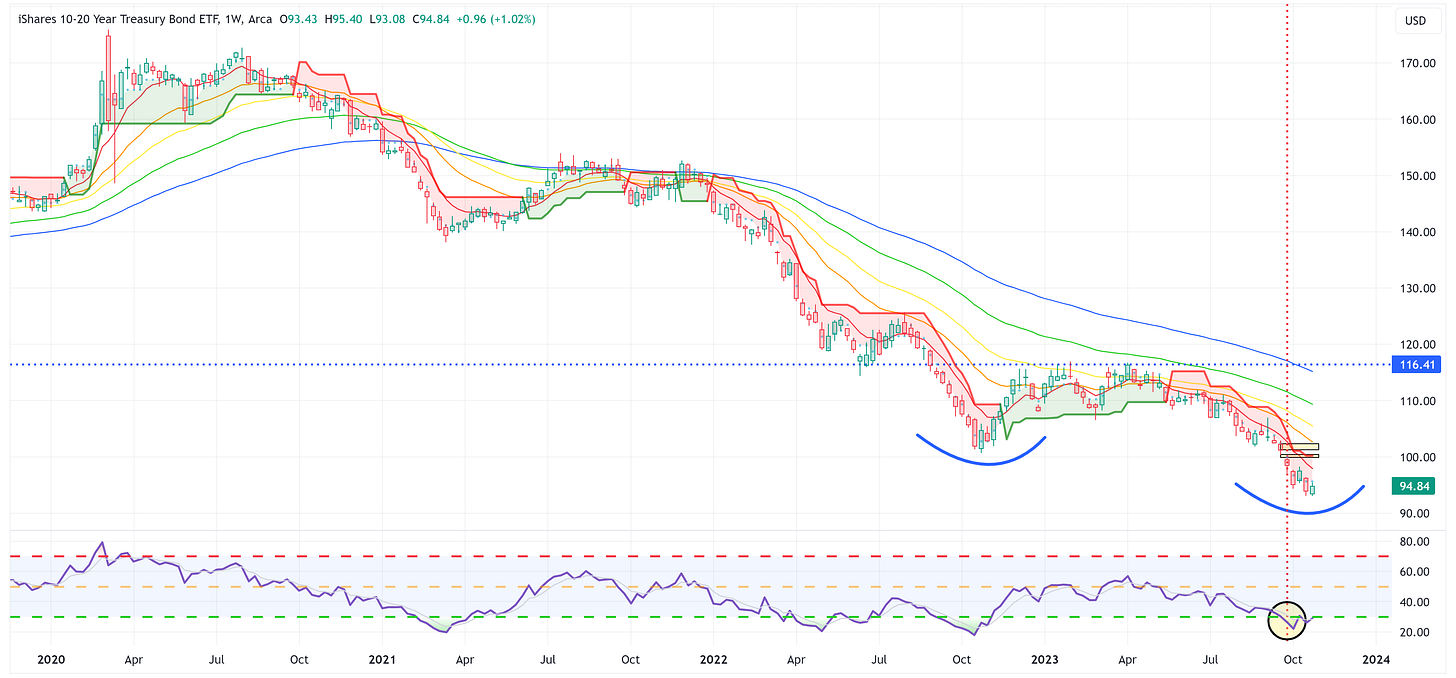
ZROZ, TLT, TLH, and IEF all have very similar charts. I realize the following rhetorical question could be (and likely is) a bit early, but “Are these four ETFs forming the “Head” of a possible inverse Head & Shoulders pattern from a deeply “oversold” position on the RSI?”
If so, a rally back to the neckline (i.e., not even accounting for the target levels that would be created above the neckline if this does turn out to be an inverse Head & Shoulders pattern), would create a move of +51.4%, +29.3%, +22.7%, and +11.5%, respectively.
Again, I have no idea if the low is in for each of these products, and it’s foolish to think that I (or anyone else) can tell you where/when the low will be. My point is to note that these products have substantial room to rally if/when they make the turn.
ZROZ: 25+ Year UST
TLT: 20+ Year UST
TLH: 10 - 20 Year UST
IEF: 7 - 10 Year UST
IEI: 3 - 7 Year UST
IEI seems to be finding support at the 23.6% Fib, let’s see if that can continue. If not, the 107.35 target remains in place.
SHY: 1 - 3 Year UST
SHY was never able to officially form a Head & Shoulders pattern. With that said, it looks like it could be in the process of forming a “busted” Head & Shoulders which would call for a target of 83.42 and call for a rally in US Treasuries on the short end of the curve.
Average Investor Allocation to Equities - Daily Chart Model
I will conclude this week with a snapshot of the daily version of my “Average Investor Allocation to Equities” model.
How to use this chart.
The blue line is the S&P 500.
The red line is my “fair value” model for the S&P 500.
“Current Value to Fair Value” is the amount the S&P 500 would “need” to decline from its current level to the “fair value” level.
“Current Z-Score Value” is a representation (in standard deviation terms) of the delta between the current price of the S&P 500 and the “fair value” price.
Historically, major corrections do not end until the Z-Score falls to somewhere between -3.0 & -4.0. The yellow circles denote the price of the S&P 500 the last four times this happened. Note where the price was at these points relative to the “fair value” line.
Let’s make it a great week and if you’ve enjoyed reading these pieces, please feel free to share it with a friend/colleague by clicking the “Share Jim’s Substack” button below, or subscribe by clicking the “Subscribe now” button below.


Best email of my week. Awaiting the Treasury upward turn as I was early! Thank you Jim.
Terrific update with that VIX chart; thank you!